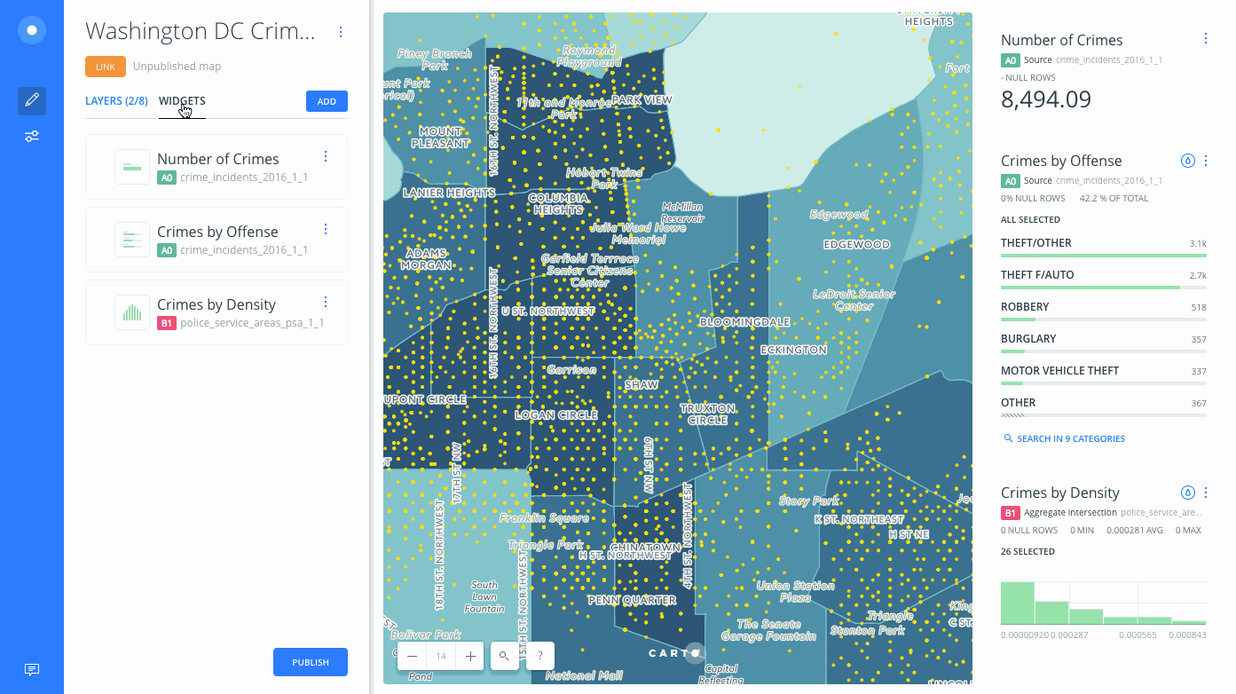
Understanding the Time-Series Widget
CARTO Builder Time-Series widgets display and filter data over time.
Time-Series widgets enable you to visualize a selected column value over a period of time. Depending on your data, Time-Series widgets can be static or animated and allow you to filter or select a range of data.
-
A static Time-Series widget is not animated and displays a specified
numberordatecolumn as a range of time. You can distribute data across your map by defined buckets. -
An animated Time-Series widget is applied when ANIMATED styling is applied to your map layer. A defined
numberordatecolumn drives the animation and the widget includes animation controls to play/pause data over a range of time.
This guide describes how to add and edit different types of data with Time-Series widgets in CARTO Builder.
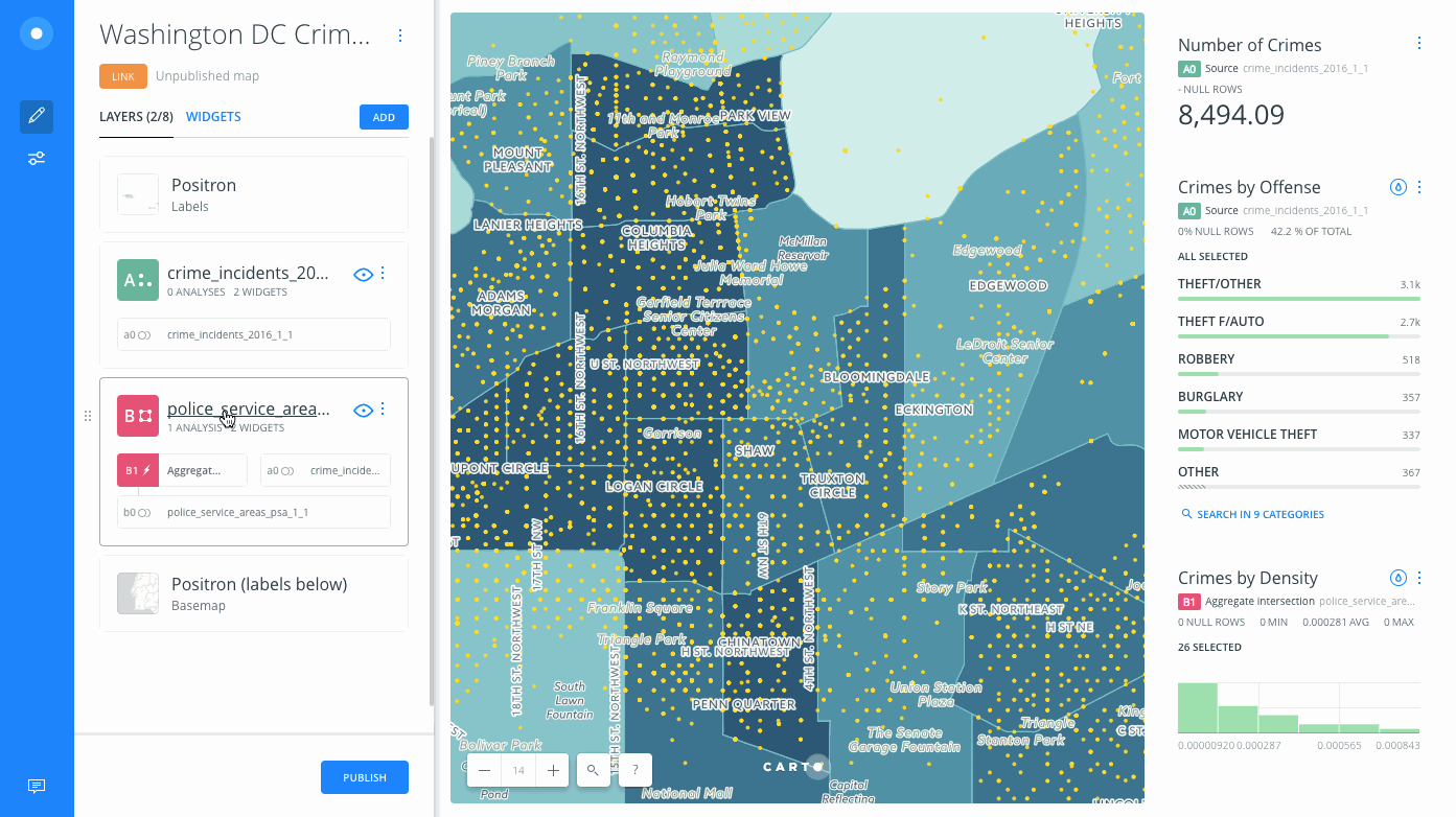
While you can include multiple Formula, Category, and Histogram widgets on your map, only one Time-Series widget is permitted and appears in a fixed location.
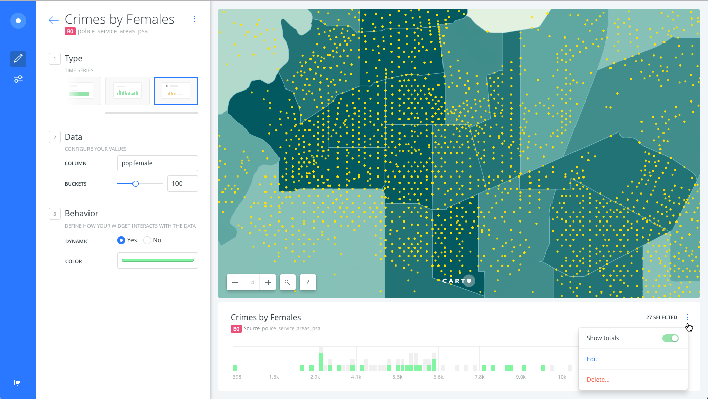
Time-Series by Number
Add a number TIME-SERIES widget in CARTO Builder and define the number of buckets to group data.
-
Navigate to the WIDGETS list.
-
Click ADD to add widgets.
-
Click the TIME-SERIES subtab.
-
Select a column from your map layer that contains
numberdata. -
Click CONTINUE.
A Time-Series widget appears in a fixed location on your map.
- Edit the widget name, number of BUCKETS for grouping data, change the dynamic behavior, or customize the widget color on your map.
If adding a number column from the widget shortcut options (the DATA tab of a map layer), the widget automatically appears as a Histogram. You must edit the widget from the WIDGETS list and change the type to TIME-SERIES.
Define the Number of Buckets
Time-Series widgets filter numerical data within a given range. The selected range is distributed across your map in buckets, to display groups of data. The higher the number of buckets, the more granular the data. The objective of grouping data into buckets is to put similar values together.
- From the Time-Series widget options, define the number of BUCKETS under the Data options.
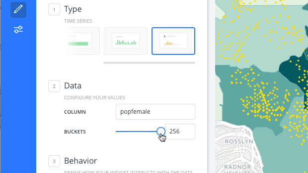
The data is grouped into different size buckets, enabling you to filter your view over the selected range of time.
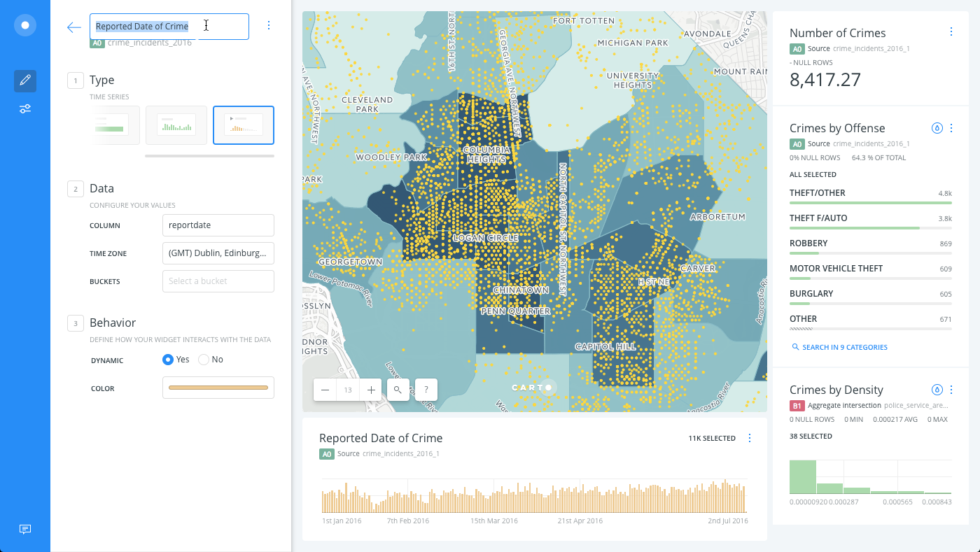
Time-Series by Date
If the selected column for the widget is a date, you can define how the date is grouped into buckets (by Minutes, Hours, Days, Weeks, Months, Quarters, Years) and visualize a selected range of time.
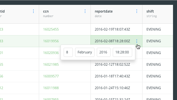
The most important requirement is that your date column contains valid timestamp values, otherwise the data may not appear correctly. A column that includes a timestamp could be date, created at, updated at, posted_time, and so on. For example, the following image shows the value of a date column in the Data View.
For details about column data types, see the Add Rows and Columns Guide.
For this example, let’s add a TIME-SERIES widget through the DATA tab shortcut.
-
From the LAYERS list, click a layer that contains at least one
datecolumn. -
Click the DATA tab.
The DATA tab enables you to view the non-geometry columns of your connected dataset and instantly add or edit widgets to gain more insights from your data.
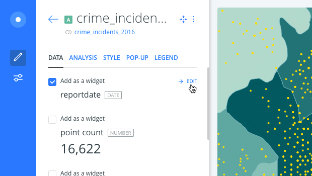
-
Click the Add as a widget checkbox next to a column that contains
date.A Time-Series widget appears in a fixed location on your map.
-
Click EDIT next to the selected column from the DATA tab, which enables you to edit the widget details.
-
Edit the widget name, define buckets for how to group date, change the dynamic behavior, or customize the widget color on your map.
If adding a date column from the widget shortcut options (the DATA tab of a map layer), the widget automatically appears as a Time-Series. If your date column does not contain timestamp values, you may want to change the column type or edit the widget and change it to a Histogram.
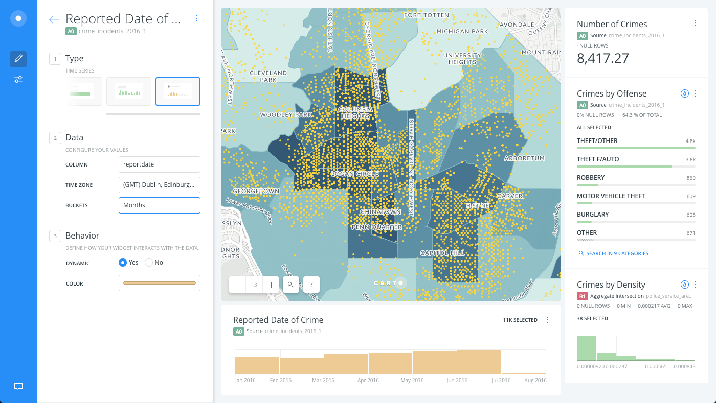
Define the Date Buckets
Time-Series widgets filter date values by a specified range of time. The selected range is distributed across your map in buckets, to display groups of data.
- From the Time-Series widget options, define the buckets under the Data options.
Only the buckets that are applicable to your date values appear (Minutes, Hours, Days, Weeks, Months, Quarters, or Years).
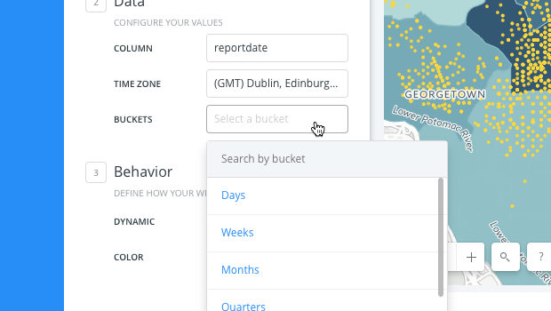
The data is grouped by buckets to specify a range of time.
Time Zones for Dates
When a time-series widget contains a date column, you can specify the time zone for how the dates appear in the widget.
- From the Time-Series widget options, select the TIME ZONE under the Data options.
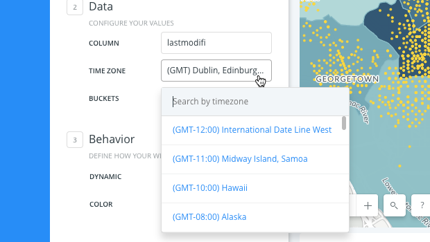
If no time zone is selected, the default time zone from CARTO Builder’s configuration is used.
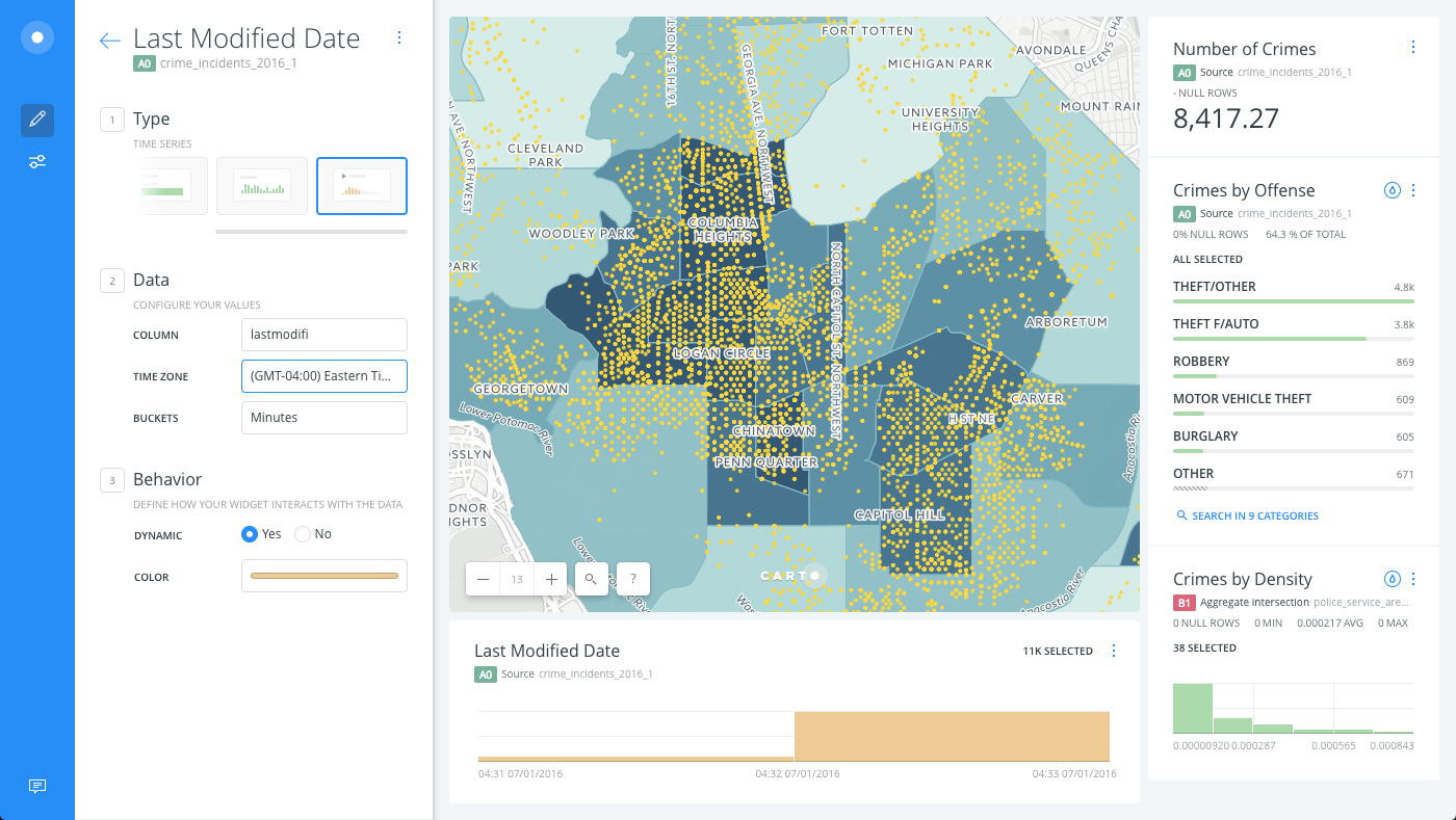
The widget displays the correct timestamp for the time zone selected. For example, the following image displays a column that contains the last modified date of crimes reported, grouped by Minutes, using the (GMT-04:00) Eastern Time (US and Canada) time zone.
Filtering Values with the Time-Series Widget
Time-Series widgets filter data within a given range. The selected range is distributed across your map to display groups of data; either by a number of buckets (for number columns) or by date buckets (for date column).
-
From the Time-Series widget, click once on a bucket to display the range selector.
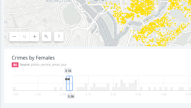
This enables you to click and drag the start and end range of selected data. The number of records in each bucket appears.
-
Select the start and end range by clicking and dragging the edge of the bucket to change the range of selected data.
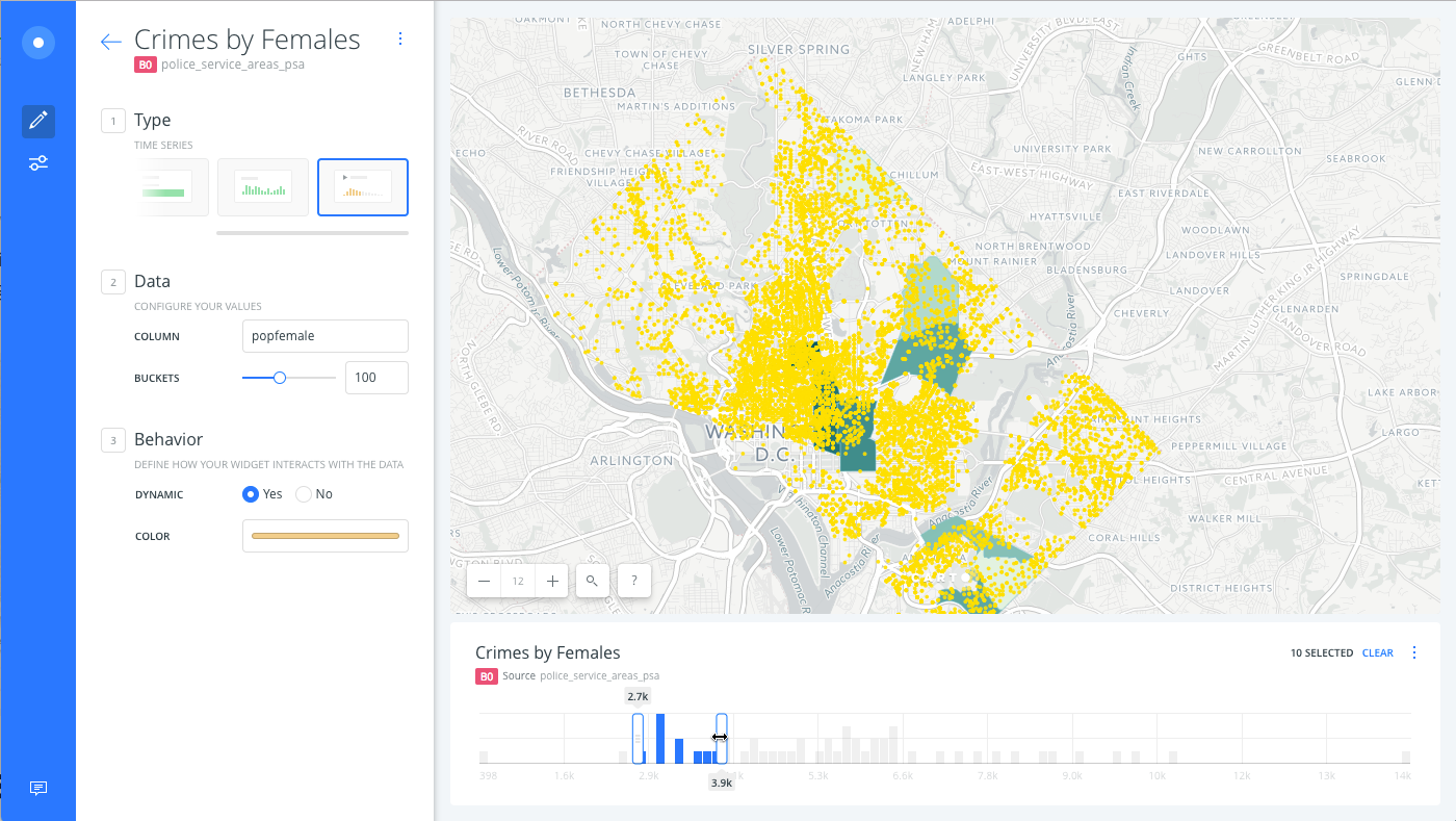
Only the selected filters appear on your map, and any analyses are rerun and recalculated!
-
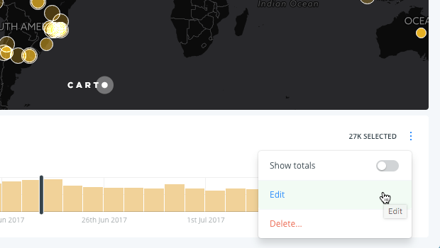
Optionally, click Show totals from widget context menu.
This option displays the total values (highlighted gray bars) in proportion to the selected range of data (as defined by the widget options), which is useful for understanding how the time-series would appear if you were visualizing all of the data.
Animated Time-Series Widget
An animated time-series widget is automatically created when you style a map layer with the ANIMATED aggregation option from the STYLE tab. This enables you to visualize point data over time and style different animation options for time-series data. This feature requires a map layer containing point geometries with a timestamp (date), or number column.
An animated time-series widget includes animation control methods such as play, stop and pause to view a selected range of time. Additionally, you can specify Torque style properties for the animation with the STYLE tab or with CartoCSS properties.
For this section of the guide, we will use a map containing Twitter data in order to view an animated Time-Series widget in action.
-
Click the STYLE tab of a selected map layer.
-
From the Aggregation section, select ANIMATED.
See the Animating Maps with Point Data Guide for details about animating your map through the STYLE tab.
A Time-Series widget is automatically added to your map.
-
From the COLUMN style option, select a
numberordatecolumn from your dataset. (You can also edit any of the styling options that drive the animation, such as the OVERLAP, DURATION, STEPS, TRAILS, and RESOLUTION).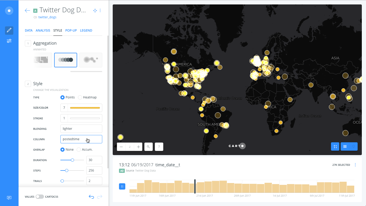
See the Torque Style Maps documentation for details about the properties behind these animated styling options.
From the widget, you can play the animated Time-Series, pause the animation and filter by a selected range of values, and show totals to display the total values in proportion to the selected range of data.
-
To edit any of the widget details, select Edit from the widget context menu.
The Time-Series widget options vary, depending on the type of column selected to animate the data.