Using 'Style by Value' with Point Geometries
Describes how to style your layers using a data attribute with CARTO Builder.
When styling maps, you can style your geometry by size and color from the STYLE tab. By default, CARTO styles by fixed values for size and solid colors. You can also style “By value”, which enables you to select a column from your dataset that drives automatic styling to your layer.
When styling By value, it is important to understand the data type of your dataset columns. When you upload your data to CARTO, it automatically assigns a data type to your columns; such as string, number, date, or boolean.
Certain styling is rendered based on the column data type. This is especially useful since you can filter and style map layers by column values in CARTO Builder.
The following animation is an overview of how By Value can be selected from your map layer.
If you are unsure about the column data types for the connected dataset, view the Data View of your map layer. The Data View and Map View appear as buttons on your map visualization when a map layer is selected. Click to switch between viewing your connected dataset as a table, or show the map view of your data.
Graduated and Proportional Maps
While you can use any map to style by column values, this guide describes how to make a bivariate map using graduated symbol size and color by using the By Value style option.
What is a bivariate map? “A bivariate map displays two variables on a single map by combining two different sets of graphic symbols or colors”©. This is a class of maps that visually use size to represent a discrete variable in a dataset. The result is a map where larger symbols indicate higher values, and smaller ones indicate lower values. This feature requires a map layer containing any geometry type that contains numeric and categorical data columns.
The two methods used are absolute scaling and range-grading. With absolute scaling, the area of each symbol on the map is scaled proportionately to its value in the data (proportional symbol maps). Range-grading breaks down values into ranges, using a classification method where symbols are sized based on the range they fall into (graduated symbol maps).
CARTO Builder supports range-grading within the styling options, which can be used with numeric fields.
Create a Graduated Symbol Map
-
Click on “Download resources” from this guide to download the
world_population_by_continent.geojsonfile. -
From your Data page, import the dataset to your account.
-
Click the CREATE MAP button from the dataset. Builder opens displaying point data.
-
Change the basemap to CARTO WORLD ANTIQUE.
-
Click on the world_population_by_continent map layer.
The STYLE tab opens, displaying no aggregations by default.
The following style aggregation methods are available for map layers containing point geometries.CHEATSHEET: Point Aggregation Styles
The following aggregation styles are available for map layers containing point geometries and apply CartoCSS related properties behind the scenes.
POINTS: Displays all geometries as a point. All columns are counted and appear as a single pattern.
SQUARES: Displays your data aggregated in squares, based on the defined operation. You can configure the grid size of the squares and apply the aggregation function for how the data is calculated (COUNT, SUM, AVG, MAX, MIN). Squares are useful if you have a high number of close points in your datasets.
TurboCARTO CartoCSS Property: The
agg_valueCartoCSS property is added and contains a unique color scheme to differentiate the styled pattern applied to your map.HEXBINS: Displays your data aggregated in hexbins, based on a defined operation. You can configure the size of the hexagonal grid and apply the operation for how the data is aggregated (COUNT, SUM, AVG, MAX, MIN). Hexbins are useful for symbolizing meaningful patterns of data for large datasets. The main difference between SQUARES and HEXBINS is how the shapes are calculated around the edges.TurboCARTO CartoCSS Property:
The
agg_valueCartoCSS property is added and contains a unique color scheme to differentiate the binned structure applied to your map.ADM. REGIONS: Aggregates points and displays the results as polygon boundaries defined by different administrative levels or regions. See Data Observatory for details about public boundary data.
TurboCARTO CartoCSS Property: The
agg_value_densityCartoCSS property is added and contains a unique color scheme based on the admin level selected.Note: ADM. REGIONS is useful if your layer contains world data, since the aggregation includes densities for normalized values. SQUARES and HEXBINS are better for local data (such as cities, stores, and so on).
- ANIMATED: Displays a selected column as an animated map, where you can style the different animation options for time-series data.CartoCSS Property: See CartoCSS Properties for Torque Style Maps for specific animated properties.
- PIXEL: Displays data aggregated by pixel(s). Areas of greater color intensity indicate a larger density of data.CartoCSS Property: See CartoCSS - Torque Heatmaps for specific Torque heatmap properties.
For a description of how aggregation functions are calculated, see MySQL documentation.
-
Edit the POINT SIZE, POINT COLOR, STROKE SIZE, STROKE COLOR, and BLENDING options to see how the points change on the Map View.
CHEATSHEET: Blending Overlapping Geometries
Blending values are style options that effect the way colors of overlapping geometries interact with each other on the Map View. Color blending is applied to the specific symbolizer property, depending on the blending mode you are trying to achieve.
- none: No color blending styling is applied to the map layer. This is the default option.
- multiply: Multiply literally multiplies the color of the top layer by the color of each layer beneath, which typically results in the overlapping areas becoming darker.
- screen: Similar to Multiply, screen multiplies the overlapping areas. Unlike multiply, it subtracts the multiplied color channel numbers from their added value to invert them. This makes the overlapping areas brighter. If white is used, it will not change appearance. Black areas will disappear. Use this when you want to lighten overlapping areas in your map.
- overlay: Overlay is a color blend mode that combines multiply and screen composite operations. Black appears as dark, as it originally is in its layer; white appears as bright, as it originally is in its layer. How purely other colors are rendered depends on how close they are to white or black. The closer a color is in value to pure midtone gray, the less it will appear. Use this when you want to show both light and dark in your overlapping layers.
- darken: Darken has a similar effect to multiply, but is more extreme. As it applies the color from the base layer to the target layers, it compares each to find the darkest-colored pixels and keeps those.
- lighten: Lighten works the same way as darken, but inversely. The lightest-colored pixels from each layer are kept, and if pixels are darker than the base layer, then the base layer color replaces them. This can be useful when you want to change the color of your overlapping areas shadows.
- color-dodge: The color-dodge color blend mode is similar to screen but the overall effect is more extreme. Your elements become much brighter (except if your base layer is black). Darker areas are tinted towards the source color. Use this when you want to have a major lightening effect with extreme contrast between your layers, without much detail showing.
- color-burn: Color-burn works similarly to color-dodge, but has a darkening effect. It increases the contrast between base and target layers, with pixels in your overlapping area tinted towards the source color. Use this when you want a darkening effect with more contrast than multiply or darken.
- xor: Xor is an alpha composite operation that shows both the base and target layers, but only the parts that do not overlap each other.
- src-over: Source-over is also an alpha composite operation that keeps the full transparency of both the base and target layers. The visual effect is that the base layer shows on top of all layers involved in the overlap area.
Additional blending options can be applied with CartoCSS syntax. View the complete list of CartoCSS values and see example effects of these blending options.
For this guide, we will symbolize the points in two ways:
- Apply a numeric attribute for the size of the symbol.
- Apply a categorical data column for its color.
Style by Value for Symbol Size
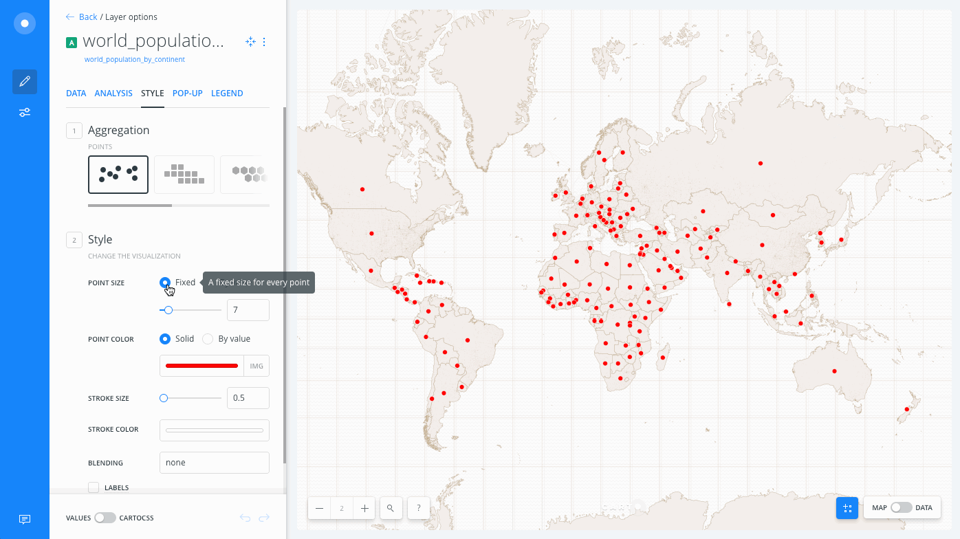
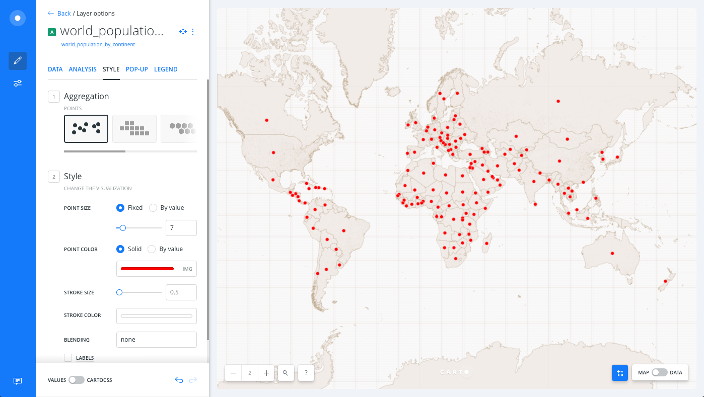
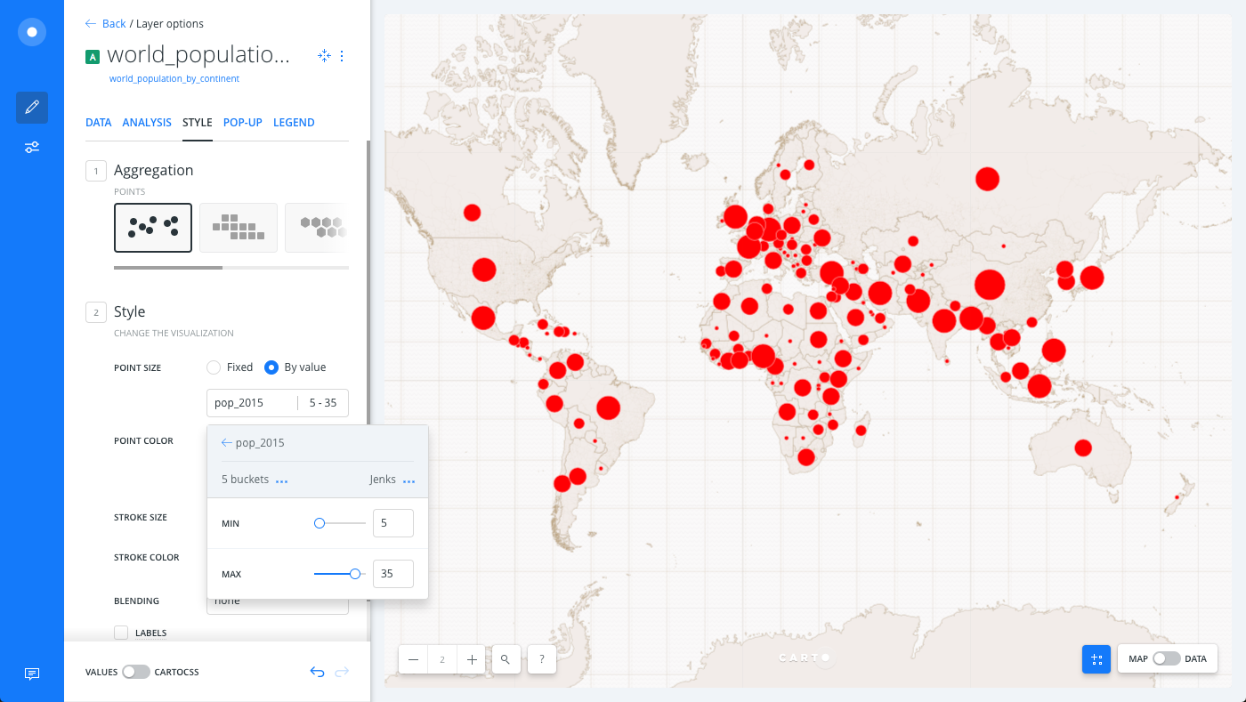
To visualize the population of different countries by varying sized symbols, style the marker POINT SIZE by the population value for the countries.
-
From the STYLE tab of the map layer, change the POINT SIZE from the default Fixed selection to the By Value option to open the size properties for the map layer.
-
Select the
pop_2015column as the value for the classification. -
Change the classification method:
-
Select
Jenksas the classification method. -
Keep
5 bucketsfor the number of data ranges to group the data.
CHEATSHEET: Classification Methods
Classification methods group data into ranges. CARTO supports classifying numeric fields for graduated symbology through the following methods:
- Quantiles: A quantile classification is well suited to linearly distributed data. Each quantile class contains an equal number of features. There are no empty classes or classes with too few or too many values. This can be misleading sometimes, since similar features can be placed in adjacent classes or widely different values can be in the same class, due to equal number grouping.
- Jenks: Breaks the data into classes based on natural groupings inherent in the data. The groups are formed by decreasing the variance within classes and increasing the variance between different classes -- a 1D k-means. Since Jenks are data-specific classifications, they are not useful for comparing multiple maps built from different underlying data.
- Equal Interval: Divides the range of attribute values into equal-sized subranges. The class breaks specified by the number of buckets selected. Usually used for percentage values, it is best applied to familiar data columns such as temperature, ratios, and other relative attribute values.
- Heads/Tails: Best for data with heavy-tailed distributions, such as exponential decay or lognormal curves. This classification is done through dividing values into large (head) and small (tail) around the arithmetic mean. The division procedure repeats continuously until the specified number of bins is met, or there is only one remaining value left. This method, more than others, helps to reveal the underlying scaling pattern of far more small values than large ones.
- Category: Classifies a limited (or fixed) number of possible values, based on an attribute of a particular group, or nominal category.
-
-
For the size of the marker, enter
5as the MIN value and35as the MAX value, which clearly symbolizes the range of population for the countries in our map.
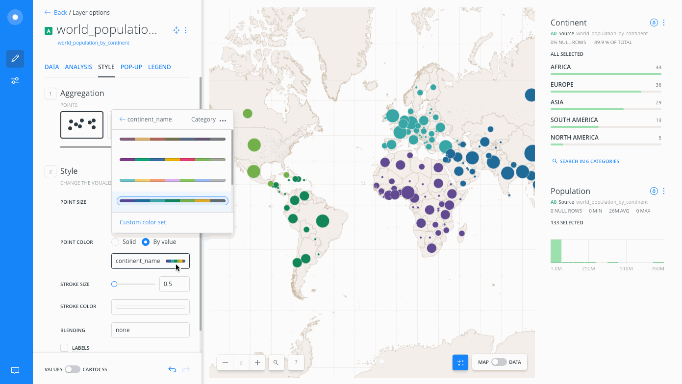
Style by Color for Categories
To visually group the population symbols by continents, style the POINT COLOR by the continent category for each country.
-
Click the By Value option for POINT COLOR. The Fixed setting is selected by default.
-
Select
continent_nameas the category column.
The default colors assigned to the six unique categories appears.
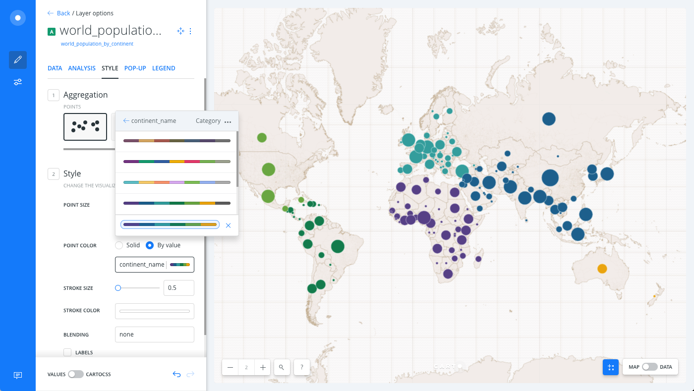
Try adding some widgets and change the colors of the various categories (click on the color scheme for each category and select a custom color), or switch to the CartoCSS view of the STYLE tab and apply a TurboCARTO ramp (which applies map styling using a single line of code). Here we have used the qualitative CARTOcolors scheme, Antique.