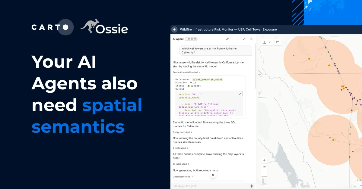
Visualize 2015 Urban Populations with Proportional Symbols


Proportional symbol maps are used to represent point data that are attached to a specific geographic location (like a city) or data aggregated to a point from an area (like a state). The area of each symbol on the map (usually a circle) is scaled according to its value at a given geographic location using either absolute scaling or range-grading. The result is a map where larger symbols indicate higher values and smaller ones lower values. This type of map is flexible in that you can represent raw data values (total population) or data that are normalized (percentage of population).
In this blog I'll walk through the basic principles of proportional symbols and some best practices when designing them. Then I'll cover the steps to make a map of 2015 urban population by country using the absolute scaling method.
Proportional Symbol Maps
Absolute Scaling vs. Range-Grading
There are two methods used to create proportional symbols: absolute scaling and range-grading. With absolute scaling the area of each symbol on the map is scaled proportionately to its value in the data. With range-grading values are broken into ranges (typically 3-5) using a classification method where symbols are sized based on the range they fall into (this is similar to the choropleth technique used for polygon data).
Use absolute scaling when you want your map reader to estimate relative magnitudes between individual values. Use range-grading to show magnitudes using classes that represent a range of values.
You will hear proportional symbol maps referred to in different ways. In the CARTO Editor we call them Bubble maps. Others refer to absolute scaled symbols as proportional symbol and range-graded as graduated symbols. Another way they are referred to is classed (range-graded) and unclassed (absolute scaling).
Best Practices
There are some important design considerations when making proportional symbol maps:
Avoid a homogeneous looking map. It is important that there is enough variation between symbol sizes representing the range of values. With absolute scaling if there isn't a lot of variation between the values in your data there will be little variation in symbol size. With range-grading make sure there is enough differentiation in symbol size from class to class so they are easily distinguishable from one another
Use the right method for your data. Research shows that map readers have a hard time estimating the area of a symbol on a map and even more difficulty between symbols. Make sure your data are appropriate for absolutely scaled symbols. If not use range-grading to limit the number of symbols that need to be interpreted
Think about your map reader. Cartographic research also shows that map readers interpret the areas of circles and squares best on proportional symbol maps. Definitely experiment with other symbol types (even text!) but when in doubt default to these
Legends are important. For absolute scaling your legend should provide symbols that are sized close to the largest and smallest values in the data. And of course with range-grading each symbol should be sized as it is on the map with its associated values listed
Symbol legibility. Make sure to order your data so symbols representing smaller values don't get lost underneath symbols with larger values. In areas where there is a concentration of symbols the key is to help each one stand out against the other. This can be done using a couple of design tricks like symbol outlines
For more information on proportional symbols definitely check out Cartography: Thematic Map Design by Borden Dent where a lot of this information comes from!
Let's Get Mapping!
Before we dive into the data preparation and map making process let's take a look at some details about the final map:
- It was designed to be viewed from zooms 2-5
- Symbols are sized using absolute scaling
- Only countries with urban populations of greater than 1 million are included
- The color of each country point relates to its continent
- It uses a simple basemap to promote visual hierarchy as discussed in this blog
- The final map projection is World Robinson (for more on projections in CARTO see this blog)
- Zoom in on the map below to see the multi-scale legend that uses custom data and CartoCSS for its design (this will be covered in another blog post!)
As mentioned earlier with absolute scaling the area of each symbol is proportionate to its value in the data. In future versions of CARTO.js and the CARTO Editor you will be able to do this on the fly. Until then this blog outlines the process to make a proportional symbol map using absolute scaling.
The topics covered are:
- Data Prep
- Formula overview for absolute scaling
- Calculating symbol sizes in CARTO
- Applying symbology based on values
- Final touches
Data
The data used for this map come from the World Bank Data Bank.
To get the data ready for the map:
- I downloaded total urban population projections by country for 2015 in
.csvformat - Next I uploaded the
.csvto CARTO where it was georeferenced using country name - I converted the resulting polygons to points using
ST_Centroid - Finally I assigned a continent to each point in the data using a method similar to the one outlined here
I won't outline each step in detail but if you would like to follow along you can download the prepared dataset here.
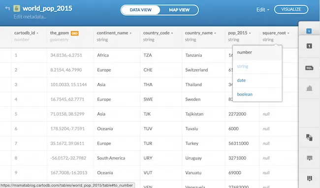
The attributes in the dataset are:
country_name: the name of the countrycountry_code: the three letter country codecontinent_name: the continent the country belongs topop_2015: the total count for 2015 urban population
Note: the SQL and CartoCSS in this blog assume that the name of your table is world_population_2015
Formula Overview
To determine the proper symbol size for each country we'll do the following:
- Pick a maximum symbol size that will be used for the largest value in the data
- Calculate the square root for each value in the data
- Use those two pieces of information to calculate the symbol size for each country
To simplify this to an equation:
symbol size = (maximum symbol size) * (square root / max square root)
Where:
maximum symbol size = the size of the largest symbol on our map
square root = the square root of each value in the data
max square root = the square root of the largest value in the data
Note: For a more detailed discussion on this calculation see Chapter 9 of Borden Dent's book!
Symbol Size Calculation in CARTO
1. Choose a Maximum Symbol Size
The maximum symbol size is assigned to the largest value in the data and is the starting point from which all other symbols will be scaled. Choose a maximum symbol size that won't cause too much clutter or overpower the map.
For the final map (after some trial and error) I chose a maximum symbol size of 75px based on the values in the data the opening scale and extent.
Note: You should adjust this number depending on your map's extent scale and the range of values. Using the method outlined below you can easily adjust this number and recalculate symbol sizes.
2. Add Fields
We need to add two numeric fields to our table: square_root where we'll calculate the square root for each pop_2015 value and symbol_size where we'll calculate the symbol size for each country.
- Go to DATA VIEW
- In the bottom right hand corner click the button to Add Column
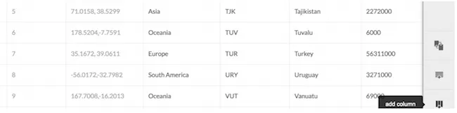
- Name the column
square_rootand hit enter - Change the column type to number by selecting it from the drop-down
- Follow the same steps to add another column named
symbol_size
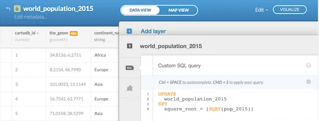
3. Calculate Square Root
- From DATA VIEW open the SQL tray
- Using the SQL query below we'll update our
square_rootfield with the square root of each value in thepop_2015field:
##_INIT_REPLACE_ME_PRE_##
UPDATE
  world_population_2015
SET
  square_root = SQRT(pop_2015)
{% endhighlight sql %}- Click Apply Query
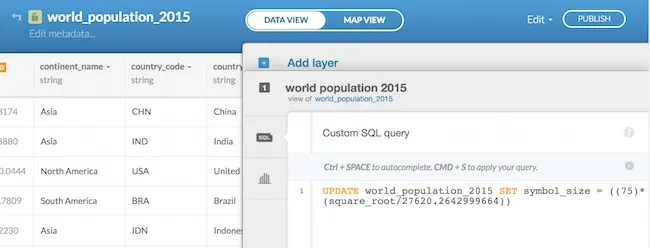
4. Calculate Symbol Size
Now that we have decided on our maximum symbol size (75) and have the square_root field populated we can use that information to calculate the symbol_size for all other values in the data.
Let's take a look at our equation again:
symbol size = (maximum symbol size) * (square root / max square root)
Where:
symbol size = our symbol_size field
maximum symbol size = 75
square root = our square_root field
max square root = 27620.2642999664 (the square_root value for China)
With all of the information that we need we can construct the equation using SQL to update the symbol_size field:
- From Data View open your SQL tray
- Copy/paste the SQL below to calculate a symbol size for each value in the data
##_INIT_REPLACE_ME_PRE_##
UPDATE
  world_population_2015
SET
  symbol_size = 75.0 * square_root / 27620.2642999664
{% endhighlight sql %}- Click Apply Query
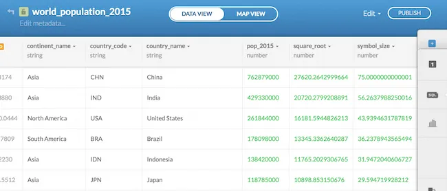
If we look at the resulting sizes we can see that the country with the largest population (China) has a symbol size of 75 and all other values are scaled accordingly:
Symbol Design
Now that we have the additional attributes in the data we'll walk through the steps to size color and define the drawing order of the symbols in MAP VIEW.
- From DATA VIEW click the option to VISUALIZE to create a map from our data table
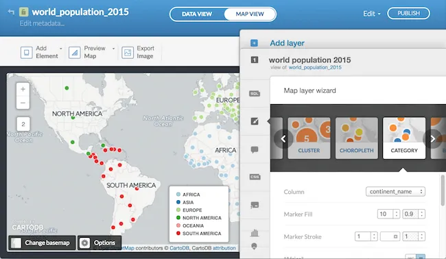
1. Symbolize by Continent
On the final map each symbol is colored according to its continent using the continent_name field.
- Open the styling Wizard
- Select the Category option and choose
continent_namefor Column
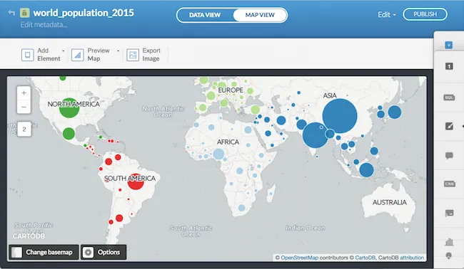
2. Size Symbols
Next we'll size each point symbol using the values from our [symbol_size] field.
- Open the CartoCSS tray for the layer
- Replace the value for
marker-width:from10to[symbol_size]so the first block of global styling looks like:
##_INIT_REPLACE_ME_PRE_##
world_population_2015 {
marker-fill-opacity: 0.9; marker-line-color: #FFF; marker-line-width: 1; marker-line-opacity: 0.8; marker-placement: point; marker-type: ellipse; marker-width: [symbol_size]; marker-allow-overlap: true; }
… ##_END_REPLACE_ME_PRE_##
- Click Apply Style
If you aren't satisfied with the symbol sizes after seeing them on the map you can change the maximum symbol size value and rerun the equation to calculate new values for the symbol_size field.
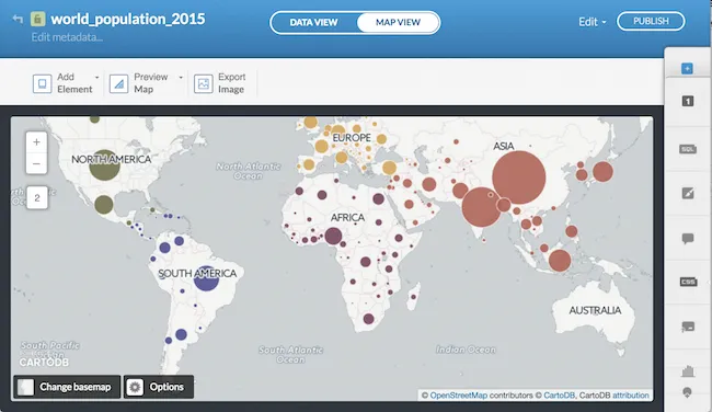
3. Color Symbols
Similar to the drought monitor map I chose six different colors for each continent assigned them as variables and then replaced the default category colors. I also made a slight adjustment to the default marker-line-opacity from 1 to 0.8.
- In the CartoCSS tray copy and paste the six color variables (or choose your own!) and paste them above the first block of CartoCSS
##_INIT_REPLACE_ME_PRE_##
@africa:  #75445C;
@asia:    #AF6458;
@europe:  #D5A75B;
@northam: #736F4C;
@oceania: #5b788e;
@southam: #4C4E8F;
##_END_REPLACE_ME_PRE_##
- Next assign the color variables to each continent name
- For example the CartoCSS for Africa would look like this:
##_INIT_REPLACE_ME_PRE_##
world_population_2015[continent_name="Africa"] {
marker-fill: @africa; } ##_END_REPLACE_ME_PRE_##
- Click Apply Style to see the changes
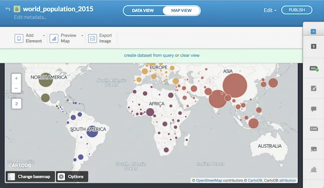
4. Drawing Order
As outlined in the best practices section we need to make sure that smaller symbols are being drawn on top of larger symbols so important information does not get covered up. Looking around the map we can see that there are cases where this is happening.
To fix this we will change the default drawing order (from ascending) to descending using a field (symbol_size) in our data along with the SQL operator ORDER BY. This will force larger symbol_size values to draw first and smaller values to draw on top.
- Open the SQL tray
- Copy/paste the following
##_INIT_REPLACE_ME_PRE_##
SELECT *
FROM
  world_population_2015
ORDER BY
  symbol_size
DESC
{% endhighlight sql %}- Click Apply Query to see the changes
Final Touches
1. Symbol Size Through Zoom
Since the map will be viewed from zooms 2-5 we need to size the symbols appropriately based on viewing scale.
We'll do this with zoom dependent styling that increases the symbol_size by a factor of 2 at each zoom level for the marker-width property.
- Open the CartoCSS tray for the layer
- We'll add the additional
marker-widthstyling to the global properties of the layer
##_INIT_REPLACE_ME_PRE_##
world_population_2015 {
marker-fill-opacity: 0.9; marker-line-color: #FFF; marker-line-width: 1; marker-line-opacity: 0.8; marker-placement: point; marker-type: ellipse; marker-width: [symbol_size]; marker-allow-overlap: true;
//scale symbols based on zoom level [zoom=3]{marker-width: [symbol_size]2;} [zoom=4]{marker-width: [symbol_size]4;} [zoom=5]{marker-width: [symbol_size]*8;} } ##_END_REPLACE_ME_PRE_##
- Click Apply Style
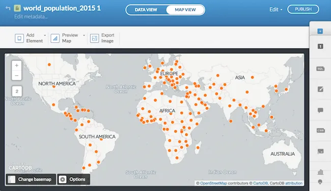
At this point your map should look something like this where symbols are colored by continent sized by the value they represent in the data smaller symbols are drawing on top of larger ones and a symbol's size scales between zooms 2-5:
2. Increase Buffer Size
If you zoom into China you'll notice that at zoom 4 the symbol cuts off along a tile boundary.
We can fix this by increasing the map's buffer-size which adds additional pixels around each tile.
- Copy the following
##_INIT_REPLACE_ME_PRE_##
Map {
  buffer-size: 256;
}
##_END_REPLACE_ME_PRE_## - Paste it above the color variables for continent colors
- Click Apply Style
And the result:
3. Basemap
For the final map I designed a simple basemap in World Robinson. For tips on designing a basemap for thematic overlays in a variety of projections see this post and this post.
Alternatively you can use one of the default CARTO basemaps like Dark Matter (the lite version):
4. Other Map Elements
As discussed earlier legends are important for proportional symbol maps. For the final map I made a legend with three data points assigned them large medium and low values and then scaled them using the same formula that was used for all other symbols. I then positioned the circles and text using CartoCSS through zoom level.
I followed the same method for the map title description and data source text.
Experiment!
Proportional symbol maps are some of my favorite! There are a lot of interesting stories that can be told using this method in a variety of creative ways.
For example the final map from the blog can be taken further to include the World Bank's population projections for multiple time periods:
or to visualize 50+ years of cholera outbreaks around the world:
or for tiger counts in India:
… and many many more …
Happy proportional symbol mapping!