Make a Thematic Map of Current Drought Conditions


The most common maps built with CartoDB highlight a specific topic or theme of information. Cartographers refer to these as thematic maps. Typically thematic maps have two components: a basemap and a thematic overlay.
The logical ordering (or visual hierarchy) of elements on thematic maps is especially important. The thematic layer should be highest in the visual hierarchy designed with bold colors to stand out against the more subtly designed basemap.
Building on these ideas and this previous discussion on map projections in CartoDB this blog walks through the steps to make a thematic map of current drought conditions in the United States using data from the [United States Drought Monitor].
All of the maps in this post are pannable and zoomable so as you go through the different steps interact with them along the way!
Getting Started
First we'll design a simple basemap that is made up of a base layer and a reference layer. The purpose of the basemap is to provide our map readers with just enough geographic context to interpret the drought conditions around the country without distracting them from the overall pattern of drought.
Data
- From your dashboard click the option for NEW MAP
- In the Add datasets dialog click on Search and type in 'states'
- Look for the dataset titled "USA States" from Natural Earth (
ne_50m_admin1_states) highlight it and click CREATE MAP
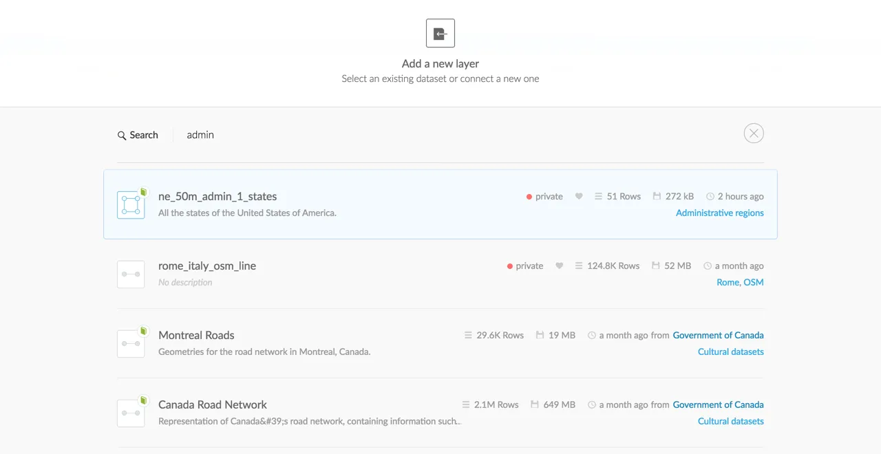
Next add the US states layer again. This is done so we can use one layer for the base and the second copy for the reference information placed on top of the drought monitor data as seen in the final map.
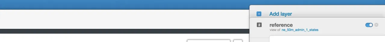
- Expand the right hand layer panel and click Add Layer
- From the "Add new layer" dialog highlight
ne_50m_admin_1_statesand click the option to ADD LAYER - Rename the layers in your map to reference and base by double clicking on the layer name in the layer panel
Labeling Attributes
The state labels on the final map transition from two letter postal codes at zoom 4 to abbreviated names at zoom 5 and full state names appear at zooms 6 and larger.
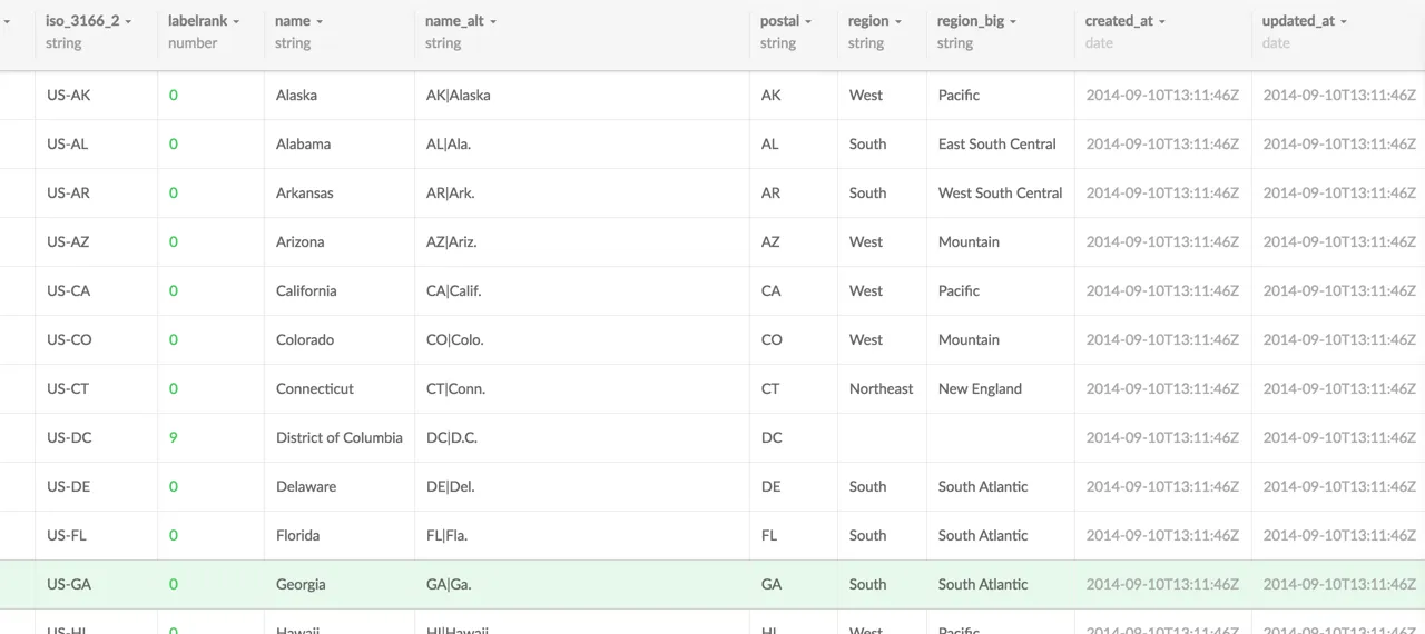
Let's take a look at the attributes for the reference layer to determine which attributes we'll use for labeling:
- From the reference layer click on DATA VIEW
- The three attributes we'll use for state labeling through zoom are:
postal(the two letter postal code for a state)abbrev(an abbreviated version of the state name) andname(the state's full name)
Keep note of these attributes as we'll use them in the SQL query we construct for the reference layer.
Projection
Our final map uses the Albers Equal Area Conic projection centered on the contiguous United States (SRID 5070). This is a very common projection for thematic maps of the US. This is an equal area projection meaning areas are preserved and distortion is minimized.
This projection is part of the default spatial_ref_sys table in your CartoDB account. If you have trouble accessing this SRID in your map you can insert it into your spatial_ref_sys table using the instructions outlined in this blog.
SQL Queries
For the reference layer we'll need to add two pieces to the SQL query: the projection information and the attributes that we need for labeling.
- Open the SQL tray for the reference layer and either copy/paste or type in the following and then click Apply Query:
##_INIT_REPLACE_ME_PRE_##
SELECT
    ST_Transform(the_geom  5070)
AS
    the_geom_webmercator
    postal
    abbrev
    name
FROM
    ne_50m_admin_1_states
{% endhighlight sql %}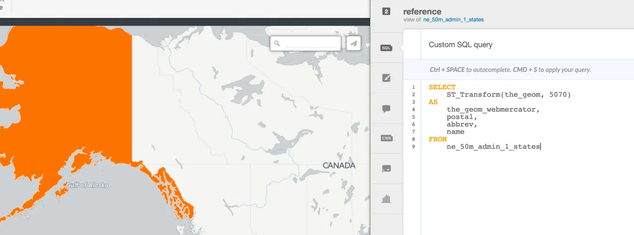
- Next open the SQL tray for the base layer and copy/paste or type in the following and then click Apply Query:
##_INIT_REPLACE_ME_PRE_##
SELECT
ST_Transform(the_geom 5070)
AS
the_geom_webmercator
FROM
ne_50m_admin_1_states
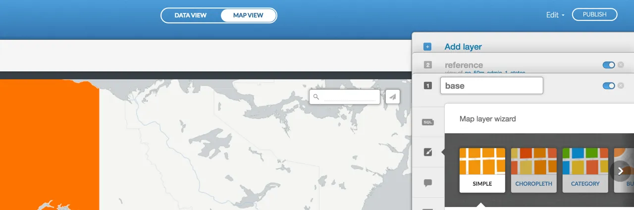
{% endhighlight sql %}At this point your map should look something like this:
Basemap Styling
Base Layer
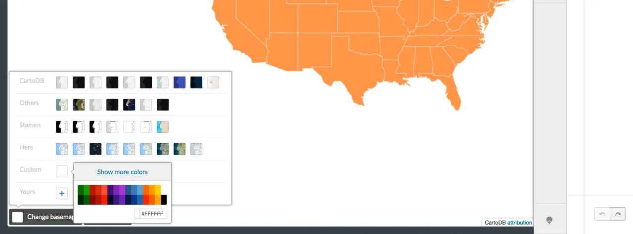
First let's turn off Postiron as the basemap and set the background to white:
- Click the option Change Basemap in the bottom left hand corner of the map editor view
- Next choose the option for Custom
- Select the white color chip (
#FFFFFF)
Next color the US polygon (base) that will show everywhere there is not drought:
- Open the styling editor for base
- Click on
CSSand copy and paste the following CartoCSS (or add your own!)
##_INIT_REPLACE_ME_PRE_##
ne_50m_admin_1_states {
polygon-fill: #E2E4DC; } ##_END_REPLACE_ME_PRE_##
Reference Layer
State Lines
- We'll style state lines white with a line width of
0.5pxand some transparency:
##_INIT_REPLACE_ME_PRE_##
ne_50m_admin_1_states {
line-color: #FFF; line-width: 0.5; line-opacity: 0.8; } ##_END_REPLACE_ME_PRE_##
- Next add some zoom dependent styling to increase the line width at larger scales:
##_INIT_REPLACE_ME_PRE_##
ne_50m_admin_1_states {
line-color: #FFF; line-width: 0.5; line-opacity: 0.8;
//at a zoom level greater than or equal to 5
//the line width changes to 1px
[zoom>=5]{line-width: 1;}
}
##_END_REPLACE_ME_PRE_##
State Labels
The three attributes we are using for the state labels are postal abbrev and name. We'll use zoom level conditions to determine when the labels turn on and zoom dependent styling to determine which version of the label draws when.
- Add the CartoCSS for state labels inside of the existing reference block using the CartoCSS symbolizer
::label
##_INIT_REPLACE_ME_PRE_##
ne_50m_admin_1_states {
line-color: #FFF; line-width: 0.5; line-opacity: 0.8;
//at a zoom level greater than or equal to 5
//the line width changes to 1px
[zoom>=5]{line-width: 1;}
//state labels begin at zoom 4 ::label[zoom>=4]{
##_INIT_REPLACE_ME_PRE_##//states labeled with postal code to start out using a 9pt font size
text-name: [postal];
text-face-name: 'Lato Bold';
text-fill: #7F858E;
text-size: 9;
//transform state labels to uppercase
text-transform: uppercase;
text-halo-fill: fadeout(#fff 70);
text-halo-radius: 2;
//at zoom 5 change to abbreviated state label and increase the font size
[zoom=5]{
text-name: [abbrev];
text-size: 10;
}
//at zoom 6 change to the full name for state labels
//increase the font size
//and wrap text for longer state labels
[zoom>=6]{
text-name: [name];
text-size: 11;
text-wrap-width: 20;
}
//at zooms 7 and larger increase font size
[zoom>=7]{
text-size:12;
}
} } ##_END_REPLACE_ME_PRE_##
Projected and styled the finished basemap looks like this:
Drought Monitor Readings
Next we'll add the latest drought monitor readings to the map compose the layer's SQL query and apply a style.
Data
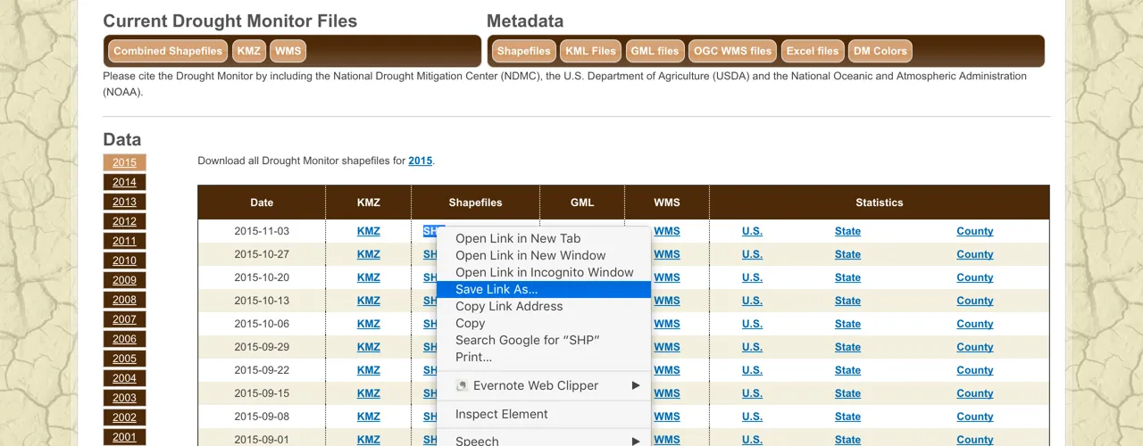
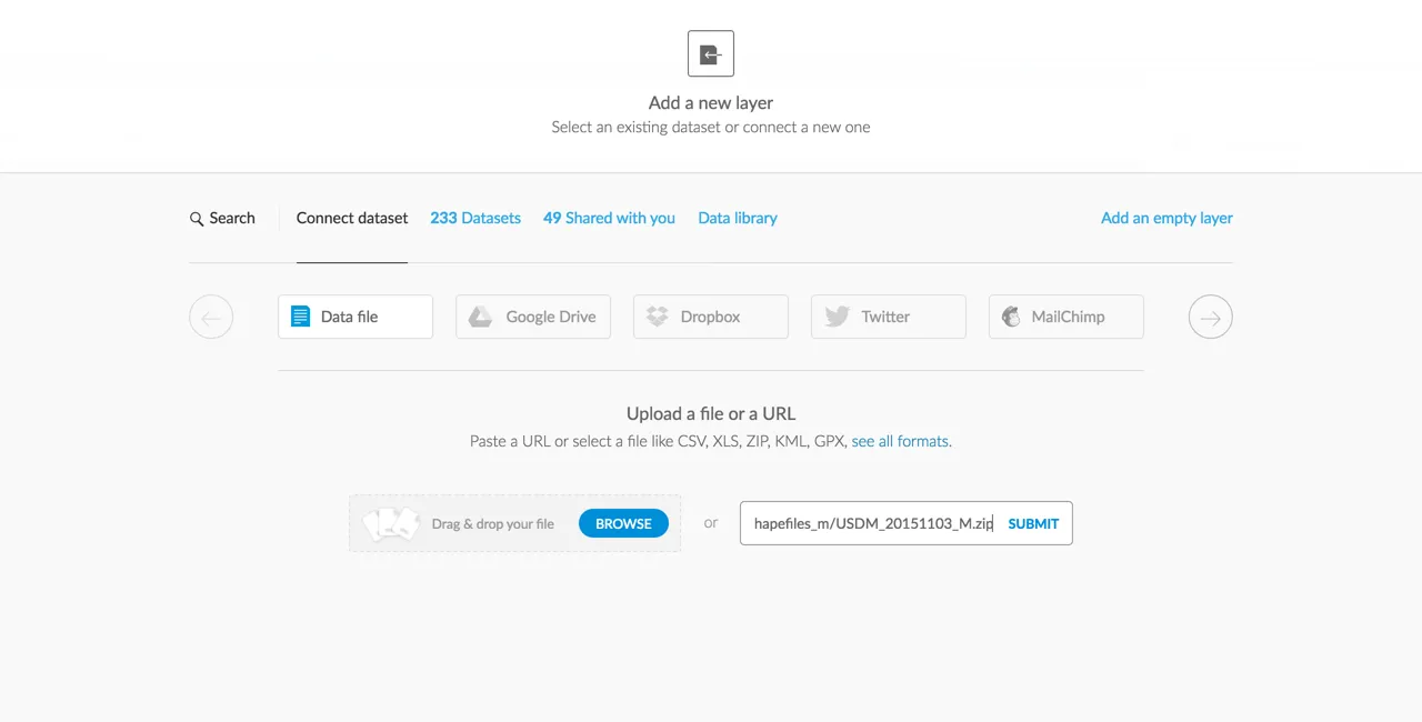
- From the [US Drought Monitor site] right-click and copy the link address for the most recent readings in shapefile format
- Back in your map click the
+sign on the right hand panel to Add Layer
- From the Add a new layer dialog click the option Connect Dataset
- Right click and paste the data URL from the drought monitor site click SUBMIT and then ADD LAYER
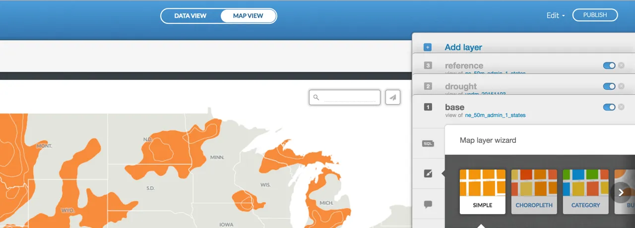
- Once added to the map rename the layer to drought and drag and drop it in between the reference and base layers to define the correct drawing order
The drought monitor data will not be visible in the current map view because we still need to project it!
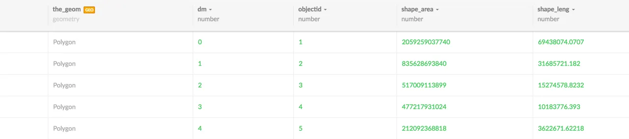
Before we do let's take a look at the attributes that we'll need for styling:
- Click on DATA VIEW
- The attribute that we'll use to color each polygon based on drought severity is
dm
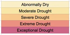
The values in the dm field range from 0-4 where 0 represents abnormally dry areas and 4 areas of exceptional drought as seen in [the metadata] and authoritative maps.
SQL Query
- In the SQL tray for the drought layer add the following query and click Apply Query
##_INIT_REPLACE_ME_PRE_##
SELECT
    ST_Transform(the_geom  5070)
AS
    the_geom_webmercator
    dm
FROM
    usdm_20151103
{% endhighlight sql %}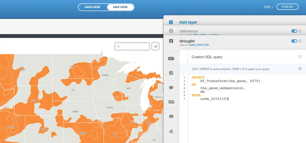
NOTE: if you download a different time period of drought monitor data you will have to change the table name accordingly. This query assumes that your table name is usdm_20151103.
- Back in MAP VIEW you should see the drought monitor data on your map drawn with default symbology sandwiched in between the reference and base layers
Drought Data Styling
- Back in MAP VIEW click on the Wizard icon and symbolize the drought readings by CATEGORY based on the
dmfield
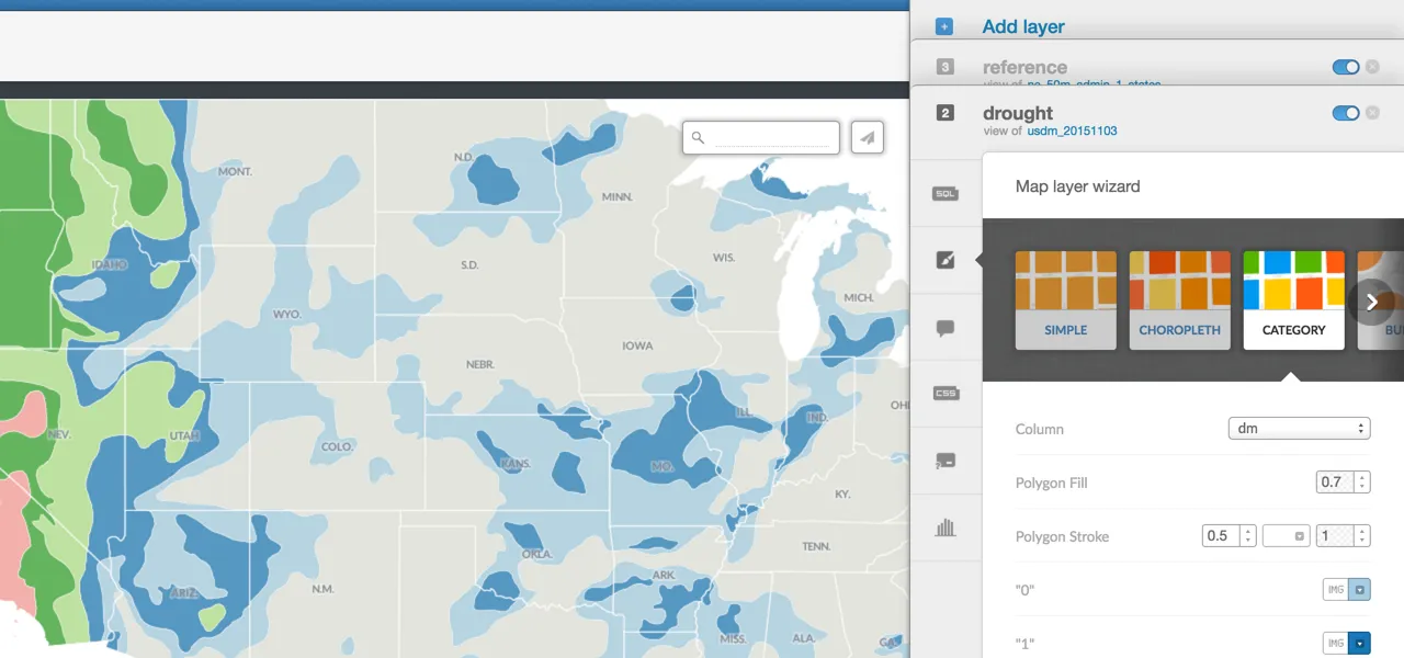
- For the final map I chose a multi-hue sequential ramp that ranges from pale yellow to red
- We'll define CartoCSS variables for each color and then assign them to the associated value in the drought data
- Click on the CSS option for the drought layer to customize the default symbology in the CartoCSS Editor
- Copy the CartoCSS for the color variables below (or assign your own colors!) and paste it at the top of the style sheet
##_INIT_REPLACE_ME_PRE_##
@0: #FAEECA;
@1: #F7E4AB;
@2: #F7C791;
@3: #E99083;
@4: #CB6787;
##_END_REPLACE_ME_PRE_##
- Set the
polygon-fillfor eachdmvalue to its associated color variable in the CartoCSS and click Apply Style
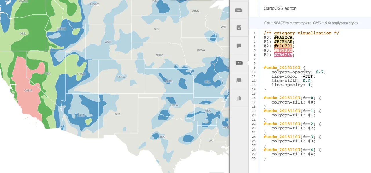
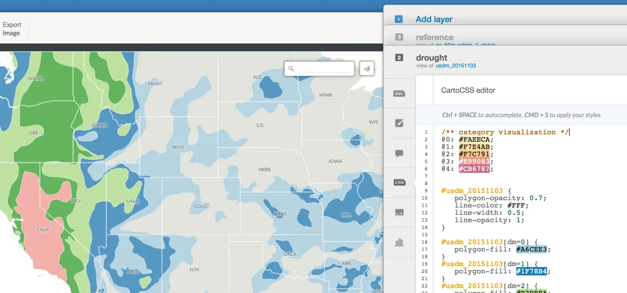
At this point this is what our CartoCSS looks like:
##_INIT_REPLACE_ME_PRE_##
/** category visualization */
@0: #FAEECA; @1: #F7E4AB; @2: #F7C791; @3: #E99083; @4: #CB6787;
usdm_20151103 {
polygon-opacity: 0.7; line-color: #FFF; line-width: 0.5; line-opacity: 1; }
usdm_20151103[dm=0] {
polygon-fill: @0; }
usdm_20151103[dm=1] {
polygon-fill: @1; }
usdm_20151103[dm=2] {
polygon-fill: @2; }
usdm_20151103[dm=3] {
polygon-fill: @3; }
usdm_20151103[dm=4] {
polygon-fill: @4; } ##_END_REPLACE_ME_PRE_##
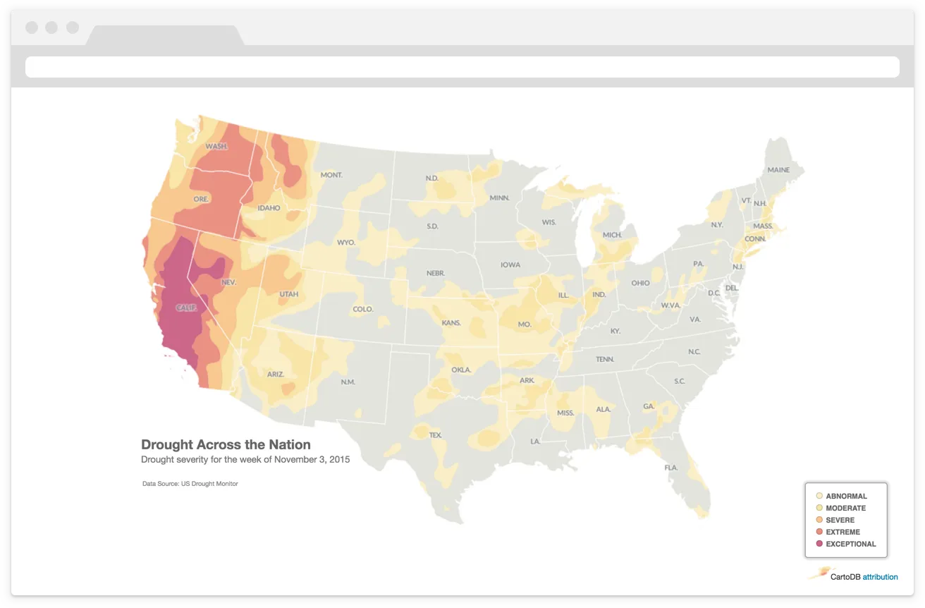
And this is what our map looks like:
Customize More
By default the Editor assigns global styles to the layer. Since the drought monitor readings are the main focus of the map we'll remove the default polygon-opacity. Additionally the default white lines make the drought data look more abrupt than continuous so we'll remove that style as well.
- To do this delete the first block of CartoCSS (commented below) and click Apply Style
##_INIT_REPLACE_ME_PRE_##
/** category visualization **/
@0: #FAEECA; @1: #F7E4AB; @2: #F7C791; @3: #E99083; @4: #CB6787;
//remove this block //starting here
usdm_20151103 {
polygon-opacity: 0.7; line-color: #FFF; line-width: 0.5; line-opacity: 1; } //ending here
usdm_20151103[dm=0] {
polygon-fill: @0; }
usdm_20151103[dm=1] {
polygon-fill: @1; }
usdm_20151103[dm=2] {
polygon-fill: @2; }
usdm_20151103[dm=3] {
polygon-fill: @3; }
usdm_20151103[dm=4] {
polygon-fill: @4; } ##_END_REPLACE_ME_PRE_##
We now have our basemap and drought monitor data styled and are ready to put a couple final touches on the map!
On the map above the labels in areas of exceptional drought (like California!) are hard to read against the darkest color in our palette. A slight adjustment you can make here is to add a white halo that has transparency by adding text-halo-fill: rgba(255 255 255 0.5) to the state label properties. Alternatively you can adjust the text-fill to a color that you feel is more suitable.
I used a small transparent halo on my state labels:
Other map elements that I customized for the the final map are:
- a legend
- an appropriate title
- and a data source citation for the US Drought Monitor
You can check out a live version of the [final map here].
BONUS!
My talented co-worker UI Developer and Designer Emilio made a template that can be used to compare drought readings over three different time periods. This example shows maps of drought severity for the same week in November in 2015 2014 and 2013. You can find the template here.
Happy thematic mapping!