CARTO Builder
Massive visualizations - fast decisions
Generate rich data insights natively in your cloud data lakehouse. Accelerate decision-making with AI-driven visualizations.


Trusted by the world's leading geospatial analysts


Maps powered natively by your lakehouse
Visualizing large geospatial datasets outside the cloud is a challenge. With Builder, create live, secure and scalable maps instantly - all inside your lakehouse.
Pick yours to learn more
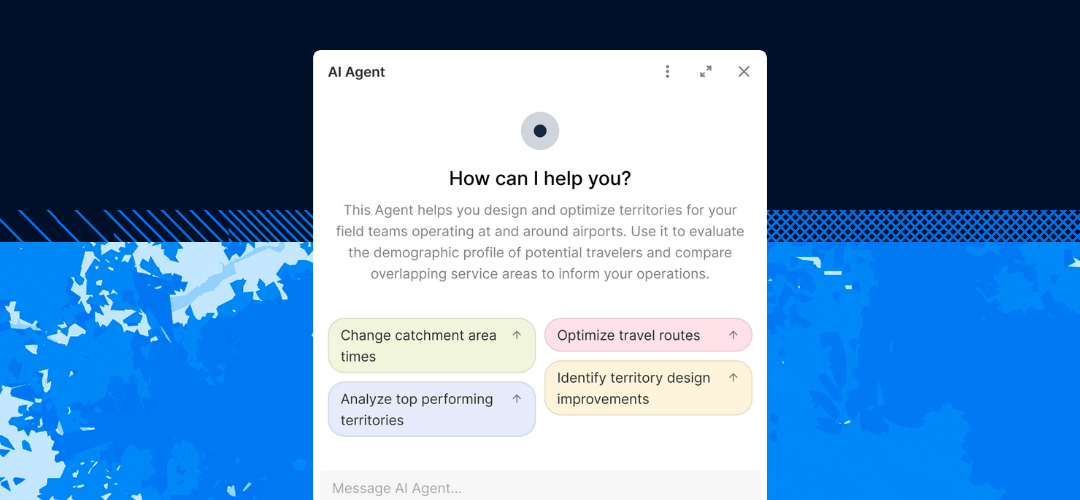
AI-driven spatial insights

.jpg)

Drive decision-making
Clunky visuals kill engagement and slow decisions. With Builder, create stunning interactive maps that captivate stakeholders, spark collaboration, and turn insights into action.


Get inspired by our customers


.jpeg)
.png)

At EQT, we constantly seek ways to enhance the strategic value of our investments and improve the decision-making process. CARTO has been a game-changer for EQT, their cloud-native platform, seamless data integration, Builder for visualization and Analytics Toolbox make it much easier for us to assess investment opportunities and provide strategic advice to our portfolio companies.


CARTO has allowed us to tackle complex challenges relating to road accident analysis in London and much more. Working with their cloud-native platform has been a transformative experience, making it faster for us to visualize large-scale geospatial data and quickly deliver insights to different areas of our business, partners, and clients.
CARTO’s cloud-native approach and the ability to use H3 at scale was a big game changer for us. We can now compute data in real time without the need for heavy coding. Working with the CARTO platform has been extremely impactful as we can now easily visualize & analyse massive amounts of satellite data.

Frequently asked questions
Our free 14-day trial gives you access to all CARTO components, including demo datasets and maps, and a CARTO Data Warehouse instance so you can fully evaluate the powerful features of our platform. If you are working on the cloud with large and complex datasets and using geospatial analysis for several use cases, we recommend you request a demo so you can start an assisted trial to make the most of our platform.
CARTO’s AI Agents translate natural-language user prompts into map actions. They enable fast, self-serve analysis without any coding or GIS expertise required.
Our enterprise-grade security, authentication, and data access controls let you publish and share your analysis securely with stakeholders. Create secure connections to your data warehouse, give access to your users with SSO, and share your interactive dashboards safely.
We designed the CARTO platform to handle datasets of all sizes with impressive performance, cost-effectively, on any modern device. Billions of points, polygons, and lines. Read here how we are making highly performant cloud-native maps.
No, CARTO also offers rich analytical capabilities, including Workflows, our low-code analysis design and automation tool, and the Analytics Toolbox, a set of functions and procedures you can use directly in your cloud data warehouse. We also offer CARTO for developers, a framework-agnostic approach to developing powerful spatial applications tailored to your needs.
Builder is designed to be intuitive, with a drag-and-drop interface and no-code functionality - allowing you to create maps in seconds. For some of the more advanced functionality - like SQL Parameters - you’ll benefit from having skills in SQL and geospatial analytics. Find out how to get started in our Academy.
You can easily embed Builder maps into external platforms using a public URL or iframe embed code. This allows you to display interactive maps within dashboards, reports, or web pages - bringing geospatial insights to the tools your team already uses. Learn more here.
Related content
.jpg)
.jpg)