The first 5 maps everyone needs to make with CARTO


So you’ve just signed up to CARTO - congratulations! You’re ready to start running analysis and building maps at a MASSIVE scale, all entirely - and securely - inside your lakehouse.
Not sure where to start? We’ve got you covered. Keep reading for our round-up of 5 maps that everyone needs to make with CARTO - from a real-time map to an AI co-piloted map. Let’s get started!
💡 No CARTO account? No problem! Sign up for a free 14-day trial here for full access.
Before you start
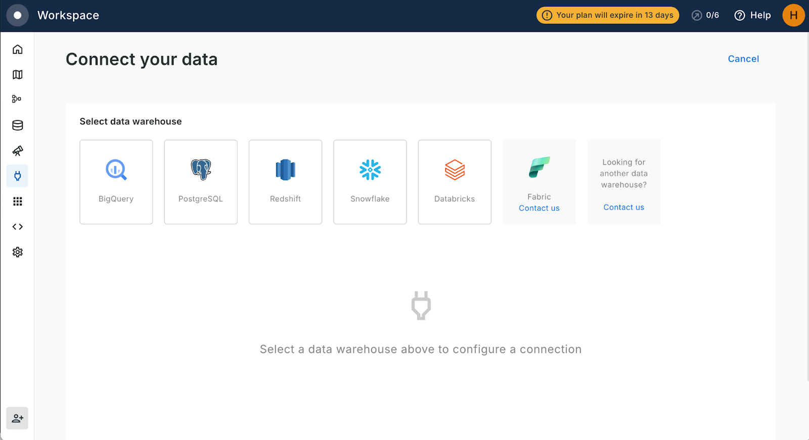
To get the most out of CARTO, you’ll want to set up a connection to your cloud lakehouse so you can access all of your own data. This only takes a few seconds. Sign in to your account and head to the Connections tab of the workspace. Select your lakehouse type, fill in your details - and you’re good to go!
If you don’t have a data lakehouse to connect to, you can use the CARTO Data Warehouse which hosts a range of useful tables, rasters and tilesets, as well as space for you and your organization to host data. You can also subscribe to around 11,000 public and premium datasets from our Spatial Data Catalog!
Map 1: The one that everyone needs
Let’s start with the one question everyone doing spatial analysis needs to answer at some point: how many - or how much of - this “thing” is near my “thing?” This fundamental geospatial question is used to solve problems such as:
- Understanding cell tower demand: How many people live within 1km of my cell towers?
- Insurance claims predictions: What is the Total Insured Value in the current flood extent?
- Optimizing geomarketing activities: How many people in my target market will walk past this billboard?
Let’s imagine we’re trying to answer the first question - how many people live within 1km of our cell towers. Before sharing the results in a map, we’ll be solving this by building the below pipeline in CARTO Workflows - our low-code tool for automating spatial analysis by connecting data sources and analytical components.
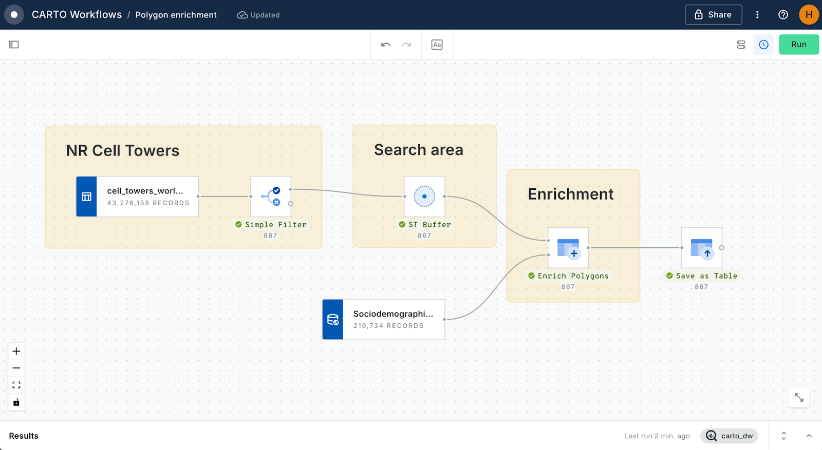
To replicate this, you’ll need three things:
- A target: your origin locations. We’ll be using a subset of cell_towers_worldwide which is a demo table in the CARTO Data Warehouse, but you can use anything: your own source data, a POI table from the Spatial Data Catalog, you can even use components like Draw Custom Features to plot your own locations!
- A search area: we’ve used the ST Buffer component to create a 1km search distance around each point. Other options for creating a search area include isolines, voronoi polygons, or even create a Spatial Index K-Ring - ideal if you’re working with millions of data points (which you'll be doing very soon!).
- A source: the data which we’re using to solve the problem. We’re using Sociodemographics, 2018, 5yrs - United States of America (Census Block Group) - but you can use whichever source table works for you.
Once you have those things, you’ll need to connect your search area and source to an Enrichment tool. There are a few different tools available depending on your inputs; we’re using Enrich Polygons to sum the population in each buffer. A full guide to this process is available on the CARTO Academy here.
Once your workflow is run, expand the Map preview tab at the bottom of the screen and select Create Map.
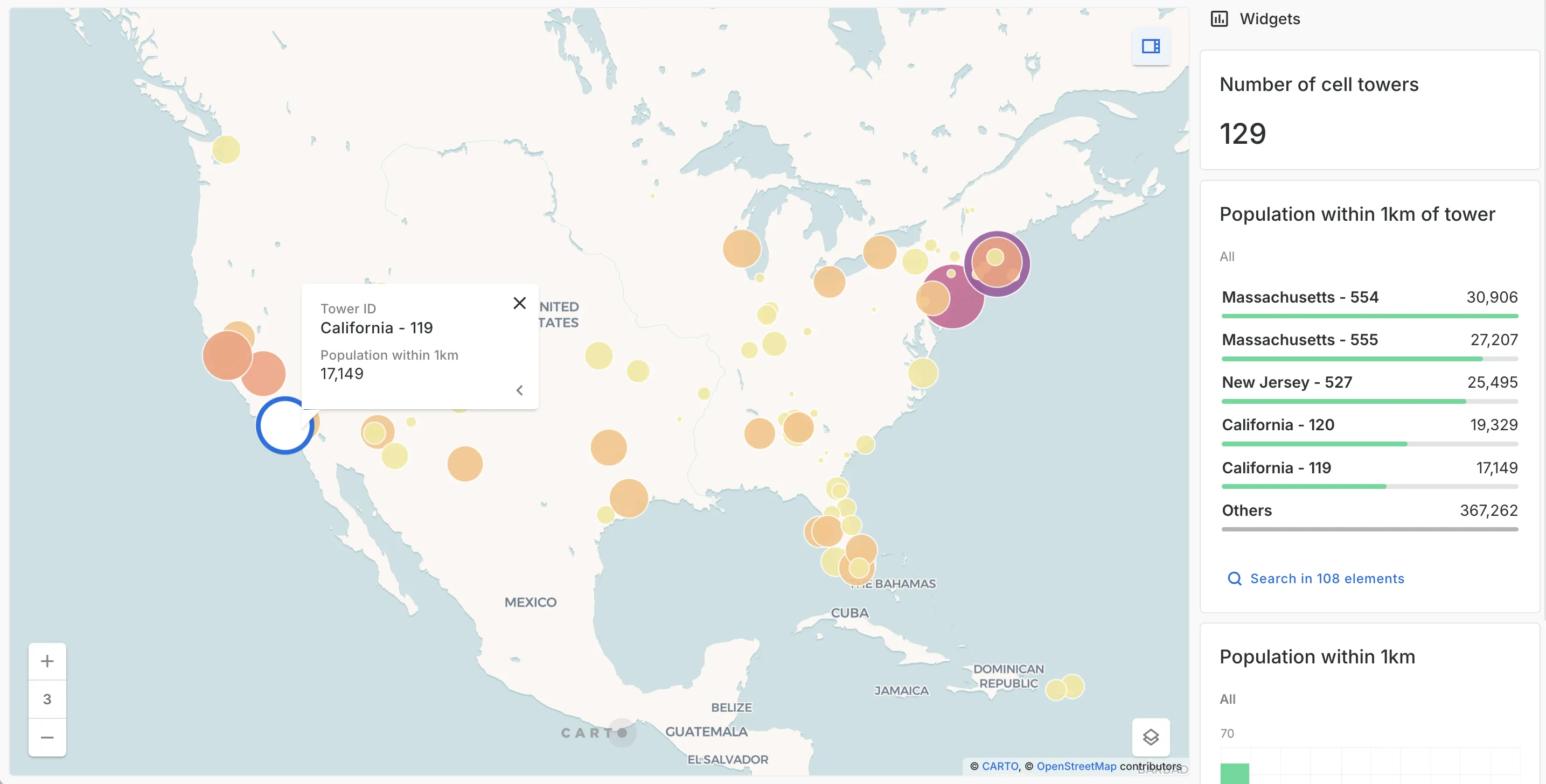
Open this map in full-screen here.
On the left-hand side of your new CARTO Builder map, you’ll find the Layer panel where you can set the layer symbology - we’ve set the point fill and radius by population. You can also switch from the layer panel to Interactions, to add pop-ups, and Widgets, where you can create dynamic graphic elements to help explain your data. With that done, you’ve solved your problem! You can find more tips, tricks and tutorials in the Data Visualization section of the CARTO Academy.
…And you’re done - problem solved!
Map 2: The Big One
One of the great things about using a fully cloud-native platform like CARTO is that you can work with big data. And we mean BIG data. Forget thousands of features on a map, we’re talking millions, billions and beyond!
Don’t believe us? Roll up your sleeves - let’s do this.
Head to the Data Explorer tab of the CARTO Workspace, and navigate to Connections > CARTO Data Warehouse > demo data > demo_tables > nyc_taxi_rides. This giant of a dataset features 11.3 million rows, 22.6 million geometry features and is a massive 1.28 GB. I think we can agree - that's a BIG table! Select Create map.
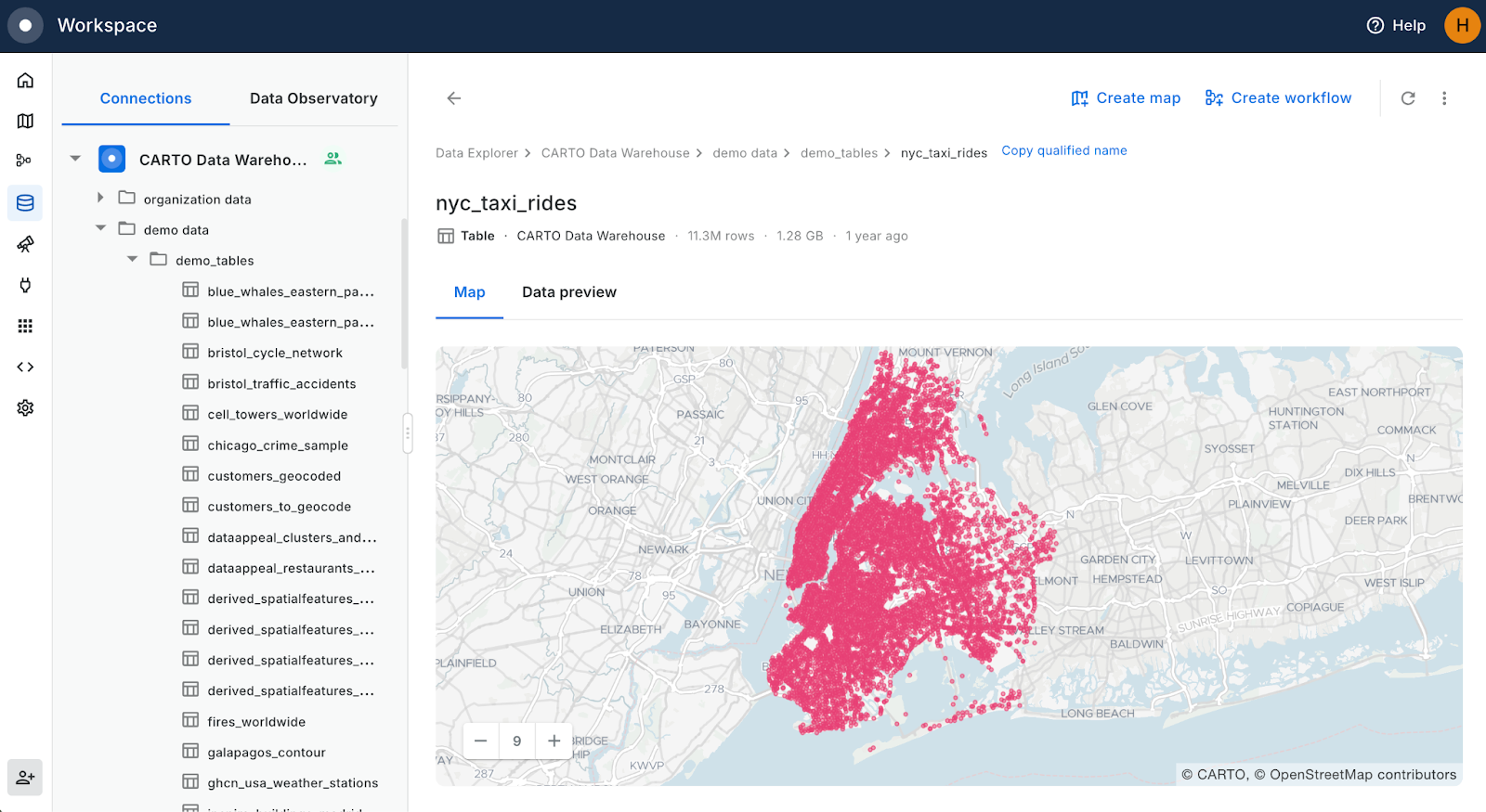
You’ve just created a map with 11.3 million features on it - congratulations! Notice how quickly features are rendered as you pan and zoom around the map - that’s being driven by a technology called dynamic tiling - in which tilesets (pre-rendered “chunks” of your data) are progressively generated as you change your extent, without you lifting a finger! Well, apart from scrolling.
In the Layer panel, expand the Visualization tab. Here, try experimenting with the different layer types available, such as grids, heatmaps and point clusters.
You can also update layers in-map based on SQL Queries. Let’s try converting this data to a H3 Spatial Index - a super lightweight hexagonal grid optimized for analyzing and visualizing massive data. In the Sources panel (just below Layers), click on the three dots next to your source, and select Query this table.
Change the query to:
WITH
hex AS (SELECT
	`carto-un`.carto.H3_FROMGEOGPOINT(pickup_geom, 11) AS h3
FROM `carto-demo-data.demo_tables.nyc_taxi_rides`)
SELECT h3, COUNT(h3) AS pickup_count FROM hex
GROUP BY h3
You can also achieve this in Workflows if you prefer an entirely no-code approach - check out this tutorial to learn how.
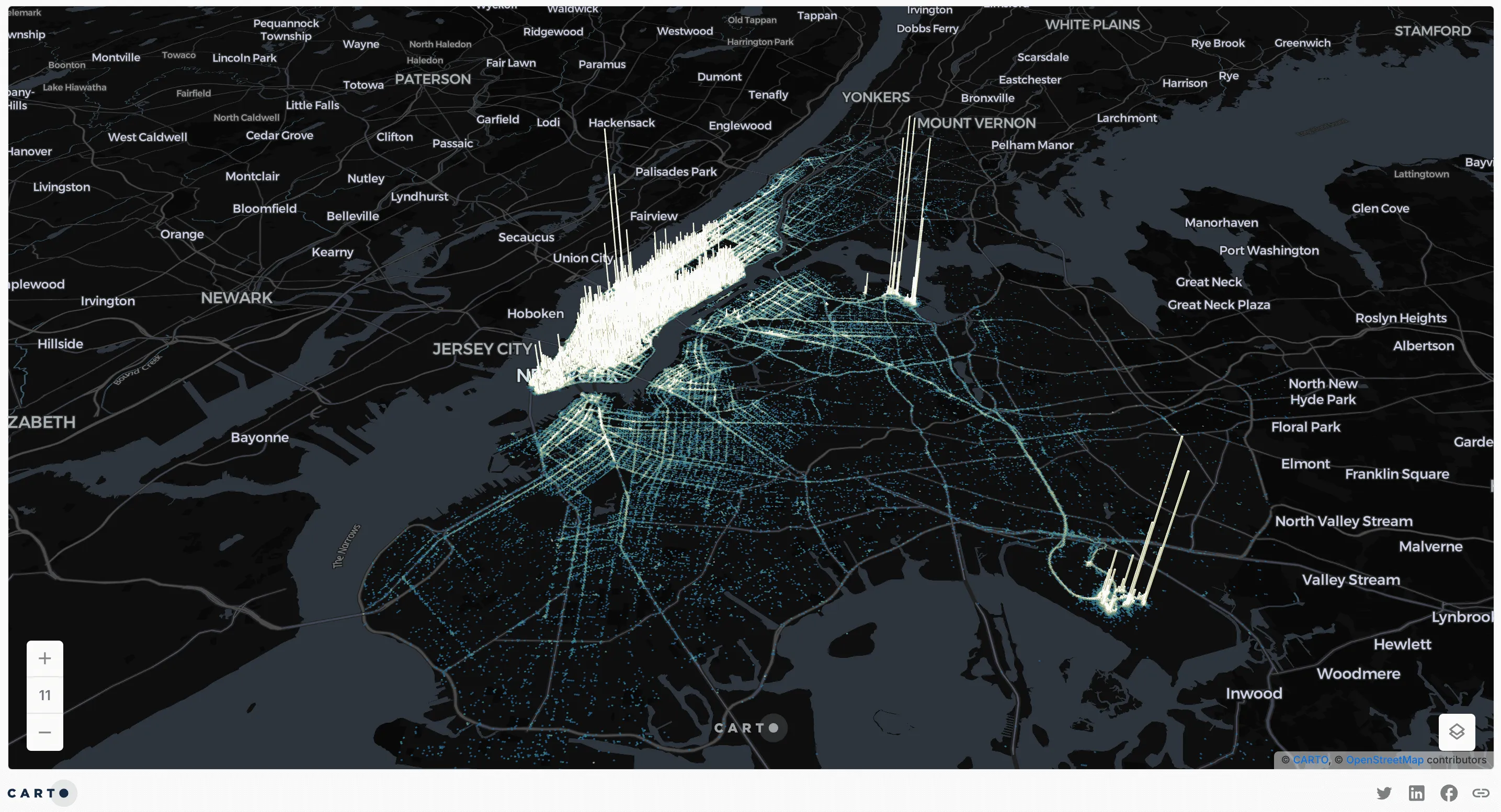
You should now have a H3 grid covering the extent of your inputs, which includes a pickup count variable, which you can use to craft a really epic map. Our recommendations?
- CARTO Dark Matter Basemap: find this in the Basemap panel, to the right of Layers.
- 3D map: switch to this at the top of your map.
- Additive blending mode:to create an awesome glow effect against your dark basemap. You can find this right at the top of the Layers panel.
- Layer:
- Aggregation size 6 for amazing detail
- Stroke removed
- Fill color set by pickup_count (avg) with a Quantile scale
- Height set by pickup_count(sum), extruded by 15
You should now have something that looks like this… 🔥
Open this map in full-screen here.
💡 Notice how the resolution of the data changes as you zoom in and out? This dynamic styling is because Spatial Indexes like H3 are hierarchical. You can set the resolution size in the Layer panel under Cell aggregation size.
Map 3: The Real-time One
Real-time spatial analytics have the power to transform the way organizations make decisions, empowering them to become far more dynamic and responsive. However, traditionally real-time analysis has been challenging, not least because it’s often locked behind a javascript skills paywall.
That’s a thing of the past!
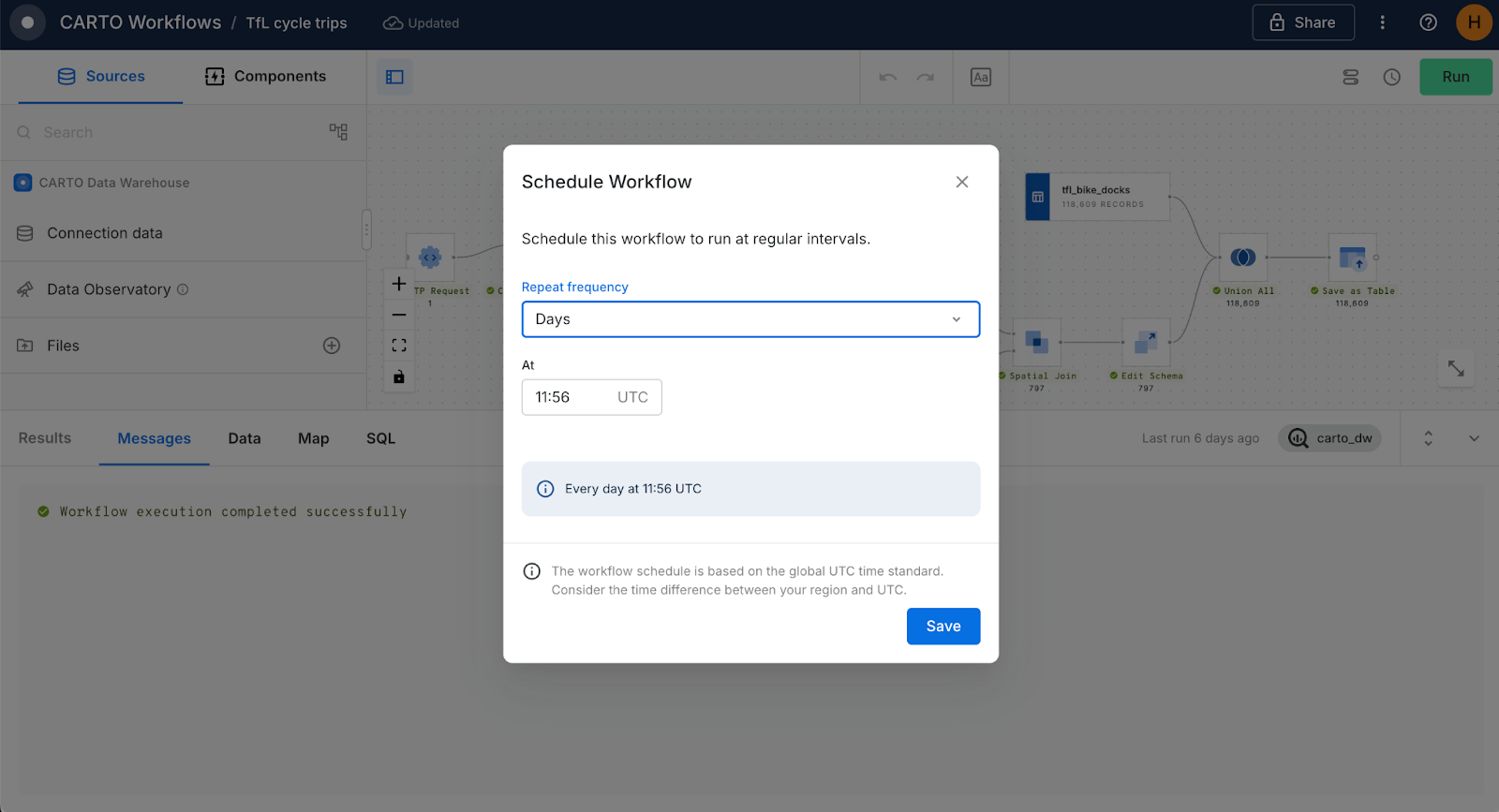
In any CARTO Builder map, you can set the Data freshness of a source to update periodically, from every 5 minutes to every 24 hours - ensuring you always have the most recent “cut” of your data available. You can also combine this with real-time analytics in CARTO Workflows, where you can set your analysis to run on a custom schedule for automated updates (see below). Just look for the clock symbol in both tools to set up your real-time analysis!
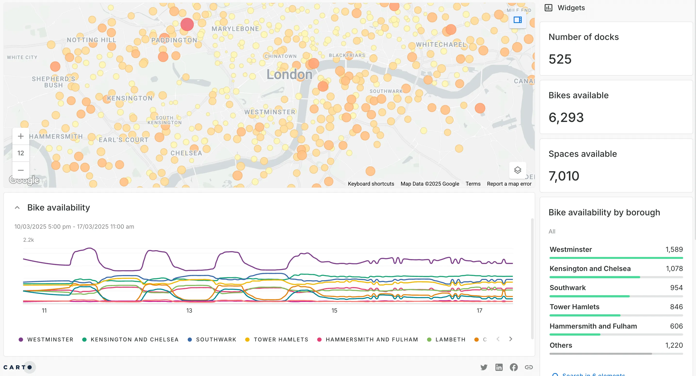
Here’s an example of this in action! The map below leverages Transport for London’s Unified API to extract real-time data on bikeshare availability. The map contains two layers:
- Bikes available - time series: every data point from across a 1-week period, allowing users to access and analyze historic trends. You can explore these in the time-series widget on the map - check out the difference in weekday and weekend patterns!
- Bikes available - most recent: just the most recent “cut” of this data, ideal for making decisions based on real-time developments. This data is driving the widgets on the right-hand side of the map.
This analysis was achieved by using the CARTO Workflows component HTTP Request to easily call the real-time API. Follow this tutorial to learn how to easily follow this approach in CARTO Workflows - the low-code way!
Want to learn more about real-time? Sign up to our webinar to learn about why - and how - more organizations are leveraging real-time spatial analytics for more dynamic decision-making.

Map 4: The One where your End-user does the Analysis
There’s three words all data professionals dread more than any others: can you just…? Can you just.. Zoom out? Change the data year? Re-run the whole analysis with different input data? Often, these types of requests require more time than the entire initial analysis.
Enter SQL Parameters. With these, you can allow your end user to select inputs from a series of pre-defined values. These values are inputted into your SQL query - in the place of your SQL Parameters - allowing your end user to customize the map in a controlled way.
You can see SQL Parameters in action in the map below.
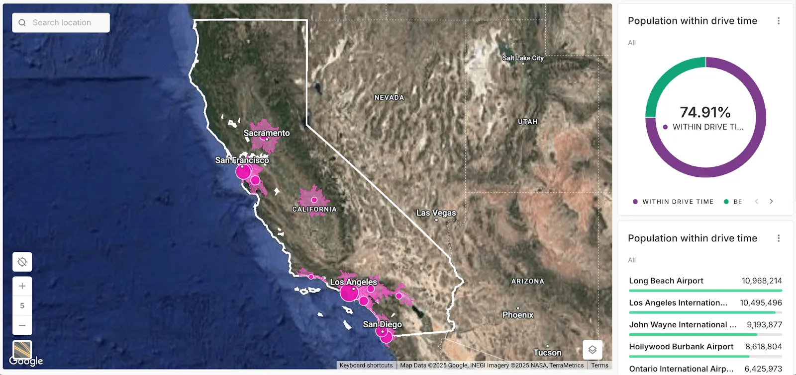
If you switch to the Parameters tab on the right of the screen, you’ll notice you can set the drive time value as anything from 10 to 60. As you change this, you’ll notice that the data on the map changes to reflect the value you’re inputting.
How does this work? The data on the map actually contains x6 isolines (drive-time catchments) for each airport, ranging from 10 to 60 minutes. This map has also been set up with a parameter called { {drive_time} }, which is used in the data query as follows:
SELECT geom, geoid, time FROM isolines
WHERE time = { {drive_time} }
This filters the data which is driving the map. However, the end user feels like they’re actually running this analysis themselves. This enhances engagement, improves trust and transparency, and saves precious analyst time.
Map 5: The One with the AI Co-Pilot
AI is so much more than hype - it’s here! From predictive modeling to automated insights, AI is helping businesses make smarter, faster decisions with their spatial data.
We recently announced the launch of CARTO AI Agents, now available in public preview! These AI-powered assistants make geospatial analysis as easy as having a conversation - no coding required! AI Agents let you interact with spatial data in natural language - inside your map! Here’s how you can get started:
- First, an admin user of your CARTO Organization will need to enable AI Agents, which they can do under Settings > Customizations.
- Next, any user can enable AI Agents from the AI panel in CARTO Builder (see below). From here, you can add map content, conversation starters and a user guide.
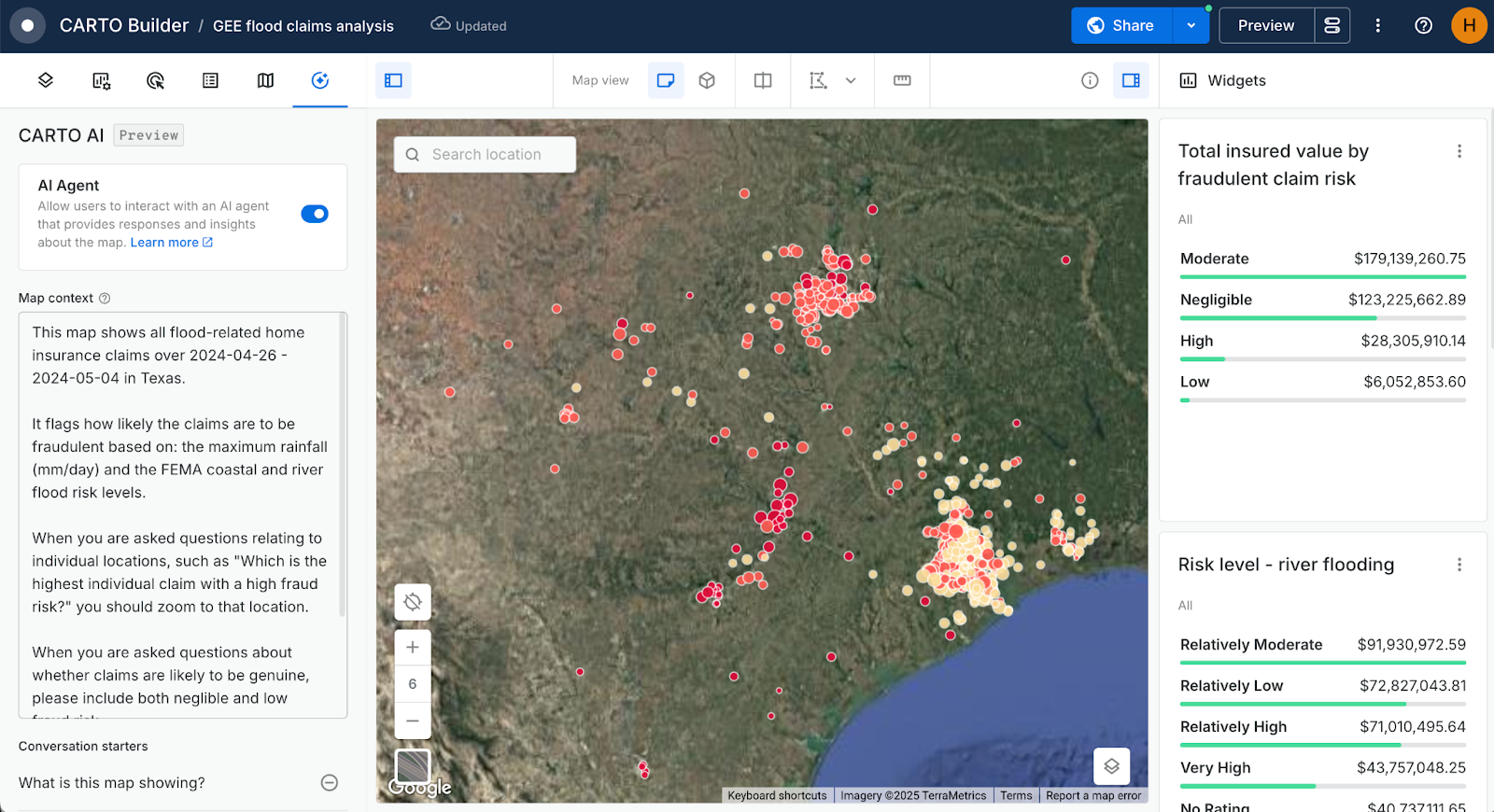
- Next, you’ll need to share your map - the AI Agents will be available in Viewer mode for other users in your organization.
Watch the video below to see this out in action!
Over to you!
With these five essential maps, you’ve taken your first steps toward unlocking the full power of CARTO. Whether you’re analyzing proximity, working with massive datasets, integrating real-time data, empowering end-users, or leveraging AI-powered insights, each of these maps showcases a different way to drive smarter spatial decisions.
But this is just the beginning! Our fully cloud-native approach to spatial analysis means CARTO is future-proofed, meaning you will always be at the forefront of spatial analytics. Ready to take it further? Our experts are here to help!