

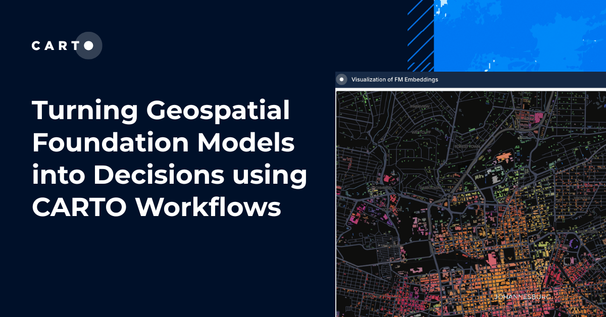


Turning Geospatial Foundation Models into Decisions using CARTO Workflows
CARTO now lets you run analytics directly on geospatial foundation model embeddings. Visualize, cluster, and detect changes to turn spatial data into decisions.

The State of Spatial Analytics 2026 - Register interest!
Key findings from the survey reveal major changes since 2024. Register interest now and get early access to the State of Spatial Analytics 2026 Report.


What is Agentic GIS?
Discover Agentic GIS: AI-powered spatial analysis that automates workflows, amplifies GIS expertise, and delivers actionable geospatial insights.
.png)
Geospatial Sovereignty in the Age of AI: A Layered Approach
Geospatial sovereignty in the AI era: why open formats, flexible compute, and interoperable standards are key to resilient, independent digital infrastructure.
.png)

The Changing Role of the GIS Analyst
Discover how GIS Analysts are evolving from map makers to strategic AI-driven experts shaping enterprise decision-making with cloud-native tools.
.png)
Unlock planetary-scale insights with CARTO & Google Earth AI
Learn how CARTO & Google Earth AI make planetary-scale insights accessible with foundation models & Agentic GIS.
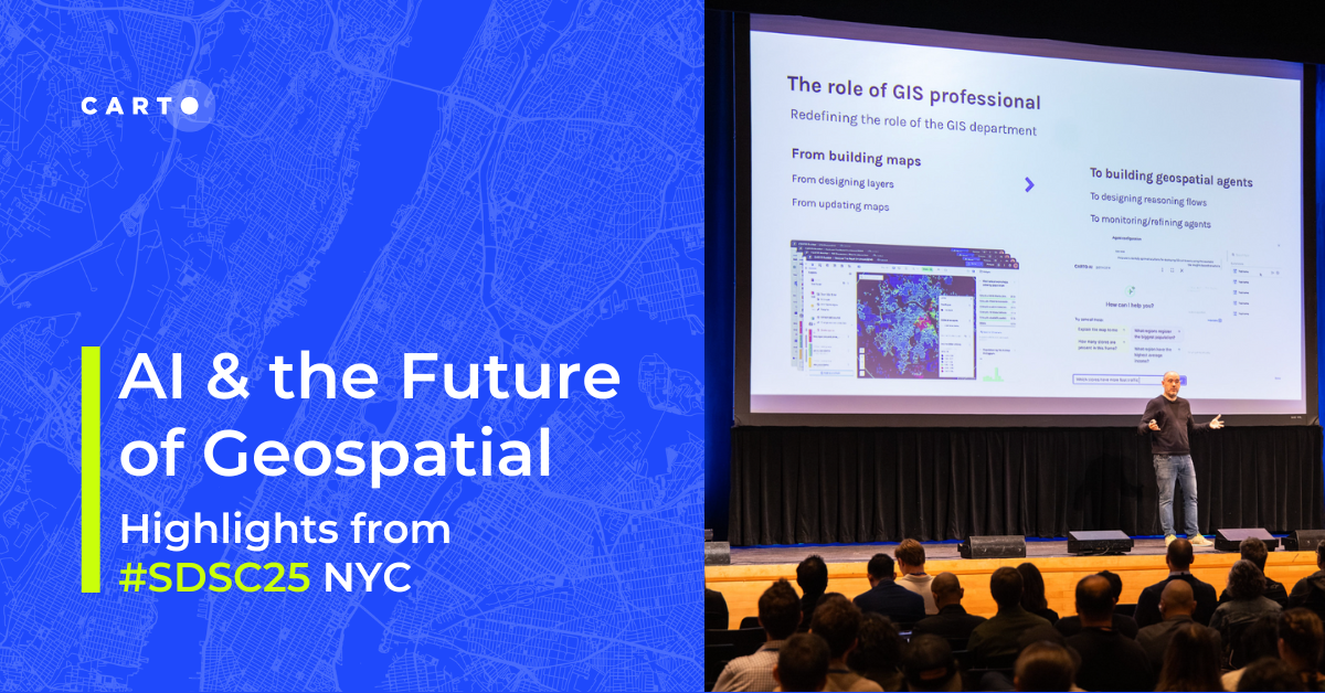

AI & the Future of Geospatial: Highlights from #SDSC25
AI and Agentic GIS are revolutionizing spatial analytics. Discover innovations, insights, and trends shaping the future from #SDSC25 New York.
%20(1).png)
How to build a geospatial AI roadmap (that actually works)
Only 1 in 4 AI projects deliver ROI. Discover a proven 5-step roadmap for scaling geospatial AI - govern data, automate workflows, and unlock Agentic GIS value.
.png)


CARTO MCP Server: turn your AI Agents into geospatial experts
Discover how the CARTO MCP Server lets enterprises connect AI agents like ChatGPT & Gemini to geospatial data and workflows via MCP.
.png)

.jpg)
GERSifying Overture Places: A Seamless Path to Richer Insights
Discover how the GERSification of Overture Maps Foundation data can help you connect open and premium data to speed up analysis and smarter spatial decisions.
.png)


Introducing CARTO Site Selection AI Agent for Gemini Enterprise
Transform Site Selection with CARTO’s AI Agent in Google's Gemini Enterprise - analyze, compare, and plan new locations in minutes.
.png)
The Modernization of Geospatial: Announcing CARTO on Oracle
Bring AI-powered spatial intelligence to your Oracle data. CARTO on Oracle modernizes GIS workflows for the cloud and the Agentic GIS era.
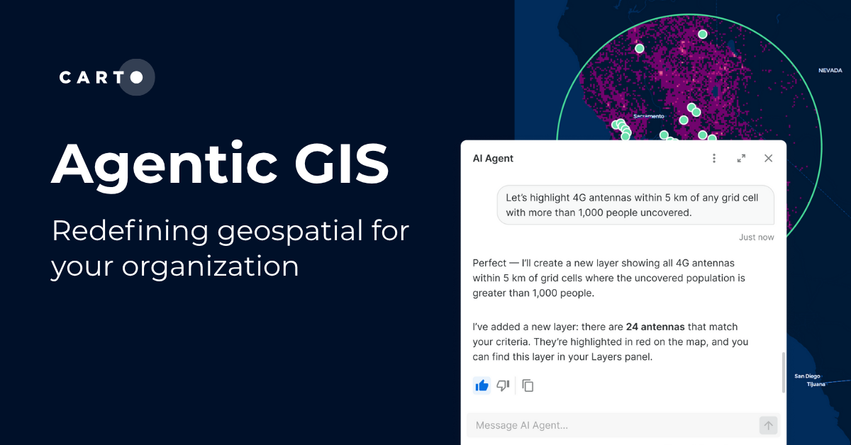
Agentic GIS has landed: redefining geospatial for your organization
Discover how CARTO’s Agentic GIS platform and AI Agents are transforming spatial analysis - making Location Intelligence accessible to everyone.

Academy
Turning Geospatial Foundation Models into Decisions using CARTO Workflows
CARTO now lets you run analytics directly on geospatial foundation model embeddings. Visualize, cluster, and detect changes to turn spatial data into decisions.
The State of Spatial Analytics 2026 - Register interest!
Key findings from the survey reveal major changes since 2024. Register interest now and get early access to the State of Spatial Analytics 2026 Report.
What is Agentic GIS?
Discover Agentic GIS: AI-powered spatial analysis that automates workflows, amplifies GIS expertise, and delivers actionable geospatial insights.