Personalizing services with spatial analytics in Google Cloud


In a world of rising customer expectations and digital-first experiences, personalization is no longer a “nice to have” - it’s a competitive necessity.
No matter the industry you work in, your customers are constantly telling you what they want - through their location, behavior, and local context. These signals are key to maximizing the ROI of any service, from financial products to last-mile delivery.
However, most data teams struggle to harness this spatial data efficiently. Legacy tools aren’t built for scalable personalization, and integrating spatial insights into customer strategies is often slow, manual, and siloed.
In this blog, we’ll explore how cloud-native Location Intelligence enables efficient, scalable personalization across services. We’ll also walk through how you can put this into practice with a walk through of financial product personalization using CARTO on Google Cloud. Let’s get started!
Service personalization: common challenges and pitfalls
Despite the promise of location-aware personalization, many organizations hit roadblocks when trying to operationalize it. Some of the most common hurdles include:
- Legacy GIS tools: Not built for scale, with spatial data often being siloed from different systems to the wider organizational data ecosystem.
- Slow, inflexible analytics: Manual joins, batch processing, and brittle pipelines delay insights.
- Lack of cloud-native tools: No seamless access to cloud warehouses causing poor collaboration.
- Specialized skill barriers: Most BI tools don’t support advanced spatial analysis.
These issues are particularly painful for analysts in large organizations, where personalization decisions span thousands of locations and millions of records. You might know what you need to do, but not have the tools to do it quickly, securely, and at scale.
CARTO’s approach aims to eliminate these barriers. Running natively inside Google Cloud, you can take advanced spatial analysis to your data - not the other way around. This makes your analytics more secure, governable and scalable while eliminating costly ETL processes. Shall we take it for a spin?
Hyper-local personalization of financial services
In this section of our blog, we’ll be walking through how you can leverage spatial data on a massive scale to make highly targeted decisions about product personalization. We’ll be focusing on financial products - but the tools and approaches we’re using could really be leveraged across any industry.
In this example, we’ll build a prioritization framework for 5 financial products:
- Youth saver account: areas with a high number of people aged < 18
- Health insurance: areas with a high number of people without health insurance
- Credit booster card: areas where incomes are lower
- Digital-first packages: rural or remote areas
- High-earner investment account: areas where incomes are higher
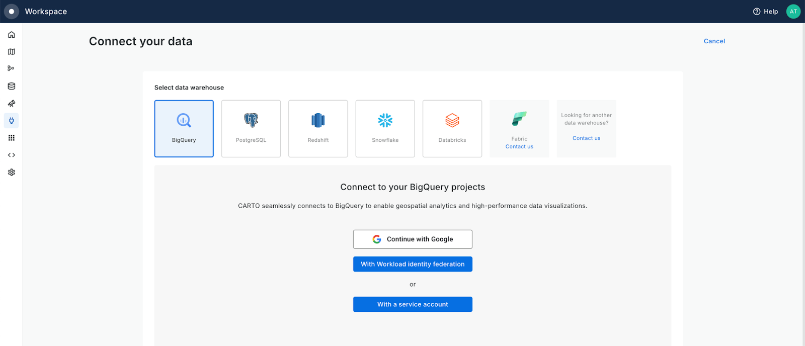
Ready to get started? All you’ll need is a CARTO account - if you aren’t already signed up, you can access your free 14-day trial here. Once you’re signed up, you can head to the Connections tab of the Workspace to easily connect to your Google BigQuery project (see below). Not ready to connect? All CARTO users are given access to the CARTO Data Warehouse, which contains a small amount of storage as well as access to demo data.
Step 1: Your source variables
Before we get started, we need to decide the variables that will inform our personalization process. This could be anything! Mode of transport, marital status, WiFi performance, social media usage… all sorts of factors can drive what makes an individual more likely to choose a specific service. You can find many data sources to support this decision in our Data Observatory - a hub of around 12,000 datasets which you can subscribe to, directly from your Google Cloud project!
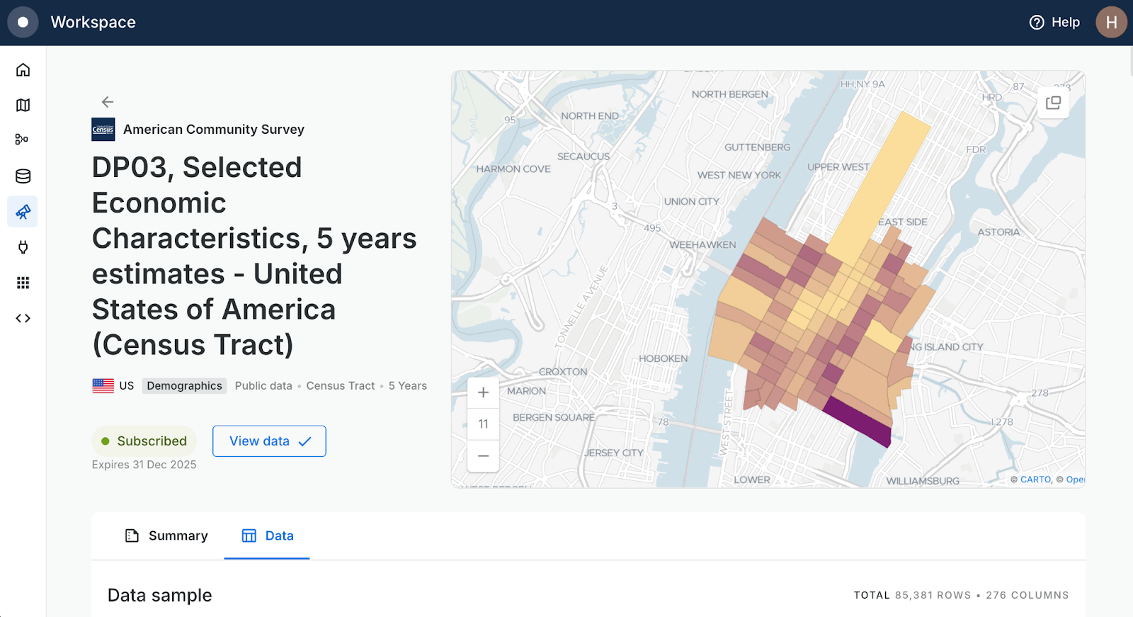
Let’s keep this simple. To determine our product prioritization, we’ll use a few key variables from the US census. From your Workspace, head to the Data Observatory tab and search for the following tables - click them and select Subscribe for free.
- For financial data: DP03, Selected Economic Characteristics, 5 years estimates - United States of America (Census Tract)
- For urbanity data: Spatial Features - United States of America (H3 Resolution 8)
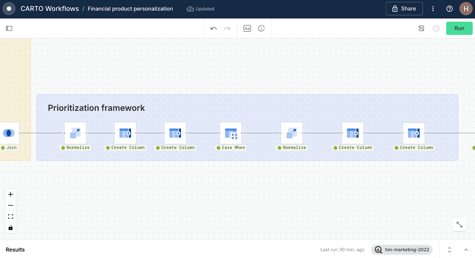
Step 2: Building a Workflow
To create our prioritization framework, we’re going to use CARTO Workflows - our low-code tool for automating spatial analysis. Eventually, we’ll end up with something like…
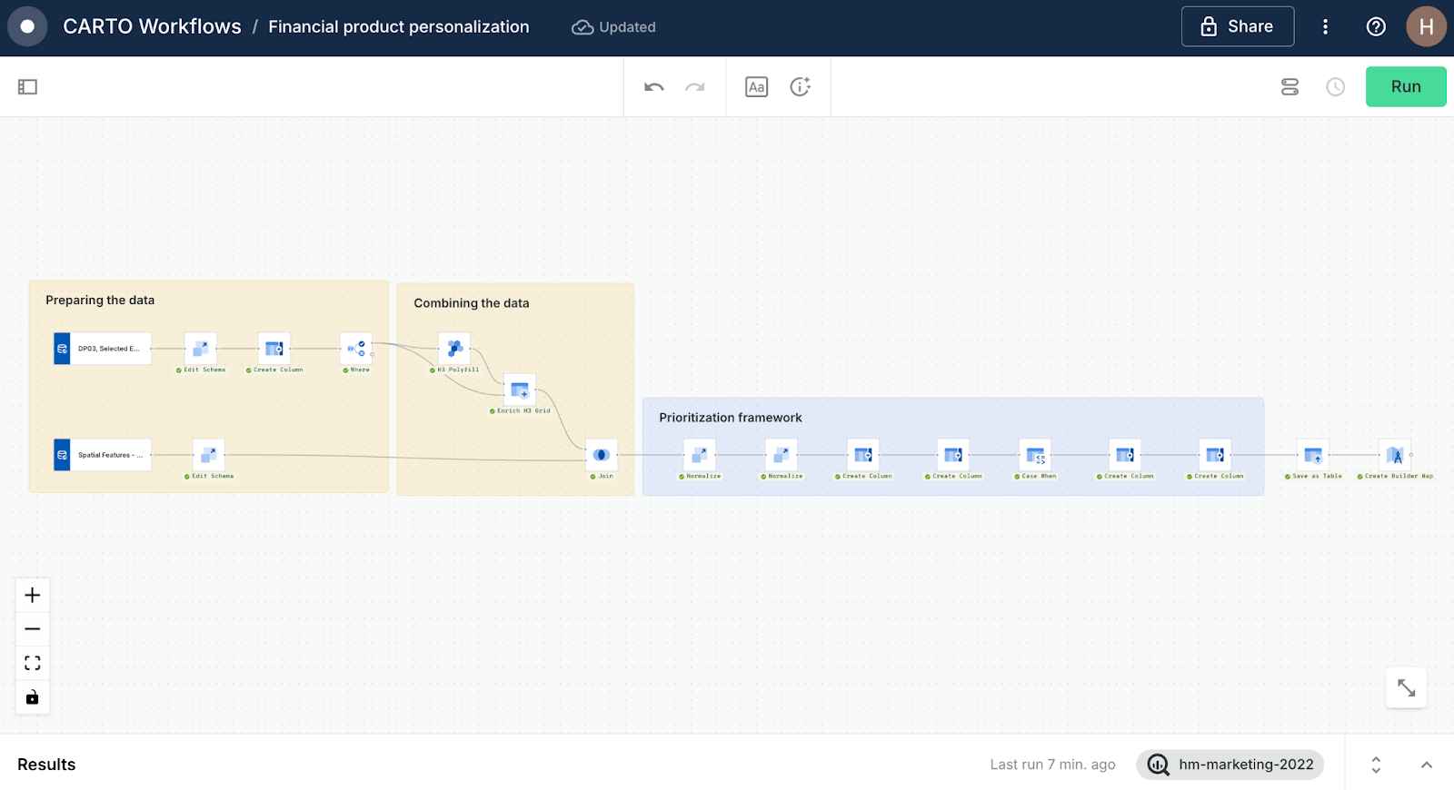
Let’s break this down step by step!
Preparing the data
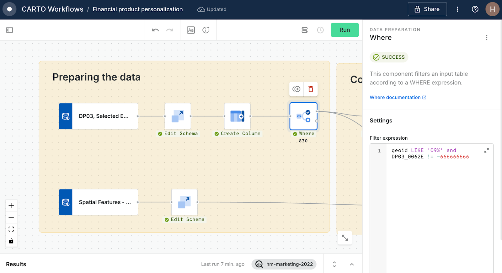
- Add your two data subscriptions to the Workflows canvas by navigating to Sources > Data Observatory > navigating to and dragging the sources onto the canvas.
- These sources are massive! Let’s improve efficiency by narrowing the data down. Switch to the Components tab and drag two instances of an Edit Schema component to the canvas, and connect to each of the sources. Set the Edit schemas to retain the following fields:
- DP03, Selected Economic Characteristics: geoid, geom (this may be right at the bottom of the drop-down), DP03_0062E (estimated mean household income), DP03_001E (children aged <6), DP03_0016E (children aged 6-17), DP03_0096PE (% with health insurance), DP03_0001E (population aged >16).*
- Spatial Features: H3, urbanity, population.
*Note you can lookup and explore these variables in the Data Observatory tab of your Data Explorer.
- Next, add a Create Column to the census tract branch of your workflow. Use the below calculation to work out the ratio of children to adults. Call this new column “ratio_children.”
CASE
  WHEN DP03_0001E != 0 THEN (DP03_0014E + DP03_0016E) / DP03_0001E
  ELSE 0
END
- Now let’s filter the census data to just the area we’re interested in - we don’t so much need to worry about filtering the Spatial Features data as this is based on a H3 Spatial Index, making it super lightweight!
Connect the two Edit schemas for the census table to a Where component, and use the snippet "geoid LIKE '09%' and DP03_0062E != -666666666." This removes any census tracts with null values, and filters data to those with a geoid starting ‘09’ which is the FIPS code for Connecticut.
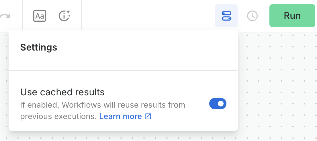
Prefer looking at another state? You can find a lookup of all state FIPS codes here. - Head to the workflow settings (see below) and turn on Used cached results to ensure the workflow only runs previously un-executed sections… and Run!
Combining the data
Now we have all of the variables we need to build our framework: urbanity, % aged 15-19, % aged 50 - 70 and median income. However, before we can really dig into the data we need to combine it into one single table. The H3 Spatial Features grid is already in a Spatial Index format; a super lightweight format ideal for storing and processing large amounts of data. We’ll convert the remaining variables to a H3 grid also.
- Create a H3 grid covering the extent of the census tracts by attaching a H3 Polyfill component to the existing Where component. Set the resolution as 8.
- Now, set this as the top input for an Enrich H3 grid component. Set the bottom input as the Where component, with the aggregation variables set up as below. This will assign the average median income to each new H3 cell based on the proportional area of overlap with the census tracts.
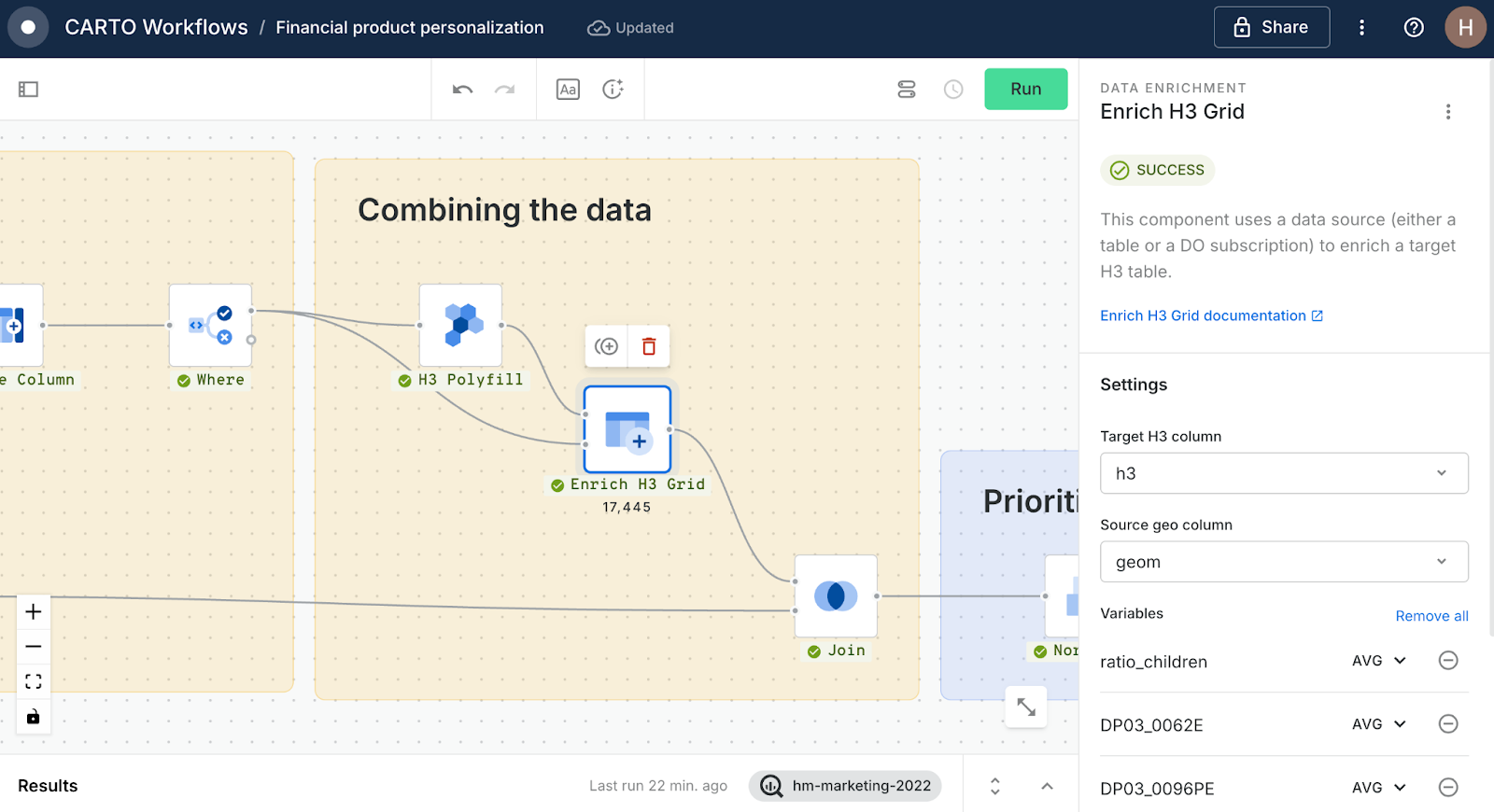
- Next, attach the output of this process to a Join component, along with the output of the second Create Column component. Set the join type to inner. Run again!
The output of this should be a H3 grid containing each of the key variables for this process.
The prioritization framework
Now our data is ready, we can use it to define which locations are best suited to which products. For each of our products, we want an outcome being a score out of a maximum of 1 which signals the optimum product fit.
- Youth saver account: Connect the Join output to a Normalize component, and set the variable to ratio_children_avg, giving you a score from 0 to 1. Easy!
- Health insurance: This one is a little more complex! For this we need to invert the normalization, i.e. a score of 1 should be given to areas where the % of people with health insurance is lower. To do this, use the following query in a Create Column component
1 - (
  (DP03_0096PE_avg - MIN(DP03_0096PE_avg) OVER ()) /
  (MAX(DP03_0096PE_avg) OVER () - MIN(DP03_0096PE_avg) OVER ())
)
- Credit booster card: As before, this is another inverted normalization. Add a second Create Column component, using the query:
1 - (
  (DP03_0062E_avg - MIN(DP03_0062E_avg) OVER ()) /
  (MAX(DP03_0062E_avg) OVER () - MIN(DP03_0062E_avg) OVER ())
)
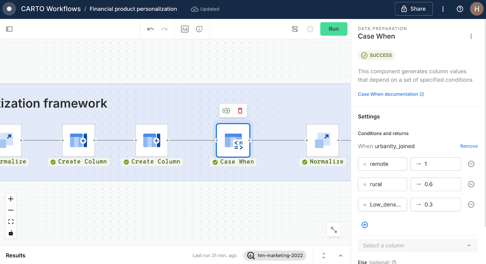
- Digital-first packages: Now for something a little different! This is a qualitative variable with descriptions of urbanity. Use a Case When component to set the following scores:
- Urbanity is remote = 1
- Urbanity is rural = 0.6
- Urbanity is Low_density_urban = 0.3
- Else 0
- High-earner investment account: For this product, we just need another simple Normalize component.
- Finally, we just want to use two Create Column components to return the top scoring products, with the following names and queries:
- Top_score:
GREATEST(
  perc_age_15_to_19_joined_norm,
  perc_age_50_70_joined_norm,
  score_p3_creditbooster,
  score_p4_digitalfirst
)
- Top_scoring_product:
CASE
    WHEN GREATEST(
      score_p4_digitalfirst,
      score_p3_creditbooster,
      score_p2_healthinsurance,
      ratio_children_avg_norm,
      DP03_0062E_avg_norm
    ) = score_p4_digitalfirst THEN 'Digital first package'
WHEN GREATEST(
  score_p4_digitalfirst,
  score_p3_creditbooster,
  score_p2_healthinsurance,
  ratio_children_avg_norm,
  DP03_0062E_avg_norm
) = score_p3_creditbooster THEN 'Credit booster'

WHEN GREATEST(
  score_p4_digitalfirst,
  score_p3_creditbooster,
  score_p2_healthinsurance,
  ratio_children_avg_norm,
  DP03_0062E_avg_norm
) = score_p2_healthinsurance THEN 'Health insurance'

WHEN GREATEST(
  score_p4_digitalfirst,
  score_p3_creditbooster,
  score_p2_healthinsurance,
  ratio_children_avg_norm,
  DP03_0062E_avg_norm
) = ratio_children_avg_norm THEN 'Youth saver account'

WHEN GREATEST(
  score_p4_digitalfirst,
  score_p3_creditbooster,
  score_p2_healthinsurance,
  ratio_children_avg_norm,
  DP03_0062E_avg_norm
) = DP03_0062E_avg_norm THEN 'High earner investment'

ELSE NULL
END
That’s your product prioritization framework complete! Shall we explore the results? First, commit your analysis to your BigQuery project with a Save as Table component, then use a Create Builder Map to automatically generate a map populated with this layer…
Step 3: Exploring the results
Here are the results of our analysis in that CARTO Builder map we’ve just generated! Complete with a bit of styling, plus a few widgets and pop-ups added… check out the Data Visualization section of the CARTO Academy to learn more!
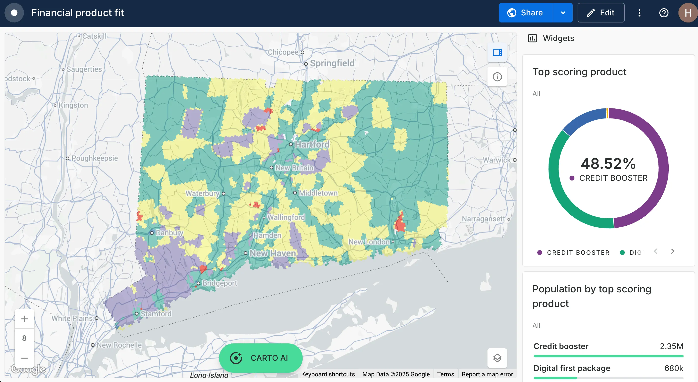
Using this map, you can clearly identify the top product for different areas, whether that’s credit boosters in Hartford or high investment accounts in the southwest - this information is ideal for boosting ROI on product rollouts, marketing campaigns and resource allocations.
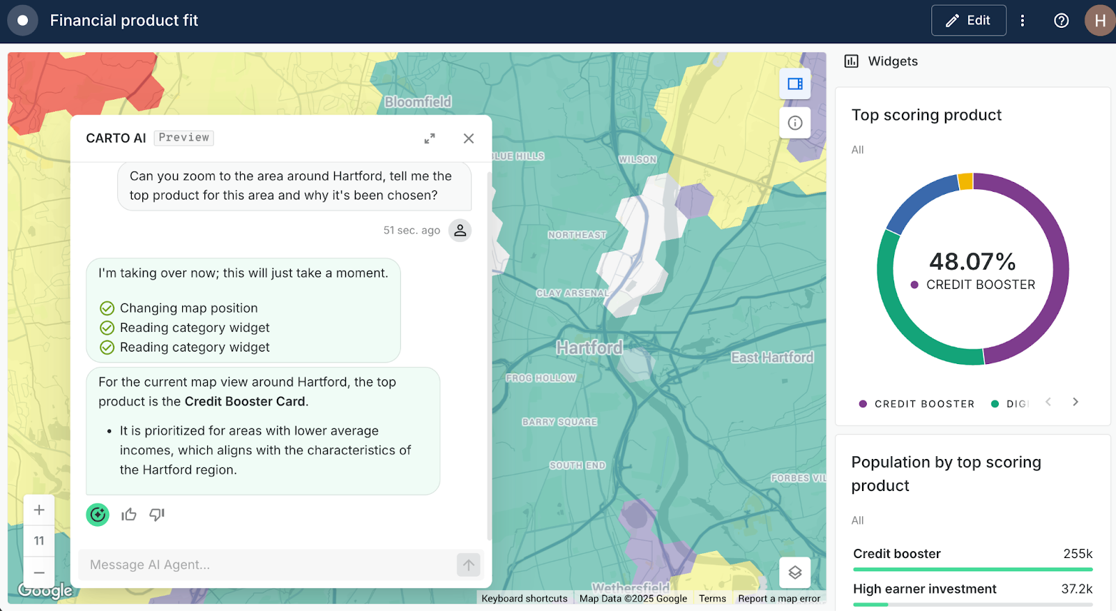
Still not sure where the best locations are for your products or services? Try asking your CARTO AI Agents!
Personalize smarter with spatial analysis
Personalization powered by spatial analytics is the key to delivering relevant, impactful services at scale. By leveraging cloud-native tools like CARTO on Google Cloud, you can break down legacy barriers and build agile, data-driven personalization frameworks that respond to your customers’ unique local contexts.
Ready to try it yourself? Book a free demo with our experts and explore how a cloud-native approach can transform your personalization strategy.