.png)


5 things we’re excited for at SDSC London 2024
Discover the latest in Spatial Data Science at SDSC London 2024! From climate risk management to AI solutions - get your tickets now!
.png)


Transforming Data Center Locations for Nautilus Data Technologies
Learn how we are collaborating with Google Cloud to provide Nautilus Data Technologies with an innovative solution for data center site selection and monitoring.
.png)

What's New in CARTO - Q1 2024
Explore the latest CARTO platform features unveiled in Q1 2024! Trigger workflows via API, control your maps via URL, the all-new CARTO Academy - and more!
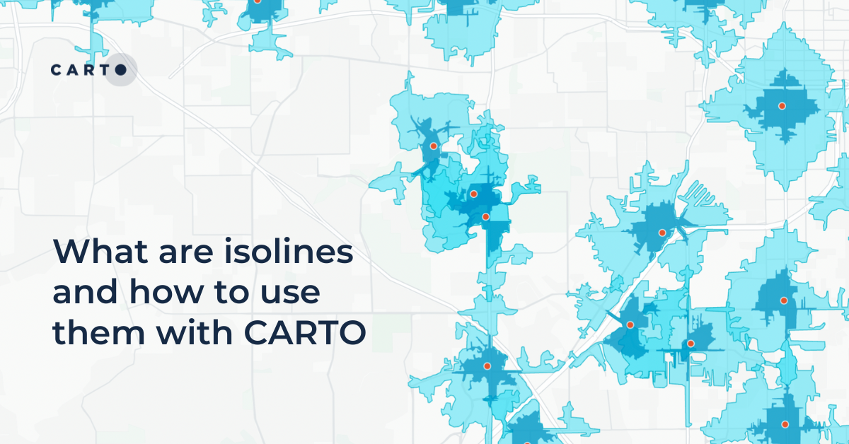
What are isolines and how to use them with CARTO
Learn what isolines are and how to use them at CARTO. Follow this quick guide for creating isolines & trade areas. Use them to derive actionable insights.
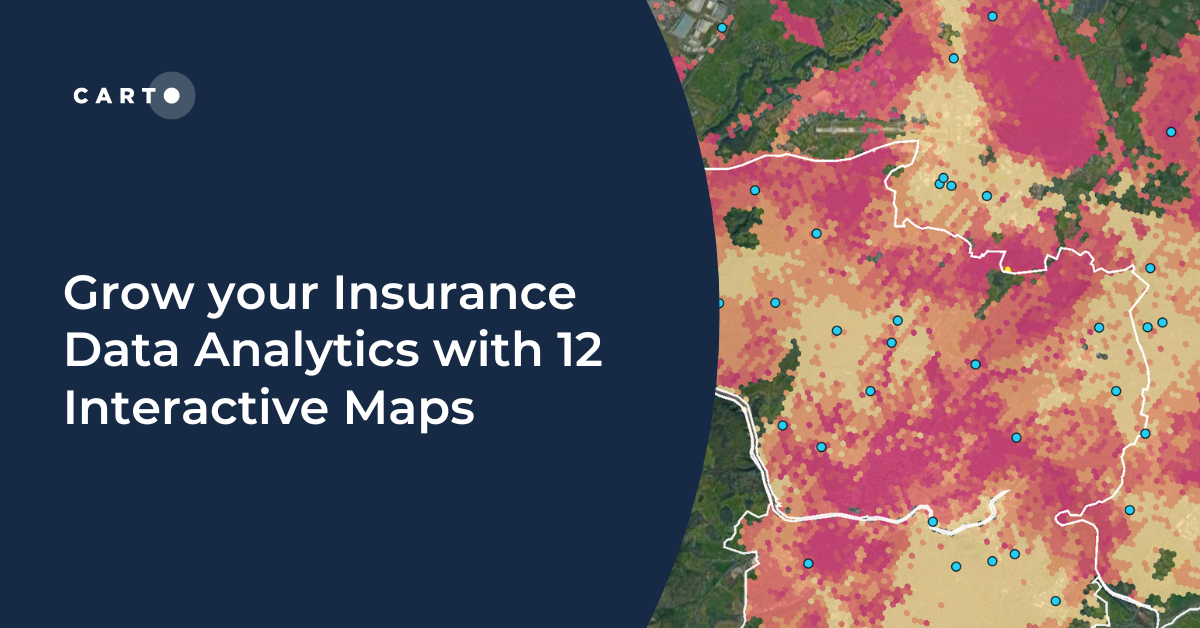

Grow your Insurance Data Analytics with 12 Interactive Maps
Grow your insurance data analytics with these 12 maps and visualizations. Request a demo now to optimize your risk assessment and decision-making processes.
.png)


Announcing Deck.gl v9: WebGPU ready & with TypeScript support
Announcing Deck.gl v9! Get ready for next-gen geospatial rendering, including TypeScript support & preparation for WebGPU.


EU Deforestation Compliance with Cloud Spatial Analytics
Streamline your sustainability efforts with our EUDR compliance solution, leveraging FAO and WRI methodologies, powered by Google Cloud and GEE.

Now in CARTO: NielsenIQ data for building powerful CPG insights
Access powerful CPG insights with NielsenIQ data, now available in CARTO! Visualize trends, optimize strategies, and make confident decisions.

Meet CARTO at Google Next '24
Join CARTO at Google Next '24 on April 9th - 11th for cutting-edge spatial analytics insights in cloud tech.
.png)

BT Active Intelligence Location Insights Now Available with CARTO
Access hyper-local footfall insights with BT Active Intelligence Location Insights, now available with CARTO! Explore granular mobility data in the cloud.
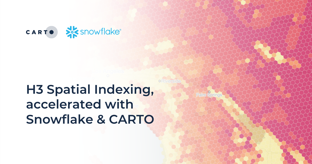
H3 Spatial Indexing, accelerated with Snowflake & CARTO
H3 Spatial Indexing is now available natively in Snowflake - learn about our new H3 Acceleration Program and discover how to get started!
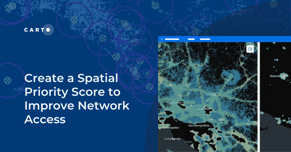

Create a Spatial Priority Score to Improve Network Access
Learn how to create a spatial priority score to improve network access for senior citizens. Explore data integration, regression models, and AI insights.

Introducing Workflows Templates: pre-built spatial analysis
Boost efficiency with CARTO Workflows Templates - no-code spatial analysis made easy. Explore pre-built templates for streamlined geospatial projects.

Academy
5 things we’re excited for at SDSC London 2024
Discover the latest in Spatial Data Science at SDSC London 2024! From climate risk management to AI solutions - get your tickets now!
Transforming Data Center Locations for Nautilus Data Technologies
Learn how we are collaborating with Google Cloud to provide Nautilus Data Technologies with an innovative solution for data center site selection and monitoring.
What's New in CARTO - Q1 2024
Explore the latest CARTO platform features unveiled in Q1 2024! Trigger workflows via API, control your maps via URL, the all-new CARTO Academy - and more!