Grow your Insurance Data Analytics with 12 Interactive Maps


According to a recent report from McKinsey & Company, insurers across regions are investing significantly in advanced analytics but have unlocked only a fraction of the potential value. Recognizing this gap and the power of Location Intelligence, we crafted a list of 12 interactive maps showcasing different use cases to help you amplify the impact of your insurance data analytics.
Read this blog post to understand how insurance data analytics could help you enhance risk assessment, underwriting, and claims management to offer actionable insights and guide informed decision-making.
These maps have been created using large datasets combining proprietary data with public and premium datasets from the Spatial Data Catalog. To replicate any of these maps, simply log in to your CARTO account. If you are new to CARTO, sign up for a free 14-day trial account.
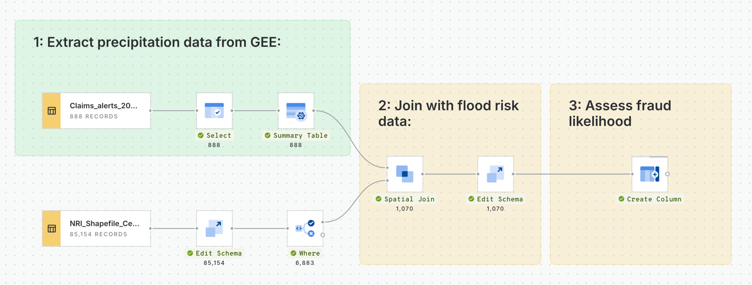
1. Investigating insurance fraud risk
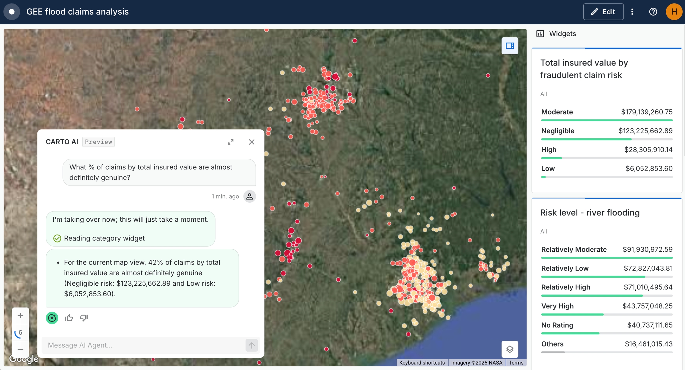
This interactive map explores how insurance companies can identify potentially fraudulent flood damage claims. It centers on improving claims accuracy and reducing losses by verifying whether reported flood events align with actual environmental conditions. In the above snapshot, CARTO's AI Agents are being used to investigate the quantity of claims which have been flagged as low risk, meaning they can easily be discounted from any ongoing investigations.
This analysis has been run by building the below pipeline in CARTO Workflows - our low-code tool for automating and productionizing spatial analysis. In this, insurance claims have been assessed in combination with FEMA flood risk scores and precipitation data from Google Earth Engine in order to rank claims from negligible to high fraud risk. You can watch this in action in our recent webinar!
2. Hurricanes in the North Atlantic for Aerospace Insurance
Explore this map here.
The map provides a visual representation of historic hurricane tracks in the North Atlantic, highlighting the frequency and paths of past hurricanes. A series of dynamic widgets have been used to help users pinpoint data of interest. For instance, the user has categorized airports by size (small, medium, large) to show their distribution and assess their exposure to hurricane risks. Additionally, it visualizes the impact radius of hurricanes at various distances from the track to understand potential damages. Risk distribution by state is mapped to illustrate variations in hurricane exposure across different areas, so you can compare state by state.
The map integrates Total Insured Value (TIV) data to quantify the financial exposure of airports, providing insurers with comprehensive insights into hurricane-related hazards and their potential impact on aerospace insurance for airports in the North Atlantic region. Open this map in full-screen here.
Want to recreate this map? You can access global climatology data from NOAA natively through your cloud platform connection - no ETL needed! Check out the listings on the Google Cloud Data Marketplace here.
3. Distribution Centers Disruption Due to Flood Events
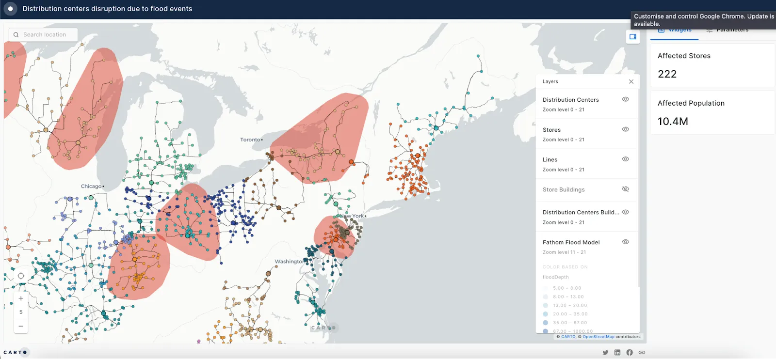
With this map, you can identify distribution centers located in flood-prone areas. Imagine how useful it would be for you to replicate the analysis with your own data! Supply chain disruption and risk management solutions could benefit from the analysis of the potential impact of flood events. More specifically, business interruption insurance, contingent business interruption coverage, and supply chain resilience programs could use these analyses to better understand the data and make optimizations.
You could even identify clients with affected stores to implement preventive measures to minimize flood-related disruptions. This is made straightforward with the CARTO Workflows Send by Email component, allowing you to automate email triggers based on the results of your analysis.
Open this map in full-screen here.
Flood Risk in Valencia
This visualization includes modeled data to show the building assets that are at risk from future flood damage. An average risk score has been calculated for each building asset based on elevation, with a prediction of average flood depth across the city, giving data analysts powerful insights to better assess the risks posed to the built environment due to future flooding events.
By incorporating flood risk data into underwriting and pricing models, in this scenario, insurers can offer customized insurance products that address the unique flood risks faced by residents and businesses in Valencia.
5. Seasonal California Wildfire Risk Index
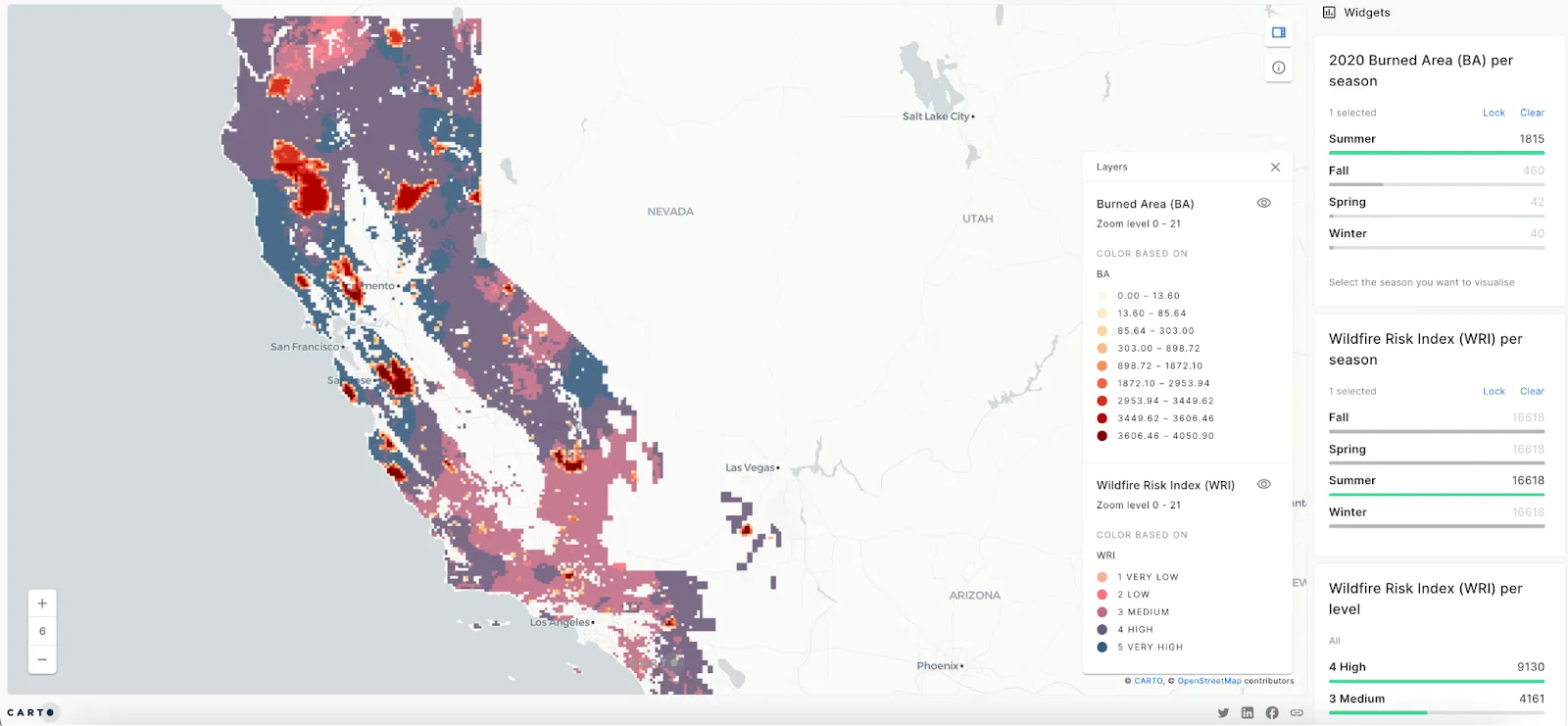
Did you know that one-quarter of California — more than 25 million acres — is now classified as under very high or extreme fire threat?
This map provides annual and seasonal indexes to better understand wildfire risk in California. If you want to create an accurate, reliable wildfire risk index (WRI), we recommend you jump into this tutorial to learn how to use spatial data to create one.
This analysis could be used in insurance to adjust underwriting guidelines, pricing strategies, and risk management plans accordingly. For example, insurers may impose stricter requirements for properties located in high-risk wildfire zones during peak wildfire seasons or offer incentives for proactive wildfire mitigation measures such as defensible space maintenance and fire-resistant constructions.
Bonus 🗾Go more in detail with this map that includes a wildfire risk index for housing in Los Angeles to evaluate the exposure of residential properties to wildfires. The Wildfire Risk Index (WRI) of this map calculates the likelihood of fires occurring based on temperature, wind levels, and vegetation. The visualization includes widgets displaying pie charts representing the distribution of risk scores, categorized from very low to very high. Additionally, it presents numerical values indicating the count of housing units classified under each risk category.
6. Global Fires
With fire incidents posing significant threats to communities and ecosystems worldwide, this map provides a comprehensive visualization of fire occurrences throughout the year 2022. Navigating the map is intuitive; users can zoom in and out to examine fires in specific regions easily. The histogram widget facilitates the filtering of fires based on their bright temperature, enabling the identification of more severe incidents. Moreover, the day-night toggle allows users to switch between 'Day' and 'Night' views, providing insights into the temporal patterns of fire occurrences.
This map offers valuable insights to enhance fire management strategies, protect vulnerable areas, and mitigate the impact of wildfires on communities and ecosystems worldwide. In the case of insurers operating in regions prone to wildfires, they may also use this information to coordinate claims response efforts and provide support to affected policyholders.
7. Earthquakes in USA
This map of Earthquakes in the USA shows individual seismic hazards and earthquakes. A series of categorical and pie widgets have been used to help users explore the data, as well as a time series widget to help them understand changes over time - make sure you hit “play” to watch this in action! by severity across different counties per month. Depending on the data available, insurers can use this information to assess the exposure of properties, infrastructure, and businesses to earthquake-related risks and determine appropriate insurance coverage levels.
Bonus 🗾If you want to access a practical example, the CARTO Academy has a tutorial available to identify earthquake-prone areas in the state of California using a BigQuery public dataset from NOAA.
8. Risk Assessment Using Crime Rate in Los Angeles
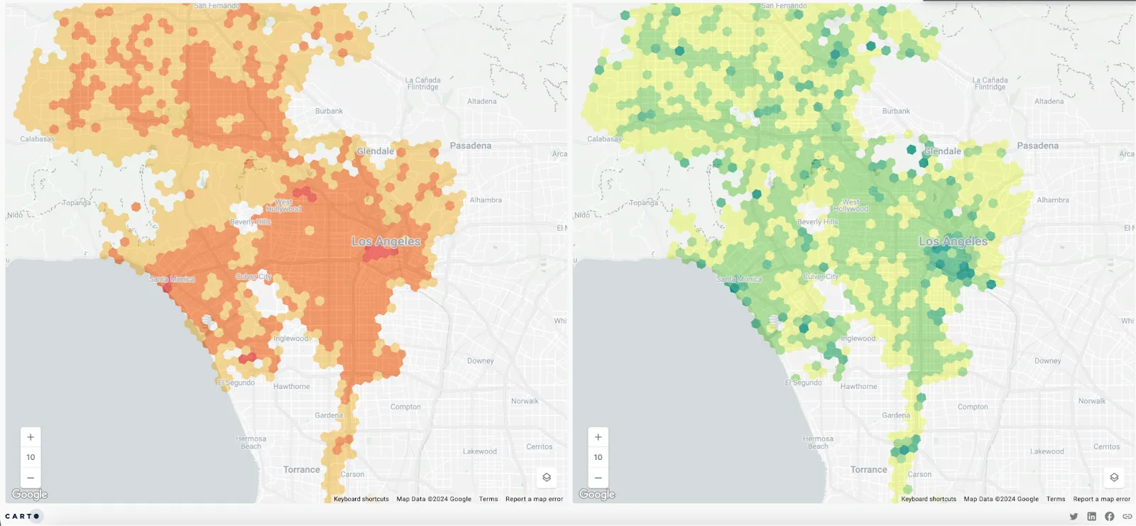
It is time to move from natural disasters like hurricanes, floods, fires, and earthquakes, and explore other insurance data analytics related to human activity, such as crime, home prices, traffic collisions, and more.
When it comes to crime data, it’s not enough to just visualize the number of crimes in an area, if we don’t contextualize it. Ten crimes occurring in a city of 1 million people doesn’t sound like much - but if those ten crimes happened in a town with 100 residents? That’s a much higher risk to residents - and a greater challenge to those seeking to insure them. Using the split-screen mode in CARTO Builder, we can contrast the raw crime counts (left) with the number of crimes per 1,000 residents (right). This analysis can help spot crime trends improving risk assessment and premium calculation.
By overlaying crime data with home insurance policies, insurers can understand the levels of insurance risk. Properties located in high-crime areas may face higher risks of theft, vandalism, and property damage, affecting insurance premiums and coverage options. This information could help adjust underwriting guidelines, pricing models, and risk mitigation strategies to address the unique security challenges faced by homeowners in different neighborhoods. Use this tutorial to replicate this map using crime data and spatial analysis to assess home insurance risk.
9. New York Crimes Using 911 Calls
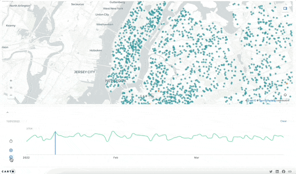
Similar to the previous map, this visualization focuses on crime data but, in this scenario, uses the 911 emergency calls in New York. This map takes advantage of zoom-based rendering; individual data points are visible at high zoom levels, switching to an aggregated grid as the user zooms out. This makes it easier for the end-user to explore the data relevant to their area of interest. Moreover, you can navigate the map to see the resolution by call and use the time series widget to see the number of calls per day.
Insurers can use this and similar data to analyze patterns of criminal activity, emergency response times, and incident hotspots to evaluate the exposure of properties to crime-related risks. By incorporating crime data into risk assessment models, insurers can tailor insurance products to mitigate risks such as burglary, robbery, and assault, and provide support to policyholders in high-crime areas through loss prevention services and security recommendations.
10. Pet Insurance Pricing Strategy
In 2022, only in the US, the pet insurance market experienced a 22% growth. Plus, the Fortune Business Insights Report projected the global pet insurance market size to reach USD 11.25 billion by 2026. If you are part of this market, you can leverage Location Intelligence to stay competitive and build a more intelligent, lower-risk pet insurance pricing strategy. Take for example this map visualization for Bristol, UK which has a comprehensive assessment of pet risk factors, integrating data on the number of nearby vet surgeries within a 10-minute drive, population density, and traffic accident frequency. You can see how this was easily calculated using our no-code tool CARTO Workflows below.
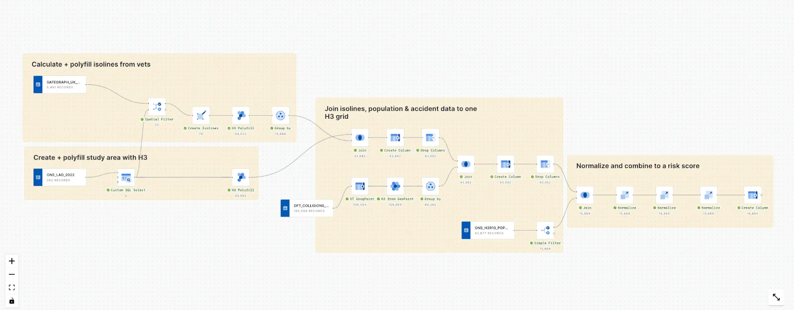
The map is built on an H3 index consisting of 16,000 grid cells and takes advantage of the isoline functionality to generate realistic drive times, allowing for a nuanced understanding of geographical risk distribution. Use the interactive widgets, pop-ups, and map descriptions to better understand the analysis. This visualization is an effective tool for optimizing pet insurance pricing strategies because it can seamlessly integrate into automated quotation systems.
11. Road Accidents in the UK
This road accident map from the UK enables insurers to easily understand the spatial distribution of road collisions, with the data aggregated to a count-based H3 grid. SQL Parameters - placeholders that allow the end-user to input from a controlled range of values into the back-end SQL code - allow stakeholders to decide which data points are used to build this grid. You can see how this works in the code below, with the WHERE clause allowing users to select the type of vehicle, the severity of the collision by slight, serious, or fatal, and the type of casualty.
   SELECT
     h3,
     COUNT(h3) AS accident_count,
   FROM
     vehicle_categorization
   WHERE
     severity IN { {severity} }
     AND (veh_motorcycle IN { {vehicle} } OR veh_goods IN { {vehicle} } OR veh_car IN { {vehicle} } OR veh_other IN { {vehicle} })
     AND (cas_pedestrian IN { {casualty} } OR cas_cyclist IN { {casualty} } OR cas_motorcycle IN { {casualty} } OR cas_other IN { {casualty} })
   GROUP BY
     h3
Check out how you can use SQL Parameters to start democratizing your spatial analytics with this tutorial!
Insurers can use this information to evaluate the risk of vehicle damage, bodily injury, and liability claims associated with road accidents.
Bonus 🗾Watch this customer story showing the use of spatial autocorrelation to understand road accident trends in London.
12. Sharing Insights Using Storytelling
Open this in full screen here.
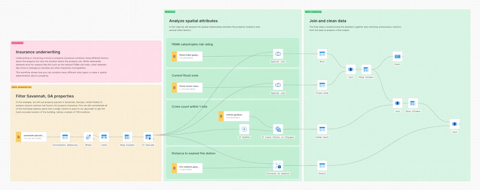
Insurers can use their data and geospatial analysis to provide clients with detailed risk evaluations and insights. This example integrates various datasets to assess risk factors such as FEMA hazard indexes, flood zones, crime rates, and proximity to emergency services, providing a comprehensive understanding of property risks.
Moreover, in this scenario the CARTO's integration with BigQuery enables the automation of large data processing and visualization, making it possible to forecast events like wildfires and predict their spread by analyzing factors such as fuel types, wind patterns, and terrain. This approach not only allows insurers to assess current threats but also offers a new way of communicating with clients. As you can see, the possibilities are endless when it comes to analysis and visualization with CARTO.
Ready to give it a try? Use our Workflow Templates for Insurance
The CARTO team has designed a collection of Workflow templates for Insurance (and other industries); these are a series of pre-built analytical templates which you can drag and drop into your workspace to get started. These examples showcase a wide range of scenarios and applications: including flood risk assessment, insurance underwriting, coastal flood risk, and a template to assess the damage of the volcanic eruption in La Palma island in Spain.
Making use of these templates is very easy - watch the quick-start guide here! You just need to download them and drop them into your CARTO account. Each example will import the necessary data upon recreation of the Workflow in your account. Once the workflow is re-created you will be able to modify, as with any other workflow, replacing the data sources and re-configuring the different nodes so it can be useful for your specific use case.
Conclusion
These interactive maps created with Builder, taking advantage of CARTO features such as widgets, Workflows, and SQL parameters, offer insurers powerful tools to analyze and mitigate a wide range of risks, including those related to crime, property damage, and liability exposures. With geospatial analytics, insurers can enhance their risk assessment accuracy, optimize underwriting profitability, and support proactive risk management strategies.
We know Insurance companies are no strangers to analytics and mapping, but today, there's a new demand: the ability to tell compelling stories to end clients with ease. That’s why these visualizations also empower insurers to effectively communicate insights to end clients, whether it be C-suite executives or client teams. From catastrophe modeling to climate indexing, these maps cater to diverse insurance use cases, providing valuable insights into flood risk, wildfire danger, crime rates, and much more.
Experience CARTO for insurance data analytics. Request a demo today with our experts.