Normalize All the Things with the Data Observatory
The data we collect about the world is rarely as clean as we would like it to be. Often times data is noisy or incomplete and because of this we draw false conclusions from our data.
One of the biggest sources of potential error in geodata comes from not properly normalizing our data. There are a plethora of maps out there that claim to show some notable effect a population has on something or the effect any given person place or thing may have on a population. However in reality these maps might just show us where a large number of people are. One of the worst offenders of these kinds of maps are those made with social media data.
In this post we will show you how you can use the Data Observatory to minimize the influence of population on your maps to let the true insight shine through.
Let's grab a dataset using CARTO's Twitter Connector and pick something we know is geographically distributed. Let's say we are trying to analyze a social media campaign that the restaurant Chick-fil-A is running. We collect tweets from the data and produce the following twitter map:
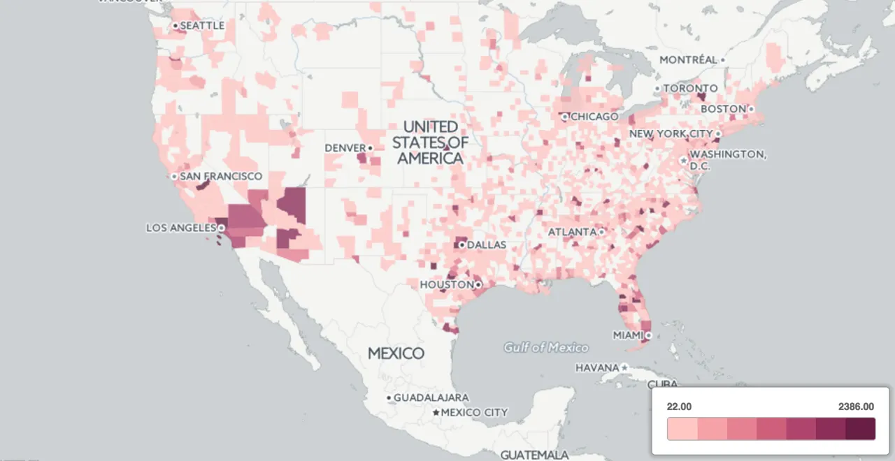
We are not able to derive much insight from this map. There are too many points on top of each other. Let's try aggregating this to counties and produce a choropleth of the number of tweets in each county.
We can use the Data Observatory to do this in one shot using the following SQL:
##_INIT_REPLACE_ME_PRE_##
WITH counties AS (
    SELECT * FROM OBS_GetBoundariesByGeometry(
        ST_MakeEnvelope( -130.61  21.21  -64.16  54.62  4326)  'us.census.tiger.county')
)
SELECT count(*) AS tweet_count
       counties.the_geom AS the_geom
WHERE ST_Within(twitter_chickgila.the_geom  counties.the_geom)
GROUP BY counties.the_geom
##_END_REPLACE_ME_PRE_##
Great! Now we have a better view of which counties are tweeting about Chick-fil-A more than others but it is still not a particularly useful metric. Let's take Albany County for example which has a population of around 304 000 people and compare it to Allegany County which has a population of about 50 000. We shouldn't be surprised if we see more tweets in Albany because there are a lot more people there to tweet.
We really want the number of tweets per person in each county and not the number of tweets per county. With the Data Observatory we can easily update our table to show a choropleth map normalized by the total number of people in each county:
##_INIT_REPLACE_ME_PRE_##
SELECT the_geom
  tweet_count / (
    ST_Area(the_geom::geography)1000.01000.0 *
      OBS_GetUsCensusMeasure( ST_PointOnSurface(the_geom)
        'Total Population'  'Area'  'us.census.tiger.county
      ) as count_per_person
  FROM twitter_chickfila_choropleth
##_END_REPLACE_ME_PRE_##
Applying a normalization query gives us a much better view of where our social media campaign is having an effect.
Normalizing other things
The example above shows how important it is to properly normalize your data for maximum insight. Geodata combined with the Data Observatory makes this really easy and with the large number of measures available in the catalogue you should be able to normalize most datasets. For example if you had a dataset of the amount of money people spend on their pets in each county a map showing the percentage of an individual's income spent on their pets. No problem! All we need to do is normalize by the median income in each of those regions.
Normalizing your data and your maps will help you create projects that are anything but normal! We can't wait to see the many different ways you will apply this strategy to your maps!
Happy (normalized) data mapping!


