

California Wildfire Maps: How fires and smoke are spreading


The wildfires ravaging northern California this month are among the most destructive in the state's history. Since the beginning of October wildfires across northern California counties including Napa Sonoma Mendocino and Butte have to date burned over 170 000 acres of land destroyed 3 500 structures forced the evacuation of 200 000 people and caused 31 deaths.
The accelerated speed at which these fires are spreading reportedly spanning 20 000 acres a single day are making it nearly impossible for fire managers to forecast using their traditional models which are typically built with data related to vegetation type humidity temperature and terrain. But as recently reported these models are outdated and do not take into account the volatile weather conditions especially turbulent wind patterns caused by the fire itself.
Together the maps visualize active fire perimeters density of smoke levels nearby vulnerable populations and property risks to local agricultural businesses. We hope the maps will help disseminate vital information to residents rescue agencies and relief organization while also raising awareness of the long term health hazards exposure to high levels of smoke.
Mapping Smoke Density Exposure Levels

The apocalyptic images (above) of Disneyland drastically show the smoke density levels across Anaheim California putting residents at-risk for health hazards from smoke inhalation. But there are no active wildfires in Anaheim or any nearby areas as the image below shows:
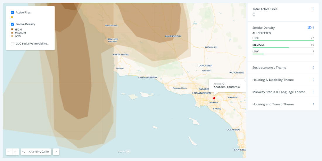
The data visualization (below) presents active wildfires (as of this publication) and the density of smoke spreading across the state using data provided by (1) NOAA's National Weather Service Storm Prediction Center and (2) Hazard Mapping System Fire Analysis.
Public health official looking for more demographic information on populations at-risk for respiratory complications resulting from exposure to high level of smoke can turn of a third layer of data provided by the Social Vulnerability Index (SVI).
In the map below the SVI data layer has been turned activated and the "Socioeconomic Theme" widget's autostyle feature has been turn on to provide demographic context to the map.
Styling this map by various demographic attributes can provide public officials insights on how best to prioritize response initiatives for the most vulnerable populations.
A close up view of Napa county
The previous map presented a statewide overview of the wildfire crisis but for a more local understanding Mamata built a second map on Napa County that syncs each hour with updated data on (1) Napa County Parcel Data and (2) Fire Perimeter Data.
The map below using the autostyle feature for the "Active Fires" widget provides tactical information on property risks through Napa county.
Local government officials can use this type of information to more strategically allocate disaster relief resources. For example the "Land Use Type" widget helps estimate residential occupancy for each parcel allowing responders to identify at-risk populations according to their proximity to active fire perimeters.
How to help
There’s plenty of ways you can help in current and future disaster relief efforts. The Red Cross has provided detailed instructions on how to donate and for more local initiatives you can checkout this post from The San Diego Union Tribune.


