Creative Maps Made with the New CARTO.js 4.0


Developers need open-source tools to be able to create applications that are both visually stunning and highly functional. CARTO and the Location Intelligence community have long supported the open-source community contributing to the development of a modern geospatial tech stack that allows all companies to take advantage of their location data.
Today we’re excited to announce a beta release of CARTO.js 4.0.
CARTO.js is an open-source JavaScript library that interacts with different APIs in the CARTO Engine ecosystem. The new version CARTO.js 4.0 provides additional functionality to extract and filter data within CARTO so that you can create custom UI components such as widgets pop-ups legends and much more.
If you have used previous versions of CARTO.js take a look at the Beta Release documentation to learn more about the basic concepts and workflow changes between the old and new library.
The current beta of CARTO.js includes changes to the JavaScript library only. A future enhancement will include functionality for maintaining your core application.
The Hackathon
We held an internal hackathon to demonstrate the functionality of this updated Javascript library (like displaying data from CARTO on top of Leaflet and Google Maps and creating fully customized web applications) and to gather feedback from our own internal experts.
The teams had 3 hours to create a map or web application that showed the power of CARTO.js 4.0.
To provide you with some inspiration here are some of the coolest things they build in less than 3 hours (click on the images to view and interact with the full map in your browser):
Wildfires in the US from 2006 to present
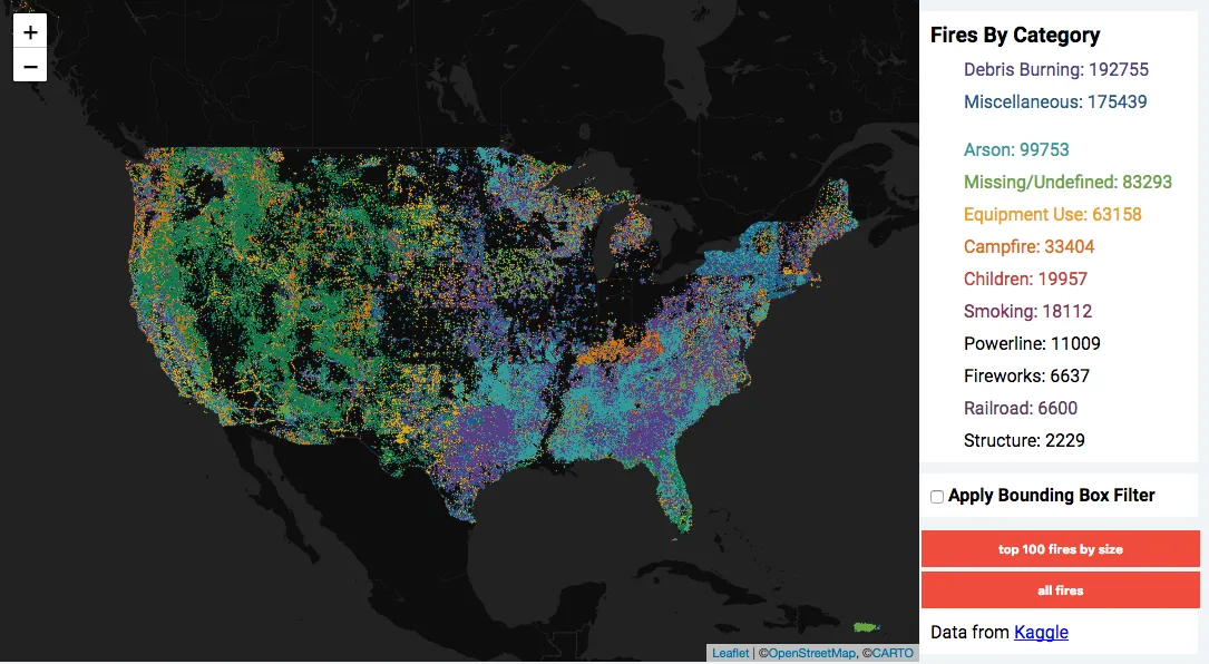
This stunning map displays US wildfires color-coded by category. The map paints an amazing picture of fire density across the country as well as an interesting look at how fires are classified and recorded by state.
U.S. Place Name Density Map
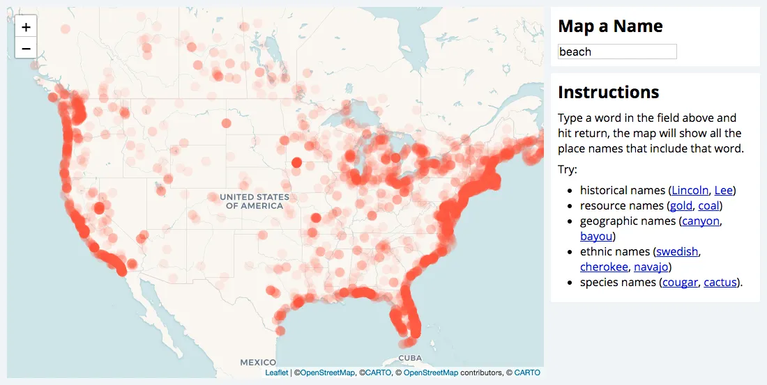
Place names can have great regional patterns. This map allows users to explore and find new and unexpected patterns in how places are named around the country
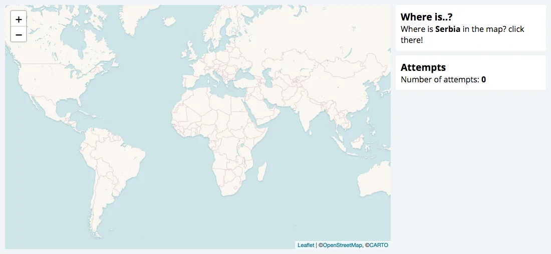
Small geography game
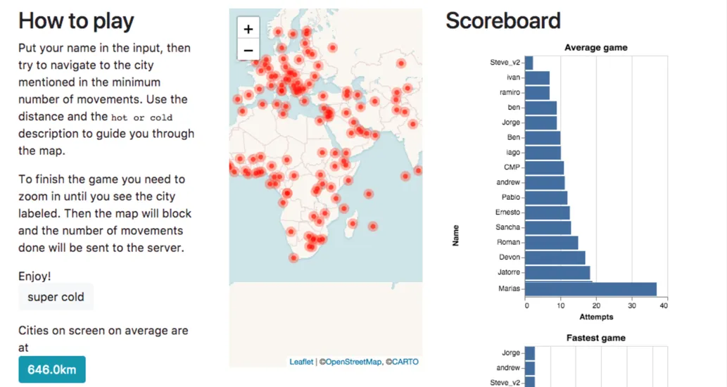
In this quick quiz game which highlights one of the ways that CARTO can work as a teaching tool players have to locate a given city using their knowledge of world geography and some hints provided on the map.
Ride map with new widgets
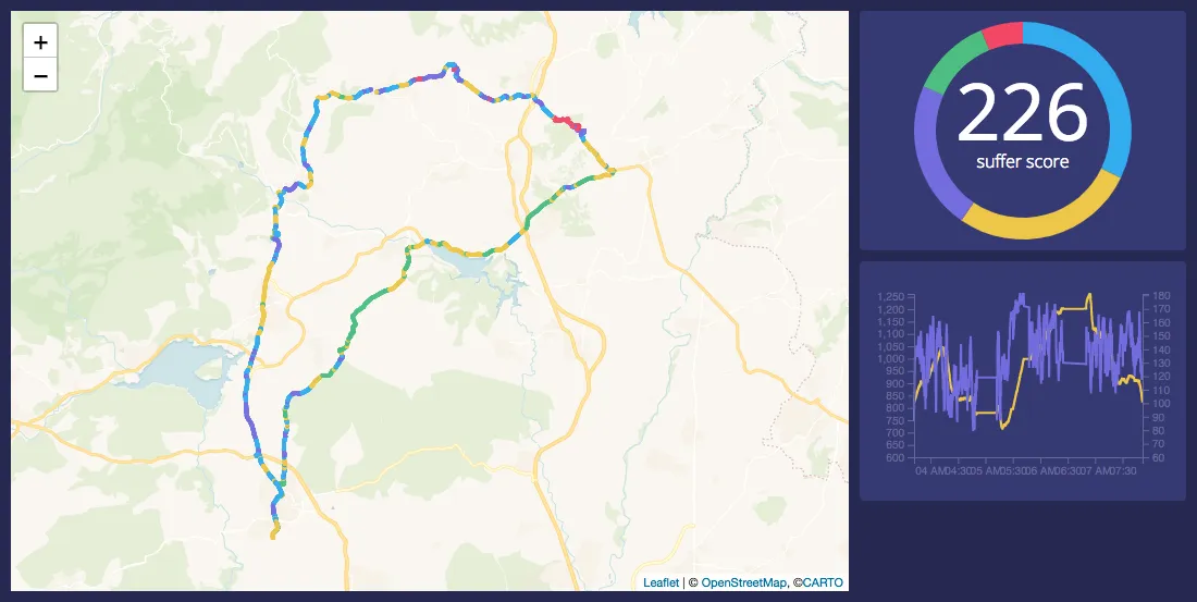
This map visualizes the intensity of a particular bike ride using a couple of new widgets to paint the picture. The pie chart and line graph can give a prospective rider a sense of a trip’s difficulty and this data can be aggregated to create an index like the suffer score for each section of the ride as pictured.
FBS college football players hometowns and schools
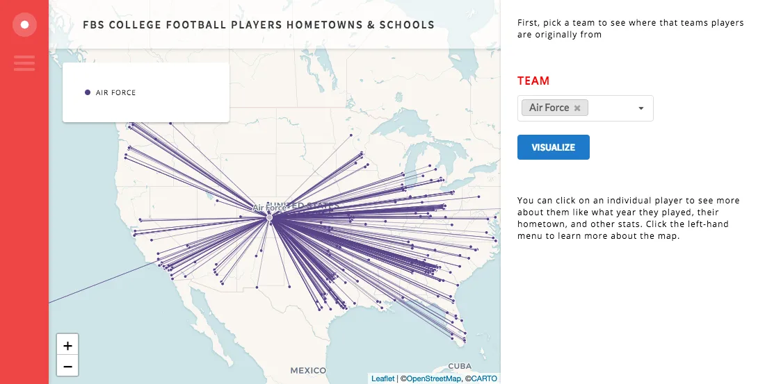
See where college football players hometowns are for each team in the FBS (Bowl Division). This map which also pulls in info on each specific player can provide an insightful look into the recruiting efforts of your favorite team!
Game of Thrones Distance Calculator
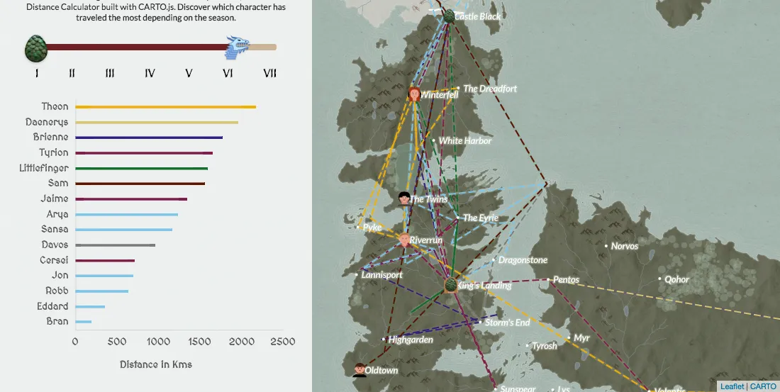
Is winter coming at the speed of light? Is Littlefinger using teleportation? Are ravens faster than dragons? In order to answer this questions our team build the GoT Distance Calculator with CARTO.js and our Game of Thrones Basemap. Discover which character has traveled the most depending on the season.
A map to promote active/rural tourism
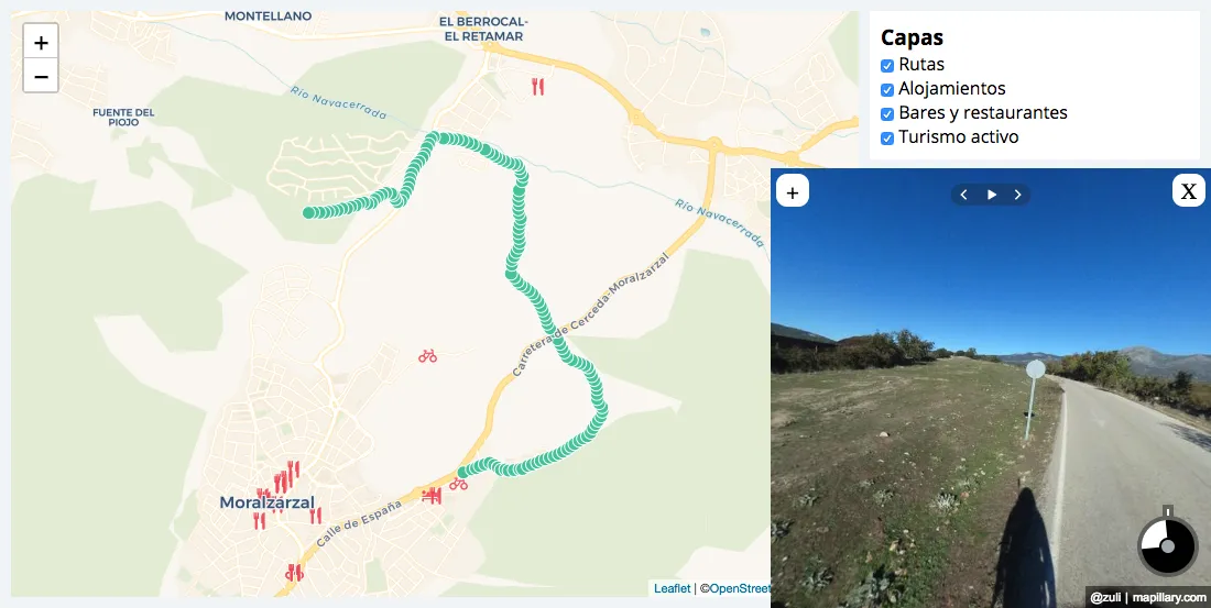
This map has been designed to promote local tourism. With several layers highlighting accommodations restaurants and bars this map can point tourists visiting the town of Moralzarzal in in the right direction. The Map also provides street-level imagery from Mapillary of a local scenic walkway.
Lasso tool
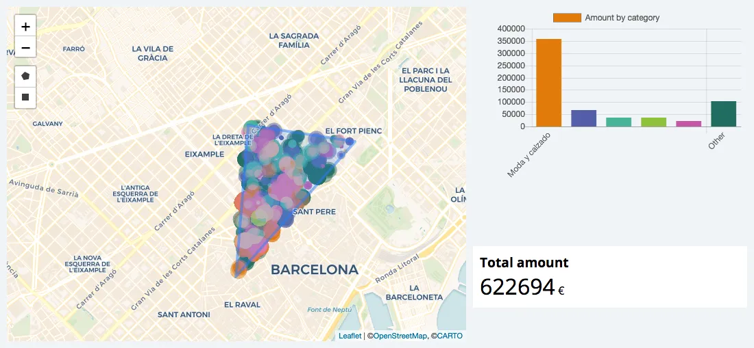
This map features the use of the lasso function to draw shapes and look specifically at the data points within a custom geography.
Where to live if you love quakes
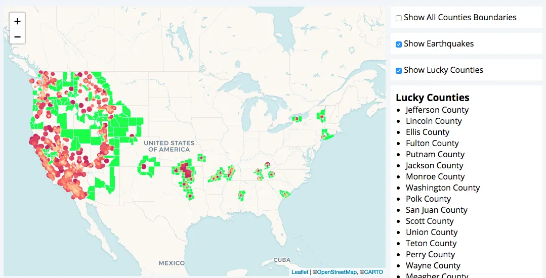
Do you like to move your body to the rhythm of earthquakes but you think your hobby can be too dangerous? Don't worry in this map you can find all the US counties that have at least one neighbour in which there have been earthquakes lately. So you can choose a safe place to live close to your favorite hobby.
Country evolution after WWII
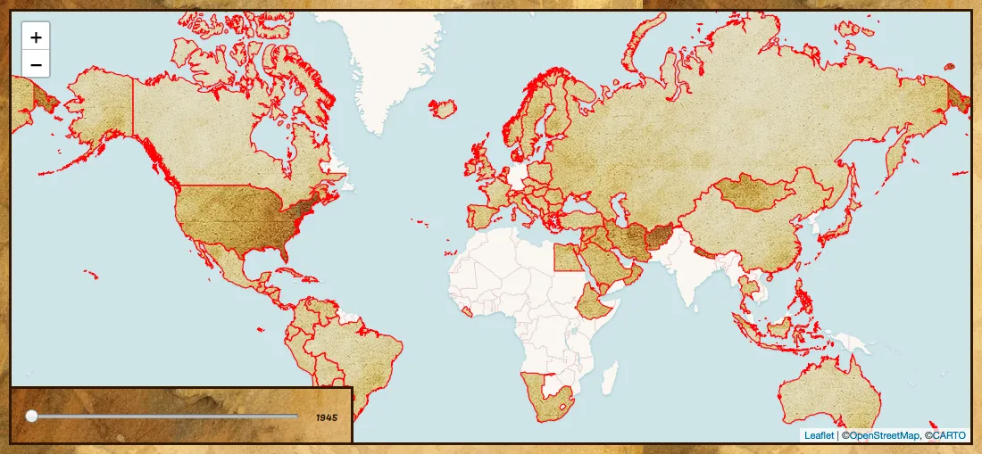
This time series map creatively presents the international instability present in the half century following the second world war. By highlighting the shifting border lines of nations along with changing country names the map paints the picture of this tumultuous era.
Exploding GIF's
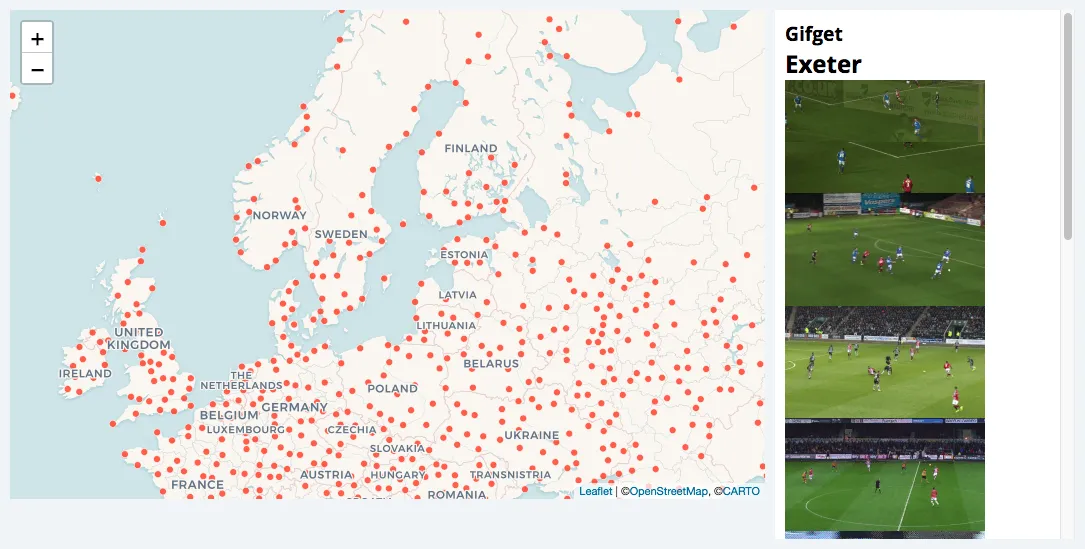
This fun experiment explodes with gifs from Giphy that share names with populated places around the world as you hover over them.
Crimes reported by a particular force
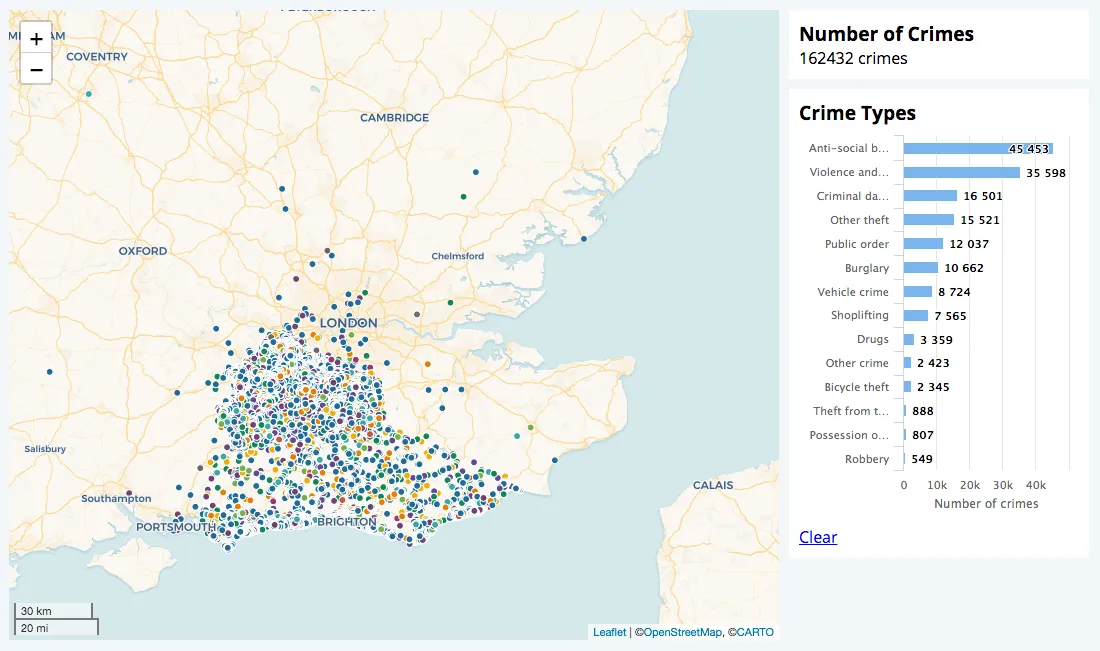
This map combines a chart library HighCharts with CARTO.js 4.0 to create an interactive widget that maps and visualizes crimes (By type) in and around London.
Trivia(l) game
Another quick geography game created using CARTO.js that asks you for a country name. If you click the correct one you win! After 3 failed attempts it shows you the correct answer.
Pollution in US since 2000

This beautiful map shows the pollution levels in several US cities across the last 16 years. A widget displays a chart with distinct pollution during the selected year giving the user the ability to break down their view based on four different types of air pollution.