Lessons Learned from Analyzing Over a Million Points of GPS Data


Data storytelling is the process of translating and presenting data analysis as meaningful information. Whether your data story promotes environmental conservation or a change in your organization’s go-to-market strategies the goal for data storytellers remains the same: tell a story that engages audiences and encourages action.
Following these principles our research team recently published a data story called A Million Walks in the Park.

Working with one month of nation-wide GPS data from LiveRamp A Million Walks in the Park explores the use of public spaces specifically public parks across New York City to understand social interactions among New Yorkers.
Wenfei Xu who led data analysis and visualization and Stuart Lynn who supervised the data engineering had two additional objectives for this story:
- Highlight the difference between raw data and information
- Extract information from GPS data a notoriously noisy type of location data not often worked with beyond academic research
Below let’s take a closer look at the story behind our new data story.
The difference between raw data and information
One of the primary objectives behind A Million Walks in the Park was to demonstrate the difference between raw data and information which Wenfei and Stuart define as:
Raw data refers to unprocessed unorganized facts that are effectively meaningless as no useful information can be extracted.
Information refers to processed organized facts that are presented in a meaningful manner to persuade an audience to act on data-driven insights.
The image below for example displays one month of raw data for cell phone pings in Manhattan’s Central Park.
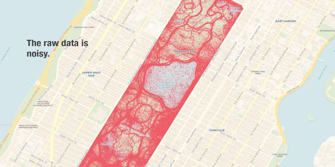
In visualizing raw data the map above presents readers with a lot of noise from which few if any meaningful information can be heard. Also because GPS signals are not 100% accurate some of the raw data is inaccurate or misrepresented. Notice the amount of cell phone pings located in the middle of the reservoir which are likely not accurate.
Instead take a look at the data visualization below displaying the same GPS data structured into spatial clusters. Using 1-dimensional range searches to calculate dwell time Wenfei was able to identify several common points of interest (POI) including organic space near the Metropolitan Museum of Art or near the Delacorte Theater Great Lawn and Belvedere Castle.
Building a typology of spatial clusters and processing cell phone pings accordingly allowed Wenfei to add meaning to this GPS data. While the raw data treated all cell phone pings equally Wenfei’s structured data visualization presents actual information about the data like:
- What areas of the park receive the most foot traffic on what day of the week?
- What organic spaces are most popular on the weekend?
- What locations facilitated the most shared experiences in the park for the month?
This type of information provides descriptive insights into how New Yorkers share public spaces allowing for more specific (and predictive!) questions to be asked of this GPS data set.
A granular look at neighborhood parks
The first obstacle that Stuart and Wenfei faced when working with a month of nationwide GPS data was determining a manageable scale on which to work with this massive amount of cell phone data.
They decided to only focus on GPS data fromthe two largest parks in New York City Manhattan’s Central Park and Brooklyn’s Prospect Park.
In the second part of A Million Walks in the Park Wenfei and Stuart zoomed in using a more granular scale to explore 270 smaller parks found across Manhattan and Brooklyn.
To help viewers navigate this more granular GPS data Wenfei and Stuart built an interactive tool that filters the data according to:
- Borough (Manhattan or Brooklyn)
- Park Type (Categories provided by NYC OpenData)
- Park Name
- Map Type (Hotspots or Travel Mode)
The image below shows a Hotspot map for Fort Greene Park in Brooklyn New York where you can see:
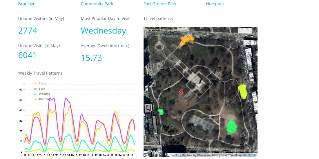
This interactive tool presents more granular information on activity in Fort Greene Park for example:
- There were 2 774 unique visitors and 6 041 total unique visits to the park in May 2017 (captured from this dataset)
- The average dwell time for a visit to Fort Greene park was approximately 15 minutes and 45 seconds
- Wednesday was the most popular day to visit Fort Greene
This method as it is now is imperfect but it is a huge advance and in the not so distant future we will be able to build a model that saves time and money for population count. Traditionally this type of count data would be collected manually resulting in far more subjective estimates that would also deplete resources in terms of time and costs. Urban planners and local city officials may find this information useful when determining future resource allocation to parks across the city.
Ranking Park Performance
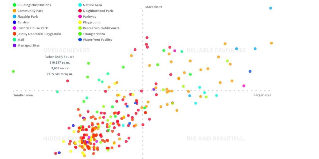
The final section of A Million Walks in the Park is an overview that ranks each park according to a classification designed according to the volume of foot traffic each park received compared to its size.
Although a correlation exists between park size and park area Wenfei discovered that park sizes scale sublinearly to visitor count. In other words every 10-fold increase in park size yielded only an 8-fold increase in the number of visitors which means that some smaller parks are receiving a high volume of visitors than more expansive parks with far less foot traffic.
To reexamine and revise our previous understanding about park size and foot traffic Wenfei devised the following classification system to rank each park.
- Overachievers: smaller parks with more visitors per square foot than other parks
- Reliable Favorites: larger well-known parks drawing many visitors
- Hidden Gems: smaller parks that tend to be neighborhood favorites given the lower volumes of foot traffic
- Big and Beautifuls: expansive areas that tend to be less crowded than Reliable Favorites
What’s meaningful about this presentation of information involves the insights into the use of space throughout New York City.
If you’re looking to find an escape from the wear and tear of the city then some of the Big and Beautiful parks (Spring Creek Park Riverside Park South Fresh Creek Nature Preserve etc.) may be the perfect destination. If you’re looking for more well-known landmarks then you may instead want to check out some Reliable Favorites (Fort Washington Park The Battery Randall’s Island Park etc.).
There’s a lot more to say about A Million Walks in the Park so make sure to visit the page and learn how New Yorkers take a walk in the park!