How Location Data Streams Can Be Used to Fight Against COVID-19


Since the new SARS-CoV-2 coronavirus made its first appearance in China in late 2019 it has kept spreading day by day all over the world; responsible for over a million cases in practically every country causing a global health economic and political crisis whose full consequences are still difficult to be determined.
The spread of COVID-19 is generating a huge disruption in our everyday activities never experienced before in our lifetime with some calling it "a war on an invisible enemy"; forcing us to follow social distancing policies temporarily suspending many business activities and limiting our travel. All of us are now key players in this fight against coronavirus.
In these circumstances the use of Spatial Data Science and location-based data streams is more important than ever. From understanding and predicting the dynamic of the COVID-19 spread over time and space to empowering our administrations with insights and tools to better plan and respond against the dramatic pressure inflicted on our health infrastructure emergency systems and overall economic system; we now have the opportunity to put forward our technology and efforts to serve this global quest and flatten the curve.
In this blogpost we outline some examples to illustrate how spatial data and analytics can become insightful resources to those trying to design monitor and optimize response measures against this global threat.
The Spread of COVID-19 in the US
A lot has changed since the first case of COVID-19 was confirmed in the US in late January and the disease was initially viewed as "a foreign issue". As of writing the US has the most confirmed active cases in the world and a large number of cities and states have imposed strict lockdown measures. As in Europe the spread and impact of the virus varies even between neighbouring regions leaving a degree of hope that in certain areas if social distancing is effective the curve will be flattened before the health system gets saturated.
Using data from our partners Unacast SafeGraph and Dstillery we are able to analyze the relationship between the spread of the virus by county the changes in human mobility in the different regions over time and the level of content people are consuming online related to COVID-19. Online audience data is provided as 1-indexed values at zip code and block group levels (i.e. national average is normalised to 1). Human mobility data originated by millions of GPS signals logged by a variety of mobile applications has been anonymized and aggregated over space and time by the different sources and provided to CARTO as indicators at either county block group and point of interest levels.
In the two maps that follow we have first visualized the average index of coronavirus-related online content audience per county by aggregating data available at zip code level provided by Dstillery; and secondly the average decrease in daily distance travelled by residents in each county using data provided by Unacast.
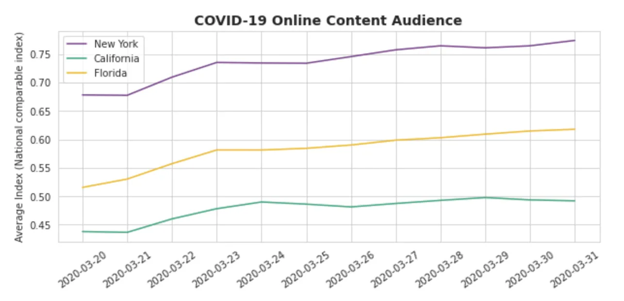
When looking at states with different degrees of coronavirus outbreak we see that the sense of alarm and concern is felt distinctively by their citizens. We can infer this fact by analyzing the online audience data that is based on consumption of COVID-19 related content. In the chart below we have averaged the indices for the different zip codes in the states of New York California and Florida.
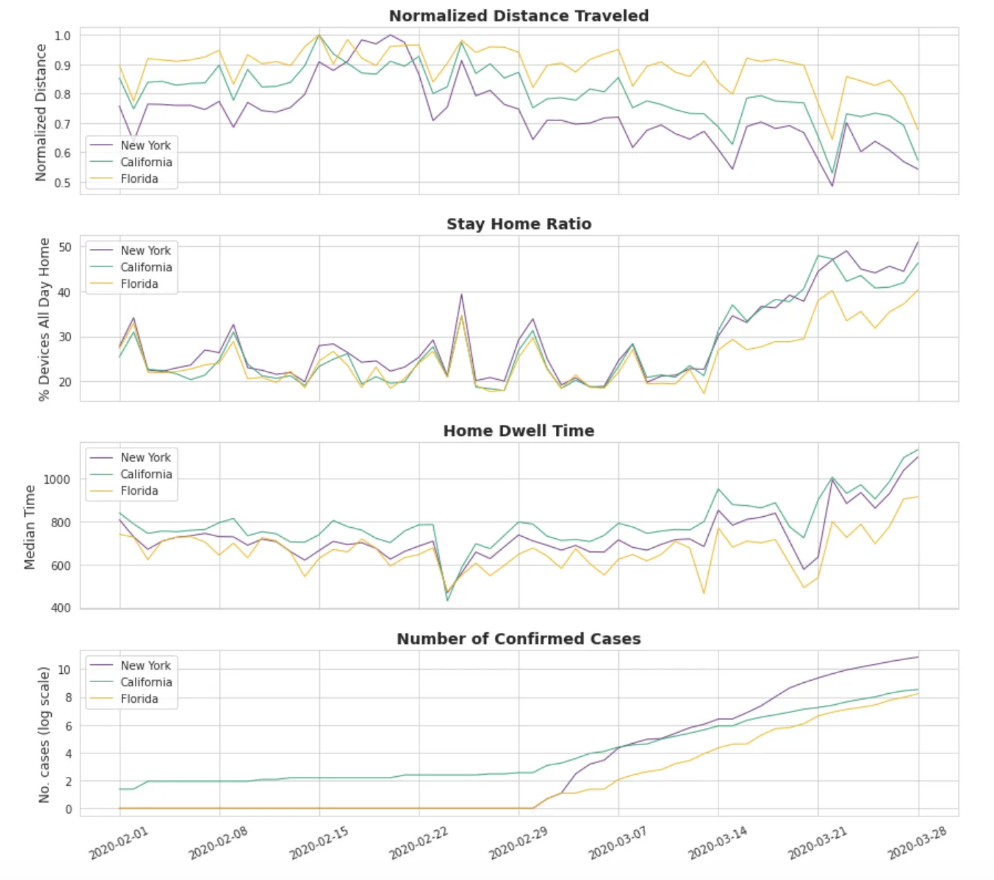
Although one could have potentially expected to see such type of behaviour in the audience data what could be more critical is that similar differences are seen in respect to how social distancing is being followed by citizens in the three different states. By analyzing the human mobility data provided by SafeGraph we can get insights on how the average distance travelled by citizens in each of the three states has been evolving in the last weeks and how in the state of Florida the ratio of people staying at home is still lower than in the other two states.
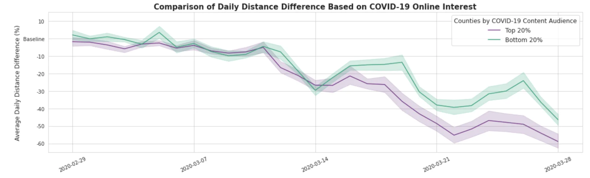
This same evidence is seen when we focus within New York state boundaries; in the 20% counties where Dstillery reports a higher level of online activity consuming COVID-19 related content the decrease in the daily distance travelled measured by Unacast has been higher over the past weeks in comparison to the counties with the 20% lowest online audience index values.
These types of insights can help governments institutions and organizations strengthen their social awareness efforts and resources in specific areas in order to slow down the spread of the virus in the shortest possible time.
Location Intelligence for city emergency management services
With the health infrastructure system facing huge challenges including hospitals at peak capacity and the shortage of ventilators masks and other key sanitary materials the situation in some of our cities is critical. Many of our neighbours are working daily as anonymous heroes in emergency response services doing everything in their capacity to minimise the havoc of this pandemic. Spatial Data Science and location data can also be a tool for them providing insightful information for better planning and optimizing of efforts and resources.
In the city of New York the Metropolitan Transport Authority (MTA) is running an essential service to guarantee that health-care workers first responders and other essential personnel can reach their destinations. However the service at certain times of the day is at least 25% lower than normal. We have processed turnstile data provided by the MTA to analyze which metro stations have a greater risk of overcrowding during different periods of time.
For illustrative purposes and using a very simple model we considered a metro station to be at risk of overcrowding if the volume of travellers measured by the turnstiles is higher than 1000 in periods of 4 hours. If we also identify the metro stations that are closer to hospitals we can add an additional risk factor to the analysis in order to identify those stations with a potential higher volume of healthcare personnel and patients going to and from hospitals.
These are just a few examples regarding how location data streams can be powerful assets in giving a better response against the COVID-19 crisis. CARTO has a team of spatial data scientists and engineers ready to collaborate with governments public institutions and private sector organisations to help overcome this global crisis with the aid of our technology data streams and services.
In need of support to apply Spatial Analysis and Spatial Data Science in the fight against COVID-19?