What space-time analysis tells us about the Paris Olympics
In 2024, it’s estimated that the world will create and consume 120 zettabytes of data. That’s an increase of 1,076% in just 10 years!
A big part of what is driving this is an increase in data velocity, with data being produced at increasing granularity, both in space and time. This is mirrored by organizations demanding ever greater detail in their analysis to drive more informed decision making.
But the question is, how can you effectively turn such a huge amount of space-time data into actually useful insights? That’s exactly what we’ll explore in this blog - including an example of space-time analytics in action where we’ll explore trends in human mobility at the 2024 Olympics!
Events like the Olympics generate an enormous volume of human mobility data. By leveraging scalable space-time data science techniques, we can turn this into valuable insights on how large-scale events influence urban dynamics and public spaces, with important insights on crowd behaviors, venue congestion, and transportation patterns.

Spotlight on the Olympics
Let’s start by exploring space-time trends at one of the top events from the 2024 calendar, the Paris Olympics! We'll explore the unexpected impact of the Olympics on existing tourist attractions, public transportation, and sports venues, as well as cross-visitation patterns between different events.
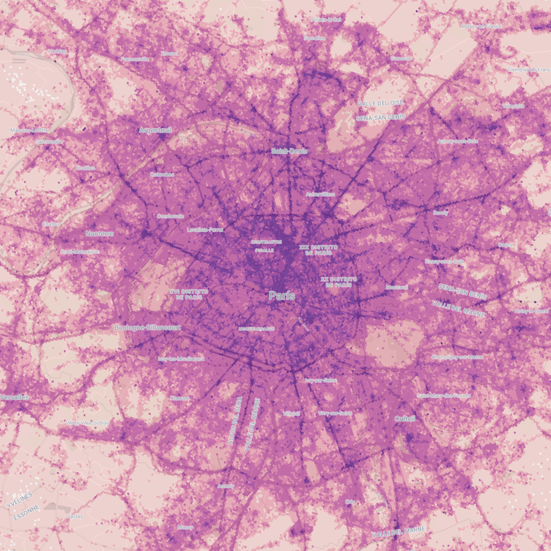
For this analysis, our data partners Unacast have provided us with a sample of anonymized mobility data, which have been aggregated to a H3 Spatial Index grid. You can explore this on the map below (open in full screen here), which shows the daily count of unique devices per cell in the 2024 summer period.
Here are 5 things we learned from exploring the space-time patterns in this data - keep reading to learn more about how you can replicate this analysis!
1 Hyper-local congestion
The spatio-temporal granularity of this data allows us to extract insights at an incredibly detailed level.
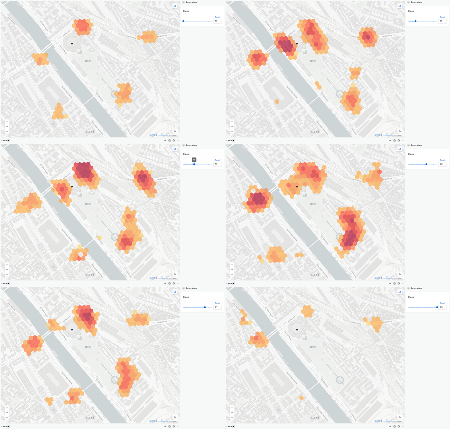
For example, the map below displays hourly footfall data around the Bercy Arena just before the men's basketball gold medal game. The map clearly shows increased foot traffic on nearby bridges and at intersections in the hours leading up to the event. It also reveals a high concentration of people gathering at the venue's entrance right before the match begins.
This type of information can be extremely valuable for transportation planners and crowd management teams when preparing for similar large-scale events.
2 Venue Proximity dictates activity
Using the complete sports events schedule, we could identify how mobility patterns differed depending on whether people attended the Games and people that did not.
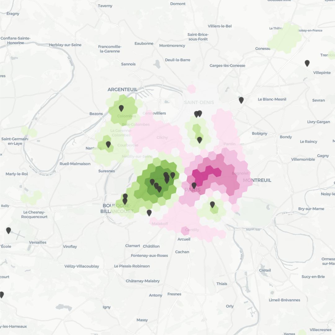
The map below (open in full screen here) shows the differing patterns of Olympics attendees and non-attendees. Green areas signify a stronger hotspot for activity from Olympics attendees. You can really see how this reflects the geography of the venues, with the strongest cluster being located to the west of the city around the Eiffel Tower Stadium. Champ de Mars Arena and the Trocadéro.
On the other hand, pink areas show greater activity amongst non-Olympics attendees. Clusters for this group can be found to the east of the center, such as around Le Marais and Belleville.
Some other key insights from this analysis include:
- Olympic attendees were more likely to stay near event venues, while non-attendees followed typical tourist or local movement patterns.
- Interestingly, some neighborhoods that were unrelated to the games experienced lower activity due to restricted access, while areas closer to the Olympic Village and Saint-Denis saw more concentrated gatherings.
Identifying these patterns can guide city planners in preparing for crowd control, ensuring accommodations are in place for attendees, and considering the broader impact on local businesses and communities.
3 Tourist Sites Experienced a Shift in Visitor Dynamics
Some of Paris’ iconic tourist destinations experienced a surprising shift in the period leading up to the games.
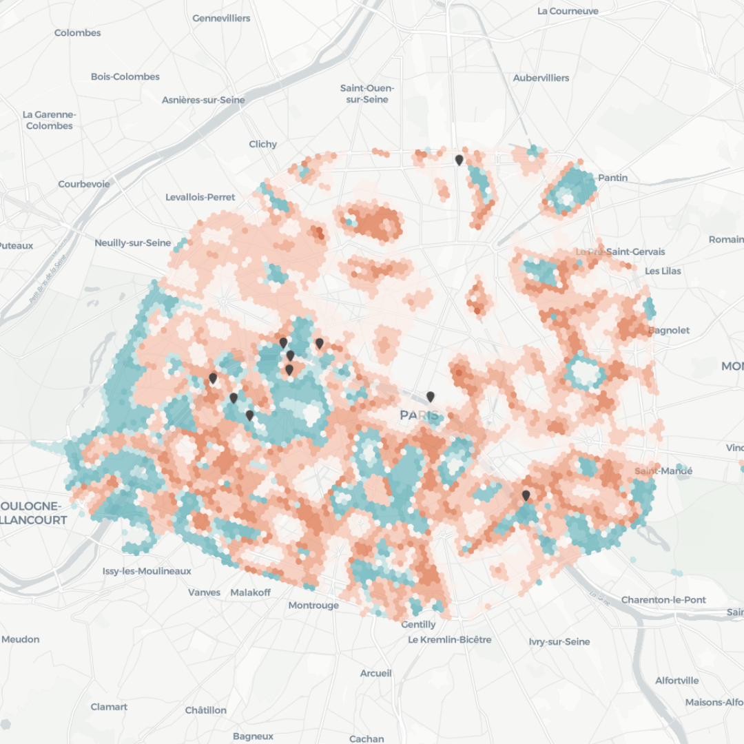
Venues like Champ de Mars and the Eiffel Tower, typically hotspots for tourists, were being used as sport venues for the Games and showed a reduced hotspot frequency. This means that they are more likely to be a hotspot outside of the Olympics period. At the same time, spots like Île de la Cité and specific Seine riverbanks saw increased hot spots due to mobility restrictions being lifted.
You can explore what this means on the map below (open in full screen here). Red areas indicate that the frequency of an area being considered a hotspot has increased during the Olympics games, while turquoise areas indicate that the frequency has decreased.
This analysis demonstrates how large-scale events like the Olympics can influence urban tourism, drawing attention away from typical tourist sites and toward novel locations. As we can see in the map above, even in some typically touristic parts of the city, the frequency of becoming a hot spot was increased, indicating that these parts of the city were even more crowded than in 2023.
4 Cross-Event Attendance Patterns: Shared Audiences Between Sports
Since we can trace a single device through different sports events, we can also check its cross-visitation patterns and infer association rules between events. Analysis of this data has shown strong correlations between attendance at different events, with several sports drawing similar crowds. Some top trends include:
- Around one-third of people who attended the Cycling BMX events also attended 3×3 Basketball at some point.
- One-fourth of Triathlon spectators also attended an Archery event.
- Breaking and 3×3 Basketball fans were 15 times more likely to also attend Skateboarding.
These attendance patterns highlight how closely related sports attract shared fan bases, providing organizers with opportunities to optimize scheduling and venue layouts to enhance fan experiences.
5 The Role of Transportation Hubs as Key Mobility Hotspots
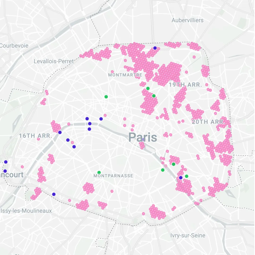
As the Olympic Games approached, mobility data has revealed an increase in activity around major train stations and public transportation hubs in Paris.
The below map shows how train stations (green points) became vital connectors, drawing in large crowds traveling between events and across the city. The pink areas are “strengthening hotspots;” clusters of high levels of human activity, which is increasing over time.
Sport venues like Trocadéro and the Bercy Arena (dark blue points) also exhibited increasing mobility patterns as the games progressed, including some unrelated to the Games like the Parc Omnisports Suzanne-Lenglen. This highlights the importance of public transport and its capacity to support the large influx of people during major events, suggesting that future planning should prioritize transportation infrastructure.
Space-time analytics with CARTO
Looking to turn your space-time data into actionable insights? You’re in the right place, as we’re excited to announce that our space-time analysis tools are now available as part of CARTO Workflows! This means you can now extract insights from your data without even a line of code! So, what tools are at your disposal?

- Space-time Getis-Ord: identify space-time hotspots and coldspots in your data, and how they change through time. Learn more in this guide.
- Spacetime hotspots classification: automatically classify locations as hotspots or coldspots based on patterns of clustering and intensity trends. Whether it’s identifying where a retail area is losing popularity or where environmental conditions are intensifying over time, this function enables users to detect and categorize emerging trends such as incipient, declining or fluctuating hotspots.
- Time-series clustering: uncover deep insights about clusters in your space-time data. This could be clustering by the proximity of their values over time (e.g., similar temperature readings across locations) or by patterns of change (e.g., locations where foot traffic rises and falls in tandem).
Learn more about these tools in the statistics module of your data warehouse’s Analytics Toolbox.
And what about the data? With CARTO, you can subscribe to various human mobility datasets via our Data Observatory - directly through your cloud data warehouse! Data available includes Unacast’s Activity dataset (which contains data on the number of people spending time in an area, segmented by resident type and origin) or the Home and Work dataset (that segments the footfall of each cell in residents and workers of an area).
Conclusion
As we’ve seen from this deep dive into space-time analytics during the 2024 Paris Olympics, understanding human mobility patterns at such large-scale events can provide critical insights for city planners, event organizers, and businesses alike. From optimizing transportation to planning security resources, space-time data reveals key trends that can inform smarter, more efficient decision-making.
If you're interested in harnessing these powerful tools to turn your own space-time data into actionable insights, why not see it in action? Request a demo with CARTO today and discover how our no-code workflows can revolutionize your approach to spatial analysis!


