Time based map visualizations unveil new patterns and insights


Over the past months you have probably come to realize we love data that moves. Moving data can make your maps and visualizations really come to life and data you can use to build these visualizations can come in a lot of forms. Whether it's data that crawls and zips across a map through time data that bursts and comes to life as you watch or data that changes form or intensity it all can lead not to some really amazing visualizations.
Seeing data come to life on your computer screen is more than just fireworks that people find pretty. Showing data move on maps isn’t new but we have really been trying to push new research into how to effectively display dynamic data on interactive maps. Seeing and also interacting with data that changes through time can be incredibly useful for gaining insights into your data and communicating those insights to a broader audience. The application of these visualizations can be anywhere from business intelligence to smart grid development to conservation planning.
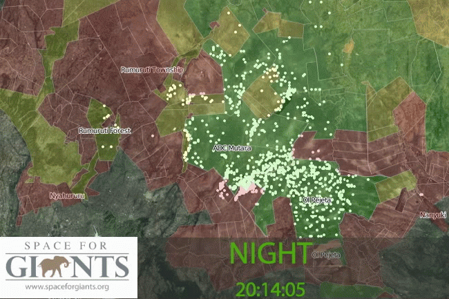
That is why we were particularly excited to see a recent visualization from Jeffery Stephens and Space for Giants. Jeffery used Torque and CartoDB to start looking at how elephants moved across the landscape. In particular these elephants have a bad habit of crossing a fence from protected areas into nearby farming areas. It is a bad habit that can lead to really bad consequences and fixing it requires understanding how and where it is happening and organizing a multifaceted solution. To help share the issue with colleagues collaborators and others they put together a really unique visualization of the elephants moving across the landscape.
In the visualization above (click the image to see the live map) a year's worth of elephant movement was reduced into a single day. Next the data was mapped over a 24-hour clock showing the dominant patterns of where and when the elephants were crossing the fence. We absolutely love this map and hope it can help the wonderful work of Space for Giants. We weren’t alone there was a really nice write-up in O’Reilly the other day too.If you want to try your hand at similar visualizations take a look at our Torque library available on GitHub. We are still working hard to incorporate this directly into the CartoDB user-interface but in the meantime you can fairly quickly get a look at your dynamic data using the sandbox tool. We would love to see any interesting visualizations you come up with!