24 of the best maps, visualizations & analysis from 2024
Forget your advent calendar, we have the real count-down treat that everyone has been waiting for!
In this annual round-up, we’re excited to share 24 of the best maps, visualizations, and analyses from 2024. This year, geospatial analysis has evolved, with more user-centric tools empowering end users to explore insights independently. As data grows bigger and faster, experts can focus on more advanced analytics, enabling smarter, faster decision-making at an unprecedented scale.
Want to try recreating some of these amazing maps? We’ve added links to tutorials throughout - and you can sign up for a free 14-day trial here!
Part 1: Bigger, faster data
With the increasing adoption of scalable data and rendering formats such as Spatial Indexes and dynamic tiles, spatial data users are tackling datasets at unprecedented scales. Meanwhile, the increasing availability and interoperability of real-time APIs means data isn’t just getting bigger - it’s getting faster too.
This section highlights some of our favorite maps from the year that demonstrate how to turn truly massive data into clear insights.
01 Climate risk levels across Texas
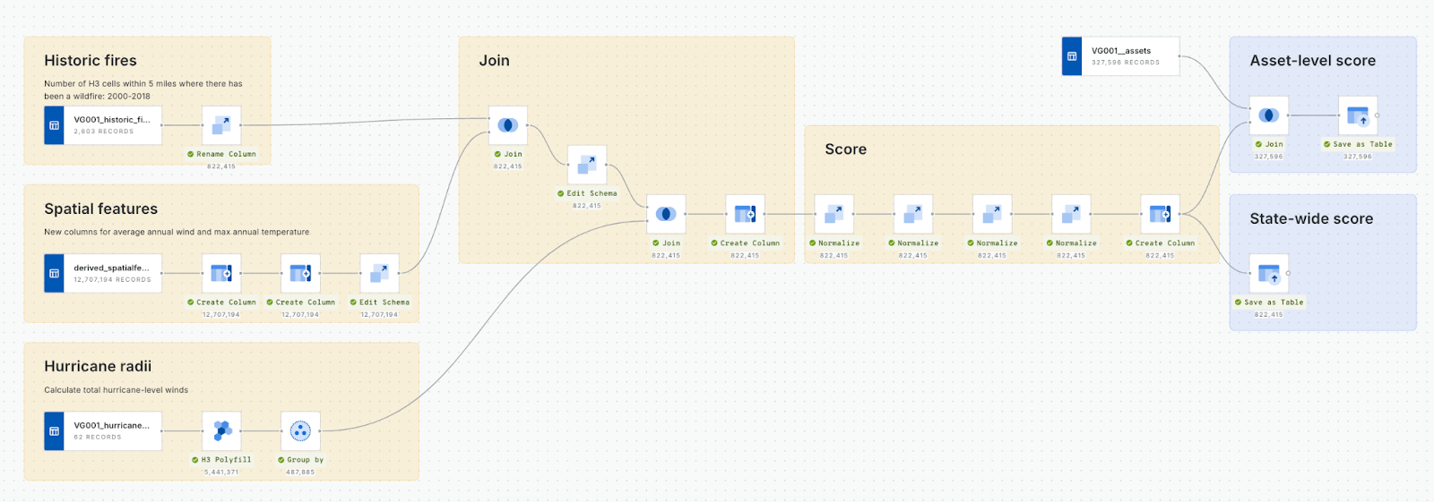
This map leverages large-scale spatial data to calculate a climate risk score with the workflow below, using data sources like NOAA hurricane paths and historic fire boundaries. Users can easily access both state and asset-level insights for pricing, underwriting, and fraud detection.
Learn more about how you can leverage Location Intelligence at scale for risk analysis here.
02 Private hire trips in NYC
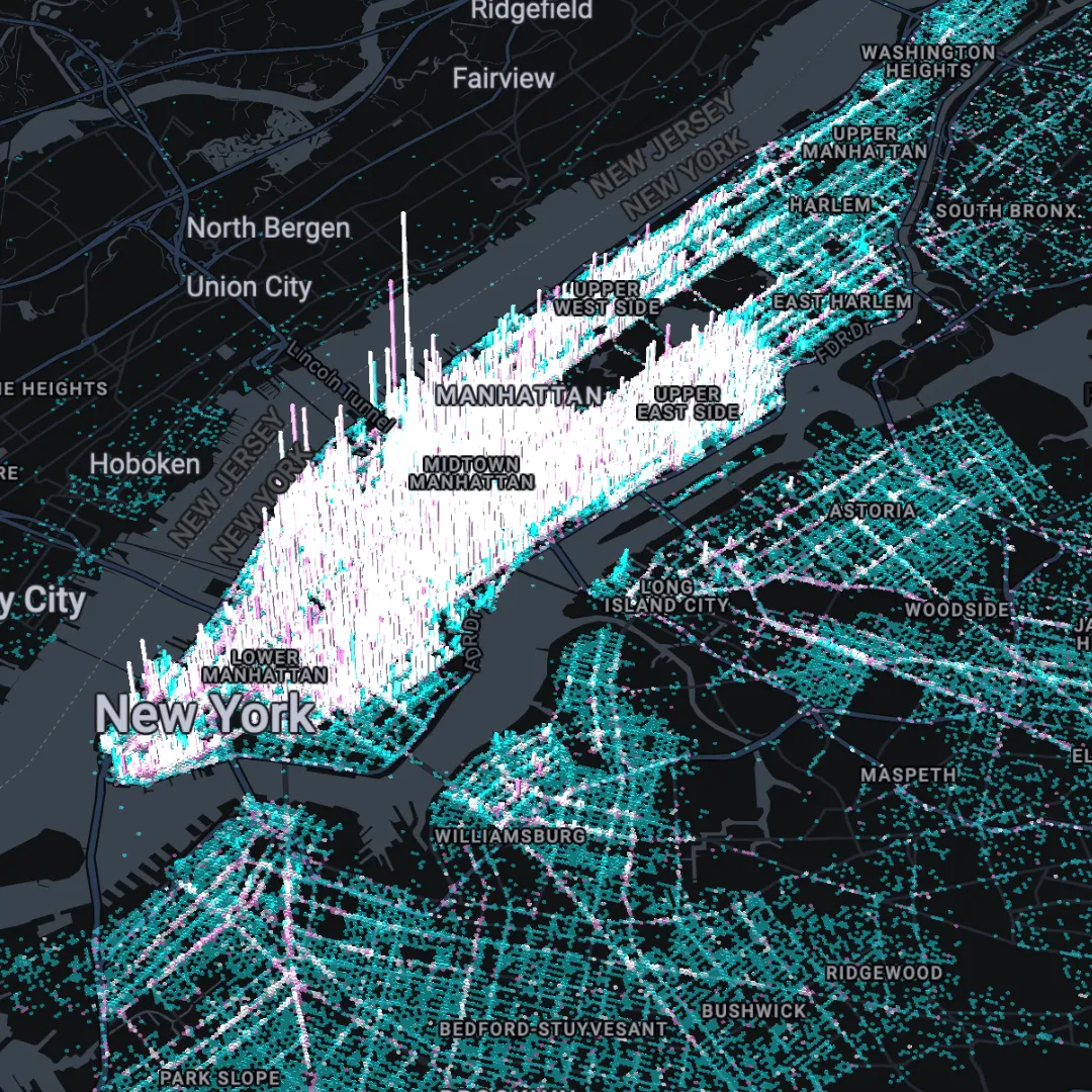
This map uses granular time-based data to reveal trends in taxi activity. Users can filter data by time of day or week using SQL Parameters to identify patterns, such as nighttime trends, with street-level precision.
By using user-controlled SQL Parameters to filter data by time period, users can identify key patterns with street-level precision.
Watch this map being created in our webinar Visualizing Massive Data: 5 Tips for Impactful Maps & Dashboards.
03 Heatmap of US Earthquakes
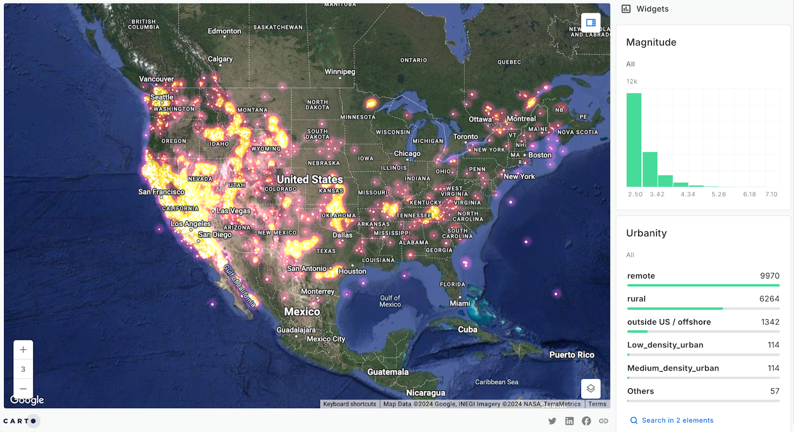
This heatmap shows the density of earthquakes across the US, along with a series of dynamic widgets which allow you to explore earthquake magnitude, urbanity - and more!
Heatmap symbology for large datasets is new to CARTO in 2024! Check out our guide to leveraging heatmaps for high-impact data visualizations here!
04 Flood risk across Harris County, Texas
This map shows flood risk across Harris County, Texas, built using data from CARTO’s new partner, Fathom. Higher flood risks (indicated by darker pink) are found along the coast and near rivers. As you zoom in, detailed insights are available at the building level, such as along the Buffalo Bayou.
Check out this tutorial to learn how to recreate this analysis yourself!
05 Mapping human mobility
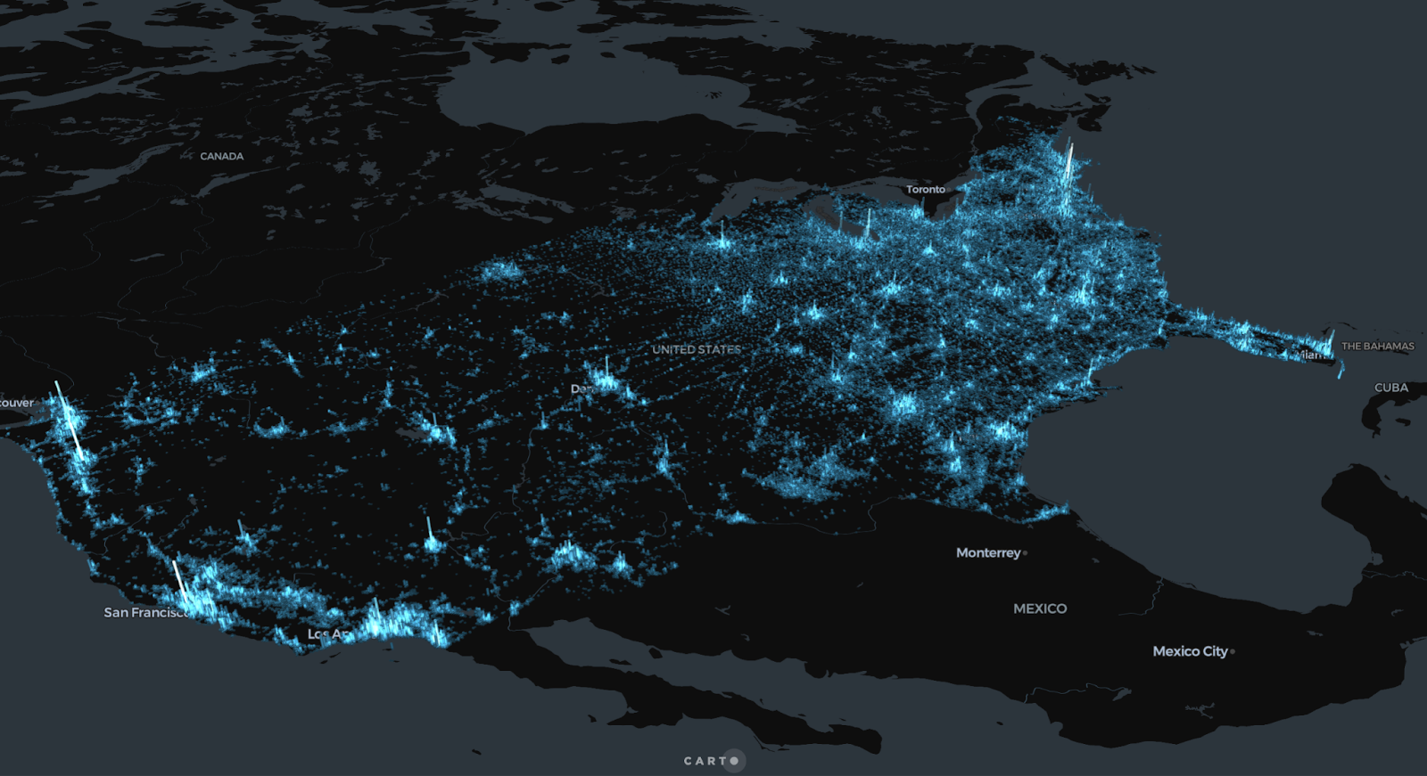
This map features our new Human Activity Index, part of the latest global Spatial Features dataset. It combines data from population, points of interest, telecom towers, and nighttime lights to provide a comprehensive measure of human activity.
You can subscribe to this data via our cloud-native Data Observatory - no complex ETL needed! Learn more here.
06 Understanding broadband access
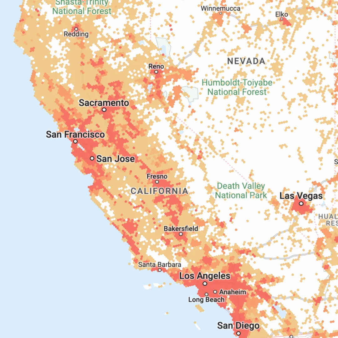
In August we were thrilled to announce Federal Communications Commission (FCC) data as a free data subscription - directly from CARTO! This U.S.-wide dataset provides detailed insights into broadband and mobile availability, speeds, providers, technology types - and more!
Learn more about this data source and how to access it here.
07 Tracking ship movements at an enormous scale
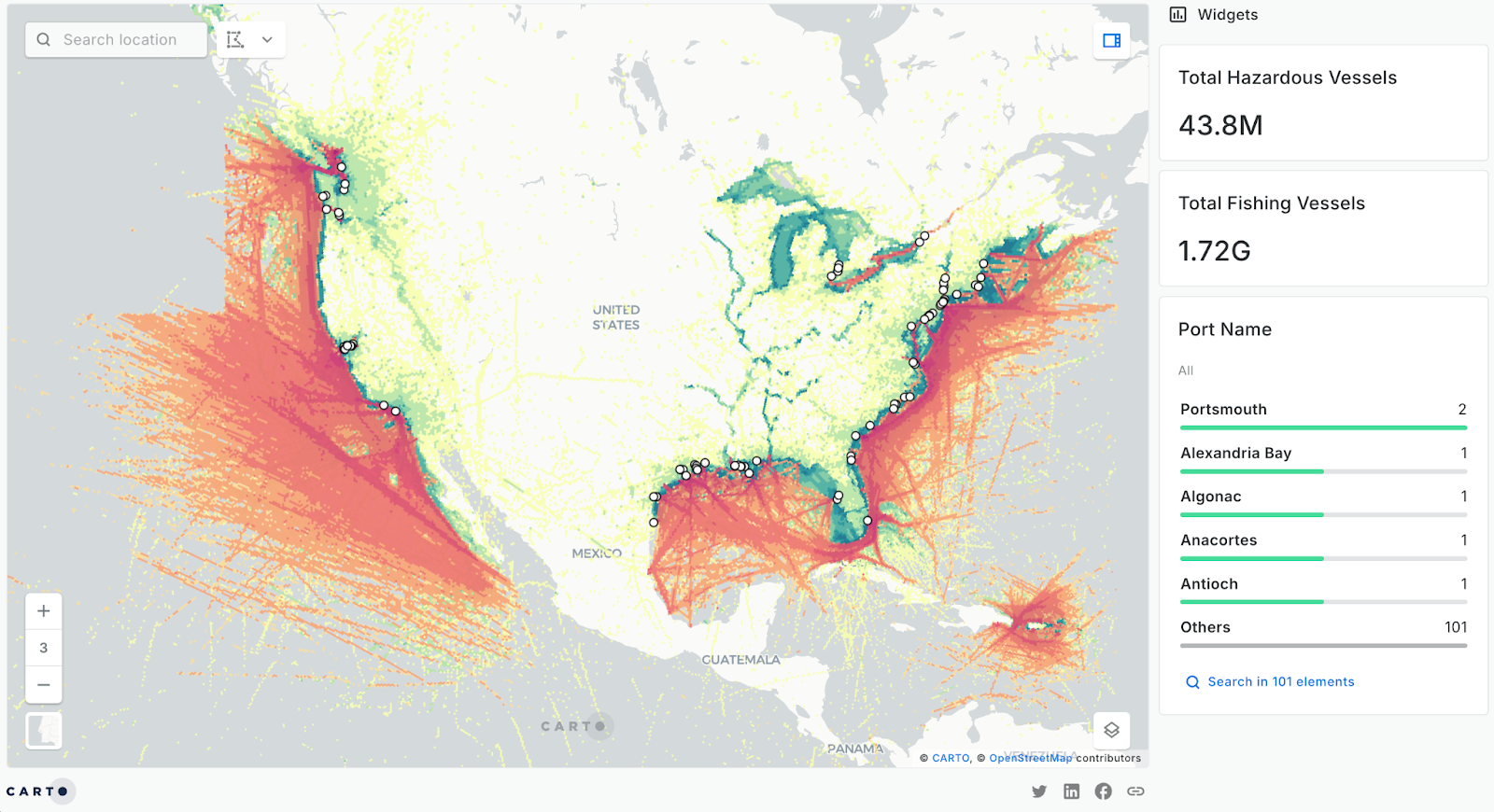
Now this is REALLY big data! Leveraging the lightweight Spatial Index grid H3, this map shows the distribution of both hazardous and fishing vessels at an enormous scale (hint: try zooming in and notice how the data resolution changes!).
Learn how to use Spatial Indexes for massive data analysis and visualization with our free ebook - Spatial Indexes 101!
08 Real-time air quality analysis
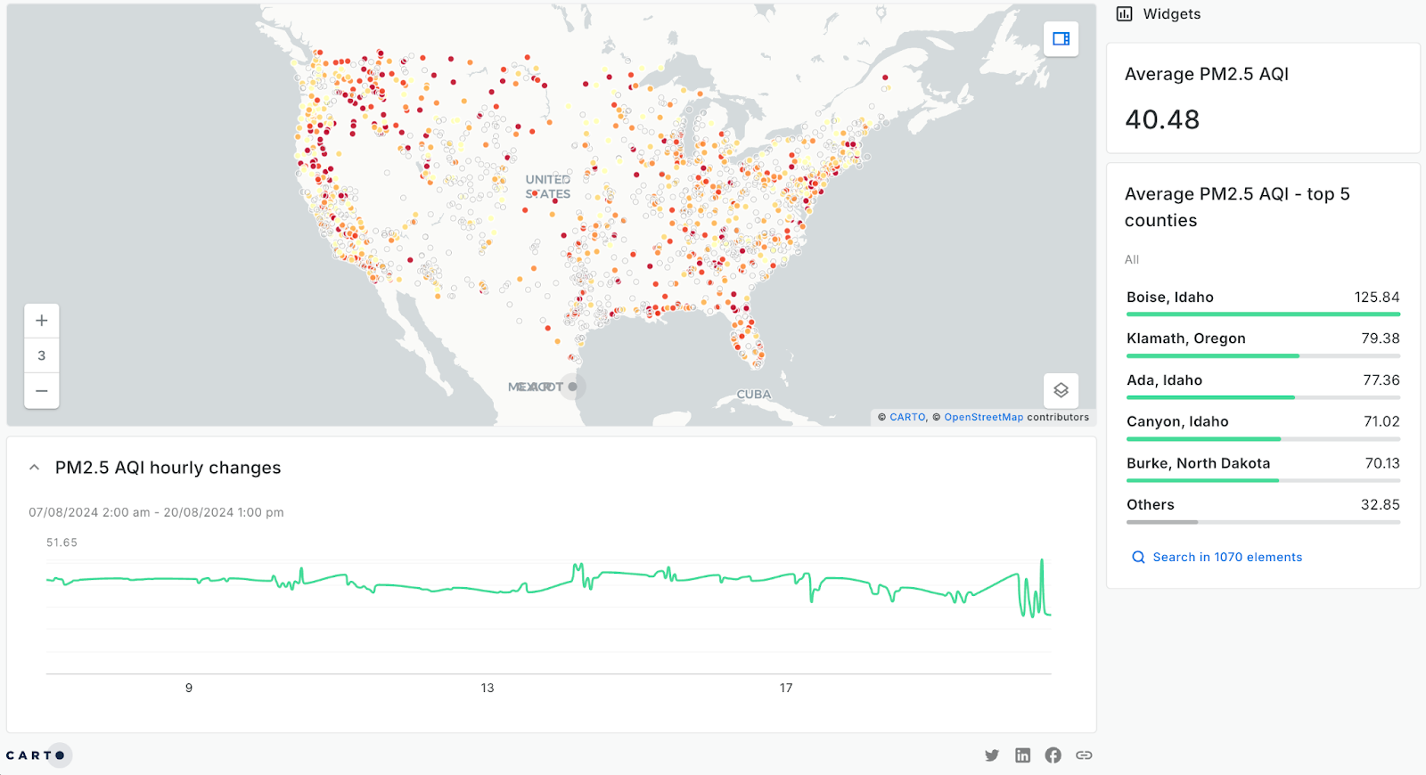
In our upcoming report Spatial Analysis in 2025: Key trends and predictions, we predict that 2025 will see real-time analytics become the new standard. This will be driven by ever-easier integrations with tools like CARTO Workflows, our low-code solution for automating complex spatial analysis.
Check out our tutorial to learn how to recreate the above map, which depicts changes to air quality over time using a real-time API.
09 Parking availability analysis
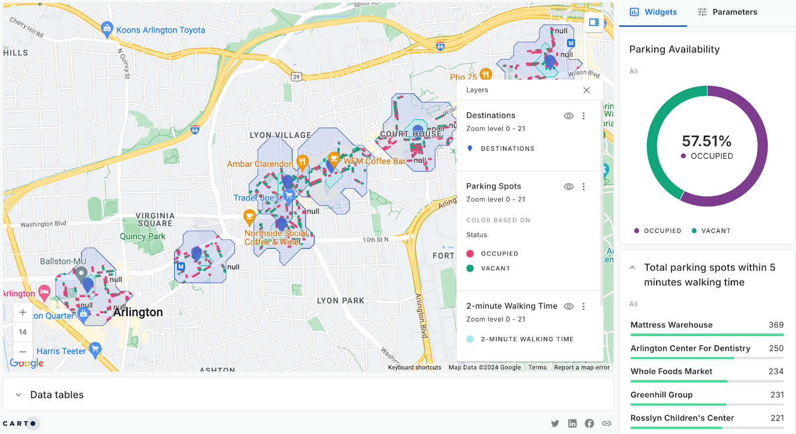
Real-time APIs are having a transformative impact on the world of spatial analysis. This CARTO Builder map is integrated with a live API feed detailing the availability of over 4,000 parking spaces. This information is overlaid with walk-time isolines from key destinations, resulting in a user-friendly, interactive map for smarter navigation.
10 Real-time flood risk
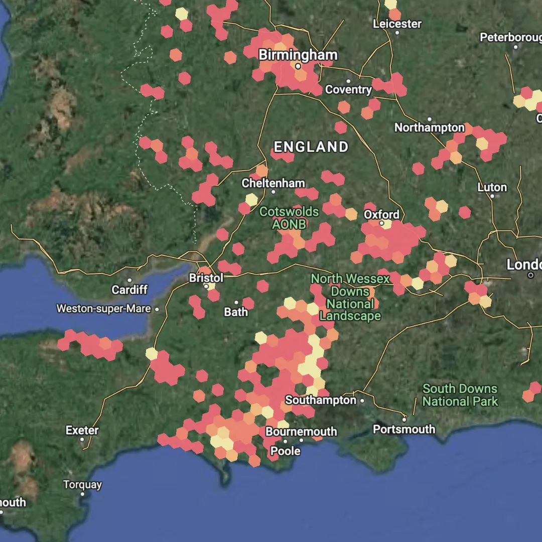
Still on the theme of real-time analysis, this map shows properties at risk of flooding across England, based on real-time data from the Environment Agency Flood Alert API. The analysis updates daily*, sending an automated email report and map detailing at-risk properties.
Follow this tutorial to replicate this analysis and learn how to leverage real-time data.
*Note this analysis was frozen on the 6th December 2024.
Part 2: Breaking the GIS silo
In 2024, spatial analysis is becoming more accessible than ever before. Tools that once required specialized training are now available to users with little to no GIS or coding experience. This section of our 2024 round-up highlights how no-code platforms and user-driven interfaces are empowering a broader audience to explore, visualize, and act on geospatial insights.
11 The impact of hurricanes on ports
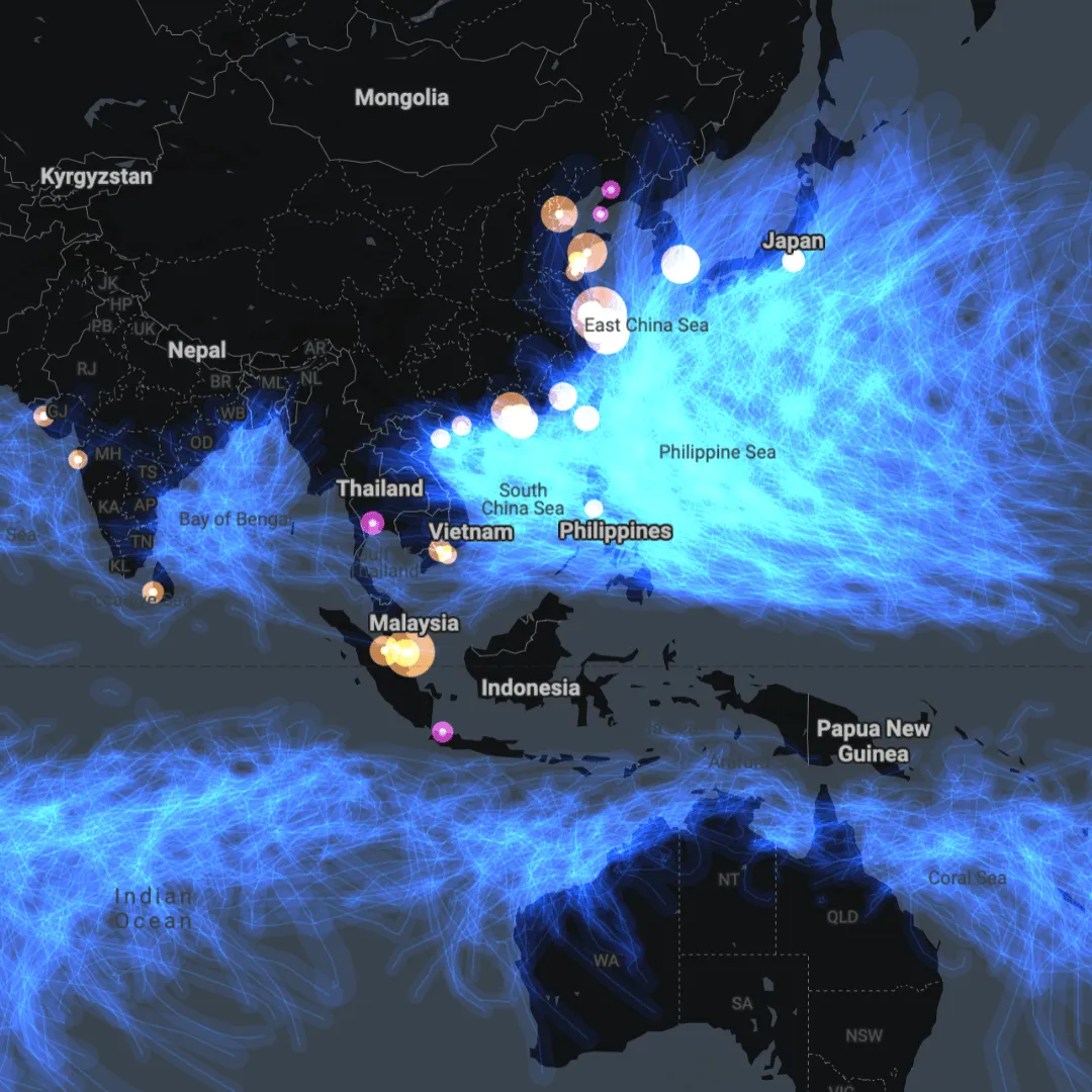
This stunning dashboard allows users to explore the impact of hurricane events on the global port network. By using the Parameters tab, users can adjust values like year and hurricane category, which dynamically update the SQL query driving the map, the ultimate in self-serve analytics!
Learn how to use SQL Parameters in your maps here.
12 User-driven isolines
Here’s another example of SQL Parameters in action! Pre-generated drive-time catchments for California airports have been enriched with demographic data, with the CARTO Builder map set up to give the impression that the end-user is generating these catchments on-the-fly, tailoring it to their needs.
13 Explaining wildfire risk with LLMs

We’ve all been there. Having spent hours developing a really sophisticated model, you’ve sent it to your client and they say, “Great, but what does 0.789651 actually mean?” This is one of the areas where GenAI is set to make a huge difference in analytics & data science; making results meaningful. In this demo, Snowflake Cortex LLM has been employed to explain wildfire risk in a user-friendly way.
Learn more about how this analysis was created here.
14 GenAI for communicating network prioritization
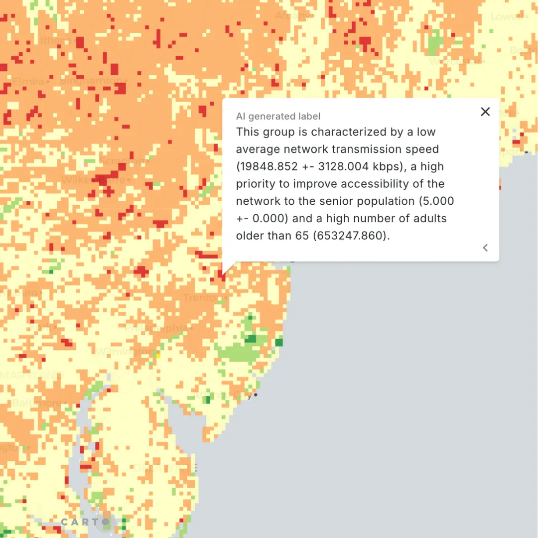
AI remains the hottest of topics in geo - so let’s check out another example!
This map is based on the workflow below, which uses a regression-based eligibility model to generate a priority score for telecom service investments. Instead of just presenting numbers, AI has been used to help stakeholders interpret the results and make informed, strategic decisions.
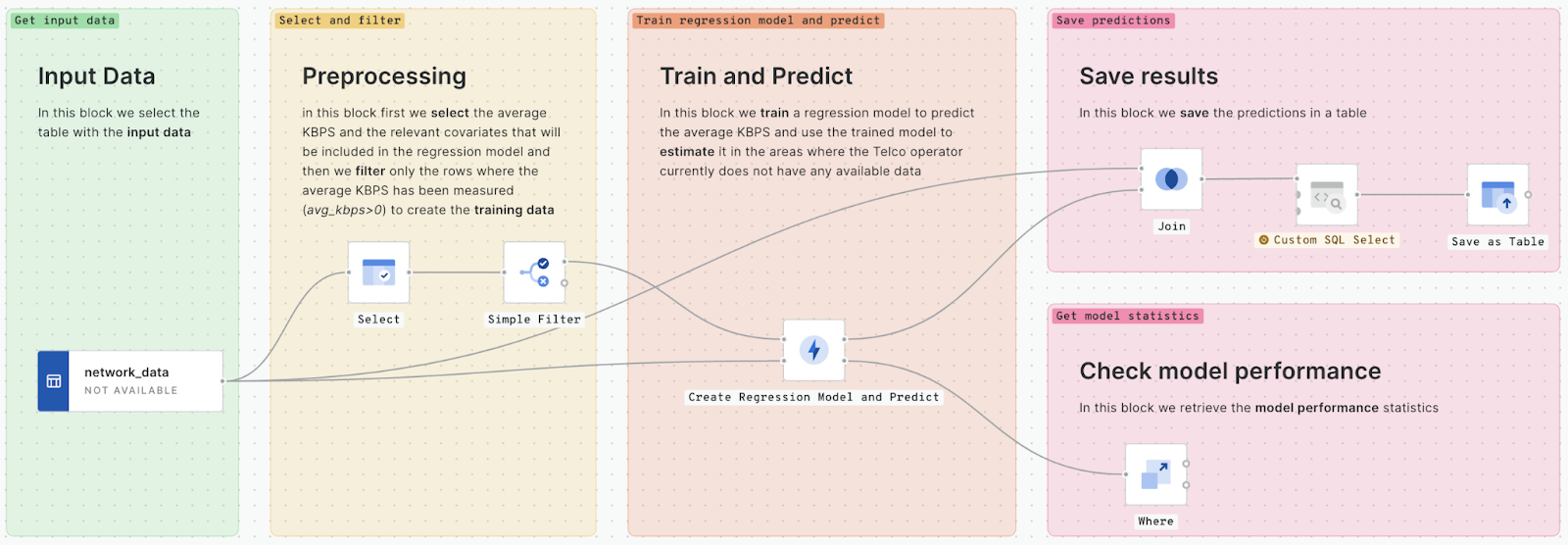
Watch our webinar Location Intelligence for Improving Network Access for Senior Citizens to learn more about this approach.
15 Automating network investment
This video - featured in the Spatial Data Science Conference (SDSC) keynote - helps users to identify areas for telecom infrastructure investment using performance metrics and demographics. The user can “co-pilot” the map with CARTO AI Agents by asking questions like "Which area should I prioritize for network upgrades?" or "Focus on New York State" - and receive actionable insights.
Did you miss out on SDSC? You can watch all of the talks on-demand here.
16 3D arc diagrams
This deck.gl map leverages 3D arc diagrams to visualize connections between points. By building interactive visualization elements like this into your maps, you can make them so much more engaging and customizable - key to stakeholder buy-in (as well as your productivity!).
Learn more about building seamless custom visualizations with deck.gl and CARTO here.
17 The Original GIS - remixed!
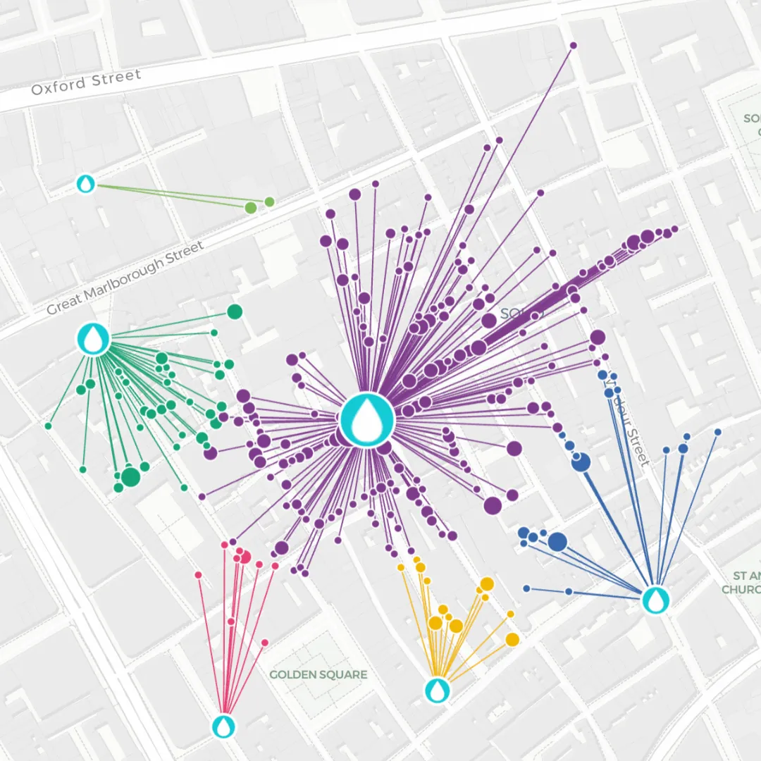
If you work in spatial analysis, you’ve probably heard of John Snow - and if you haven’t, you might be wondering why we’re referencing a character from Game of Thrones. Well the OTHER John Snow was a 19th century physician who used spatial analysis to link water contamination to a cholera outbreak in Soho, London. We’ve recreated this analysis using CARTO Builder, bringing Snow’s groundbreaking work to the 21st century
Part 3: Advanced analytics
While spatial analysis may be becoming more democratic to end-users, experts are continuing to push the boundaries with ever-more advanced and sophisticated algorithms for the most intelligent decision-making. In this final section of our 2024 round-up, get inspired by the possibilities of advanced spatial analytics.
18 Mobility hotspots at the Paris Olympics
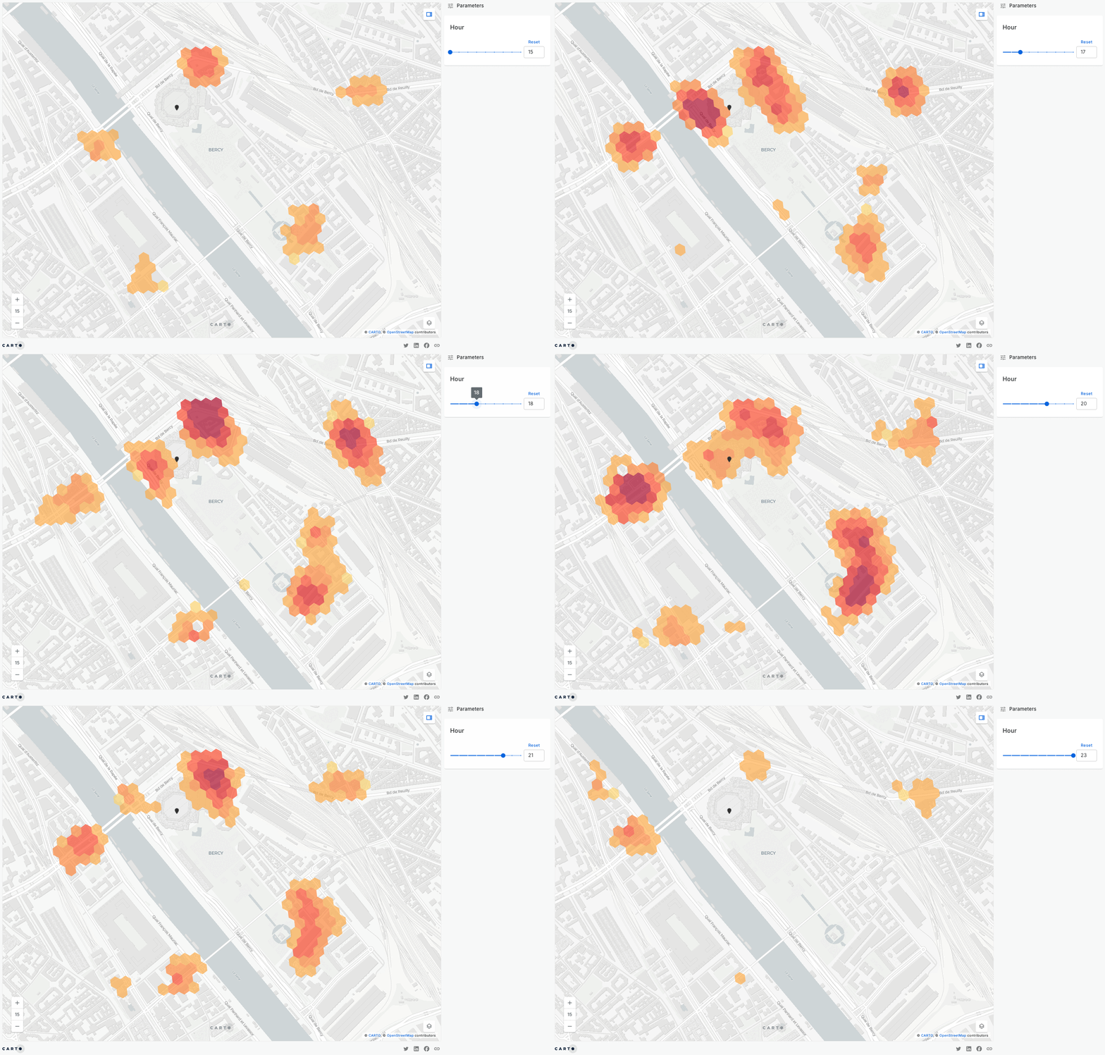
To mark the 2024 Paris Olympics, we used our new no-code space-time analysis tools to uncover human mobility patterns around key venues. This analysis revealed hyper-local congestion near places like the Bercy Arena, highway intersections and key bridges, offering valuable insights for transportation planning and crowd management.
Check out our blog for more insights from this research and a guide to how you can leverage space-time analytics to transform vast datasets into actionable insights.
19 Fleet optimization analysis
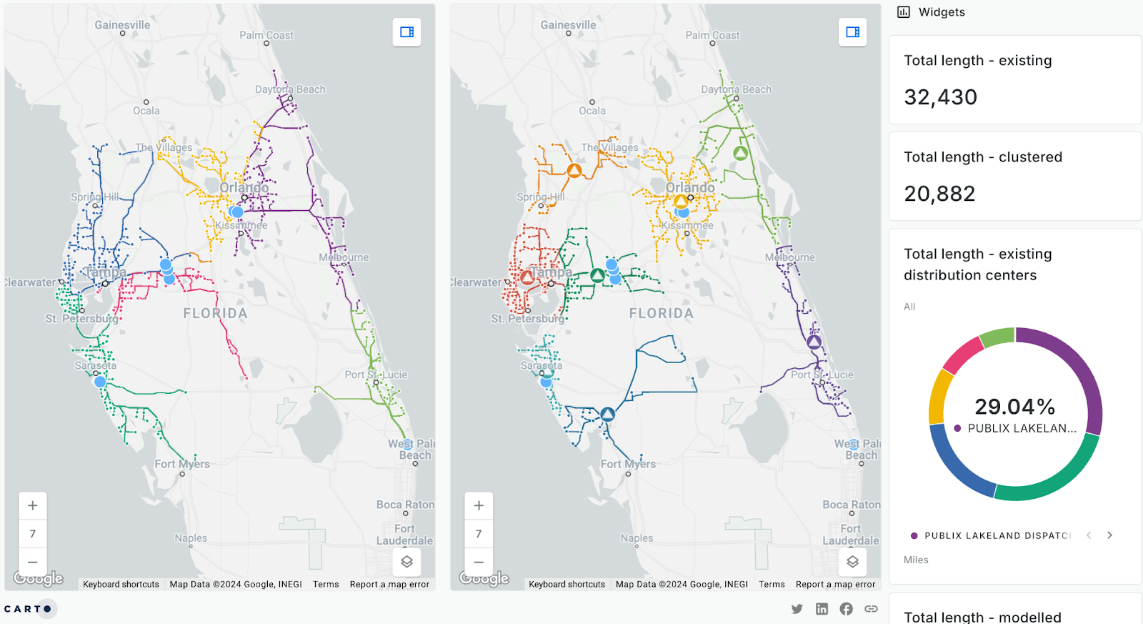
Fleet optimization is a challenging type of spatial analysis, requiring a balance of efficiency, cost, and sustainability. We used our route optimization and K-Means clustering tool to identify inefficiencies in Publix’s supply chain. Our hypothetically optimized network could reduce 12,000 miles per restocking cycle, cutting costs, carbon emissions, and reliance on key centers.
Explore our full supply chain analysis guide here!
20 Cell tower propagation
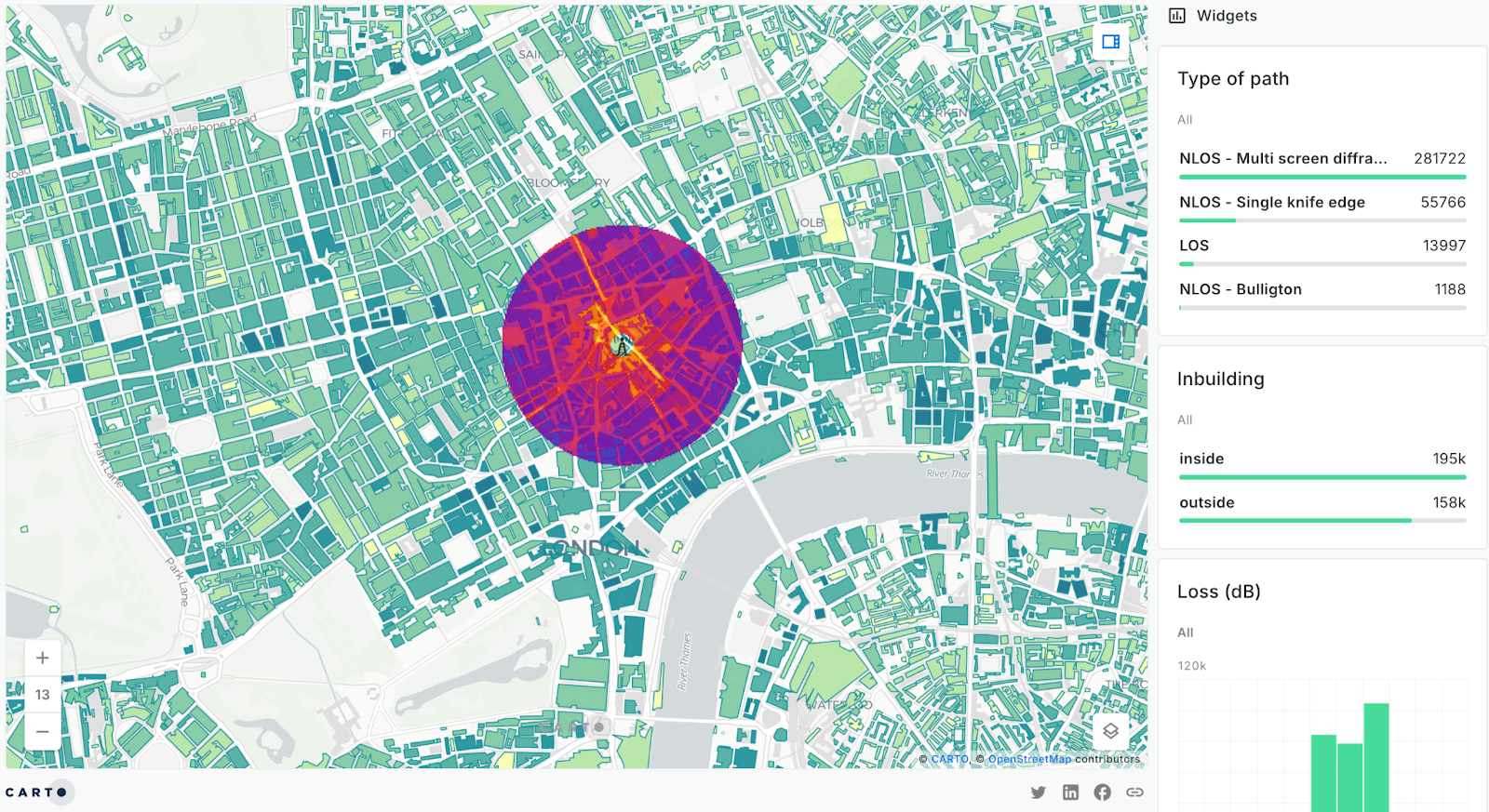
This map displays the output of a telecom propagation model in London, highlighting signal path loss and coverage. Telecoms can use this analysis to optimize infrastructure, improve service quality, and plan for expansion.
Check out our blog 10 Examples of Spatial Data & Visualizations for Telecom Analytics for more examples like this.
21 Raw data vs hotspots
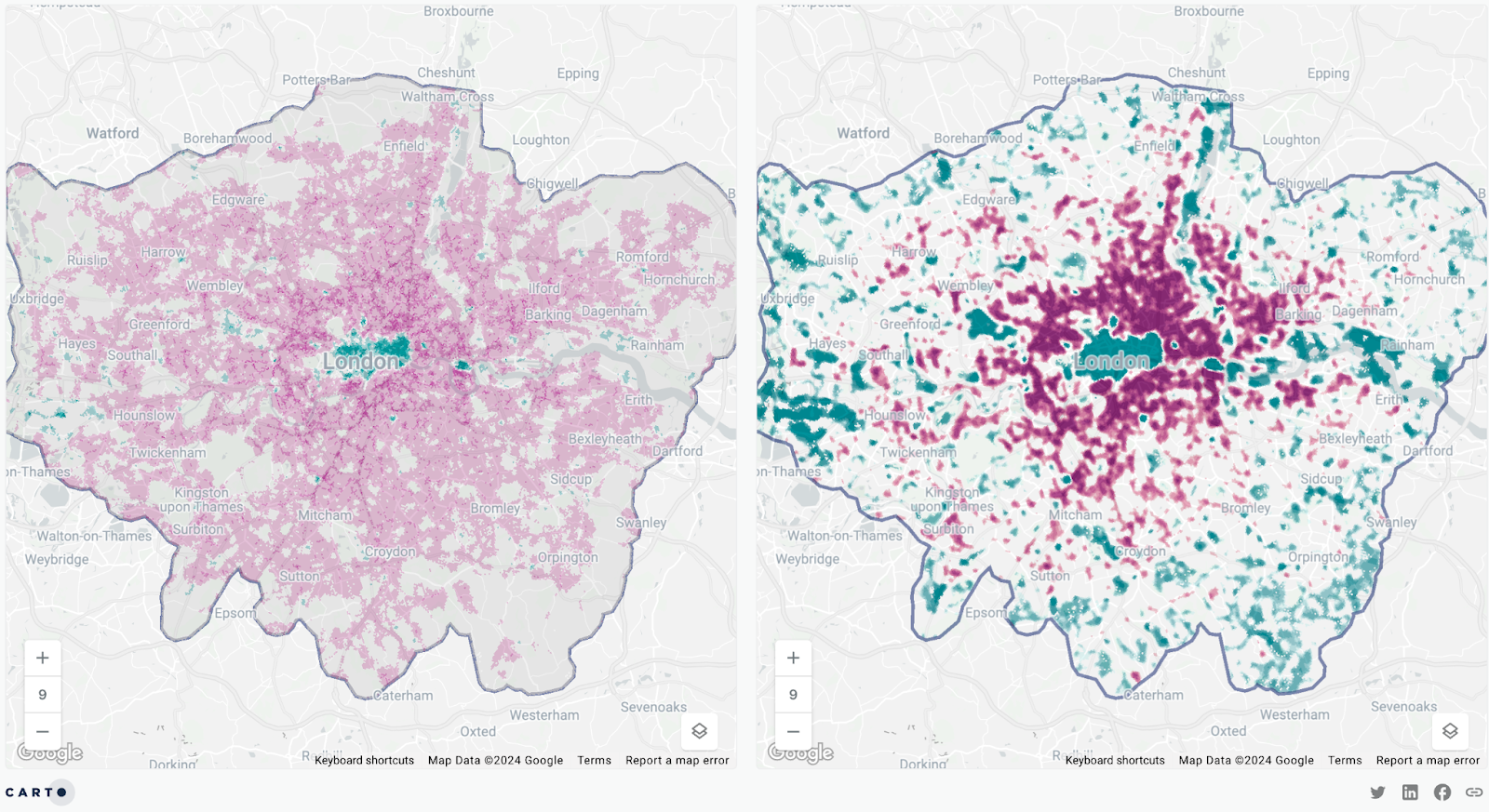
Advanced spatial analysis techniques, like hotspot analysis, transform raw location data into clear patterns and trends - making it far easier to derive actionable insights.
This map is a fantastic example of what this looks like; leveraging human mobility data from our new data partner BT Active Intelligence, this map shows hotspots of footfall differences between workers and residents in Greater London. This reveals clear patterns, such as high worker activity in Central London and industrial hubs, and high residential activity in suburban areas.
New to spatial statistics? Our on-demand webinar Decision Making With Spatial Statistics: 5 Top Techniques is a great place to start!
22 Geographic segmentation: Wanderlust
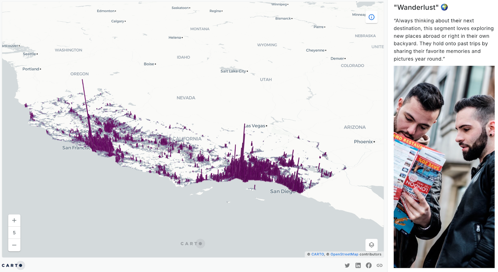
Looking for deeper insights beyond basic demographics? Try Geographic Segmentation—analyzing not just who people are, but their behaviors, opinions, and interests. This map uses our partner Spatial.ai’s Proximity dataset to score areas based on shared social media experiences. In this map, you can explore the “Wanderlust” segment which highlights those passionate about exploring new places and sharing travel memories.
Check out our blog Geographic Segmentation: How to get started for tips, tricks and best practice for employing this hugely valuable analysis.
23 London’s coffee affinity
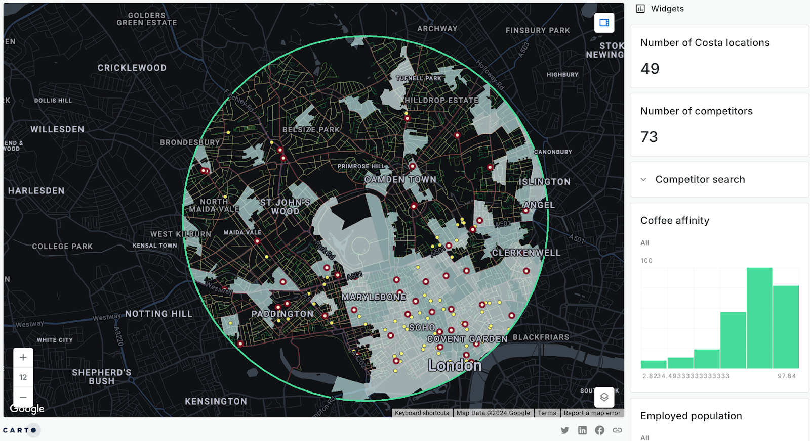
While we’re on the subject of geographic segmentation, this example maps out the “Coffee affinity” segment alongside the locations of various coffee shop brands, helping businesses identify optimal store locations and target marketing strategies to areas with high interest in their products.
Learn more about using spatial analysis for more intelligent Site Selection here.
24 Solar panel suitability analytics
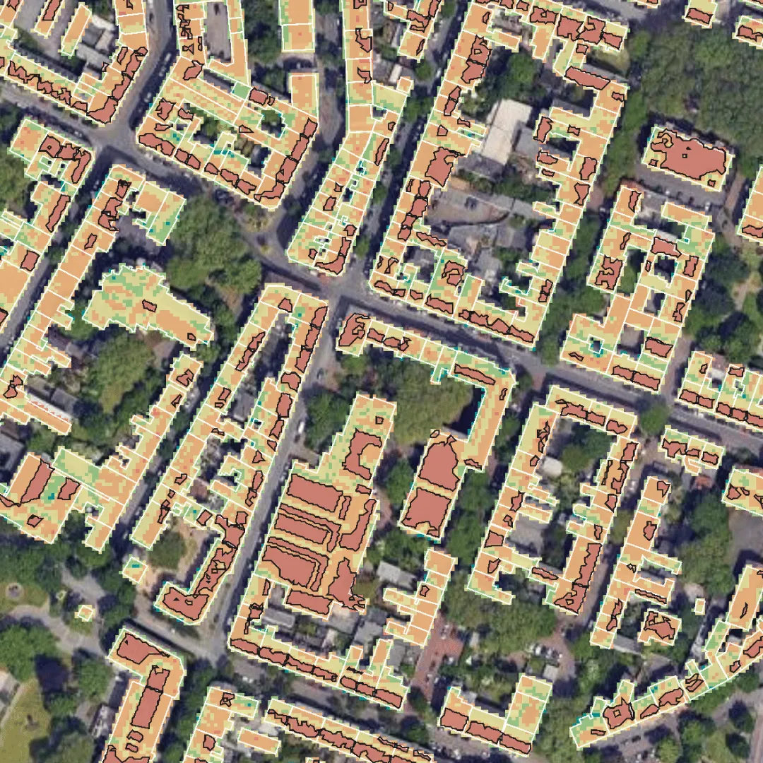
This map allows the user to explore optimal locations for solar panels. By combining building footprint data from OpenStreetMap with Solar API raster data, we extracted values within building footprints to pinpoint the best sites for installation.
You can read about our thoughts on the future of raster analysis in the cloud in our blog Democratizing Spatial Analysis with Raster Data on the Cloud.
Conclusion
In 2024, spatial analytics has shifted to a more democratic practice, powered by user-centric, self-serve solutions. This shift has freed up experts to focus on strategic, advanced analytics, tackling complex challenges that demand their expertise. All of this is underpinned by the increasing demand for bigger, faster data, enabling decision-making at an unprecedented scale.
Feeling inspired? Schedule a demo with one of our experts. Who knows, maybe one of your maps will be featured next year…


