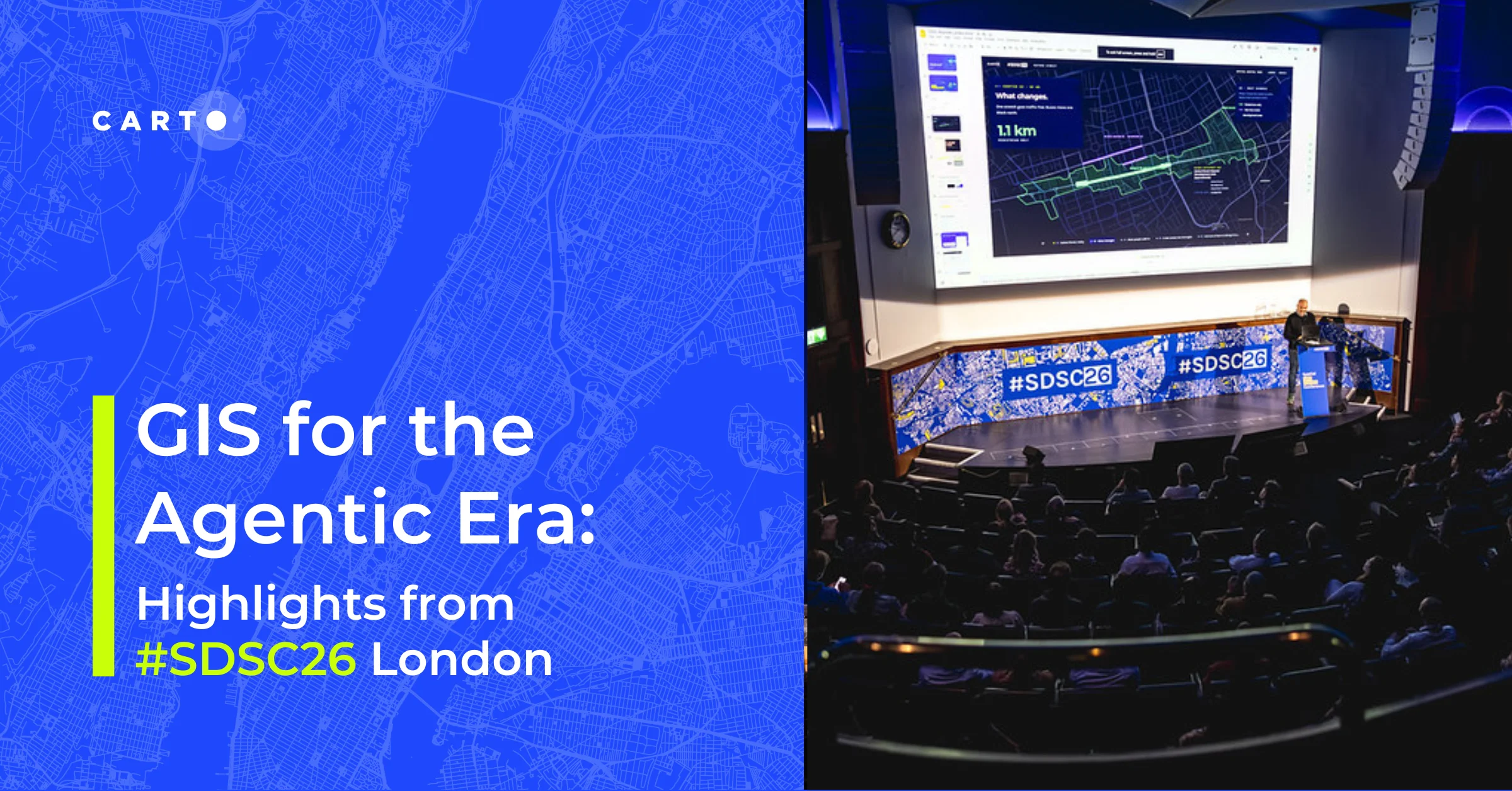
Our favorite Earth Day maps


At CartoDB our toes grow green. That is to say, we love our planet, environment, biodiversity, clean water, and all great things that envelope our shared hunk of rock in space. So Happy Earth Day! Celebrate with us by reaching out to your favorite organizations, getting out on your favorite trails, and of course, exploring some of your favorite environment maps :)
Here are some of our favorite maps from the past year that help us understand our world and help us connect with our local and global environment.
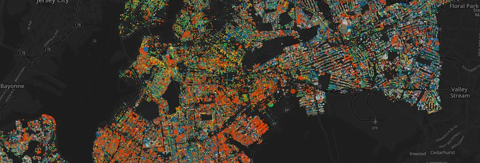
NYC Tree maps
Two really cool projects leapt onto our radar this week. The first is a longer running project Treekit that aims to help NYC citizens map and manage their own trees. Technical.ly had a very nice write-up of the project in their article TreeKIT platform incorporated into NYC Parks tree census.
The second project, NYC Street Trees by Species, is an interactive map built with CartoDB that lets you explore every tree catalogued from the last NYC Tree Census mapped. It gives you some nice filters to explore and learn about this city's canopy.
Visualizing forest change
The next two projects are looking at trees, and more specifically deforestation and forest change, at global scales. The first is a long-time collaborator of CartoDB Global Forest Watch. The GFW team is building a comprehensive online platform and mapping tool that allows you to dig into data related to deforestation. The platform is used by policy makers, scientists, and journalists alike to help us all defend our forests from the diversity of threats they face. To get a sense of the work enabled by GFW, take some time to read through their blog.
The next project is actually a collection of many projects known as InfoAmazonia. InfoAmazonia provides everything from workshops, to data, to news and maps that help inform people about changes to the endangered Amazon region. The maps they create are often simultaneously beautiful and alarming but in the end hopefully help us identify change and create solutions for the future. Take a look at this map of supply chain connections to China.
And if you're in New York City on May 15th, stop by our conference, GeoJourNews, to hear Miguel of InfoAmazonia give a talk on maps and Geo.
Tracking the birds
I love a map that shows animal movements. I have no idea why, but I can't help but get lost in them. I'm biased but I have loved every map that LifeWatch INBO has created from their projects tracking Gulls across Belgium and elsewhere. If you are interested in making these types of maps LifeWatch INBO prepared some really nice tutorials too. One of the things I love the most about their maps is how willing they are to explore both scientific maps that help explain their research and more artistic maps that inspire and engage in a different way.
Take a look at the life patterns of these two gulls:
If you love animal tracking maps, also check out this map of a Fisher moving in urban areas or this map Spencer the house cat. Want to learn more? Check out our Academy lesson on Torque methods and stork migration patterns here!
Mapping the air
It is important to communicate the impact of our populations and industries on the environment. One of the most apparent and difficult of these to communicate is pollution. Here we have two maps that have worked to help communicate the impact on our society.
The first map was published in the Los Angeles Times and helps to unravel a state-generated report on various scores of pollution into a simple-to-use interface for anyone to explore.
The second map is part of a series of maps produced by Yale's Environmental Performance Index. The EPI has mapped out [pollution]( and [biodiversity metrics] in a number of different ways. Not only to engage a broader general audience, but to successfully engage scientists in mapping and the user of interactive maps for communication. The following map shows how users of Weibo have engaged in topics related to pollution.
Hopefully one of these maps inspire you to get out and discover or communicate something about our environment today!
Happy Earth Day!