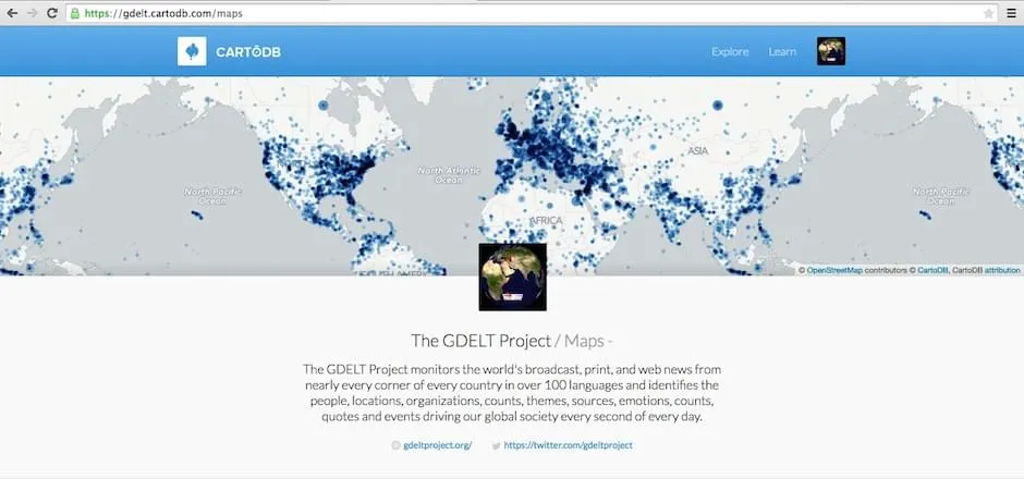
Making Maps with GDELT + CartoDB


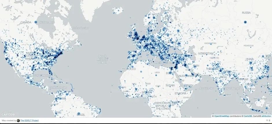
What would it look like to literally map the world’s news as it happens? What if you could reach across a growing fraction of the world's news media every day in real time in 65 languages and put a dot on a map for every mention in every article in every language of any location on earth along with the people organizations topics and emotions associated with each place? That’s the vision that drives the GDELT Project.
In the wake of our GeoJourNews conference celebrating journalists cartographers and coders we have an exciting partnership to announce with GDELT one that we hope will only further support our community! We welcome Kalev H. Leetaru a Senior Fellow at the George Washington University Center for Cyber & Homeland Security in Washington DC to author a guest post demoing how CartoDB can be used to map the world's news in real time!
The GDELT Project processes a growing fraction of the world's news media in real time identifying the people locations organizations themes sources emotions counts quotes and events driving global society. The GDELT Project creates a free open platform for computing on the entire world. In essence GDELT acts as an automated open data real time metadata index over the world’s news media.
Working closely with governments media organizations think tanks academics NGOs and ordinary citizens GDELT has been steadily building one of the highest resolution catalogs of the world's local media which it monitors in real time and partners with the Internet Archive to preserve. Since much of the world's local news is not in English GDELT uses one of the largest deployments of streaming machine translation to live translate the world's news from 65 languages accounting for 98.4% of media it finds each day. In one of the largest deployments of sentiment analysis GDELT brings together 24 emotion (tone) mining packages that assess more than 2 300 emotions and themes from every article including native measures for 15 languages. One of the largest multilingual geocoding platforms completes the pipeline identifying disambiguating and rendering to centroid geographic coordinates every mention of more than 10 million places worldwide across 65 languages.
All of this happens 24/7 with updates every 15 minutes around the clock and that makes for some pretty powerful and timely maps!
Getting to Know GDELT
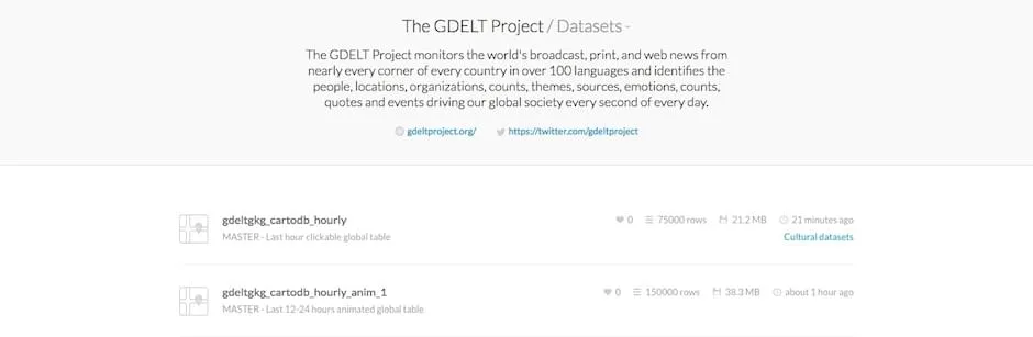
The GDELT Project compiles an enormous array of information about global human society spanning many different datasets.
Here's a taste of what it has to offer:
As you can see there is so much data here to map making for incredible opportunities for a mashup between GDELT and CartoDB. In December 2013 GDELT used CartoDB to produce animated and searchable maps of the geographic footprint of American television news using an earlier version of the dataset linked above. Likewise CartoDB was used to create all of the geographic visualizations for the paper describing the Africa and Middle East GKG research. Each of these datasets includes rich geographic information geocoded down to the city or hilltop level globally and each is available in its entirety as open data for immediate download. However due to their enormous size and complexity these datasets require non-trivial programming expertise to manage and munge the data not to mention substantial disk and CPU resources.
We’re going to focus here on one final GDELT dataset called the Global Knowledge Graph (GKG). In a nutshell the GKG processes every news article across all 65 languages and extracts a vast array of metadata indicators. We'll use a set of tools that do all of the hard work to reformat these data to make it point-and-click easy for us to map it.
The GDELT Project is one of the most ambitious programs ever attempted to codify the world's news into computable format and as a disclaimer there will always be a certain level of error in the data it produces. First there's a lot of news media out there and monitoring local news outlets in every corner of the world is really hard. GDELT will always miss some portion of the news each day – it is not an exhaustive catalog of every report. Attempting to automate the parsing of narrative across 65 languages and literally all the world's news technology platforms is exquisitely difficult. Combined with the subtlties of geopolitical and placename identifiers assumptions of shared locality the mixture of textual and visual locative cues and transcription and typographical error the multilingual geocoding is especially challenging!
However the GDELT team has been exploring the geography of text for more than a decade. The data that GDELT provides overall reflects a reasonably accurate representation of the world's media output.
Mapping with GDELT
All this is to say you can do some pretty incredible things with GDELT data and we're here to make that easier!
Get the Data
Make Maps
Many geospatial analysis and approaches are possible with the API or hourly data resources. You can check out the GDELT Public Profile on CartoDB for mapping ideas and ongoing experiments!
For example the map below explores the geography of discussion of protests (orange) cyber (purple) and unrest (red). An orange dot doesn't necessarily indicate that a protest is taking place at that location only that protest-related language appears to be associated with it over the last hour.
Instead of filtering by topic what if we displayed every worldwide location mentioned in an article monitored by GDELT over the 12-24 hours and color-coded each location by the language of the news article mentioning it first in a given 15 minute interval? We'd end up with the animated map below of the linguistic geography of the world's news!
Instead of language what if we color-coded each location by the average "tone" from highly positive (green) to highly negative (red) of all worldwide news coverage mentioning each location in 15 minute increments? We'd get the real time map below of the World's Happiest and Saddest News!
Explore the Sandbox Search Tool!
To make your first maps of the world's news media you don't even need to touch a single line of SQL. Instead we've created an interactive Geographic News Search Tool using the CartoDB platform and the CartoDB.js library.
You can enter any major person or organization name a GDELT Theme the phrase "lang:”" plus one of the 65 languages GDELT translates (to display all coverage written in that language) or "domain:" and the domain name of a news outlet (to display all coverage from that domain). There's autocomplete functionality to guide your search toward relevant coverage over the past 24 hours. Be careful to check the linked vocabularies about to generate the most robust maps!
Try searching for "lang:Portuguese" to view the locations being discussed in the Portuguese-language press
"domain:bbc.co.uk" to create an instant geographic search interface to the BBC or the GDELT Theme "REFUGEES" to view all coverage across all 65 languages relating to Refugees.
With three layers accessible in the upper right dropdown you can filter your search to the last hour of coverage an animated heatmap view and an emotional graph view showing you broader temporal patterns throughout the past 12-24 hours.
Read on to find out more about the Geographic News Search possiblities on the GDELT blog!
Stay Tuned!
We'll be releasing more GDELT features and tutorials incrementally over the next few weeks. Stay tuned for the upcoming posts on how to use the GDELT API and CartoDB to create fully-customized maps with UI flexibliity multilayer query mashups and more extensive emotional/tonal analysis!
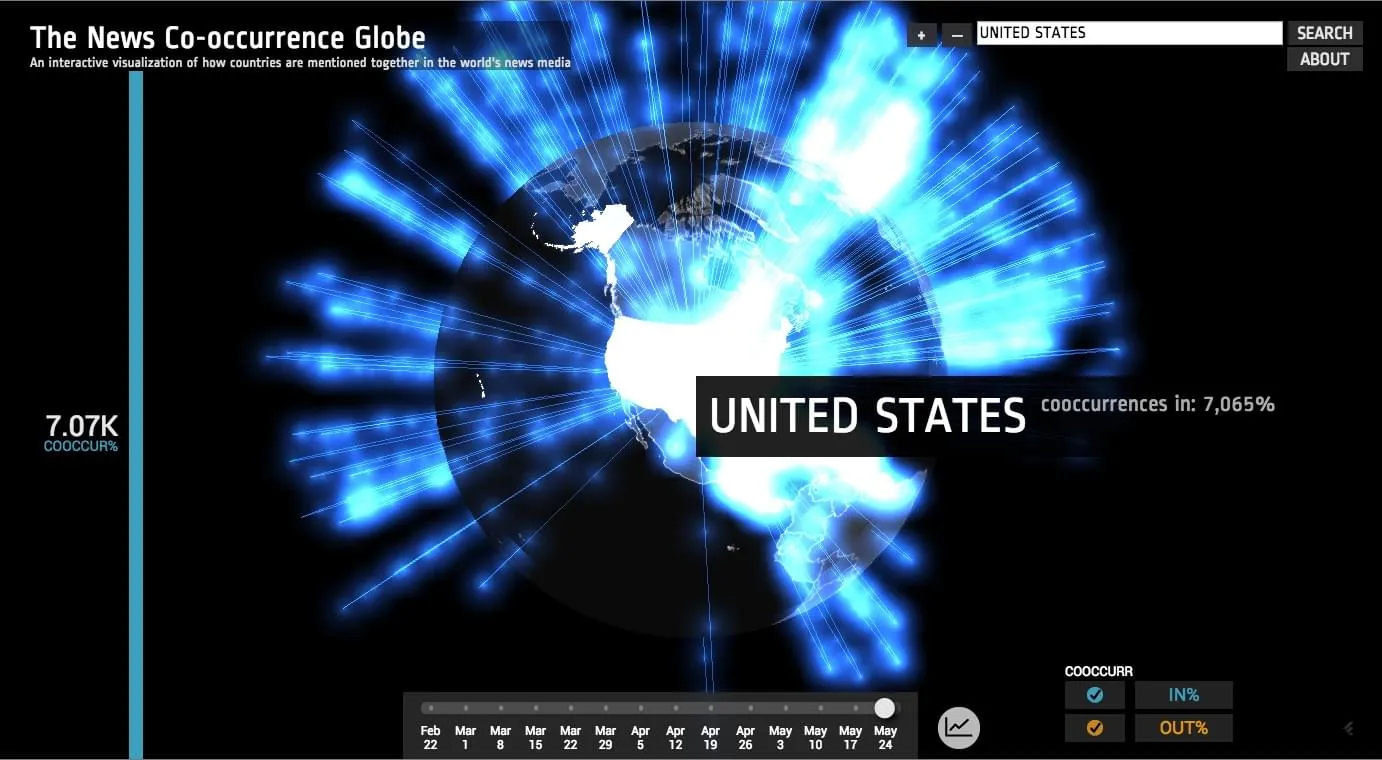
Looking for one last map before you go? Check out this visualization exploring the world's news media groups by countries in clusters. In essence for every monitored news article published anywhere in the world that mentions a given country we compile a list of all other countries also mentioned in those articles: in essence a dynamic time-varying geographic co-occurrence network. Read more about what the visualization shows or view the live interactive display!
Meanwhile thanks Kalev and happy mapping to all!