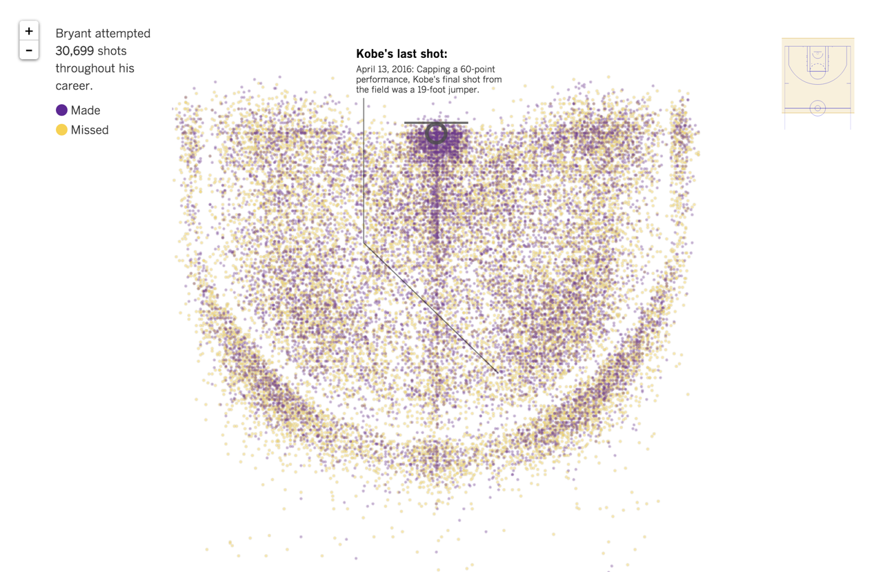
The L.A. Times scores a slam dunk with a data visualization of every shot Kobe’s made...ever!

On April 13, Kobe Bryant played his last game of his 20-year career and, in great form, scored 60 points! Fans from Los Angeles, and the world over were saddened to see the Black Mamba go, but his shooting record will live on in history, and now as a visualization. The LA Times mapped all of Kobe’s career shots using CartoDB and Python. The NBA data-driven visualization, charts every shot ever taken by Kobe - roughly 30 699 (data) points. How many points did he score in his lifetime? For those of you keeping count: 33 643 points.
So how exactly did the LA Times do it?
Well first, to process that many data points they needed to use Python. Second, CartoDB’s technology allowed the LA Times to take the individual data points and quickly render them into square image tiles with an invisible interaction layer. The LA Times used CartoCSS to style the map in purple and gold for shots made and shots missed. They used CartoDB to store the data from the NBA's database, which allowed them to choose which points they wanted to show on the map.
The sql line in the code tells CartoDB to return all the shots and sort them by a column called "priority " which we used to keep certain points on top for interactions. Then it sorts by "event_type " which is the NBA's name for the column that denotes a made shot or a missed shot.
Tooltips appear when you hover over a point to show you what kind of shot, when it was made, against who, and how many feet away from the key.
We sat down with the LA Times and this is what they told us:
CartoDB was perfect for this project even though it didn’t seem like a natural fit. We had a set of data that’s not geographic, but it is spatial, so we were able to translate it onto a map. If we hadn’t used CartoDB, we probably would have used something like d3.js, but with the number of shots we were visualizing, we didn’t want to put that kind of strain on readers’ browsers (especially on mobile). So having CartoDB handle that for us by spitting out tiles was perfect.
Kobe has been a huge figure in LA for 20 years — he was a superstar almost from the moment he was drafted out of high school. So it was really important for us to have great coverage of his retirement. For the graphics team, that meant finding ways to show what a monumental figure he really was here and his 30 000 shots are a pretty dramatic way to illustrate that.
We did — it’s drawn 1.5 million page views and 1.3 million unique visitors in the week since it launched.
The day the project launched it was by far the most viewed page on the site.
My favorite thing about using CartoDB on this project was being able to send SQL queries and get tiles back on the fly. Letting users filter the data was really a cool thing about this project.
I think if Steph Curry comes back 100% from his sprained ankle nobody’s going to beat the Warriors.
We have some things in the works for the rest of the playoffs — we’ll see how far they get.
Interested in making brand impact or just timely, topical visualizations for your news and media outlet? Contact us.
Happy data mapping!


