Map of the Week: Making Rent in Montréal
Rent and real estate conditions are fascinating subjects for maps. While they may be the maps that haunt us when in moving-in/out mode they are likewise the ones that help us mostly clearly comprehend the human economic and social landscape of our surroundings.
Read on to continue in our series on Map of the Week posts related to "making rent" this installment—Montréal.
Historically the affect of human migration patterns has dramatically changed the topography of our world and this helps explain some of our obsession with the patterns of human mobility in metropolitan areas. Presently the obsession continues with more factors complicating how we deal with dual changes in pricing stability and our concept of community. Certain months of the year define the cultural patterns of human movement in most cities: the beginning of September marks a return to school and likewise some rental flux in New York the end of August marks an exodus from San Francisco for those planning a pilgrimage to Burning Man.
This Map of the Week chronicles a map project built to track the July migrations in Montréal; for this we welcome our Ambassador Florent Daudens journalist at Radio Canada to discuss this project and the peculiar conditionals of its genesis (with translations en anglais and en français également).
Migration Data in Montréal
Montreal has a curious tradition: many people move on July 1. Which causes an intense hunting for flats in the previous months.
Two journalists from Radio-Canada Pasquale Harrison-Julien (@pasqualehj) and (myself) Florent Daudens (@fdaudens) wanted to know how much the average rent is in the city and the suburbs.
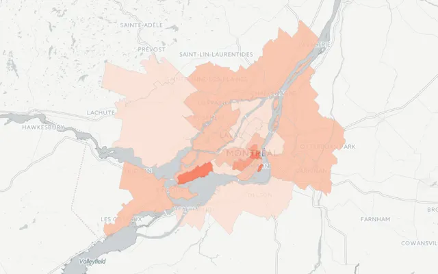
We created two maps. The first one displays the average rent prices in 35 areas of the city and its suburbs by number of rooms according to their sample. The second one compares these data with the ones of the Canada Mortgage and Housing Corporation (CMHC) the government agency that oversees the market. It shows neighbourhoods where new rents are higher than the average suggesting that this is where gentrification occurs.
We first searched the CMHC data. The catch: this data establishes an overall picture both for tenants who retain the same lease for 20 years as those who wish to rent today. They do not tell us how much the rent is for those seeking an apartment today.
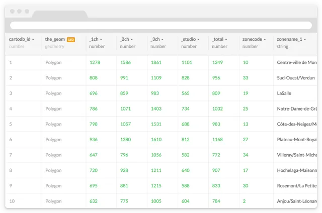
To arrive at the final result we had to follow several steps :
In the end we mapped 10 000 ads in 35 zones.
Adventures in Multilingual Mobile Map Projects
With these data we could begin our interviews. Comparing and validating data getting different perspectives and going beyond only a visualization to a data journalism that provides context and helps to decrypt the situation.
Where is my flat?
Then we turned to CartoDB because we had several requirements:
Polygons were included in our SHP files and CartoDB’s import wizard recognized them easily.
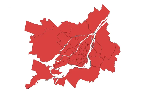
So we started to style our two maps in French in CartoDB’s GUI to generate choropleth maps. Then we adjusted the color slices to produces uniforms brackets for all types of apartments and thus keep the same color scale between all number of rooms.
In addition to zoom in on a specific area we wanted to allow the user to filter by number of rooms so that s/he can fully compare with his/her own situation. Therefore we used cartodb.js with createLayer method to be able to filter with SQL.
To set the style of each filter we copied the CSS generated by the CartoDB wizard and simply changed the ID of the column for each apartment type.
For example:
##_INIT_REPLACE_ME_PRE_##
#database_name [1bedroom <= 800] {
polygon-fill: # fee0d2;
}
#database_name [1bedroom <= 600] {
polygon-fill: # fff5f0;
}
##_INIT_REPLACE_ME_PRE_## #database_name [2bedrooms <= 800] {
polygon-fill: # fee0d2;
}
#database_name [2bedrooms <= 600] {
polygon-fill: # fff5f0;
}
##END_REPLACE_ME_PRE_##
##_END_REPLACE_ME_PRE_##
As for the tooltip on each area we set it up with the CartoDB’s GUI after several unsuccessful attempts in the code editor. This seems simpler with createVis than with createLayer.
Once our code was ready for the first map we just had to make a few modifications for the second one which displays the gap between our data and those from the CHMC. With our code finally structured it was easy to create the English version. We only had to translate the text in the tooltips.
ENGLISH
FRENCH
Reflections on a Rental Realities
The final results were published in our article on CBC.ca accompanied by a french version of the same article.
ENGLISH
FRENCH
Looking back we see some opportunities for improvement. We would have liked to style the map background and also to limit the levels of minimum and maximum zoom as well as the perimeter of the map to guide the user.
That said we were able to configure our maps to be closest as possible to the reality of our readers. Tens of thousands of them have felt challenged by the subject and read the article. Moreover we also showed our maps on our TV channel and thus make a complex subject accessible thanks to its visual dimension. We even managed to speak about it on our radio channel!
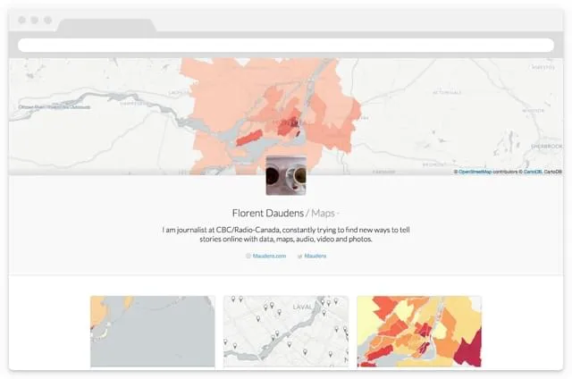
Multi-media maps at their finest we hope you enjoyed! You can reach out to Florent via Twitter to learn more about his maps or check out his public profile on CartoDB.
Meantime happy data mapping!


