Rat Race: Mapping Conservation in the Galapagos Archipelago
As many know CartoDB's commitment to elevating efforts in [conservation] climate change and the environment has shaped our practice and given way to many exciting mapping projects such as the creative and impressive Carbon Calculator and the Global Forest Watch Map that allows users to monitor deforestation in real time.
Recently we came across a very interesting case-study article in conservation and invasive species mitigation published by the international weekly journal of science Nature. The article titled Invasive species: The 18-km2 rat trap and authored by Henry Nicholls depicts a narrative of passionate and dedicated conservation through invasive species eradication (specifically rats) in the Galapagos archipelago off of the Ecuadorian mainland coast. As the article states: "The rodents feed on the eggs and young of seabirds land birds and reptiles and have brought several species — including the rare Pinzón giant tortoise (Chelonoidisduncanensis) — to the brink of extinction…[the effort] promises to allow unique species to flourish again and building on the prior removal of feral pigs and goats from much of the archipelago to make Ecuador a world leader in the eradication of invasive species".
Fueled by our passion for cutting-edge mapping technology and the environment Nature's article inspired us to take this beautiful static map of the conservation effort phases and create an interactive and versatile version that allows for in depth exploration using the CartoDB platform!
Check it out!
Map Annotations
The CartoDB Rat Race Map serves as a wonderful example of just how CartoDB can be used in journalism planning and information design in a broad sense. One of the key features of this map is the annotation styling that allows any CartoDB user to place text information directly related to specific Geo-spatial locations on the map. This often overlooked built in feature offers versatile labeling capabilities that anyone can use!
This is how it works:
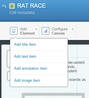
In the upper left hand side of your CartoDB visualization editor (not the table editor) There is an option to "Add Element". This drop down menu contains CartoDB's built in capabilities for labels text boxes images and annotations.

Clicking on add annotation item generates a movable element that attaches itself to the geographic location on the map. This feature remains fixed on the specific latitude and longitude and moves with them map unlike the label text and image options.
The built in styling interface allows for your annotations to be fully customizable and comes with a wide range of features to get the most out of your maps.

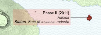
The user interface allows users to modify the text color orientation size bounding box and many other styling options to fit the needs of the map and story being told. The styling example above generates this annotation:

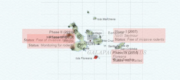
in the styling interface the option "Zoom (min-max)" adds an additional level of customization to your annotations by designating the parameters where your annotations are the most prominent. In the example above the parameters are set from zoom level 8 to 28. This means that the opacity and prominence of the annotation is reduced outside of these boundaries. Here is what the same annotations look like at zoom level 7:

As you continue to explore and create with CartoDB don't forget to share your maps stories and data visualizations with us @cartodb on Twitter. We're always excited to see new maps and interesting visualizations that we can share with our mapping communities!
Happy Mapping!


