

Identifying Serial's global audience with Twitter


Late last year the second season of the podcast Serial began. The very popular first season in 2014 had re-investigated an old case of murder in Baltimore. It gripped audiences with its reporting and was a thrilling listen every week.
When the new season began in December they took a global turn looking closely at the case of Bowe Bergdahl the soldier held captive for five years and the circumstances which led up to his capture and later release. It was a geographic story shift from the US to the whole world. Curious about where people were listening and commenting we decided to do a little investigation.
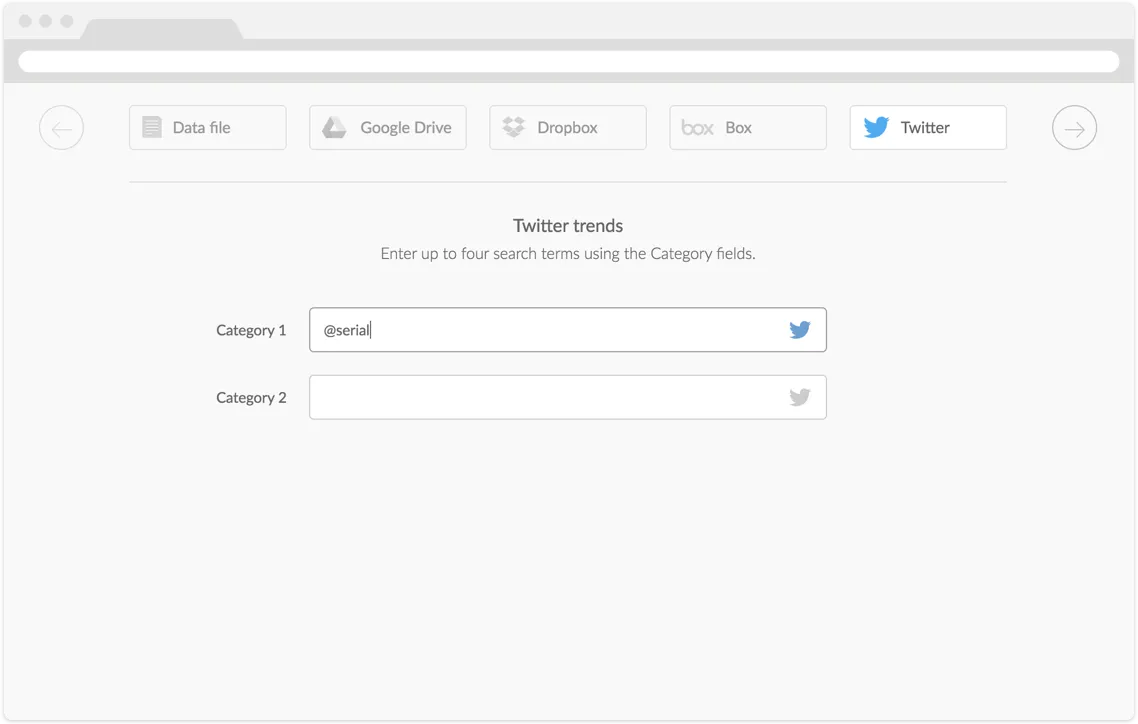
We fired up CartoDB’s twitter firehose entering @serial as the search term to see where on earth the tweets were coming from in the first week.
The launch week’s tweets (12/10-12/17) were put into a map. The results were definitely global with tweets coming from some remote corners of the planet which was interesting and chances are the previous show may not have had
that reach.
Animating them over time with torque showed us the passage of tweets over the week. We aggregated the tweets at any single location:
-torque-aggregation-function:"sum(1)";
That gave us a bubble that grew as tweets were generated about Serial. Now we could see where people were saying the most – places like New York London and Chicago. But across the world there were smaller unexpected places too in South America and Africa.
We handed this to our friends at Serial as a friendly data gesture and they loved it. We woke up to the podcast announcement that they were switching to a bi-weekly format and as we were listening Sarah Koenig the host of Serial mentioned the map we had given them (and posted it on their site).
During the in-between weeks we will have more posts and graphics on our website. In fact we just put up this beautiful thing this map of the world with all these twinkling dots that show where tweets have come from responding to the show. So you know obvious places like the East Cost of the US – but then Mongolia Afghanistan Chile Nigeria Papua New Guinea Canada. It’s made me so happy to see it like we’re all holding up lighters all over the globe.
So a little bit of twitter data made the show feel a sense of community which is why we love the twitter access CartoDB offers as well. It makes it easy to get a heartbeat from the planet on any topic you’d like.
Happy Twitter mapping!
