Packing Data for Faster Map Rendering


To an outside observer serving a population of 150 000 map creators and millions of map viewers might seem like a simple matter but to us it's a big complex deal and we're always looking for ways to make the CartoDB platform faster!
Because we serve so many users and thus so many apps finding even small efficiencies can generate big savings on the amount of infrastructure we need to deploy which is good for the environment and good for the business.
We work with spatial data to draw maps and one thing that disguishes spatial data from regular data is size -- it's really really large. Just one country polygon can take up as much storage as several pages of text.
If we can reduce spatial data in size we win twice. A big polygon takes up a lot of memory on a map rendering server and a lot of network bandwidth as it is moved from the database server to the rendering server. And if we do the job right any changes in the maps will be visually undetectable.
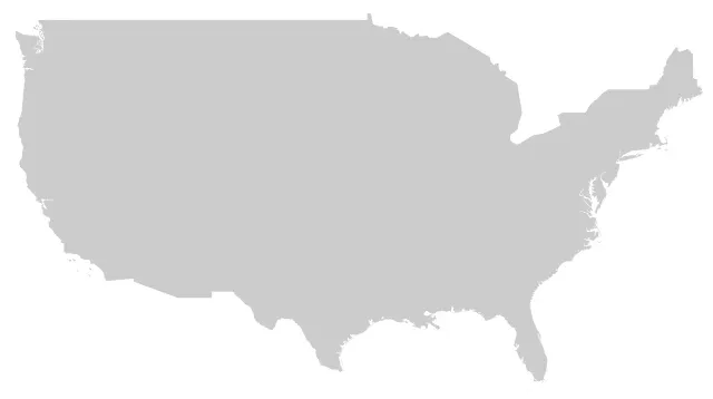
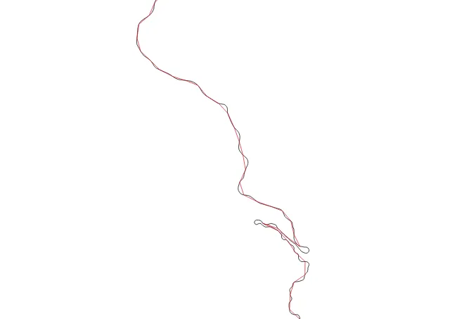
The input data for this map were 24kb:
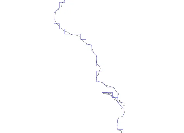
The input data for this map were 554kb:
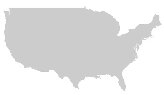
See the difference? Me neither.
There are two ways to make spatial objects smaller:
To improve CartoDB efficiency this summer we worked on both approaches changing the SQL Mapnik generated during rendering requests to lower the size of the generated spatial data.
Reducing vertex count
As a loose rule since the map output will be displayed on a screen with some kind of resolution any vertex density that exceeds the output resolution is wasted information. (That isn't quite true since most modern map renderers use "sub-pixel" shading to convey higher density information but past a certain point like 1/10 of a pixel extra vertices aren't helping much).
We started with a simple approach just using the ST_Simplify() function to reduce the number of vertices in our geometry. This worked great creating compact geometries that still captured the intent of the original but it had two problems:
Pre-filtering to make things faster
Our initial filtering used the long-standing ST_SnapToGrid() function since snapping coordinates to a tolerance and removing duplicates is a very fast operation.
Unfortunately snapping at high tolerances can lead to an output that doesn't follow the original line particularly closely and can contain some odd effects.
For PostGIS 2.2 ST_RemoveRepeatedPoints() includes an optional parameter to consider any point within a tolerance to be "repeated". The cost is only the distance calculation so it's no more expensive than snapping and the results are much closer to the original line.
Retaining small geometries
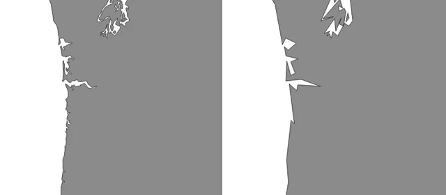
We had to enhance the ST_Simplify() function to optionally retain geometries that were simplified out of existence. For example look at this map of building footprints (in red) simplified to a 30 meter tolerance (in green).
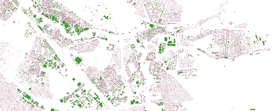
Many of the buildings are smaller than 30 meters and simply disappear from the green map. To create an attractive rendering we want to keep the tiny buildings around in their simplest form so they fill out the picture. For PostGIS 2.2 we added a second parameter to ST_Simplify() to "preserve collapsed" geometries rather than throwing them out.
Reducing representation size
If you don't work with strongly-typed programming languages you probably don't put a lot of thought into how much space a representation takes but different representations can take drastically different amounts of size to store the same value.
The number "5" can be stored as a:
So for this example there's an eight-times storage size win available just for choosing a good representation.
The default implementation of the PostGIS plug-in for Mapnik uses the OGC "well-known binary" (WKB) format to represent geometries when requesting them from PostGIS. The WKB format in turn specifies 8-byte doubles for representing vertices. That can take a lot of space space that maybe we don't need to use.
Accurately storing the distance from the origin to a vertex takes pretty big numbers sometimes in the millions or 10s of millions. That might legitimately take 3 or 4 bytes or more if you need sub-meter precision.
But storing the distance between one vertex and the next vertex in a shape usually only takes 1 or 2 bytes because the points aren't very far apart.
So there is a big space savings available in using "delta" coordinates rather than "absolute" coordinates.
Also the image resolution we are going to be rendering to implies an upper limit to how much precision we will need to represent in each delta. Anything more precise than 1/10 of a pixel or so is wasted energy.
To make all this a reality we made use of the work Niklas Aven has been doing on "Tiny well-known binary" a representation that retains the logical structure of WKB (simple feature geometry types) but packs them into the minimum possible size using delta encoding and variable length integers.
All this calculating of deltas and minimum sized integers takes a fair amount of CPU time but in our application the trade-off is worth it. Our databases very happily serve thousands of users without putting pressure on the CPUs -- all the pressure is on the network and renderer memory.
We have made sure that tiny well-known binary is ready for release with PostGIS 2.2 as well.
Putting it all together
When we put it all together and tested it out we were very happy particularly for rendering large complex features.
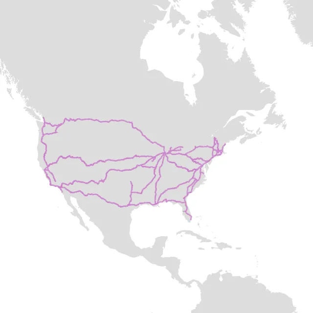
This set of Amtrak routes drawn in purple is rendered without filtering and using WKB as the representation format. So the image is as "correct" as possible. Because the routes have some small back-and-forth patterns in them below the pixel scale you can see the renderer has furred the lines in places.
In terms of size the original data are:
That's a lot of data to throw over the wire just to draw some purple lines.
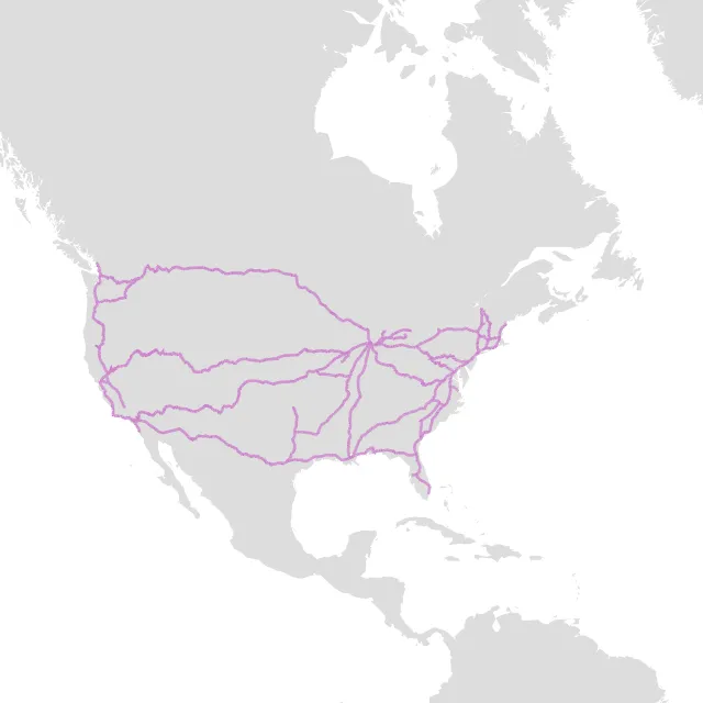
Here's the same data rendered after being filtered (using repeated point removal) simplified (but not dropping features below tolerance) and encoded in TWKB. Our size is now:
That's right we are now only transporting 1% of the data size to create basically the same image. In some ways this image is even nicer lacking the furry parts created by the overly-precise WKB data.
Final answer
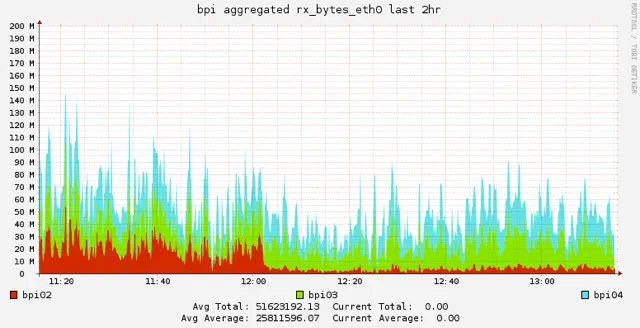
And when we rolled it out to the real world did it perform as we hoped? Yes it did indeed visibly reducing our network overhead and memory usage when it rolled out: the red graph is network usage and you can see when the deployment took place.
We're running a patched version of PostGIS 2.1 right now updated with all the changes we require. These changes are all part of the PostGIS 2.2 release which will come out very soon. We hope others will find these updates as useful as we have.
Yet there are still many things to optimize would you like to help? Join us!
Happy data mapping!