The 5+ maps that explain the State of the Union
On Tuesday evening President Barack Obama delivered his final State of the Union Address. This year marks the first year that the State of the Union address was made available as full text for perusal and commentary prior to the speech. In the spirit of this openness we've paired a few pull quotes with some awesome maps from our community. This will kickstart a series of blogs wherein we'll feature 5+ community maps based on a concept or theme.
Skim the speech text here and follow along below to check out the State of the Union as measured in maps!
Economy
The topic of economy is so broad and important that it takes a major role in almost every political speech. In Obama's final SOTU he covered it from many angles indicating that it is clearly a topic he knows we are all watching and thinking about carefully. As a major driver and indicator of the economy the topic of employment came up again and again. In an interesting series of maps the Wall Street Journal showed us how U.S. job opportunity has been changing over time. Take a look at this example showing the change from 2013-2014.
Another map we found interesting is the one below created by the International Business Times last September. The map shows the at-the-time ongoing protests by fast-food workers around the country aimed at raising the hourly wage.
Our unemployment rate is now lower than it was before the financial crisis.
Healthcare
There is no question healthcare has been a focal point of Obama's presidency. In a story published in November the Wall Street Journal highlighted what America was talking about during the interim election. In the map below the WSJ focused on healthcare a topic highlighted during the election by many Republican candidates. If you are interested in maps showing the intended impact of Obamacare also take a look at this series of maps from the IBTimes in 2013 Obamacare: How Effective Will It Be In Each State?
And in the past year alone about ten million uninsured Americans finally gained the security of health coverage.
Education
Throughout his discourse on education Obama detailed the need for more and easier access to higher education stating "[b]y the end of this decade two in three job openings will require some higher education. Two in three." We thought the contrast between the two maps below was relevant. In the first the IBTimes published a map of High School Rankings around the country. In the second map published by one of our users we can see the concentrations of the country's top ten public and private universities…
Environment
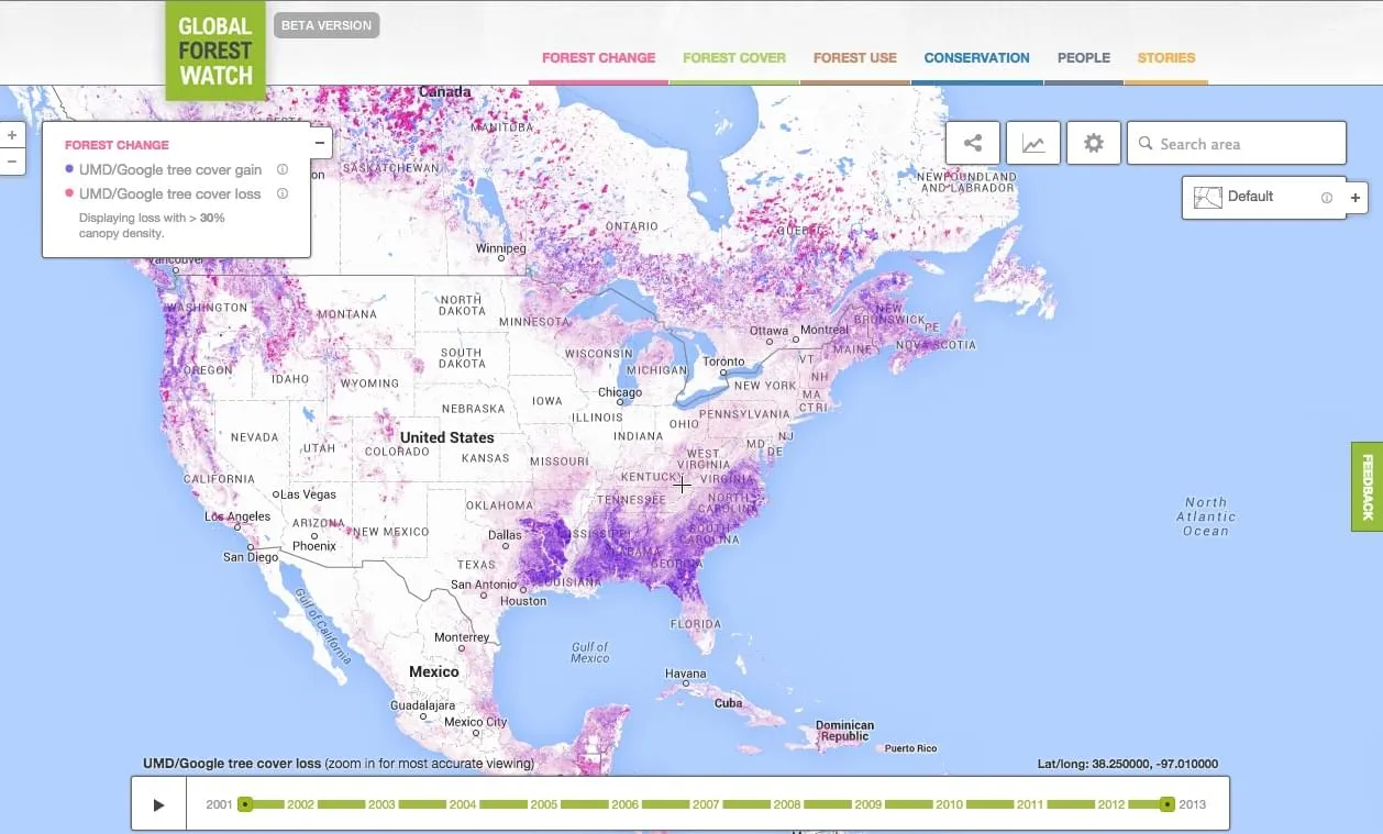
Obama took a moment to highlight his administration's commitment to the environment and the fact that they have "set aside more public lands and waters than any administration in history". This is very relevant to the work of the Global Forest Watch which aims to make the data around deforestation available for journalists policy makers scientists and others. While not always perfect protected areas are a great step to protecting our forests.

Learn more about public land use and deforestation globally here.
That’s why we’ve set aside more public lands and waters than any administration in history.
Equal Opportunity
Same-sex marriage is just one component of the equal opportunity struggle. Al Jazeera America created the map below in the process of tracking the status of same-sex marriage across the country.
I’ve seen something like gay marriage go from a wedge issue used to drive us apart to a story of freedom across our country a civil right now legal in states that seven in ten Americans call home.
Women's right to choose
The President approached the topic of womens' right to choose gingerly saying "We still may not agree on a woman’s right to choose but surely we can agree it’s a good thing that teen pregnancies and abortions are nearing all-time lows and that every woman should have access to the health care she needs." This is a topic some of our users addressed thoroughly. Take a look at this complete interactive piece developed for the 40th Aniversary of Roe V Wade.
Learn a bit more about that map in this feature on its authors.
BONUS: Campaign Zinger
I have no more campaigns to run. My only agenda for the next two years is the same as the one I’ve had since the day I swore an oath on the steps of this Capitol — to do what I believe is best for America.
~ President Obama January 20th 2015
And in case you missed it check out the reaction to this quote:
Finally we'd be remiss if we didn't include Twitter's map of the SOTU reaction available on Vox
Read more
If you want to read more about State of the Union check out the ABC News coverage or the Atlantic's Split in the State of the Union piece. Here's some interesting history datasets and data science related to the SOTU addresses over the years.
Stay tuned for a map review of the address this week and look out for our upcoming series Roughly 5 maps to explain [XYZ]. Thanks for reading!
Happy mapping!


