The Northwest Bushwick Community Map Redesign

Today we hear from a friend from our NYC community Chris Henrick. Chris is a MFA Design & Technology graduate student at Parsons The New School For Design. He is a long time user and an expert on CartoDB. We recently saw The Northwest Bushwick Community Map a project he has been developing to document ongoing change in one of our communities. We wanted to hear more! Read Chris's description of the project below.
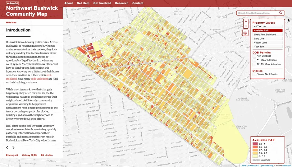
The Northwest Bushwick Community Map is meant to be a resource for local community organizations and tenants rights groups to easily access disparate information around land use housing and urban development for the neighborhood of Bushwick in Brooklyn NY. It is also intended to be a tool to inform NYC residents about what kinds of indicators may be used to predict new urban development and help prevent displacement of residents in their own neighborhoods. Recently I had the opportunity to work with the original author of the map and some fellow designers in the MFA DT program at Parsons to improve the map's design and functionality.
Background
In the fall of 2014 two members of the Northwest Bushwick Community Group (NWB) Michael ‘Ziggy’ Mintz and Brigette Blood met with several graduate students from MFA DT to discuss improvements to the beta-version of the map. Previously the map used vanilla Leaflet.js with GeoJSON data created from NYC’s MapPLUTO and Department of Buildings permits open data. However the original map lacked a cohesive design and was slow in regards to loading of the data due to technical issues.
Map Improvements
To improve the interactivity of the map I chose to host the data on CartoDB and use the CartoDB.js library to handle loading styling and toggling of the map's data layers. When the user selects layers CartoCSS and SQL code is passed to CartoDB to retrieve and style the data being rendered on the map. Hosting the data on CartoDB also allows for processing of the data in the CartoDB dashboard using PostgreSQL and PostGIS. This is beneficial as SQL scripts can be run to automate the processing of new data when the map needs to be updated.
To improve the context of the map (the Who What Where When Why and How) the MFA DT team asked Ziggy and Brigette to provide us with some real world stories that show how the data relates to the dwindling affordable housing stock and displacement of longtime residents in Bushwick. To accomplish this we used the Odyssey.js Javascript API to create an interactive slide show with the map which transitions between three of NWB's stories. With a bit of hacking we were was able to use the changing of the slides as a jQuery event trigger to toggle the map's data layers. This allows for the slide show to give background and context about the project while also relating seemingly abstract data in a visceral way.
Besides Cartodb.js and Odyssey.js we added some other features to the map to make it more useful for the Bushwick community. As there is a large Latino presence in Bushwick it was imperative to have the text of the map's UI and the overall website toggle between English and Spanish. Additionally the non-map parts of the site were redesigned responsively using CSS Media Queries so that the other content such as “Get Help” can be easily viewed on a mobile device.
Future Plans
In the future NWB plans on adding participatory map data they’ve collected on housing vacancy and new development as well as stories of people who have experienced being displaced or harassed by their landlords. These features may be integrated with the current map or developed separately but either way CartoDB and Odyssey will allow for the further creation of customized interactive map content to be readily achievable.
If you are interested in more take a look at some of these links
Thanks Chris for the awesome post about the great project!


