CartoDB to CARTO: the Back Story to our New Brand


We are no longer CartoDB, but CARTO: in capitals and without the "DB " as it was clear that to have more exciting and engaging conversations with our users we needed to drop the acronymn for database and become simplified, bold, and more aligned with their voices.
CARTO has matured tremendously over the past few years. We have evolved from a spatial database to a geo-visualization tool to a location-based business intelligence platform. Our users have changed, too, from specialized developers to business users with little to no programming knowledge—and for whom geospatial analysis is not only a skill but an enormous strategic advantage.
For some time we had been faced with the opportunity to develop our brand into something more effective at communicating our product's new values. But we also knew that any rebranding would require going far beyond a mere logo swap or name change; it had to be a process that transformed us on the inside as well as the outside. Because we wanted everyone to feel personally involved with the transition, we didn’t outsource the brand design but started it on it quietly in house.
The first weeks after we decided to rebrand, we assembled a special internal team of designers, product strategists, and some of our best communicators. We started from a market analysis approach that, several months later, finally identified our starting point. We then began searching for new language to communicate our product and values.
We spent months rethinking brand positioning and the new language kit we needed to make our vision work. One of our most challenging goals was how to communicate what we do, the way we do it, and who we do it for. We aimed for simplicity over buzzwords.
Our thought process centered around several issues. First, the software we make is both simple and complex. On the one hand, it’s a tool for building analytical, location-based apps. On the other, it’s a platform packed with APIs, an SDK, and even a drag-and-drop web map editor. Because we like to speak directly to our users, the final outcome was changing our libset to "Engine" and our self-service Editor to "Builder."
Second, we knew we liked strong, objective messages about how we allow companies to grow; our new tagline "Predict through location " best reflects this preference. At the end of the day we work in units of "location" enhanced with analysis and data enrichment, smart features that lead to actual prediction, not just visualization and discovery. Because of the rebranding we also had the opportunity to talk about prediction in a different way—not only about predicting through time, but space. CARTO aims to predict in both dimensions, allowing you to understand what may happen somewhere before it actually happens.

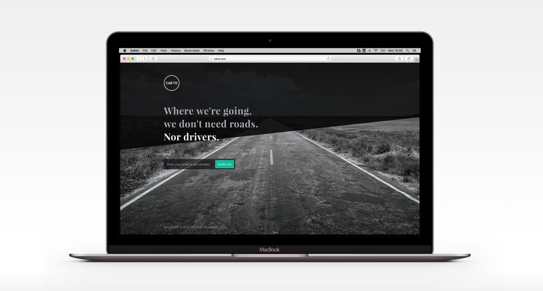
At this point, roughly three months, in the rebranding team's work had been under wraps and only select employees knew about the big project that was underway. In fact, the secrecy was so complete that several months before the announcement, when our team began to use carto.com as a brand prototyping sandbox and built a landing page from a fake competitor in the location intelligence market (Car To), many of our colleagues and some of our customers and stakeholders thought there was a new player with a very similar name in the industry. But it was just us, playfully using our new domain to fine-tune our future brand language.
Soon thereafter we raised the curtain for the entire team. First, we transmitted the idea of the brand as much more than a name. CARTO encompasses a set of values empowered by an exciting message. We shared the idea of a culture that permeates everything on both sides of the company’s doors. We shared that our new brand and positioning was a complex strategic exercise that should result in an extraordinarily simple system of ideas, forms, and messages. Finally, we disclosed that we had been working on a completely new visual toolkit, including the new logo, the last but not least important piece of the puzzle, to make everything complete.
Here I'd like to highlight some of the biggest visual changes:
The Marker
Our essence is location, and location is typically represented by a marker. For CARTO, however, location is more than sticking a point on a map. Location is understanding what happens around that point and looking deeply at everything that can impact this point. Using technology like the Data Observatory and Deep Insights, CARTO enables contextualization and analysis. Our marker is not a superficial icon merely pointing at something, but a spatial probe analyzing the profound, such as all the data columns it contains. CARTO is a tool to understand and predict these phenomena, and our brand therefore visually expands always from the marker.

Our colors
We do geospatial intelligence. More precisely we have a technology that helps people discover and predict insights that can change their companies and we are forthright every time we explain this. And so we have the red, which we call "Location Red." Red is the color of something important happening now or at a certain point in the future. Red comes next to blue on the color palette: a blue as deep as that insights that help you decide where to place your next shop. And green, a green that visualizes how you may grow. There are so many facts to be told that we even have purple.

Our typography
To further deliver our message in a clear and assertive way, we have chosen a fantastic font family that has a lot in common with us: the open source Montserrat, designed by Julieta Ulanovsky. Montserrat is geometric and rigorous, just like our spatial-data analysis. It is also readable and powerful, like the maps you can create in CARTO Builder. Montserrat works in tandem within our visual system with the fantastic Open Sans, which is also an open versatile, and readable font that Steve Matteson designed a few years ago. We are an open company, so using fonts with open licenses was mandatory.

The marker and our new name written on red in capitals with Montserrat is our logo. But the fact is that we have changed everything else. We are now bold and direct when we speak our values, but also detailed when we explain how we do it. Our new brand best represents our product visually, but the most important thing is that it speaks about us symbolically in a much more genuine way. Because we built it. That is what our product needed.
CARTO. Predict through location.On July 7, we announced the rebranding of our company and simultaneously introduced a leap in our product's evolution, CARTO Builder. This is the story of the process behind the new name that embodies this transformation.