Map of the Week: Creating a Daily Dashboard of Global Conflict


Welcome Kalev H. Leetaru a fellow and adjunct faculty in the Edmund A. Walsh School of Foreign Service at Georgetown University in Washington DC. In this guest post Kalev talks about how he used CartoDB to create a map of global conflict that updates every morning.
Imagine a map that uses computers to “read” news reports from across the entire world each day identifying the events described within and their locations and placing all of that into a single interactive map zoomable and clickable down to the level of a city or hilltop across the globe summarizing at a glance our world in motion. Add on top of that an animation of global events over the past six months placing current events into context and illuminating macro-level global trends. Through the support of the United States Institute of Peace and using the CartoDB platform this dream has become a reality.
Mapping the Geography of Text
My work centers on how creative applications of the world’s largest datasets computing platforms algorithms and mindsets can reimagine the way we understand and interact with our global world. Towards this end a lot of my projects revolve around extracting analyzing and visualizing the locative information in the textual narrative that surrounds us from mapping the world’s news media to Wikipedia Twitter diplomatic communication and even television.
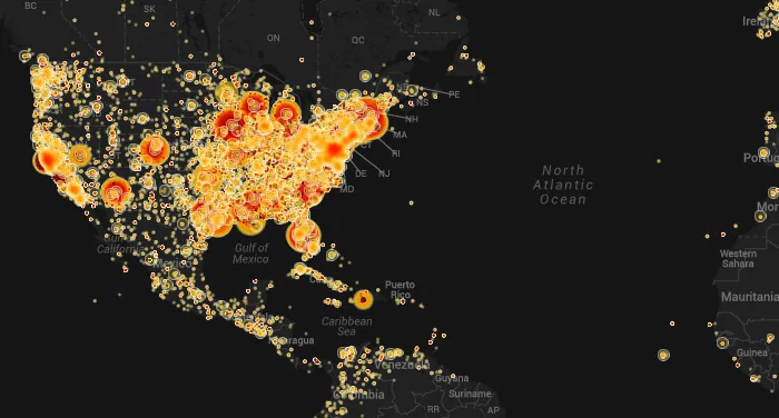
This past December I worked with the Internet Archive to create what we believe is one of the first large-scale glimpses of the geography of American television news revealing which areas receive outsized attention and which are neglected by geocoding the closed captioning stream of all half million hours of their television archive. To visualize such a massive dataset we turned to CartoDB to create an interactive clickable map where visitors could instantly view every mention of a city or landmark in context.
On top of this we decided to create an animation showing how the geographic focus of American news has changed over time. Instead of a traditional pre-rendered animation we wanted to offer an interactive experience where visitors could live-zoom into the map literally watching the floodlight of American journalism move across a region or country. One of CartoDB’s most powerful capabilities lies in its ability to create precisely these kinds of animated interactive maps with just a few mouse clicks. In the end we created both an animated map and a comparison map that allows you to drill down by time period and specific station to compare coverage. Read more about the maps.
Mapping Global Conflict
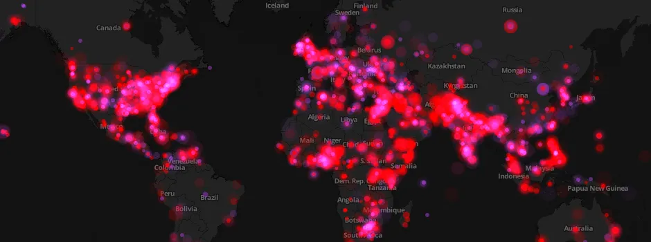
Using the lessons learned from mapping American television news could one create a similar map of global conflict this time bringing to bear CartoDB’s SQL API to update the map every morning completely automatically? The GDELT Project I founded monitors the world's broadcast print and web news from nearly every corner of the world in over 100 languages and uses sophisticated computer algorithms to compile a daily list of the people locations organizations counts themes sources and events driving global society creating a free open platform that makes global society “computable”. Each day GDELT compiles a catalog of over 300 categories of events from around the world georeferenced to the city level from riots to peace appeals totaling more than a quarter-billion records 1979-present and updating every morning.
GDELT provides the ultimate mappable database of global conflict translating the world’s textual news reports into quantitative spreadsheet entries each geocoded to the level of a specific city or landmark worldwide. CartoDB in turn provides the ultimate interactive mapping platform to visualize this massive geographic database. To me one of the most powerful aspects of CartoDB is its ease of use. Unlike desktop GIS software you don’t have to spend hours carefully preparing a dataset for importing trying to figure out why a “float” column keeps truncating to 2 decimals or fighting your way through screen after screen of prompts. Instead you literally drag-and-drop a spreadsheet onto the CartoDB window and the rest as they say is “magic”. CartoDB automatically recognizes which columns contain geographic coordinates and transparently converts it all to a point-based map. Want to add additional layers such as shapefiles? Once again just a trivial drag-and-drop and your new layer appears a few seconds later. The resulting maps are among the best looking cartographic visualizations I’ve seen supporting complex raster operations and sophisticated render styling with ease. In fact combined with the built-in visualization wizards it is possible to go from spreadsheet to final production map in just a few minutes.
I’ve twice used CartoDB to create maps of GDELT for columns I’ve written for Foreign Policy magazine mapping protests and violence in Ukraine the day before President Yanukovych fled and the spatial divisions of unrest in Nigeria. However in both cases I had to do a fair bit of manual work to query and translate GDELT into the final spreadsheet to load into CartoDB. Once created these maps were also static reflecting only snapshots in time. Could this entire process be automated and update each day?
To begin with the manual workflow used for the Ukraine and Nigerian maps was automated into a PERL script that runs each morning on the GDELT servers. Each day around 6AM EST it downloads the daily GDELT event export which is a CSV file listing all of the global events that GDELT monitored in the previous day’s media. The PERL script scans all of these records and collapses them down by city applying some additional filtering to try and minimize false positives and surface only the most significant events. The final output of the PERL script is a simple four-column tab-delimited file listing all events from the previous day collapsed to the city level and containing latitude/longitude event type (protest or conflict) and the number of events found in each city.
The CartoDB SQL API is then used to upload all of these new entries to the underlying map table on CartoDB’s servers. In a nutshell the SQL API offers an incredibly easy-to-use HTTP-based access modality by allowing SQL commands to be passed via GET or POST web requests. This allows the daily PERL script running on the GDELT servers to remotely manage the hosted map table running on CartoDB’s cloud service to upload the latest new records each morning. Similarly the SQL API is used to delete the oldest records maintaining a 180-day rolling window of events for the animated layer. Essentially the PERL script “remote controls” the CartoDB map updating it each morning. Making the map required just a few mouse clicks to add three layers: a pink layer for yesterday’s protests a red layer for yesterday’s conflict and an animated layer showing both protests and unrest over the past 180 days.
The resulting map can be seen below protests in pink and conflict in red read more about the specific filtering and settings used.
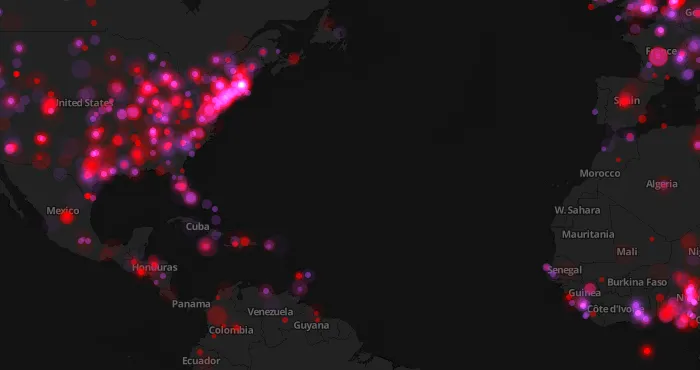
CartoDB’s unique browser-based animation system means that you can see global-scale patterns one moment and the next moment zoom into a specific country or region to visualize its localized trends. ISIS’ march across Iraq is instantly visible civil war in Ukraine bursts into view and the clustering of protests and violence in Nigeria leaps from the screen.
Using CartoDB’s ability to separate the underlying data from the maps that visualize that data an alternative version of the map was also developed using a bright daytime colored map with a different color scheme for the events. In addition the ability to specify different versions of the same map that have different centerpoints and zooms has made it possible to create embeddable maps for different countries and regions without changing any code. To make an embeddable map of Iraq one simply uses the main map visualization and hands it different zoom/center parameters. Instead of manually creating 20 completely different maps the same map can be used for infinite different localization needs. CartoDB’s incredible ease of use gorgeous nearly art-like visualizations powerful interactivity unique browser-based zoomable animations and SQL API made the creation of this global conflict dashboard incredibly easy.
If you think about it this map represents an entirely new way of thinking about visualizing understanding analyzing and interacting with our world’s news. News is intrinsically rooted in space: events happen or are announced or discussed at particular locations and involve people organizations and actors situated and moving through their own array of locations. Yet in an era where one cannot spend more than a few minutes without encountering a map of some kind the world’s news media is still presented as a pile of words and images completely detached from space. Despite a typical news report averaging one location every 200-300 words today we still interact with the news through the humble keyword search box or selecting by country. Yet retrieving 1 000 000 matching articles for Iraq does little to shed light upon the “big picture” of how unrest is moving through the country and region. Through the power of GDELT and CartoDB and the support of the United States Institute of Peace we were able to create a first glimpse of a global map of conflict updated each day.
Acknowledgements
We’d like to thank the United States Institute of Peace for making this map possible and Google Ideas for their support of the GDELT Project.
Take a look at our Map Gallery and check what you can build using CartoDB. Also go to our website sign up for a free account and start creating customized maps.