How to Create Maps from Snowflake using CARTO & SQL


Simpler data workflows for Snowflake users
Some weeks ago we announced our exciting new connector for Snowflake. With this latest feature Snowflake users can easily import data into CARTO to create advanced visualizations and perform advanced geospatial analysis.
In this blogpost we will demonstrate how simple it is to import almost 4 million records from Snowflake into CARTO and create insightful visualizations with the help of CARTO Builder our web-based location intelligence solution for analysts and business users.
Importing data from Snowflake
As a first step we need to import our dataset from our Snowflake database into CARTO through the account dashboard but the process can also be automated using our Import API.
In this example we are going to use one of Ookla's Open Datasets available from AWS' Open Data Registry. These datasets include telecoms fixed and mobile performance data aggregated by quadkeys. For our analysis we are going to import the global mobile (cellular) network performance dataset for Q1 2020.We start by creating a stage for loading data from files into Snowflake tables pointing to the S3 folder where the Ookla files are stored:
CREATE OR REPLACE STAGE ookla url = 's3://ookla-open-data/';
Next we are going to create the Snowflake table where we want to load the data. The attributes for each tile are described here.
CREATE OR REPLACE TABLE OOKLA (
  avg_d_kbps INTEGER
  avg_u_kpbs INTEGER
  avg_lat_ms INTEGER
  tests      INTEGER
  devices    INTEGER
  quadkey    VARCHAR
  tile       GEOGRAPHY
);
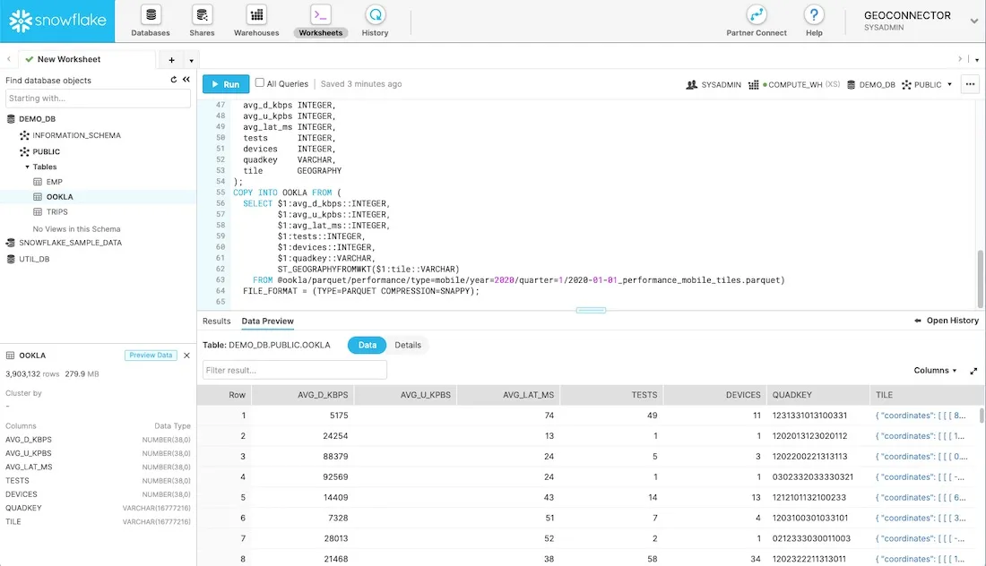
We are now ready to load the data from the Parquet file. The tile attribute contains the geometry in WKT format; we are going to store the geometries using Snowflake’s GEOGRAPHY data type.
COPY INTO OOKLA FROM (
  SELECT $1:avg_d_kbps::INTEGER
         $1:avg_u_kpbs::INTEGER
         $1:avg_lat_ms::INTEGER
         $1:tests::INTEGER
         $1:devices::INTEGER
         $1:quadkey::VARCHAR
         ST_GEOGRAPHYFROMWKT($1:tile::VARCHAR)
    FROM @ookla/parquet/performance/type=mobile/year=2020/quarter=1/2020-01-01_performance_mobile_tiles.parquet)
  FILE_FORMAT = (TYPE=PARQUET COMPRESSION=SNAPPY);
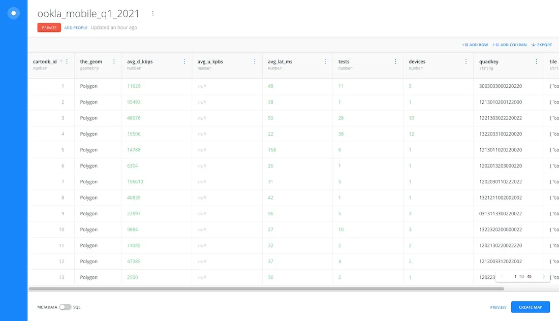
When the process is complete we can preview the data. As you can see the “TILE” column shows the GeoJSON representation for the geometry (default format).
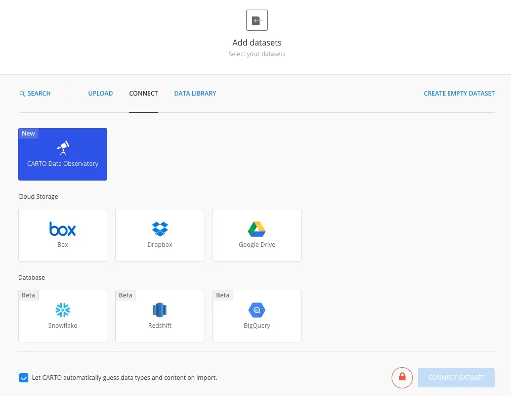
Now we are going to import the data from Snowflake into CARTO. From the CARTO dashboard home page we need to click on the “New Dataset” button. This will open a dialog box to select the connector we'd like to use. Here we select the Snowflake connector.
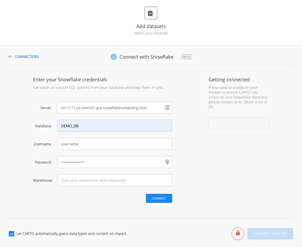
Having selected the connector we need to enter our credentials to connect to the Snowflake database. Here we should specify the server database username and password. We can optionally specify the warehouse; if left blank it will use the default warehouse setting.
Then we click on the “CONNECT” button and CARTO validates the credentials. We will be redirected to the next dialog where we need to enter the required SQL query to retrieve the information and also assign a name to the dataset.
CARTO supports importing columns with Snowflake GEOGRAPHY; in order to identify the column correctly we need to give it an alias (the_geom). We are going to load the whole dataset into CARTO using the following SQL query:
SELECT tile as the_geom  *
  FROM OOKLA
If we wanted to import only a subset of the data available in the original dataset we could make use of Snowflake’s geospatial functionality to filter the data using a bounding box like in the following example that filters the geographical region around Florida and Cuba:
SELECT tile as the_geom  *
  FROM OOKLA
 WHERE ST_Intersects(tile
                     to_geography('POLYGON((-86.3741 28.1758
                                            -75.4067 28.1758
                                            -75.4067 21.8036
                                            -86.3741 21.8036
                                            -86.3741 28.1758))'))
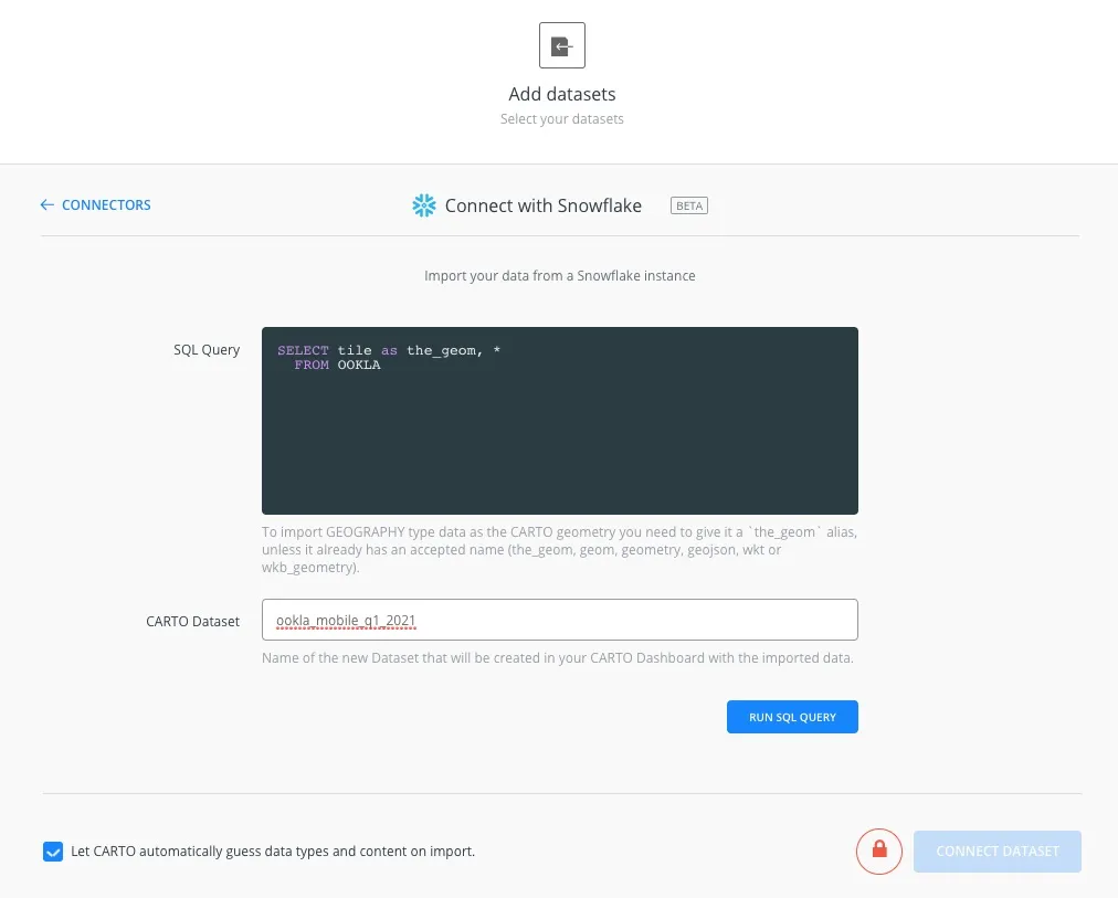
We can now click the “RUN SQL QUERY” button. The application will check the syntax of the SQL query; if everything is correct the synchronization dialog will be displayed. CARTO allows you to keep your Snowflake dataset in sync so it is automatically updated with any desired frequency. In this example as the data is static we select “NEVER” as the sync frequency.
Now we can click the “CONNECT DATASET” button and the import process will begin. When the process is complete we will be redirected to the table preview page where we can check the imported information. We also have the option to create a new map using this imported dataset.
Creating a visualization
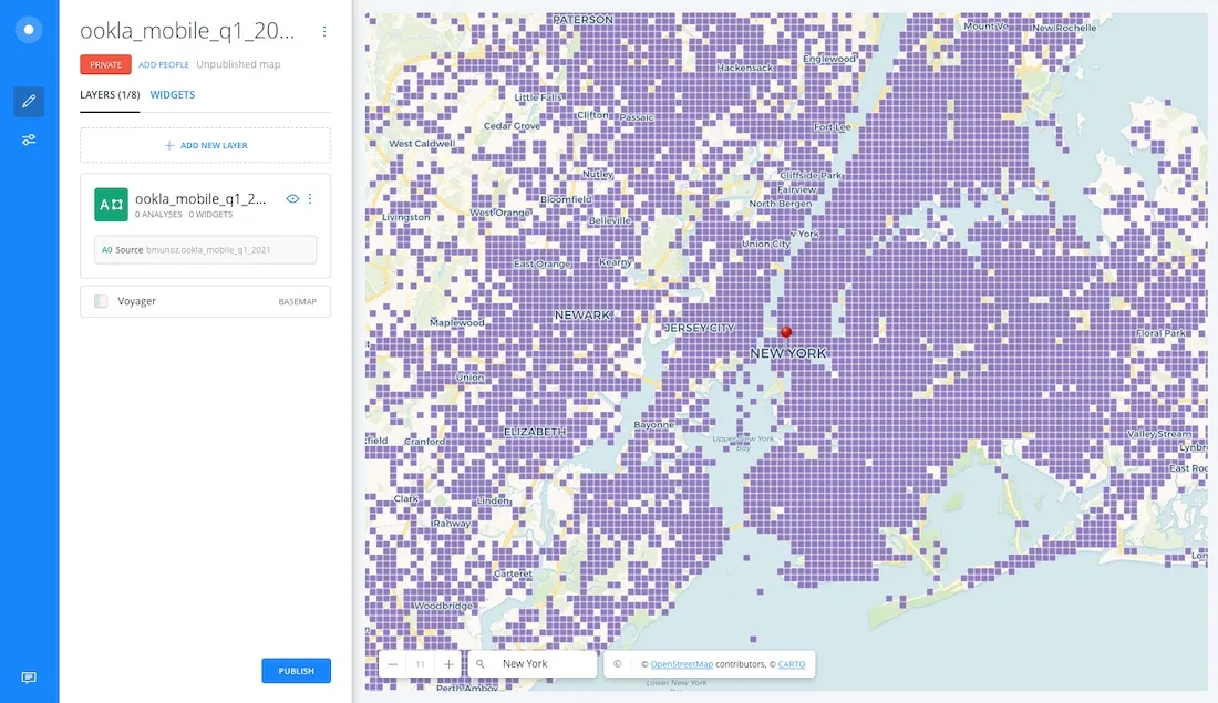
When clicking on the “CREATE MAP” button CARTO opens with the default basemap and a layer created from our imported Snowflake dataset using a default style. The map opens at zoom level 1 and the polygons are too small to be easily visualized we can therefore use the search bar at the bottom of the map introduce “New York” and press the Enter key and the map will zoom to that location.
The default visualization assigns the same color to all polygons. In order to better analyze the data it makes sense to style the polygons using the average download speed field. To do this we need to click on the layer name and select the “By value” option in the POLYGON COLOR section. Then we select the avg_d_kpbs column and the application automatically applies a visualization style with 5 quantiles. Here we can customize the color palette used for the different intervals.
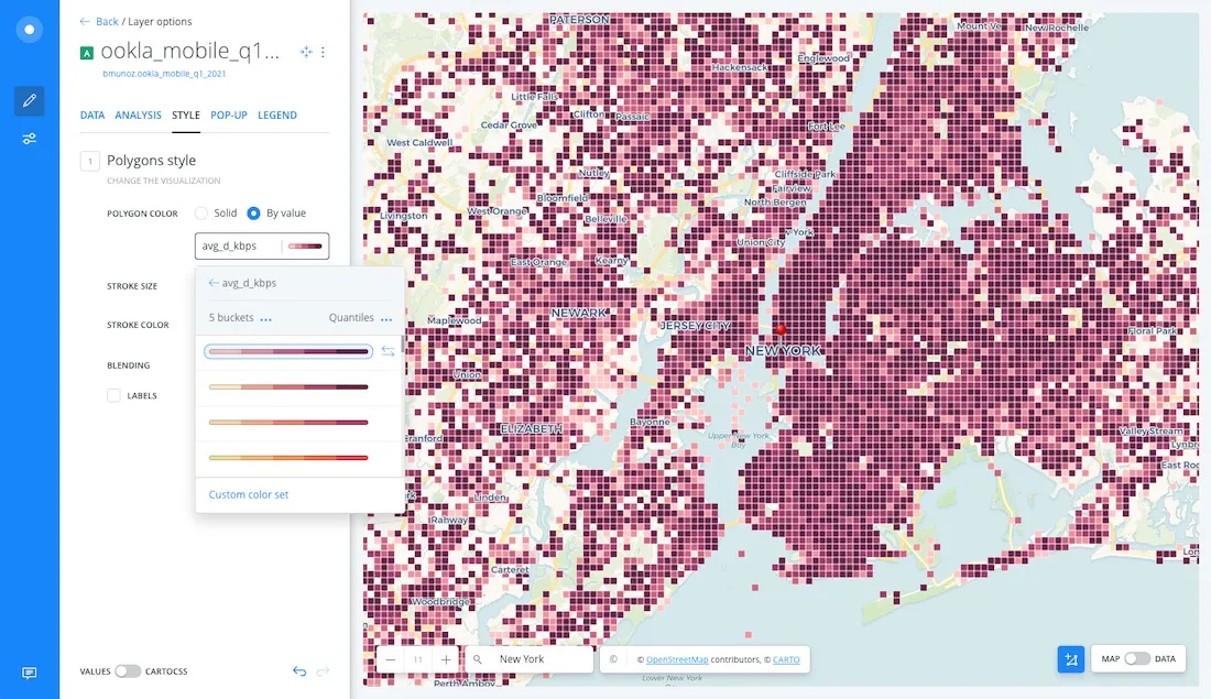
With these enhancements to the map we can start deriving data insights. For instance the average download speed in Manhattan seems to be higher than the speed in The Bronx or the Jersey Shore. We can also see whitespace corresponding to areas where we don’t have measurements because population density is quite low.If you want to derive additional insights you can use Builder’s interactive data-driven widgets that allow you to filter the data or you can make use of Builder analysis options. These provide valuable drag and drop spatial analysis functionalities.
You can further customize your map by using CartoCSS to define advanced styling properties or by configuring a pop-up that is shown when the user hovers through a polygon. In the final map that you can see below we have specified additional CartoCSS properties to set the polygon opacity based on the number of tests (the polygons with more tests are more opaque) and we have also modified the color ramp.
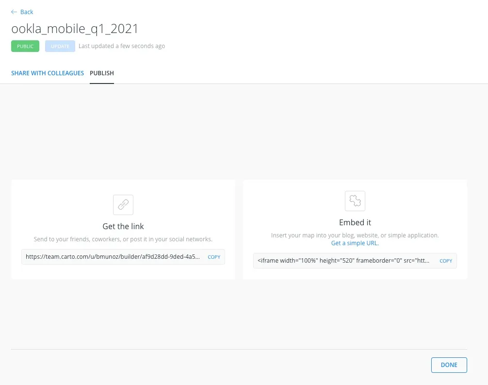
Finally it is easy to share the map with anyone on the internet by making it public (with or without a password). We just click on the “PUBLISH” button and select the desired option. If we select the public or password option by clicking on the red “PRIVATE” button we will get an URL that we can easily share. When making our map public we also have the possibility to obtain HTML code so we can easily embed it in an existing page by selecting the “PUBLISH” tab. This allows us to copy the HTML code by clicking on the “COPY” link within the embed area.
An example of an embedded map can be seen below:
Get Started
If you are a Snowflake user and want to easily connect your data to CARTO sign up for a trial account to access the Snowflake connector.
Want to get started?
If you are an enterprise user of CARTO your Customer Success Manager will be happy to guide you through this connection process.
And what about bigger datasets?
We are working with Snowflake to enable the creation of TileSets right inside Snowflake which will make the visualization of massive spatial datasets a real breeze.
How massive? We are talking about anything from millions to tens of billions of records. If you are interested in taking your large datasets to Snowflake and visualizing them let us know. We’d love to hear from you.
Want to see this in action?