Visualizing the Olympics: Top Maps and Data Visualizations from Pyeongchang


On Friday February 9th the 2018 Winter Olympic Games kicked off in Pyeongchang South Korea. Featuring athletes from 92 countries around the world this Winter Games provided myriad international headlines ranging from the geopolitically important (such as the North and South Korean teams marching as one during the opening ceremony) to the downright silly (chefs for team Norway ordering 15 000 eggs due to a typo).
Unsurprisingly The Olympics have long been a rich source for data journalists and storytellers as well sitting squarely at the intersection of international politics sports and statistics. 2016's Summer Olympic games in Rio de Janeiro proffered a number of insightful data stories maps infographics and visualizations. The Guardian for example ran a series of deep dive data stories with interactive visualizations including this look at the dramatic finish in the 200 meter freestyle race.
The Olympic games also generates a large quantity of location data. Due to its very nature as an international competition there are obvious location components to draw on such as the home countries of athletes and the location of qualifying events. In the wake of the Rio Olympics Telegraph took the opportunity to map medal winners highlighting those nations who have dominated the games and those who still seek their first taste of olympic glory. Mapping tools are helping storytellers to paint a deeper picture and provide new insights into the inner-workings of the Games and are a key piece of the modern data journalist's toolkit.
In celebration of this year's competition here is a look at some of our favorite maps and visualizations from the past two weeks:
Google Search Trends: Pyeongchang Olympics 2018
Google Trends is Google's public web interface for exploring their search data. Empowering users to investigate the prevalence of searches by topic around the world and to do comparisons between topics and search terms Trends is a useful tool for understanding the impact or interest in an event like the Olympics on a country-by-country basis.
Launched in conjunction with the start of the games their Olympics story provides a deep dive into each sport combing the search data for distinct insights. Curling for example enjoys a substantial bump in searches every four years the number one searched question often being "What is Curling?"
The story provides maps based on additional data such as each country's favorite winter olympic sport on Youtube and the top searched sport in each country. Interactive maps such as these can empower analysis for example providing insights to advertisers as they target their messaging during the games.
>Each Country's Chances of Winning a Medal

Freelance Designer Anthony Veyssiere set out to visualize the chances for a medal for each country participating in these winter games. Based on each athlete's standings in the global rankings of their respective sport Anthony assigned a likelihood of victory (big chance average chance small chance).
In addition to seeing likely medal counts by country Anthony's visualization also uses an Olympic event calendar. Once a nation is selected the events where they have a shot at a medal are highlighted on the calendar and a handy pop up shows you where each athlete stands in the rankings going into the games making this visualization a handy and interactive alternative to a traditional tv guide style listing.
Demographic Insights from YouGov
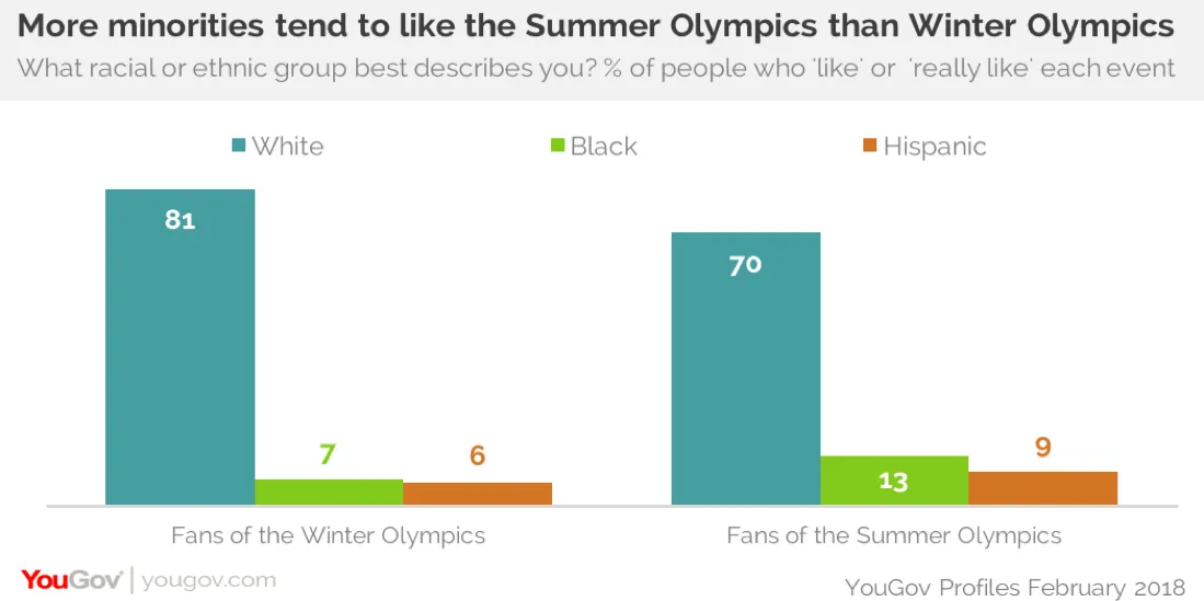
Market research polling and data analytics firm YouGov dove into their opinion data and discovered some interesting insights into Olympic interest by demographic in America. For example the American fanbase of the Winter Olympics is notably less diverse than that of the Summer Olympics. They also note the regional difference in preference between the Winter and Summer games with the western and midwestern United States having a greater number of Winter games fans and the Southern and Northeastern United States favoring the Summer Games.
YouGov also links the Olympic seasonal preference to consumer data showing what some fans are more likely purchase what websites they are likely to view and even which health insurer they are most likely to use. Visualizations and resources like YouGov data are critical for marketers looking to make informed decisions and reach target audiences around major events like the Olympics.
The Speediest Winter Olympic Sports

The team at The Washington Post put together an amazing animation for their exploration of the speeds attained by Winter Olympians. Displaying athletes from varied events crossing a snowy finish line the difference in speeds is painted in stark relief exemplified by a luger rocketing past a curler trundling along the track.
The article includes a brief quiz to test readers' knowledge of Olympic speed. In addition to providing excellent trivia (in the non-Olympic sport of Speed Skiing Italian skier Ivan Origone clocked a blistering top speed of 158.4 MPH!) the article's stunning use of data visualization provides a new perspective on how truly fast these athletes go and exemplifies data visualization as a learning and education tool.
SnapMap

While SnapMap isn't an example of data journalism in and of itself it is a tool that data storytellers are going to want in their toolkit going forward. This Snapchat component which maps Snaps from across the globe was previously an in-app only feature but the improved in-browser version launched mere days after the Olympics kicked off and has seen substantial use showcasing the goings-on in Pyeongchang.
With a search bar highlighting the most active events and stories going on at any given moment and an easy embed tool SnapMap is perfectly suited to real-time event reporting. Presenting these short videos on a map will engender a greater understanding of an event's global reach and impact. Keep an eye out as digital media organizations acclimate to this new feature which we expect may make embedded Snaps as prevalent as ubiquitous Twitter and Instagram embeds.
Medals Per Capita: Olympic Glory in Proportion
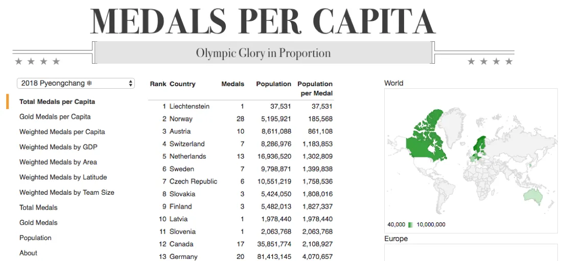
The national pride that accompanies Olympic glory often involves substantial grandstanding and one upmanship. But while the United States can boast about their impressive 2 814 total medals across all olympic games that doesn't paint the full picture.
With his Medals Per Capita page Craig Nevill-Manning aims to do just that. The Sidewalk Labs CTO dives into the data going all the way back to the first modern Olympics in Athens in 1896 mapping out medals earned per capita. By this measure the USA having an olympic medal for about every 100 000 people pales in comparison to the triumph of current leader Liechtenstein who with 10 medals has one for every 3 647 Liechtensteiners. >Learn more about the family from the world's 6th smallest country that carries the legacy of Liechtenstein's Olympic Alpine Dominance
MedalsPerCapita allows users to sort by specific Olympic games and view the data categorized in several additional ways such as weighted medals by area and weighted medals by GDP. The site also includes choropleth maps of the world that update based on the readers selections empowering greater insight into the geographical differences in Olympic success. Craig's site looks at the data in a different way and in so doing highlights otherwise hidden stories from the Olympic games.
What's next?
With the proliferation of modern techniques and technologies for visual storytelling mapping location data and performing spatial analytics Data from the Olympics will be put to even greater use in the future.
We can already see some of these new technologies being implemented with tools like the Snapchat's aforementioned SnapMap The New York Times' embrace of Augmented Reality to show the complexity and rigor of Olympic Events and the NBC-Intel partnership providing Virtual Reality access to the games allowing fans to experience Pyeongchang without leaving their living rooms.
Additionally Location data isn't limited to regions and countries and the Olympics is a valuable source of far more granular datasets. Puck and player tracking data for example recording movement around a hockey rink is being tested at this Olympics and coaches and athletes will inevitably look to emerging techniques such as spatial analysis to gain a competitive edge within each sport.
One thing is certain that these techniques will continue to grow yielding more powerful and insightful stories from Tokyo 2020 and beyond.