Data Through Design Opening Reception: Kicking-Off NYC Open Data Week 2018 in Style


“Open data ” as a core value is easy to endorse but it is not always so easy to practice. This problem inspired last year’s NYC Open Data Week a collaboration between NYC Open Data BetaNYC and the greater NYC civic tech community to organize a series of events workshops and presentations to raise awareness and provide lessons to the public on working with the nearly 2 000 available data assets. For NYC Open Data Week 2018 there is an even greater emphasis on “learning how to work in the open ” Adrienne Schmoeker explained “versus merely managing an open government program.”
Teaching the public to work with open data also requires teaching the public to see how open data already shapes living conditions for New Yorkers across the city.
Data Through Design a new art exhibit featuring tangible works made with and inspired by intangible open data from developers designers and data experts provides viewers new ways to think about living and working in an open city. Together with our friends at Pratt SAVI and Enigma we organized Data Through Design to explore new ways to show the public the processes involved in moving from noisy data to information and from information to insights.
Don’t miss Data Through Design’s opening reception Friday March 2nd from 6:00-8:00pm at the Made in NY Media Center by IFP to get a head start on NYC Open Data Week 2018. Below learn more about open data themes the exhibit explores and for more information on each project and presenter check out the Data Through Design website.
Data interpretation and its discontents
Several projects selected for Data Through Design expose repercussions related to confusing data for information. Despite Clifford Stoll’s warnings that data is not information many data-driven policies and procedures fail to account for implicit biases insufficient sample sizes and margins of error introduced while collecting data and figuring out what collected data means.
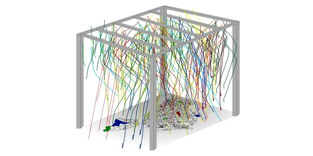
Jill Hubley explores the consequences of putting these policies into practice in Broken Windows and Pink Tickets. Drawing attention to the ways data-driven solutions can revert back to problematic practices like broken window policing Hubley consulted open data on criminal court sumonses and population demographics to build an installation encouraging visitors to walk through a mass of parachute cords corresponding to the amount of summons issued for various infractions across the city’s 78 police precincts. This immersive experiences explores whether open cities are really open to all residents while raising questions on urban mobility more generally.
Additionally other projects engaged in redesigning data interpretations include:
- Marutha Govindarajan and David Lockard present a valuable lesson in their installation What Our Numbers Don’t Show revealing how data is commonly misinterpreted.
- So Yeon Jeong and Ye Eun Jeong spotlight the lives behind statistics with their light installation The Time of Sexual Trauma
- In Life or Death in the Built Environment James Proctor and Pitch Interactive highlight zoning choices and decisions impact lives lived across the city
Topographies typologies and the open city
One aim for cities and local governments in working with open data is to redesign urban topographies in order to improve city services. But what typologies and classifications inform these redesigns and what questions do they raise on working with open data to improve citywide living conditions? Several projects in Data Through Design tackle these questions with the help of mortality tree census and traffic accident data assets.
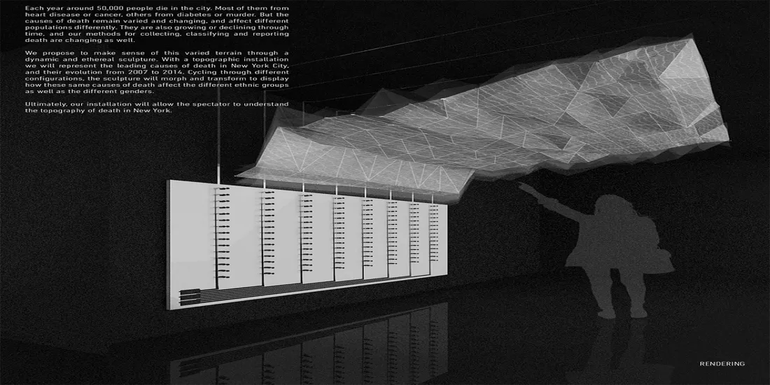
In How We Die a topographic installation representing causes of death in New York City from 2007 to 2014 Juan Francisco Saldarriaga and Steven Sanchez reimagine the city’s terrain through death to raise questions on living conditions in an open city. In creating an installation that maps death data this project invites visitors to consider how the same cause of death has different effects across the city when mapped by ethnic communities and gender.
- Ellen Oh brings awareness to the need for more road safety measures in Slow Down an installation visualizing traffic crash data from 2010 through 2017 to expose the physical and psychic toll of living in the city.
- Manhattan Tree Topography from the team over at TWO-N presents an interactive sculpture whose blocks correspond to the type and amount of each neighborhood’s most prevalent tree.
- Jeremy Neiman takes poetic license in his exploration of how nearly 400 000 government employees keep New York City running each day in New York Seeks Talented Individuals to Compose Haikus using an algorithm to generate haikus based upon job descriptions.