How Yale Climate Connections Uses Spatial Visualization for Community Engagement


What is the first thing that you do when you open a web map? For most of us we scroll and scroll until we’re zoomed right in to exactly where we live to find out what’s happening where we are. This isn’t necessarily us being self-centered; understanding what is happening where you are gives you context for the story the map is telling. It makes it “real.”
This is something that the team at Yale Climate Connections takes advantage of. Tasked with sharing stories about climate change and action they’ve used CARTO to create a spatial visualization that shares local stories to help explain a global phenomenon.
About YCC
Yale Climate Connections (YCC) is a program at Yale Program on Climate Change Communication. It is a “nonpartisan multimedia service providing daily broadcast radio programming and original web-based reporting commentary and analysis on the issue of climate change.” Through a range of articles radio stories videos and webinars they help individuals and institutions to understand the ways in which climate change is happening right now.
YCC believes that effective communication around climate change stems from targeted audience communication. With this in mind they have used the Yale Program on Climate Change Communication (YPCCC) typology of “Global Warming’s Six Americas.” This typology outlines six key groups with different beliefs and motivations around climate change: the Alarmed Concerned Cautious Disengaged Doubtful and Dismissive. The YCC Story & Stations map particularly aims to target the groups most concerned about and motivated to combat climate change. These groups are the Alarmed who are keen to but unsure how to act and the Concerned who are less convinced that climate change is an immediate or local problem.
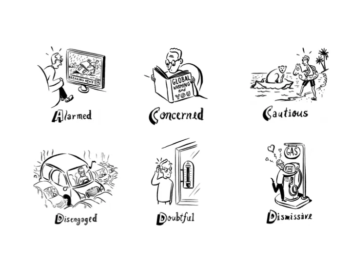
Artwork by Michael Sloan.
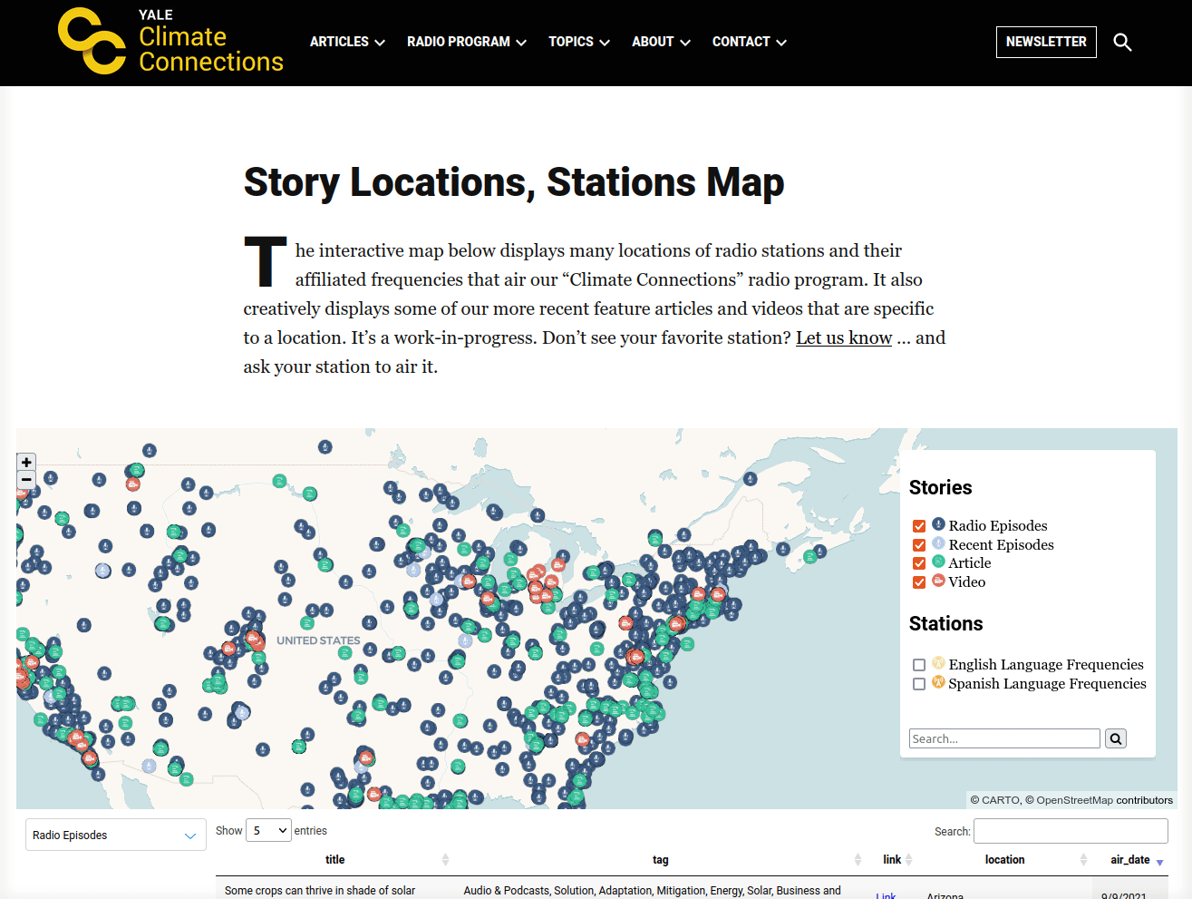
Climate Connections Mapped
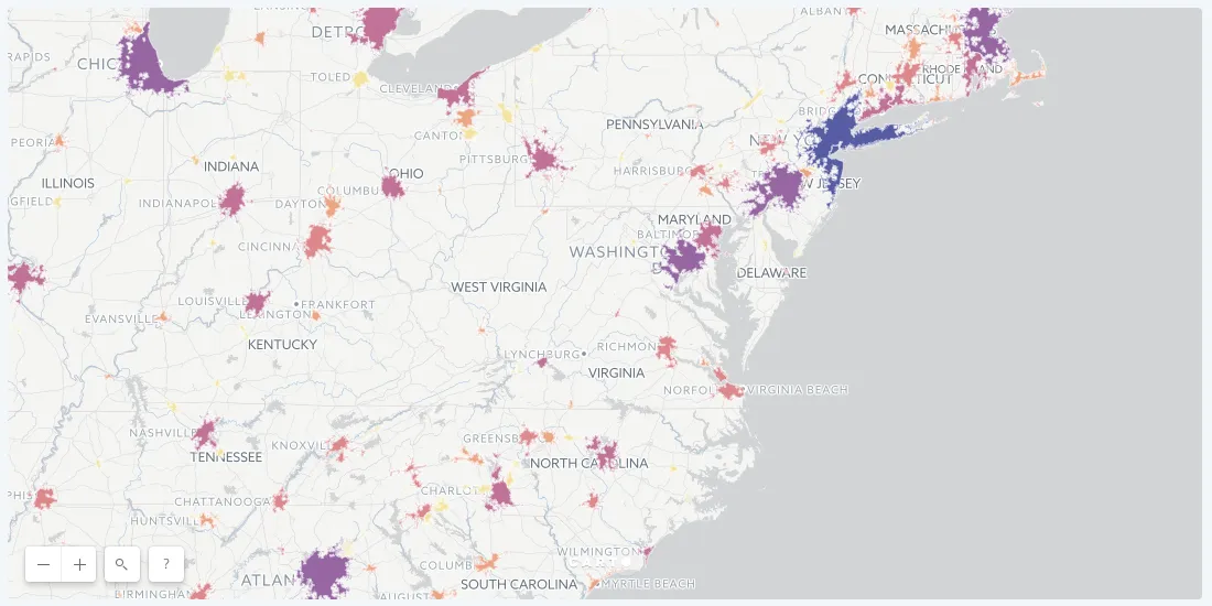
The CARTO-powered Yale Climate Connections map shares the locations of radio stations that air the Climate Connections radio show. It also maps out the locations of topics of pertinent articles and videos.
According to YPCCC the US demographic that is most concerned about climate change is Latinos especially among those people who prefer to speak Spanish. With this in mind the map also highlights where radio segments air in English or Spanish. This information is differentiated by color and iconography with further information available via popup and the dynamic table beneath the map.
Why Use Location Intelligence?
YCC sees one of the key barriers to appreciating the reality of climate change being people see it as a distant threat both in terms of distance and time. Sharing local stories as a map is a way of communicating the reality of climate change; that it is both happening now and it is happening everywhere to everyone.
As well as being an impactful way of sharing this information the creation of the map was also a conscious user experience decision as it empowers users to quickly pinpoint information of interest to them rather than having to scroll through multiple stories of lesser interest.
In addition to benefits for the users mapping out the locations of these engagement activities is also of benefit to the people within YCC. It allows them to identify gaps in their activities in order to establish a strategy for future engagements.
Behind the Map
YCC has been working with the support of the CARTO team to build this custom app. This has allowed them to take advantage of advanced visualization tools such as the dynamic data table and SVG-icons giving users a richness of insight into the data behind the visualization.
To produce the map YCC extracts relevant data from the transcriptions of each radio show on a monthly basis. This information is stored in spreadsheet format with the team using CARTO’s Sync Table API to automatically update the map every 24 hours without the need for any manual user input saving vast amounts of time.
The Future of Climate Connections
So what does the future hold for the Climate Connections map? Since its inception in 2013 the team have sought to constantly improve both the map and the processes driving it. A potential ambition is to take advantage of our cloud native analytics and visualization capabilities and move their workflow to a cloud data warehouse. This approach would allow for more efficient scalable and performative workflows as well as enhanced collaboration opportunities.
The team is also exploring how to include a temporal element in the visualization such as including a time series widget. This strategy would help users easily pinpoint events that are most current or from a particularly interesting time period.
YCC is also keen to enhance its understanding of the data with further employment of Spatial Data Science. One option would be to use a spatial statistic such as Getis-Ord to understand engagement event hot and cold spots. This would help identify locations which are sparse in climate change communications. Enriching this data with relevant demographic information (such as % Hispanic residents language spoken or education level) could lead to even greater insight.
H3 cells enriched with USA census data to identify locations with high percentages of hispanic residents.
Location Intelligence for Community Engagement
Place is a deeply emotive concept and one we all experience and understand intuitively. Communicating the “where” of a data story is a powerful step in engaging audiences to not just understand your data and analysis but also to care about it.
A huge thanks to Eric Fine and Ben Everett-Lane at YPCCC for their insights and contributions to this piece.
If you’d like to find out more about their work click here.
Have a Spatial Story to Tell?
Get in touch with CARTO today to find out how you can use Location Intelligence to transform your data into powerful spatial analytics and narrative tools.