Introducing CARTO Heatmaps for Big Data Visualization
Today we're excited to share an update to our CARTO Builder heatmap style which can now support large-scale data! Keep reading for our full guide to heatmaps including why, when and how to use them 🔥
What are heatmaps?
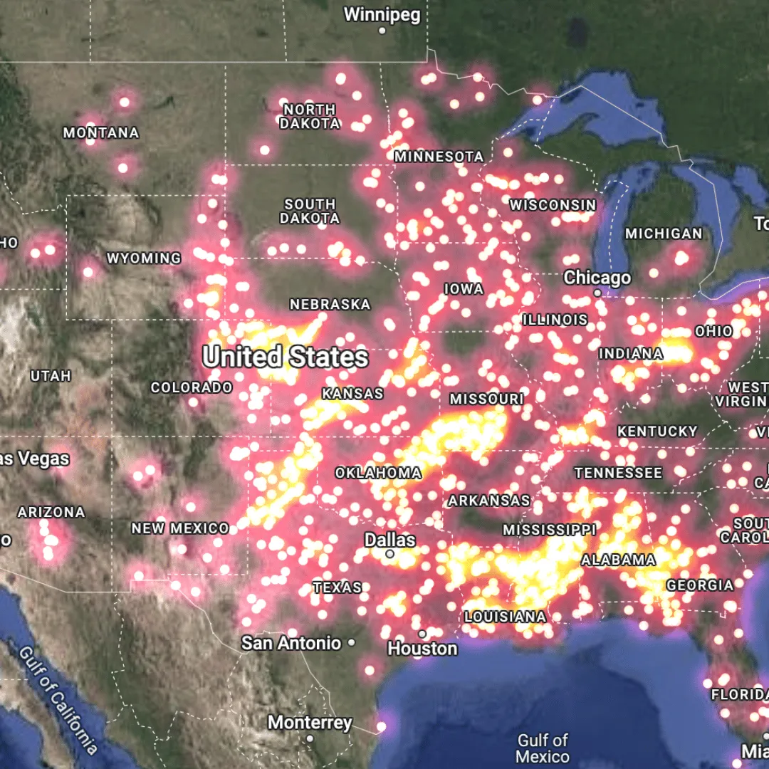
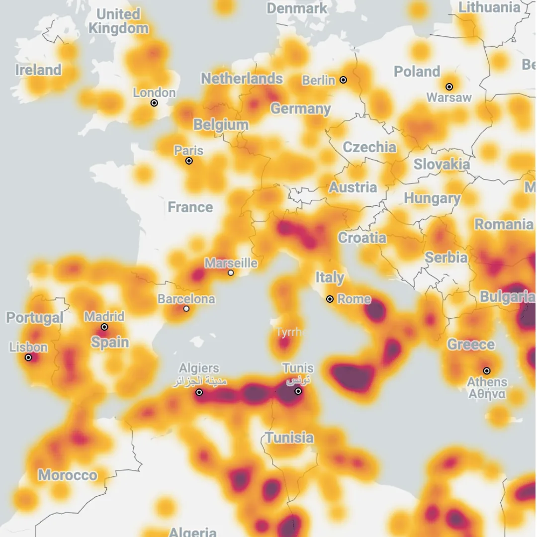
Heatmaps are a powerful way of visualizing your spatial data which uses color gradients to represent the density and intensity of data points over a geographical area. They can be based purely on the spatial distribution of data - such as the number of tornadoes (see below) - or can be weighted to account for numeric variables such as mobile signal strength or earthquake magnitude.
The strength of heatmaps lies in their simplicity; they are incredibly simple to interpret, enabling users to turn noisy data into an intuitive visualization of geographic distribution. With CARTO, you can now take advantage of this style for layers of an unlimited size - which are often noisy and complex. Want to try for yourself? Sign up for a FREE 14-day trial here!
When to use heatmaps - and when not to
The simplicity of heatmaps means they are ideal for building visualizations when you are trying to convey…
- A quick visualization of data concentration: when you need an immediate, intuitive representation of where data points are concentrated, density heatmaps provide a clear and straightforward visual.
- High and low density areas: heatmaps are perfect for identifying and presenting areas with a high/low density of data points, making it easier to spot trends and hotspots.
- Qualitative analysis: if your goal is to conduct a qualitative analysis that benefits from a visual overview of data concentration patterns, heatmaps offer an effective and engaging way to convey your findings.
- Sensitive or private data: if you have sensitive or imprecise data, heatmaps can be a great way to communicate the general trends of your data without exposing the individual data points.
Despite their benefits, there will be some use cases when heatmaps aren’t optimal for what you’re trying to share. These include:
- Lack of data suitability: if there are no spatial patterns in your data - for instance if it’s in a regular grid - then a heatmap won’t be effective.
- Precision of outputs: your user requires precise spatial analysis rather than a more qualitative visual representation.
If you do require more quantitative and precise outputs, a more optimum approach would be to aggregate your data to a Spatial Index grid such as H3 or Quadbin. Spatial Indexes have the added benefit of enabling scalable and efficient management of very large datasets, as well as enabling spatially hierarchical organization of data. Want to find out more? You can learn more about Spatial Indexes in our free ebook Spatial Indexes 101!
How to create a heatmap in CARTO
Want to create a heatmap online? Getting started with heatmaps in CARTO couldn’t be easier! Sign up for a FREE 14-day trial here to try this for yourself.
- Create a Builder map in the CARTO Workspace in the Maps tab (New map +).
- Add a point layer; you can do this through Sources (bottom > Add source from > navigate to your point table. We’re using fires_worldwide from the demo tables dataset in the CARTO Data Warehouse which all users will have access to.
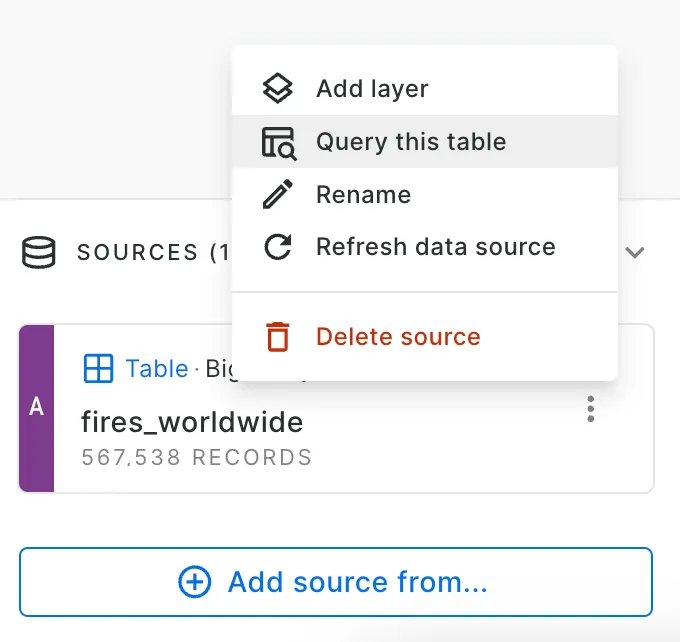
Don’t have a point layer? You can easily convert any polygon or line table to a central point using the command ST Centroid in either CARTO Workflows or by selecting Query this table under source options (see below) and modifying the query to SELECT ST_CENTROID(geom) AS geom, other_fields FROM project.dataset.table.
- With your point layer added, change the Layer type to heatmap… and you’re done! From here, you can change the color palette and heatmap size to best suit your layer and use case. You can also add widgets using your heatmap layer to help your user interact with the data.
Developers can also build their own large-scale heatmaps in their apps using CARTO + deck.gl, with the new heatmapTileLayer (Experimental). Learn more from our documentation and examples.
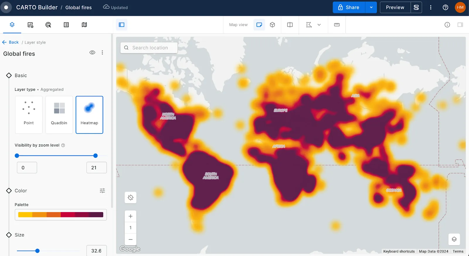
Explore this in action below, or open in full-screen here. You can see how easy it is to identify patterns in the data, such as the density of fires around the coast of Australia, or the latitudinal cut-off in South America.
Building impactful heatmaps - tips & tricks
So, how can you craft your map to make your heatmaps have the most impact? Here are some top tips:
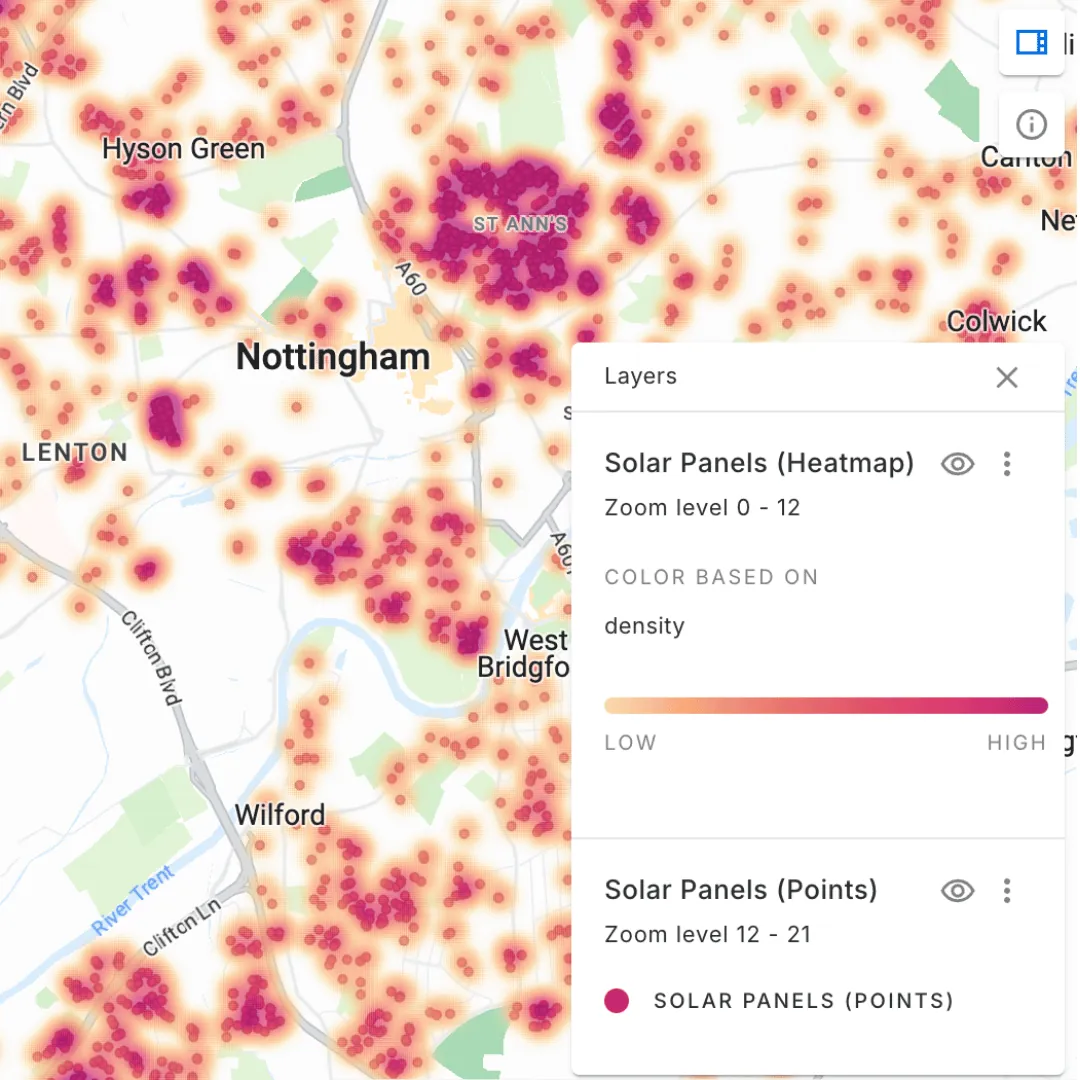
- Choose the right color palette. Ideally, you’ll want to use a sequential palette (i.e. one which transitions from light to dark, or from one color to another). As a general rule, you’ll want the high density value to have the greatest contrast with your selected basemap. So for a light basemap, high-density areas should be represented by darker colors (see below), whereas for darker basemaps high-density areas should be lighter.
- Choose a density radius which makes sense for the extent and distribution of your data, but also for the purpose of your map and the problem you’re trying to solve.
- Experiment with using zoom-based visibility, with your heatmap being visible when the user is zoomed out, and then the source points visible as they zoom in. Check this out in action in the map below - you can even click on the individual points to see a Google Streetview image of each location (check out this blog to learn how!).
Check out our webinar Data Visualization & Storytelling with Maps: Tips, Tricks & Best Practice for more advice on crafting impactful maps and dashboards.
Analyzing solar panel distribution in the UK. Want to recreate this map? You can find the source data for this in the CARTO Data Warehouse under demo tables.
Learn more about how organisations are modernising their approach to location with our FREE ebook The State of Spatial Data Science 2024!
—
With CARTO's new heatmap capabilities, visualizing large and complex spatial data has never been easier or more effective.
Ready to start transforming your spatial data into clear, intuitive insights? Schedule a demo with one of our experts today and learn how you can start analyzing spatial data at scale!


