Understanding flood risk at scale with Fathom’s new Risk Scores


We’re excited to share that you can now access our data partner Fathom’s Flooding Risk Scores directly from our Data Observatory! Risk Scores are a simple yet powerful tool for assessing flood risk to assets across your portfolio, helping you make faster, more informed risk-management decisions.
You can now access Risk Scores via CARTO’s Data Observatory by subscribing to the data via your cloud data warehouse – no ETL needed! Quickly understand flood risk for various time horizons, in any location on the planet.
Meeting the challenge of measuring flood risk
Flooding can cause serious damage to buildings, assets, infrastructure and business operations, which is why most organizations now acknowledge that flood risk equals financial risk. As climate change makes extreme rainfall and flooding events more frequent and intense, measuring and managing this risk is crucial.
However, it is not always an easy task. To build a true picture of flood risk in a changing environment, you need reliable, detailed, scientifically robust data – and lots of it. Often, this kind of data is difficult to access and time-consuming to analyze, requiring in-house GIS specialists and a huge amount of computing resources.
That’s why Fathom created Risk Scores. Developed as part of the company’s award-winning Global Flood Map – the most comprehensive set of hazard and flood risk data in the world – Risk Scores distill vast amounts of information into one simple metric.
What can you use Risk Scores for?
Risk Scores are used by risk-management professionals in sectors including insurance, engineering, international development and financial markets. They can be used to drive the following decisions:
- Portfolio screening: Quickly assess the risk of any asset, book or portfolio.
- Investment due diligence: Screen the risk before making decisions to ensure that you are investing in resilient assets.
- Pricing or valuing: Determine the level of risk and establish appropriate pricing and valuation models for any location, account or portfolio.
- Underwriting: Use Risk Scores in conjunction with underwriting authority, to control the amount of flood risk an insurer takes on.
- Regulatory compliance: Generate metrics that provide valuable intelligence on asset and portfolio flood risk.
- Long-term portfolio management: Plan and mitigate possible risks for any future year and climate scenario up to 2100.
How Risk Scores make the complex simple
Risk Scores are designed to deliver a consistent method of understanding how flood risk varies from one location to another. They’re available in two types of metric: Relative Risk and Risk Category.
The Relative Risk score is a number from 1 to 1 million, which you can use as an annual average loss to determine the risk at any location globally. Risk Category scores the risk on a scale of 0 (least risk) to 100 (most risk), which you can rank as low, medium or high (or as anything you want) according to your own risk appetite.
The scores give you a quick but detailed view of the risk both to a single asset and an entire portfolio, for any major flood peril, time horizon and climate scenario.
In addition to Relative Risk and Risk Category scores, users can also build their analysis with the following variables:
- Climate Scenario: based on greenhouse gas and CO2 emissions. Options include current scenario, net zero/1.7ºC warming to very high emissions/2.4ºC.
- Time Horizon: the selection of a particular year within a 21-year period centered on that year.
- Type of Flood: fluvial, pluvial, coastal, inland - or a combination.
- Percentile: the climate model uncertainty.
- Delta Risk: Number between -1,000,000 and 1,000,000, indicating the difference in Relative Risk for the alternative "climate_scenario" relative to the current view, for the given "percentile".
How to use Risk Score data in CARTO
Ready to get started with using Fathom’s Risk Score data to drive actionable insights? First, you’ll need a CARTO account (if you don’t have one - you can sign up for a FREE 14-day trial here).
To subscribe to the data, in the CARTO Workspace locate the dataset of interest in the Data Observatory tab. Select “Request Subscription” - a member of the CARTO team will be in touch to discuss your requirements. In the meantime, you can access a free sample of the dataset directly.
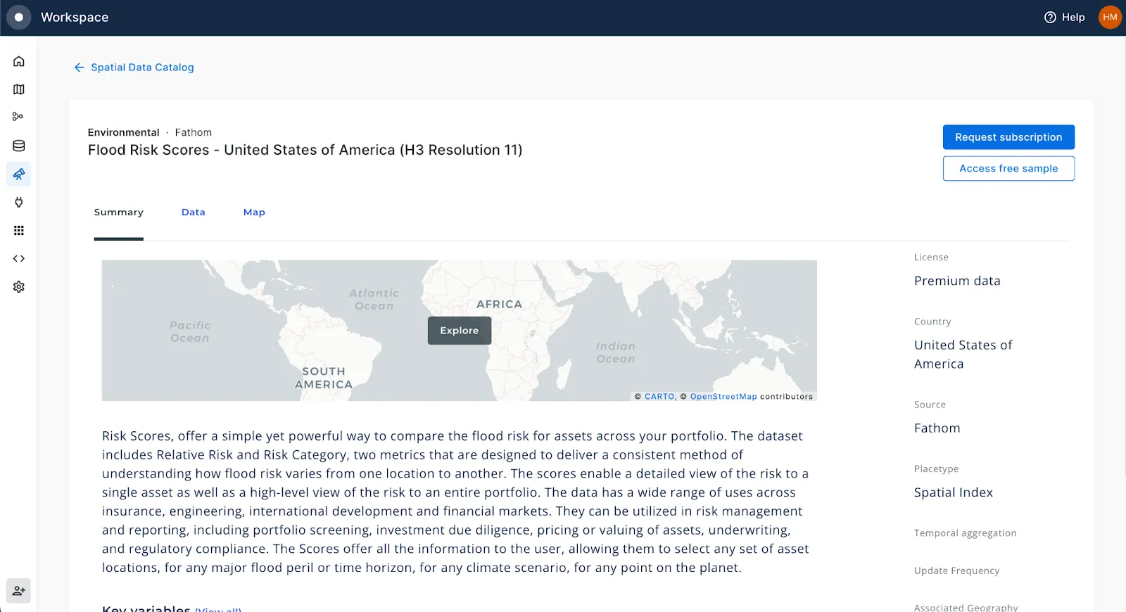
The data is available as a H3 Spatial Index - a discrete global grid system in which location is encoded through a short reference string. This makes the data super lightweight to store, analyze and visualize! Learn more about the benefits of working with H3 here.
Once subscribed, you’ll be able to start using this data in everything from low-code workflows, CARTO Builder maps and customized apps. Keep reading for an example!
Risk Score data in action; flooding in Harris County, Texas
Ready to start turning Fathom’s Risk Score data into insights? Check out this super quick tutorial!
We’ll be analyzing flood risk from county level, right down to individual buildings! All you’ll need is…
- A CARTO account (sign up for a FREE 14-day trial here if you don’t have one)
- A subscription to one of Fathom’s Risk Score tables (you can also use a sample)
- A subscription to both US Counties and Overture Buildings from our Data Observatory - these are both free, open datasets which you can subscribe to directly.
Let’s build this workflow! 👇Head to the CARTO Workspace and Create a new workflow, using your connection of choice (the CARTO Data Warehouse works for this if you don’t have a connection already set up).
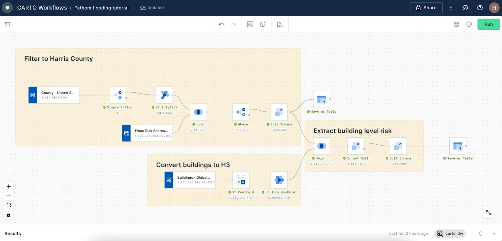
Follow the below simple steps to recreate this analysis:
Filter to Harris County
As we’re using a Spatial Index, we can replace a computationally heavy spatial filter operation with a more computationally efficient join.
- First, locate your Flood Risk, Counties & Buildings tables under Sources > Data Observatory and drag them onto the canvas.
- Filter the counties to geoid = 48201 (Harris County) and convert to a H3 grid with H3 Polyfill (resolution 11 - the same as the Fathom Risk Score data).
- Join to the Flood Risk Scores with the common H3 index columns.
- Use a Where component to filter to the flood scenario characteristics of choice (for instance, fluvial, pluvial or coastal) and Edit Schema to drop any surplus fields.
- Save as Table - that’s our county-wide grid sorted!
Convert buildings to H3
This is a global building layer so it’s pretty huge. Again, let’s leverage the power of H3 to replace what would be an enormous spatial join to extract the flood risk data from the grids, with a string-based join.
- Create building centroids with ST Centroid.
- Use H3 from GeoPoint to encode these with a H3 index.
Extract building-level risk:
- Join the H3 grid (join type right) to the H3 from GeoPoint component to associate a flood risk score with each building, then use Is not null and Edit Schema again to drop any buildings without a flood risk score (i.e. those outside Harris County) as well as any surplus fields.
- Save as table again - and that’s our building-level flood risk data sorted!
Shall we explore the results? To start building your map, you can select any Workflows component, preview the map (at the bottom of the window) and select Create a map - or add the data directly in CARTO Builder.
We’ve added in a series of widgets to help our users explore the data. We’ve also set up the map with zoom-based rendering so that our buildings layer appears when the user zooms in - meaning they can explore everything from building-level insights to county-wide trends, all in one map!
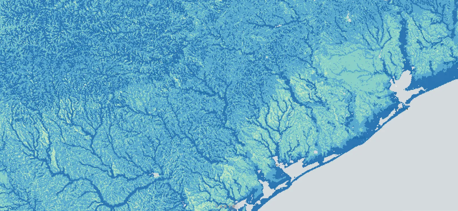
You can see the flood risk is highest (darker pink areas) along the coast and areas in close proximity to rivers. As you zoom in you can explore how flood risk impacts individual buildings, such as along the Buffalo Bayou river (see below).
Understanding Risk Scores at scale
Ready to leverage Fathom’s Risk Scores to help you make decisions at scale? Get in touch for a demo with one of our geo experts to learn more!