

10 Examples of Spatial Data & Visualizations for Telecom Analytics


For telecom analytics, data overload is a common challenge. Telecoms deal with vast amounts of data from various sources, including the network, users, devices, internal operations, partners, and more. As a result, telecom analytics requires handling massive volumes of data constantly with the right data infrastructure to ensure scalability without compromising speed and performance.
One approach to tackle such complex analytics is through the cloud and the modernization of data infrastructure. This approach is an enabler of successful data analytics in many sectors that has been adopted by a growing number of organizations including Vodafone, T-Mobile, Telefónica, and more.
Join us as we explore 10 maps showcasing how CARTO, the leading cloud-native platform for spatial analytics, enables its users to turn spatial data into actionable insights, empowering telecoms to optimize networks, increase mobile coverage, diversify revenue streams, and enhance customer satisfaction.
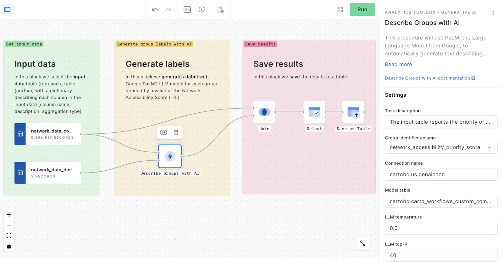
1. Priority Score for Network Access Using AI Labels
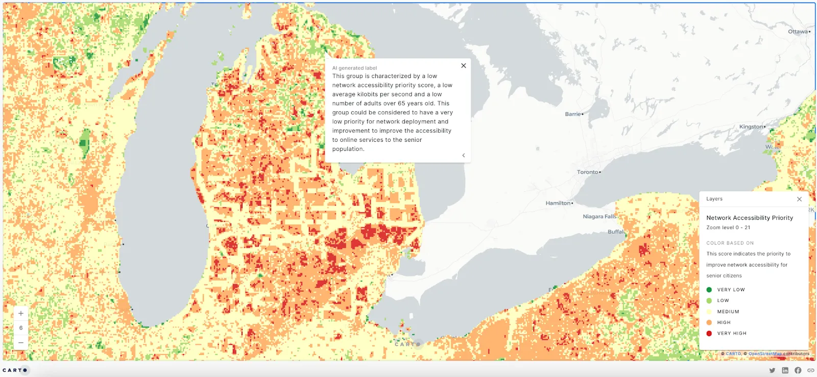
This map is a great example if you’re looking to benefit from the use of AI. The analysis behind this map includes creating an eligibility model through regression analysis and generating a priority score for identifying higher-priority areas. The priority score identifies when there is a bigger proportion of senior citizens with a lower network speed in areas with high urbanity levels, with input sources including building heights, Spatial Features data, telecom data, and human mobility data. Based on this information, descriptive labels have been generated using AI to help stakeholders understand the data and make strategic decisions.
BONUS📱If you want to replicate this map you can watch this video tutorial or read this blog post for a step-by-step guide. Use your own data to draw actionable insights and provide better network access for your users.
2. Wifi Download & Upload Speeds using Quadbins
You probably have wifi at home, at work, and in almost any shop you recently visited. Now imagine how much data that represents for a telecom wanting to visualize a specific location's wifi upload/download speeds.
This interactive map uses a global open-source dataset from Ookla on download and upload speed-test results for fixed and mobile network performance. This is a well-known dataset in the telecom industry and is a great way to identify areas of poor performance and tests taken from mobile devices with GPS-quality location and a non-cellular connection type (i.e. WiFi, ethernet).
Some of the technology used to create this map include the BigQuery Analytics Toolbox functions (Quadkey to Quadbin transformation), Spatial Indexes (with Quadbin as the support geography), Workflows, dynamic tiling, and widgets.
3. Story Map: CARTO & Google Cloud for telecoms
Customer experience is key for telecoms and resolving issues in specific areas and for specific towers can increase satisfaction, reduce churn, and improve overall customer experience. That’s why finding and detecting issues at a tower level is a top priority among many telecom providers. However, a common challenge is to identify towers that have performance far outside the norm.
Explore this demo to see how CARTO and Google Cloud allow you to see tower-by-tower data in detail to identify gaps in customer experience across your network. You can spot areas that need improvements, understand performance data using Generative AI, and see issues at a tower level across all core performance metrics.
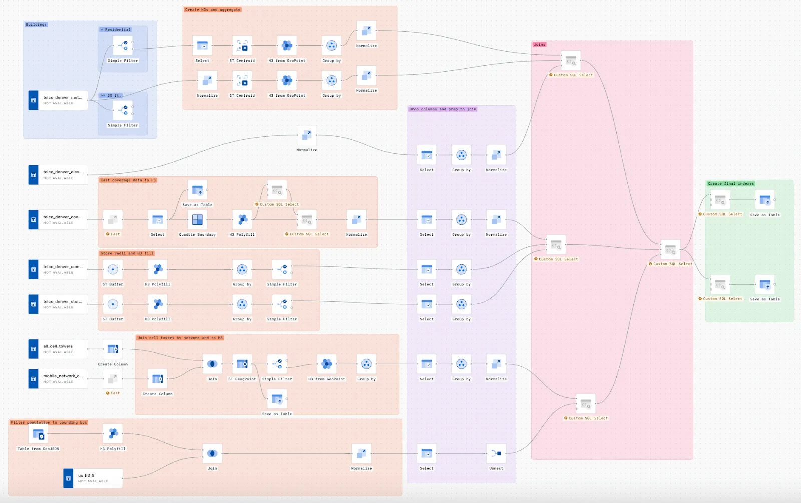
4. Tower Site Selection in Denver
.webp)
Wondering how to find the best spots for new telecom towers? Look no further. This map shows you how to identify the best areas for new towers.
This is achieved through aggregating various data layers such as elevation, building heights, tree canopy, customer locations, and existing cell service into a common H3 Spatial Index for scalable analytics. Each variable is then normalized to a common scale, from which a composite score is calculated which highlights the most suitable locations for new towers.
This analysis is conducted through the below Workflow:
BONUS 📱You can replicate this map with this video tutorial prepared by one of our geospatial experts.
5. 5G Propagation Model
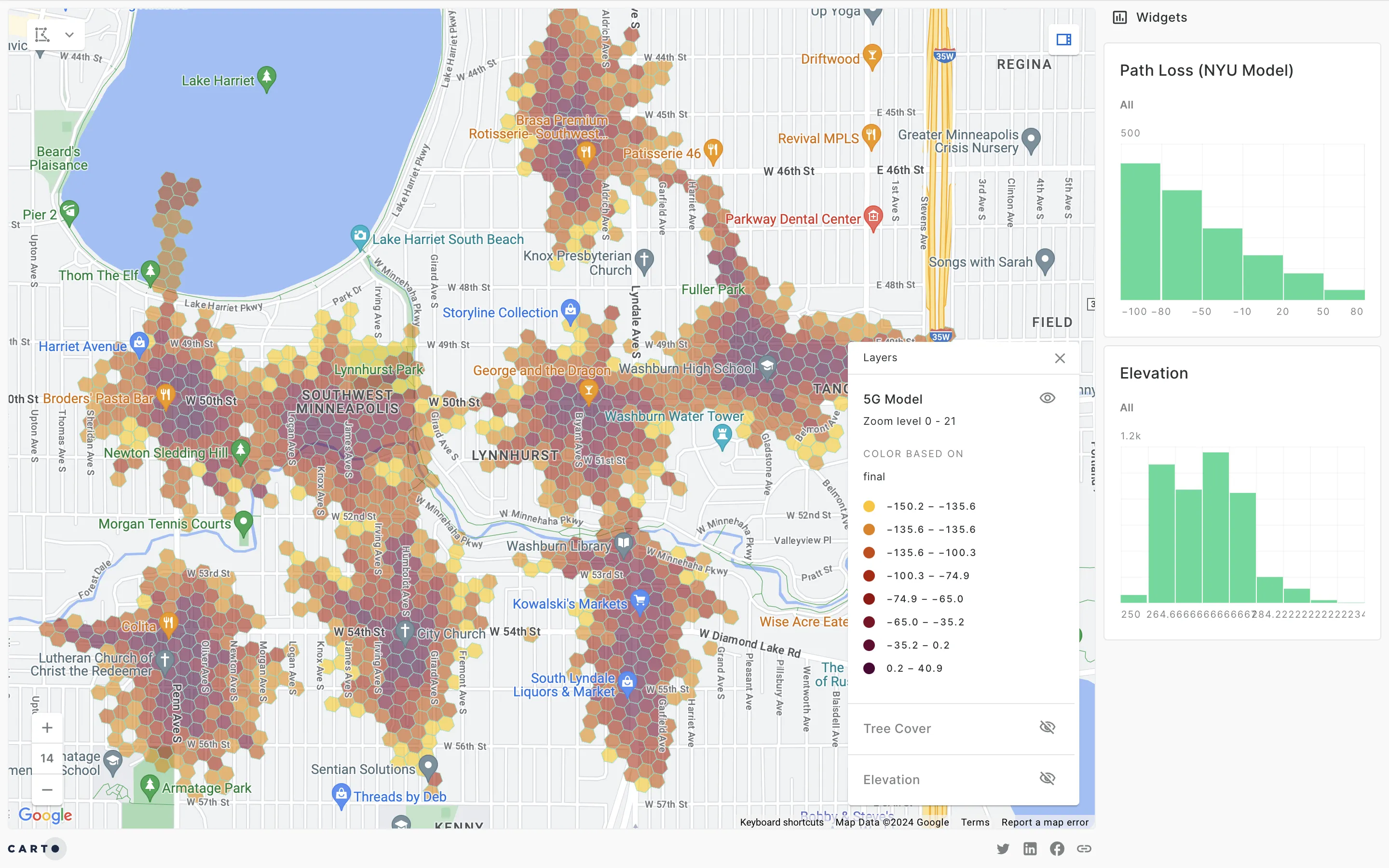
This interactive map displays a 5G propagation model in Minnesota which enables analysts to better predict the success of their 5G rollout. It uses the H3 Spatial Indexing system to visualize the signal strength and coverage of 5G networks. Darker areas on the map represent stronger 5G signals, while lighter areas indicate weaker signals. The map allows for a detailed analysis of 5G coverage at a granular level, highlighting areas with robust connectivity and those needing improvements. Mobile operators can use this information to optimize their network infrastructure and address coverage gaps effectively.
BONUS 📱 Watch this video to learn how to build your own telecom propagation model using machine learning. This analysis incorporates data on demographics, and elevation including tree coverage.
6. Cell Tower Improvements Using K-rings
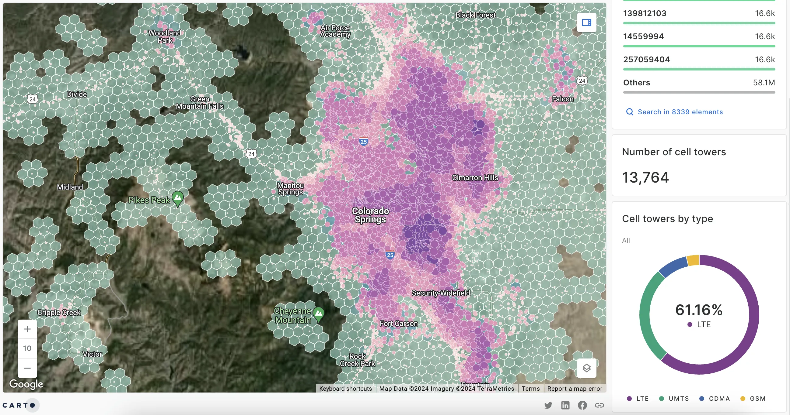
K-rings are a simple concept to understand, but can be a powerful tool in your analytics arsenal. With K-rings, you can define areas of interest without requiring the use of complex buffer or isoline geometries, making it a great way to take advantage of the unique properties of Spatial Indexes.
Let’s see an example! How would you roll out cell tower improvements in a specific area? One approach would be to understand which cell towers serve the largest population. Unfortunately, with thousands of cell towers, calculating the local population would be slow. The traditional way would require intersecting buffers with administrative geographies. However, the perk of Spatial Indexes (H3) with this interactive map is that you can use K-rings to replace geometries with far lighter string or integer IDs making it much faster to visualize the data.
BONUS 📱Use this Telco template to recreate this workflow and check out the blog on Medium by Oleksii Bielov, Product Manager at Snowflake, on Low-code spatial analysis based on H3 with CARTO and Snowflake.
7. Internet User Classification for Customer Segmentation
If you work with telecoms, you know that not everything is about network optimization, propagation models, or mobile coverage. It is also about finding - and keeping - customers, and a great way of getting started is by using customer segmentation.
This interactive map is a visualization of the Internet User Classification dataset from the Consumer Data Research Centre - available in the Spatial Data Catalog. The map uses category widgets in CARTO Builder and the dataset is a geodemographic classification into 10 Internet user types that describe how people living in different parts of Great Britain interact and engage with the Internet.
BONUS 📱Read on this blog post different ways to improve customer experience in telecoms with geospatial analytics. Watch how Telefónica builds customer loyalty with a user-centric mapping solution in this customer story.
8. US Telecoms with 4G LTE Coverage
Compare differences in 4G LTE coverage between U.S. telecom providers with this visualization. This demo shows a solution to a telecom's common challenge of visualizing large complex data without sacrificing visualization speed and performance.
The public datasets used for this analysis are Federal Communications Commission (FCC) 4G LTE coverages, Census block groups, Washington Geoservices WA trails, and Washington Geospatial Open Data Portal hiking trailheads.
9. React Demo App for Network Deployment & Optimization
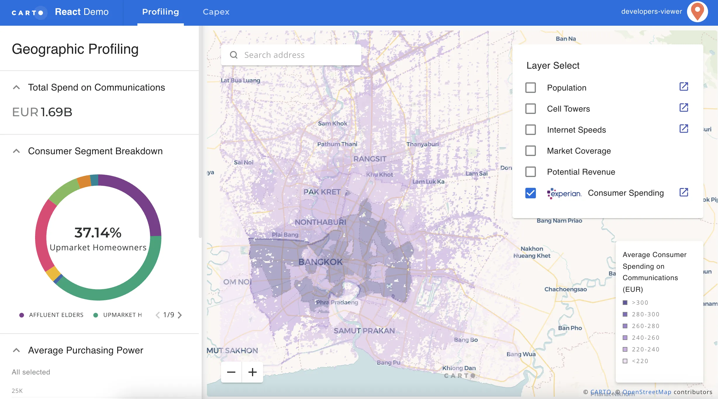
CARTO for React is a winning combination for developers because it provides a powerful and flexible way to build fully customizable, interactive, and data-driven visualizations. This map created by Thinking Machines showcases customer profiling and network performance analysis.
With this demo you can learn how to implement a geographic profiling tool to analyze a region around Bangkok, focusing on information about telecommunications including internet speeds, cellular towers, etc. You can also explore how you can build a tool to help you optimize capex that uses suitability analysis by combining different data variables and weightings.
10. Mobile Operator Coverage in Catalunya
If you work for a telecom, do you know the quality and strength of your signals vs your competitors? Analyzing mobile coverage with a comparison of operators' performance to identify strong and weak signals is a great way to gain a competitive advantage.
Replicate this map using the BigQuery Public Dataset: Catalonian Mobile Coverage, which can be transformed into the lightweight Quadbin grid you see here using the Spatial Indexes components from CARTO Workflows and the Analytics Toolbox. Next, use the CARTO widgets to drive granular insights, SQL parameters to control user interactions, and Spatial Indexes (Quadbin) to work with massive datasets.
11. And one for luck! London Propagation Analysis
This map visualization shows a propagation model in London. It highlights signal path loss and coverage, enabling telecoms to identify strong and weak coverage zones. By replicating this analysis, telecoms can optimize their network infrastructure, enhance service quality, and strategically plan for expansion. This visualization uses datasets of buildings and their heights to work out where tall buildings might be blocking mobile signals for a mobile tower.
Ready to give it a try? Use our Workflow Templates for telecoms
The CARTO team has designed a collection of Workflow templates for telecom (and other industries); these are a series of pre-built analytical templates that you can drag and drop into your workspace to get started. These examples showcase a wide range of scenarios and applications: including mobile pings within an area of interest, population statistics, emergency response, new tower site selection, and the estimated population covered by a telecommunications cell network.
Making use of these templates is very easy- you just need to download them and drop them into your CARTO account. Check these templates out in action in this webinar to learn more.
Conclusion
Using CARTO's cloud-native spatial analytics platform, telecoms can visualize, analyze, and gain insights from their vast amounts of data. From enhancing broadband coverage accuracy to optimizing mobile network performance and customer segmentation, these interactive maps showcase the power of CARTO in modernizing telecom operations.
By adopting these advanced analytics and visualization techniques, telecoms can significantly improve their operational efficiency, customer satisfaction, and strategic planning. The integration of spatial data with AI and machine learning further improves the ability to make informed decisions, ensuring that telecom providers stay competitive in an increasingly data-driven world.
Uncover spatial insights to elevate your network optimization approach
Experience CARTO for data analytics in the telecom industry. Request a demo today with our experts.


