Unlock the Potential of Spatial Indexes: 10 Powerful Uses of H3


Working with spatial data? H3 is the buzzword at the moment.
In your spatial analysis, understanding the benefits of H3 is crucial. Leveraging H3 as a Spatial Index can significantly enhance processing efficiency, especially when dealing with a large number of data points.
If you aren’t already familiar with or using H3, by the end of this post you’ll be an expert.
Wait… what is H3 again?
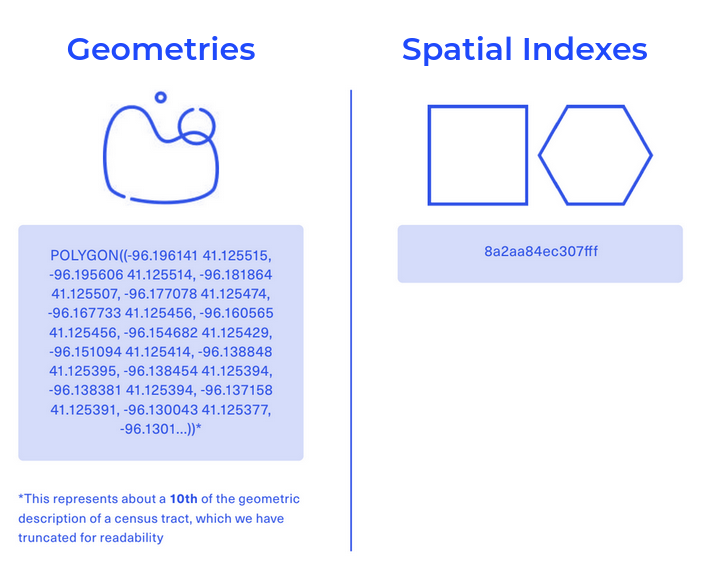
H3 is a type of Spatial Index; a global, multi-resolution grid system. The H3 index functions as the spatial column of a dataset instead of a geometry. Spatial Indexes are special in that they are much more lightweight than conventional spatial geometries. Where geometries are geolocated (i.e. placed on the earth) by a series - and often a very long series - of coordinate pairs representing each vertex of that feature, Spatial Indexes are geolocated by a short reference string.
Many spatial analysts are turning to Spatial Indexes like H3 to act as a support geography. When the index is created, they enrich it with their raw data and run analysis on this rather than the heavier raw geometry. By doing this, we estimate they could be saving up to 98% in processing time! You can read more about the benefits of Spatial Indexes in our handbook; Spatial Indexes 101.

But why H3 specifically?
There are a few different types of Spatial Indexes such as S2 and Quadbin which have great applications across spatial data science - but it’s H3 that is quickly emerging as the popular choice.
Why? It’s all to do with its shape; the hexagon. Of all the shapes which tessellate into a regular, continuous grid, hexagons are closest to the circle. This means that all spaces across the hexagon are well represented. There are no acute angles, and no extremities within the shape are further from the centroid than others. Hexagons are also optimal for representing curved geographies such as rivers and roads.
If you want to learn more about the role of hexagons in spatial analysis (who wouldn’t!?), check out our blog post “Hexagons for Location Intelligence: Why, When & How?”
Of course another great benefit of H3 lies in the momentum behind it. If your clients are using H3, then you’ll much more easily be able to share data with them if you’re leveraging it too. And then maybe your partners will do the same… And so on!
We cover the main advantages and disadvantages of the different Spatial Index types in our ebook - we recommend reading this to make a more informed decision on the best index for you!
H3 in action!
Don’t just take our word for it - check out these great examples of H3 in action!
#1: Mars-inspired population density map
On this map, you’re looking at 4,024,322 individual H3 cells which show population density across the contiguous USA.
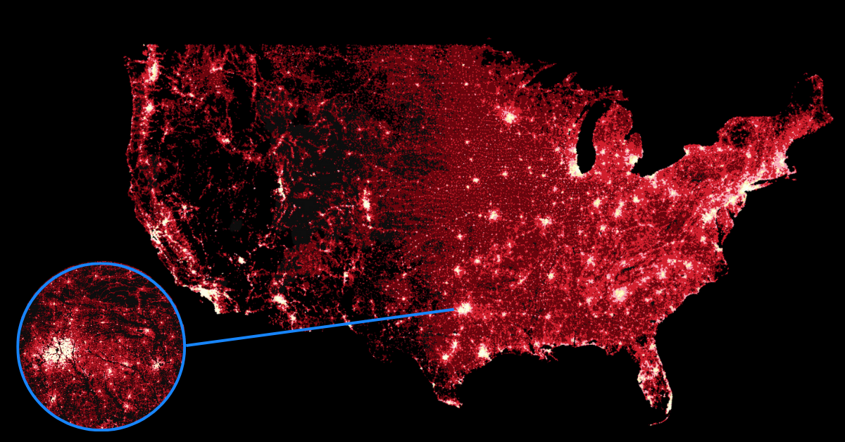
This is utilizing our USA Spatial Features dataset which contains a range of demographic, environmental and economic variables. It’s freely available for all CARTO users to subscribe to via our Spatial Data Catalog - so you can easily recreate this yourself! If you don't already have a CARTO account, you can sign up for a free 14-day trial here.
Some things to try:
- When selecting a basemap, CARTO base maps give you the option to remove layers less relevant to your analysis. In this instance, the entire base map was removed to keep the focus on the data.
- Utilizing blending modes and adding multiple iterations of the same layer can really give your map the wow factor!
#2: Taxi distribution in NYC
In this map, NYC taxi movements have been aggregated to a really high-resolution H3 grid. It portrays the difference between normalized taxi pickups and dropoffs; when the value is green, there are far more pickups in relation to dropoffs, while the reverse is true in orange areas. Where it’s grey, there are roughly the same number of pickups and dropoffs, which is optimal for driver distribution.
Explore this visualization yourself here! This map takes advantage of user-defined parameters, which allow your end user to run simple spatial analysis and filters in a controlled way - check out our guide to implementing these here.
#3: Human mobility in the UK
Another great advantage of H3? They are incredibly 3D-friendly. This is because of their low vertex count; where more complex shapes can be really difficult for the human eye to interpret in a 3D visualization, simple hexagons are ideal.
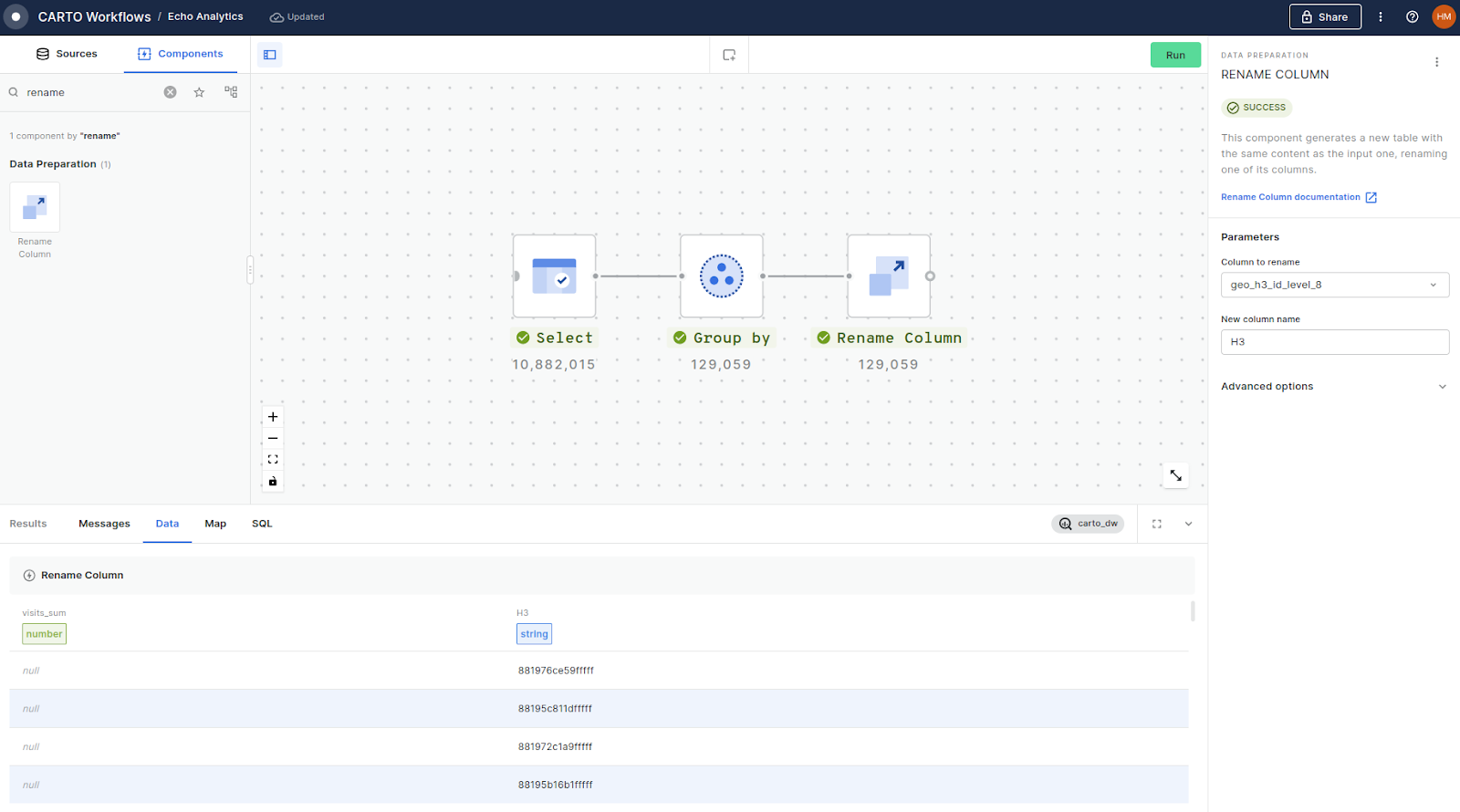
We love how the H3 data type showcases Echo Analytics’ Places & Activity dataset, available via our Spatial Data Catalog. This depicts the total number of visits made to each H3 cell across the UK - find out more about Echo Analytics’ awesome human mobility data here!
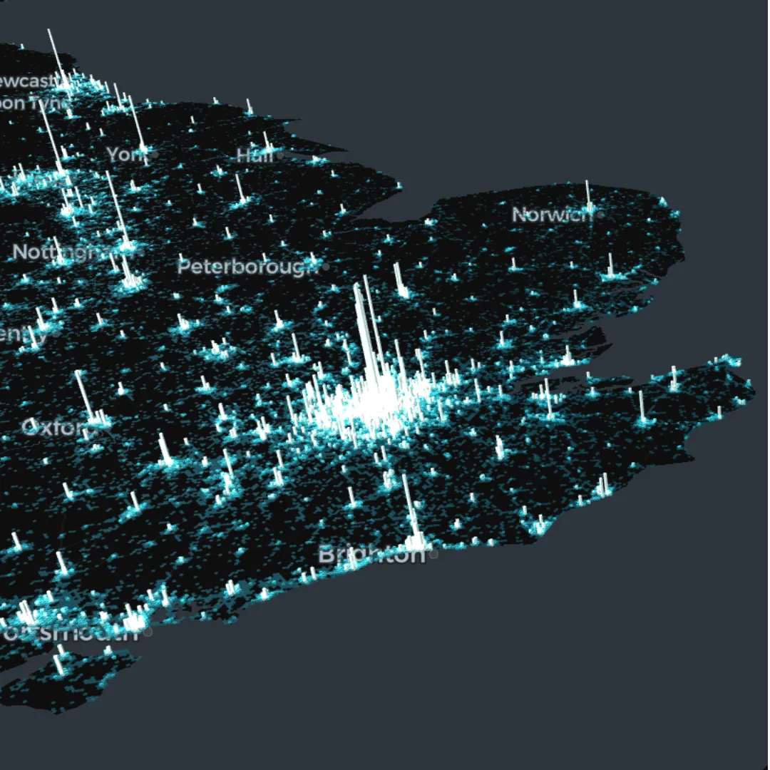
Explore in full screen here.
This data is available in raw format as a point geometry, however Echo Analytics also provides the H3 ID for each input point. This allows you to easily aggregate the data to a H3 grid using the GROUP BY function (see below in Workflows) without ever having to touch the heavier geometries.
#4: Bike-friendly index
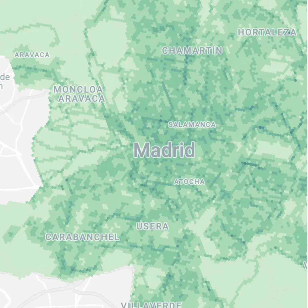
Composite indexes aggregate a number of variables with the aim of measuring multidimensional concepts which are difficult to define, and cannot be measured directly. In this example (open in full screen here), areas across Madrid are given a score based on how “cycleable” they are.
H3 is here used as a support geography for a variety of variables - including dedicated bike lanes, distance to bike parking facilities and quiet streets (all sourced from Comunidad de Madrid Open Data). Having all variables aggregated to this one geography unlocks the ability to run analysis like composite scoring.
#5: Where is the north?
One for our UK readers!
Have you ever been locked in a fierce debate about where in the UK constitutes “the north”? Well our Solutions Engineer Simon Wrigley has an alternative answer to that question.
Using the UK Spatial Indexes dataset, Simon first uses Spatial SQL to calculate the cumulative population for each H3 cell moving from south to north, taking advantage of the H3_CENTER function in our Analytics Toolbox.
...SUM(population) OVER (ORDER BY ST_Y(`carto-un`.carto.H3_CENTER(h3) DESC) AS cumulative_pop...
Next, he uses a CASE function to bisect the country based on the halfway population line.
 ...CASE
   WHEN cumulative_pop >= ( SELECT SUM(population) FROM spatial_features)/2 THEN 'south'
 ELSE
 'north'
END
 AS region...
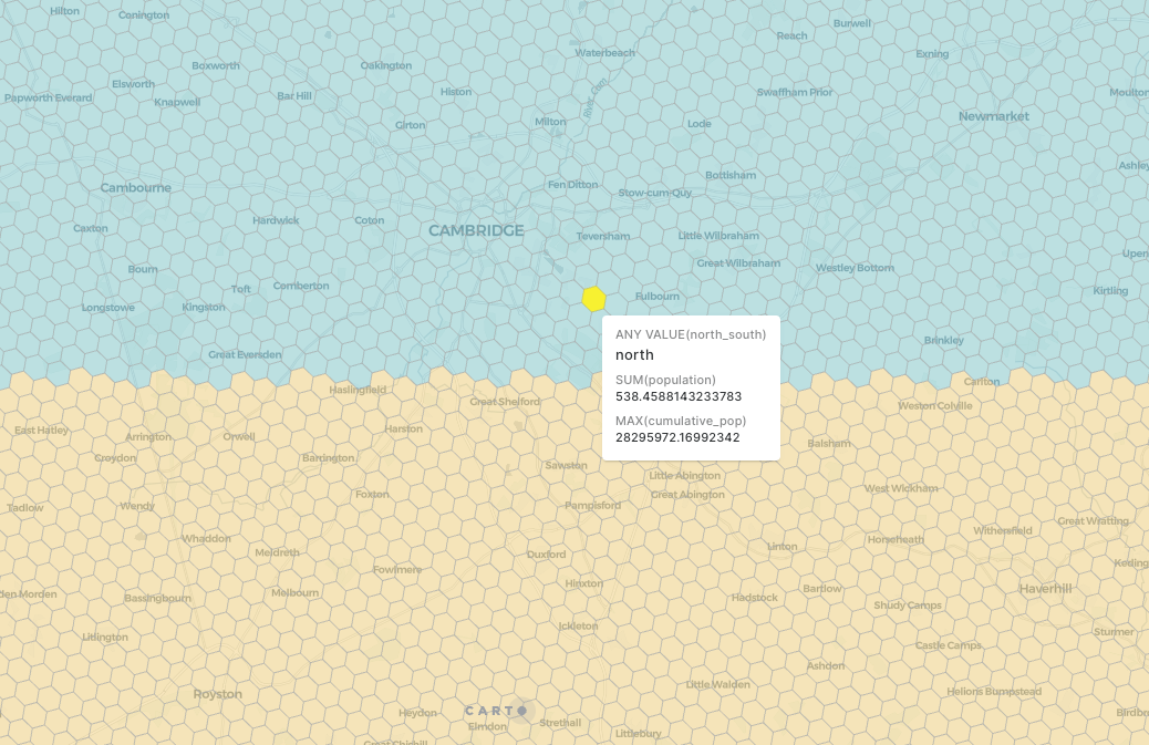
The result? Controversially, “the north” - were it to be designated by population - starts just below Cambridge.
Read all about his investigation and get the full code here!
#6: Lightning striking more than once
This map is the result of 255.5 MILLION lightning strikes being aggregated to a H3 grid for a much more lightweight and visually engaging map.
You can replicate this with NOAA lightning data (available from the Google BigQuery public data marketplace here), and by following the steps in this video.
Catch more videos like this on our YouTube channel!
#7: Telecom network optimization
In this example, the analyst needs to understand the population which lives within 500 meters of the 25,059 cell towers in Orange County, Florida.
Achieving this with traditional geometries would require an area-based join. This would involve creating buffers around each point and then running an ST_INTERSECTION to calculate the area of each input geometry (probably a census block group) which intersects each buffer. Finally, the population within each buffer would be calculated based on the proportion of each census tract that intersects each buffer.
Sounds like a lot, right? Just selecting the census block groups is a 5GB query!
Instead, the analyst has used the H3_POLYFILL function to fill each buffer with H3 cells, and then joins these to the Spatial Features table to calculate the population within 500 meters of each cell tower. By doing this, they are replacing a geometry calculation with a much faster and more efficient table join.
Learn more about this workflow here.
#8: Restaurant hotspots in Los Angeles
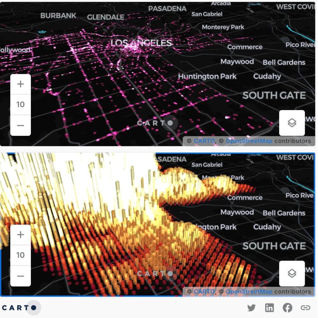
Another key benefit of H3 is that it translates data into a continuous spatial format, which unlocks entirely new forms of analysis!
In this example, the large number of raw data points - restaurant locations provided by our data partner SafeGraph (available here) - has been aggregated to a H3 index. This has allowed the user to calculate spatial hotspots using the Getis Ord* function. Hotspots are really useful in this context for helping brands to understand their competitor landscape.
You can learn about the full range of statistical functions available usingSpatial Indexes in our Analytics Toolbox documentation here, or if you’re ready to get started with hotspots - check out our guide!
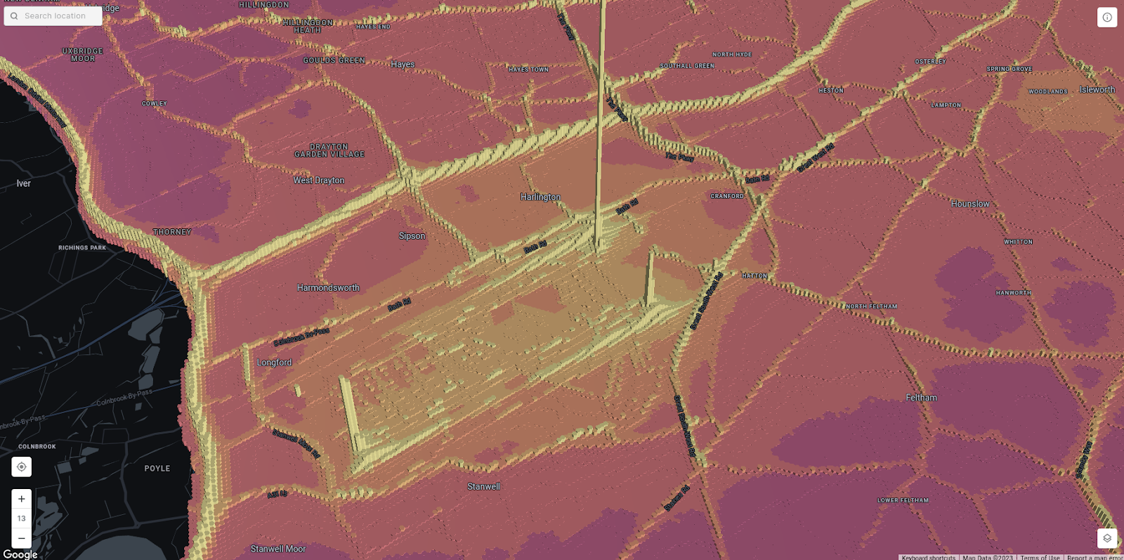
#9: Air quality in London
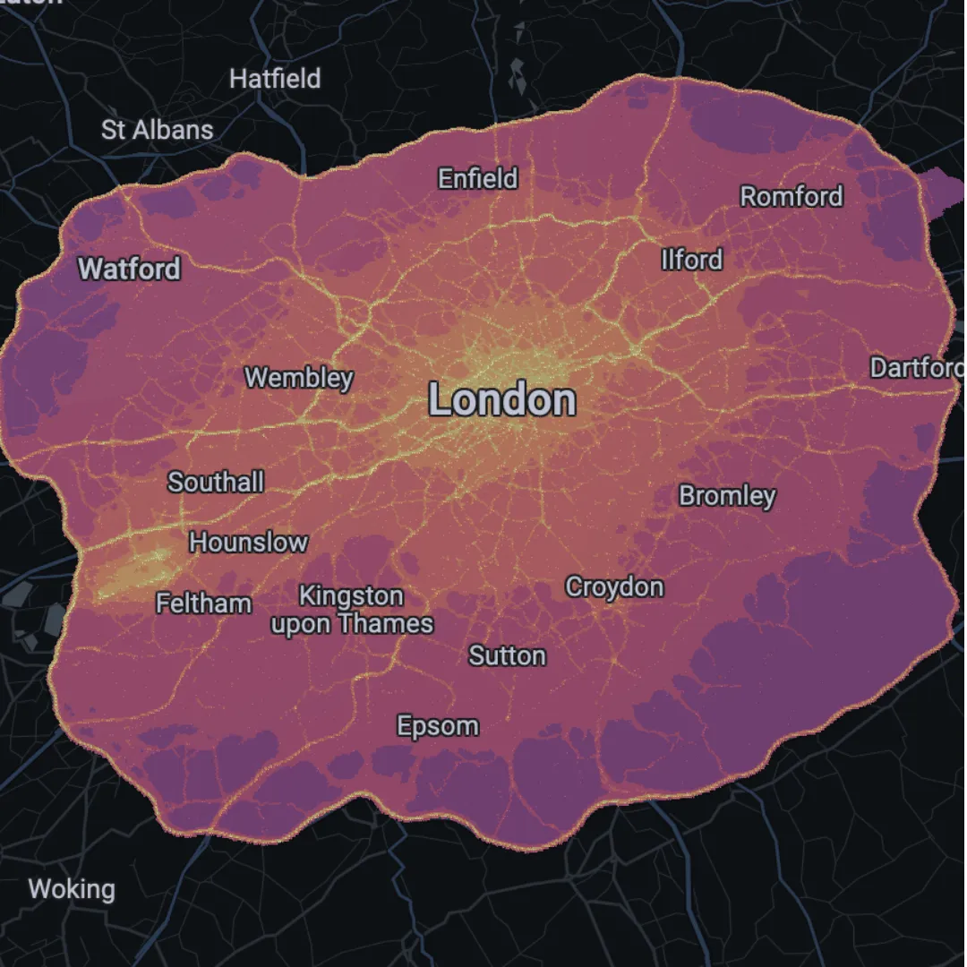
Open this map in full screen here.
Based on data from the Greater London Authority (available here), this map shows NO2 concentration levels across London. To create this visualization, a grid of 5.8 million data points was converted to a 1.2 million H3 cells using H3 from Geopoint in CARTO Workflows.
Typically when working with data this big, analysts have to compromise between scale and detail. With H3, that trade-off is lessened. You can visualize a grid of 1.2 million cells at a city-level and still be able to establish hyper-local insights, like what’s happening at the end of the Heathrow Airport runways (see below).
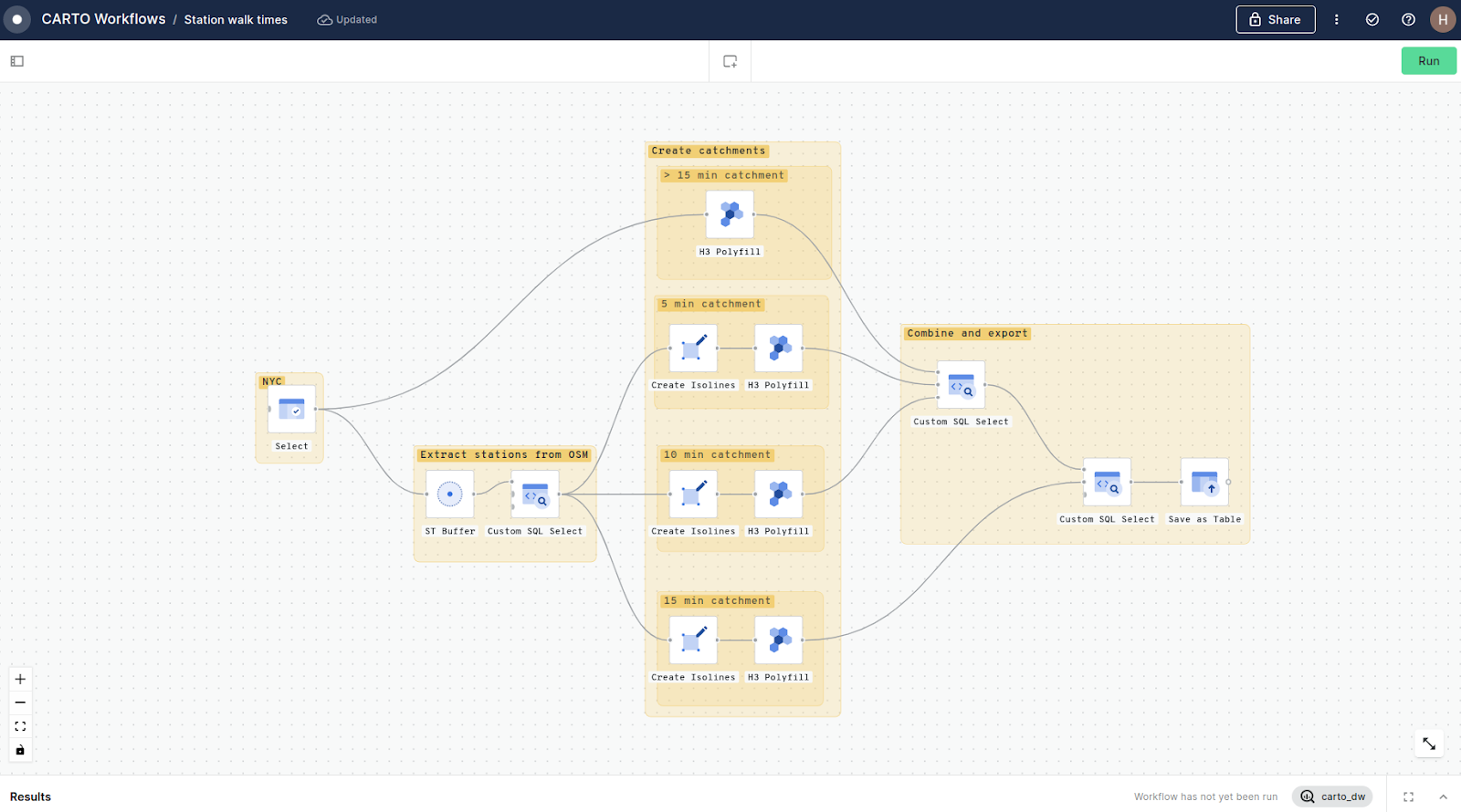
#10: Subway accessibility in Manhattan
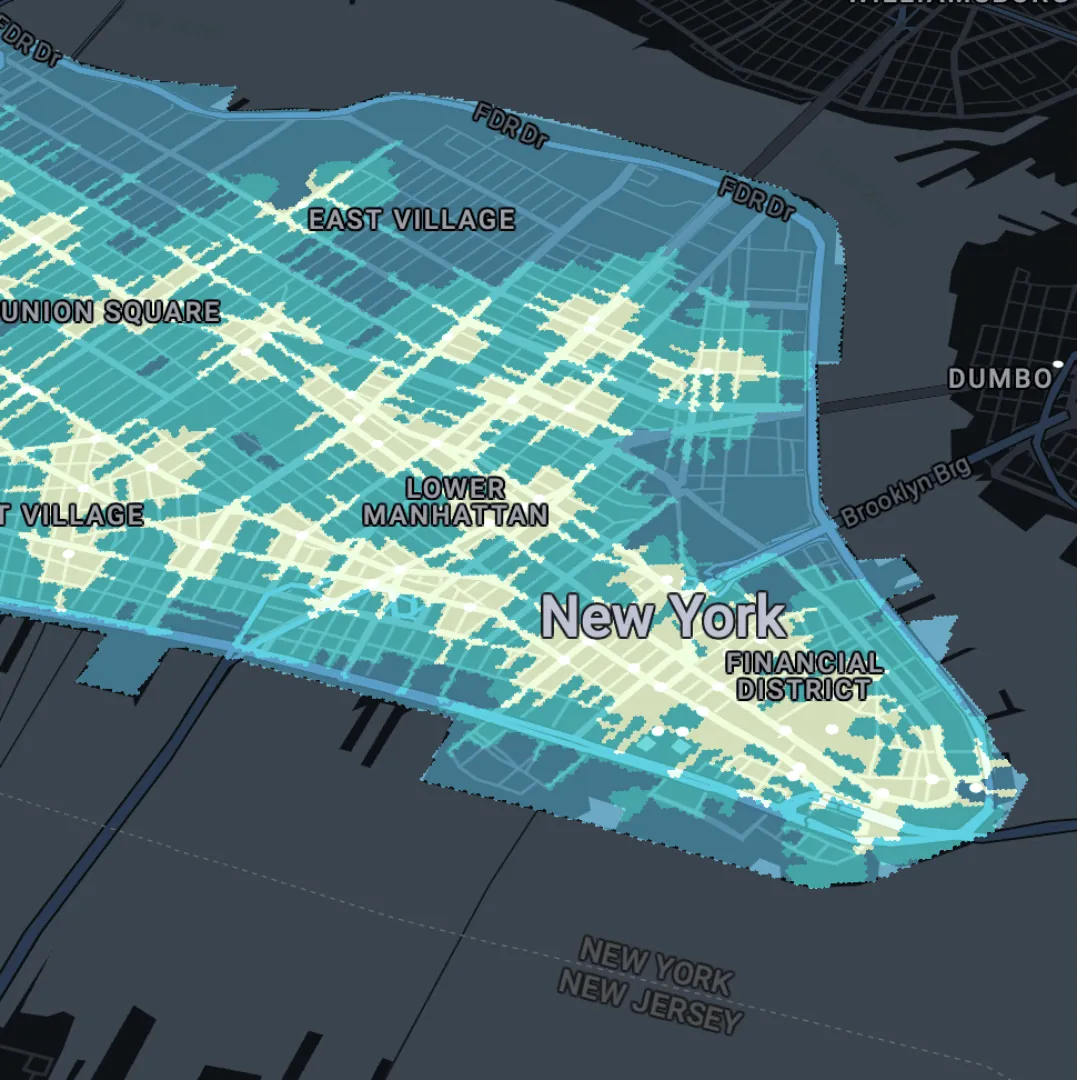
Explore in full screen here.
In this example - generated with CARTO Workflows (see below for the process), the analyst has converted the isolines to H3 cells using H3 Polyfill. While the resulting table contains 189.5K rows, it only requires 4.2 MB of storage. Compare this to if the isolines were to be saved as geometries, where 3.78MB of storage is needed for the 483 geometries - 0.25% of the 189.5K rows stored with H3.
🌎 🌍 🌏
H3 Spatial Indexes have become a game-changer in spatial data analysis, offering many powerful use cases. By leveraging H3, analysts can save significant costs and processing time while unlocking new analytical possibilities.
Start your H3 adventure today with a free 14-day trial and experience the transformative power of this global grid system.
The flexibility of a spatial column enriched by H3 allows for more streamlined analyses, making it a game-changer in the realm of spatial data analysis.