CARTO Provides Free Visualization Software for Organizations Fighting COVID-19


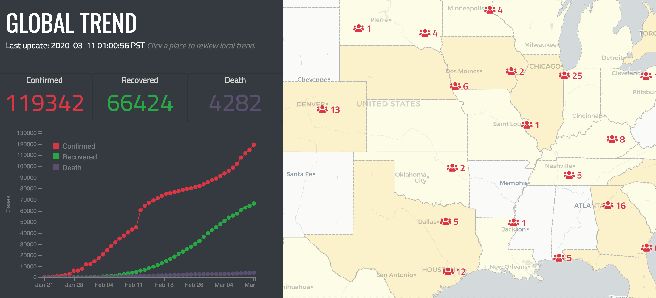
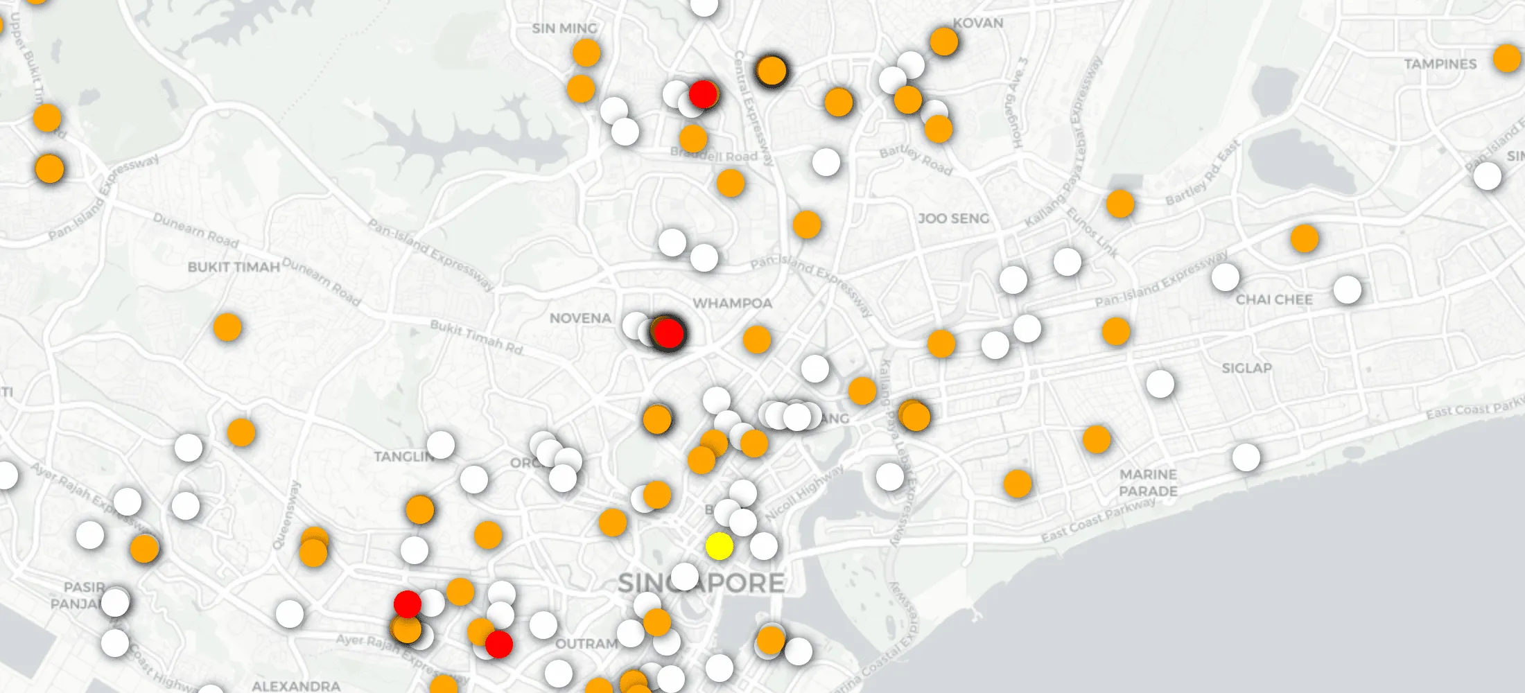
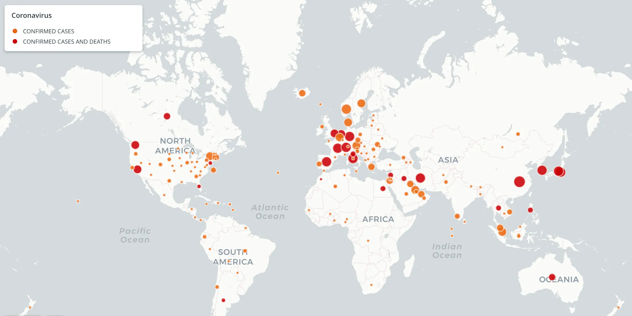
In the fight against COVID-19 maps have become a valuable tool in understanding the spread of the disease. Many organizations and individuals around the world are using maps for awareness communication and to increase the effectiveness of our response.
Responses seen recently such as cancelling events and self quarantines can save lives by ‘flattening the curve’.
For that reason CARTO will be making its platform available to public and private sector organizations fighting against the coronavirus outbreak via our grants program. Whether you are a media outlet sharing advice for the general public a healthcare organization optimizing resource allocation or a government entity looking to assess the impact of lockdowns - we want to help you with your use case and ensure we are making data-driven decisions together throughout this outbreak.
We’ve already seen a growing number of individuals within the spatial analysis community creating maps that bring together different streams of open data - as well as leveraging information from our Data Observatory:
The Spatial Community Mapping Response
- Novel Coronavirus (COVID-19) Infection Map by the Humanistic GIS Lab at University of Washington - Seattle
- Coronavirus Tracker by Hari Krishna
Grants Approved
Here are just some of the grants that have been approved so far:
- Colten Care Limited in the UK: to visually display and manage the affect of COVID-19 on their care home residents over 21 locations their interaction with families/friends and their employees
- Mekansal in Turkey: to create a Turkish Mapping Portal for Coronavirus for the web and mobile to increase awareness.
- Los Angeles County Department of Public Health in the US: to keep track of the cases in real time in LA County as part of the Acute Communicable Disease Control Program.
- An individual creating the first Arabic-language COVID-19 map which will provide access to a much bigger demographic within the Arab world.
- Hocelot in Spain: trying to avoid emergency calls overloading the system and to identify infection focus.
- All In One Online in Cyprus
- Geomatic Solutions Company in Algeria: to develop a dashboard informing on the evolution of the Coronavirus occurrences in Algeria per district
- University of Leeds in the UK: to perform social epidemiology anlaysis which can help map and identify risk areas for potential outbreak.
- Education Week in the US: Tracking school closures.
- Wuru in Argentina: to provide public healthcare datasets that will help individuals and the government make better decisions.
- RedCross in the Netherlands.
- Alkemy in Italy: A dashboard created by @alkemy to analyze more than 2 million tweets to understand social media behavior on Twitter throughout the Coronavirus outbreak in Italy.
- Catchy in Italy: to focus on the geographical visualization of the tweets relating to COVID19 to show how people talk about the topic.
- University of São Paulo in Brazil: Use to plot the information of people with COVID-19 in Brazil
- HotelesEnAccion (Hotels in Action) in Spain: Building a platform for the coordination of the Spanish hotel sector in the face of the COVID-19 crisis.
- Montgomery Township in the US: To aid in the district's Coronavirus response.
- Municipality of San Pedro in Mexico: To map coronavirus cases resources businesses and every other variable that can help the municipality better deal with the crisis.
- Joint Research Project by Universitat Rovira i Virgili & Universidad de Zaragoza in Spain Universidade Federal de Viçosa in Brazil Centro de Física Teórica e Computacional in Portugal & Harvard Medical School in the US: To produce risk maps for the spread of COVID-19 in Spain Portgual and Brazil.


- Coded S+P Corp in Puerto Rico: To strengthen their existing maps by including data for city COVID-19 test centers and information for the US-VI and other Caribbean Islands. Also to provide a map of available food services in the Rio Piedras borough of San Juan.
- University of Lisbon in Portugal: To map and cross reference data with a view to develop preditive algorithms and statistical functions so cities can be more preventive and resilient.
- Kemitraan Partnership in Indonesia: To use CARTO to perform spatial modelling to contribute to the on-going efforts to curb the epidemic / outbreak in Indonesia.
- Central-Buda Volunteer Civil protection Association (ÖPVE) in Hungary: To visualise statistics for presentation to public or presentation to cooperating official and cooperating bodies or to partner rescue organisations abroad or the European Union contact points.
- Universidad de Alcala in Spain: To create COVID-19 maps of Spain and Madrid areas.
- Skylight Digital in the US: To show geographic data of COVID-19 cases in Los Angeles neighborhoods and to make LA data more accessible.
- Miranda Partners in Mexico: To communicate the progress of this epidemic and hopefully raise awareness their clients and the general public.
- Innóvate Perú in Peru: To be a reliable source of information in Peru
- cekdiri.id in Indonesia: To map COVID-19 risk & health facilities in Indonesia.
- Instituto Superior Técnico Universidade de Lisboa in Portugal: To analyse flow data to prevent and monitor COVID-19 in Portugal
- Fundacion IO in Spain: To facilitate containment actions planning or any public health measure that contributes to fighting the COVID-19 pandemic in the state or beyond if requested.
- Goiar in Argentina: To assist Argentina's national health ministry.
- Southwest LatinX in the US: To connect their young participants with CARTO in order to help them visually comprehend and interact with different sets of data.
- An individual in Mexico: To provide a shared repository of data visualization and prediction for COVID-19 in Mexico.
- Ormacorp in Bolivia: To help distribute information regarding COVID-19.
- Ubermedia in the US: To visualize their mobile location data containing key insights to social distancing and spreading of the virus.
- virtualCIO in Colombia: To geocalize food providers and the status of their business operation.
- Fundacion Las Dos Orillas in Colombia: A non profit media organization wanting to make effective coverage of Coronavirus information in Colombia.
- AfrikaStream in Rwanda: To assist making a COVID awareness app for Ministries of Health in places Like Congo Brazzaville.
- An individual in Finland: To create a dynamic situation map of the worldwide spread of COVID-19.
- Coronavirus Makers in Spain: To understand location of volunteers and demand for 3D printed protective gear for health workers.
- Maldita.es in Spain: To aid data visualization for public service and journalism particularly debunking misinformation.
- New Options Worldwide in the Phillippines: To create livelihood for displaced and out-of-work Filipinos during and after the COVID-19 crisis by pinpointing where to propagate where bamboo is harvestable and to show location opportunities for farming.
- Sculpture Hospitality in Canada: To map hospitality locations that are impacted by government closures and/or economic adversity due to COVID-19.
- Process First in the US: To support their non-profit partners in the Boston area as they try to rapidly adapt their food system to serve those who find themselves suddenly in need.
- Grupo Apoyo Infraestructuras COVID-19 in Spain: To propose alternatives to the public administration on the usage of the infrastructure and be able to identify areas where once the curve has been flattened be able to start opening businesses and return to "normal" economic activity.
- Georgia Public Broadcasting in the US: To raise awareness among the economic majority of the state of the severity of the outbreak in a historically impoverished and segregated place.
- Radboud University in the Netherlands: To deliver an interactive web map with the following layers: hospitals sitting near to low-income/ risk population groups to COVID-19.
- Narrativa in Spain: To create a dashboard to follow the COVID-19 evolution.
- BNHR in the Phillippines: To provide real-time tracking and crowdsourcing of COVID-19 facilities front line information and other related data.
- A professor at Stanford University in the US: To estimate connectivity and mobility matrixes to be used in mathematical models of coronavirus spatial and temporal dynamics for Italy Senegal and the bay area in California extended down to the Monterey county.
- zetabytelab in the UK: To help hospitals and elderly social care homes with the demand/supply of equipment in Spain & the UK.
- A PHD Candidate at Brown University in the US: To map the visit patterns to Hospitals leveraging on SafeGraph patterns to assess the geographical extent of under-reporting and/or effectiveness of NPI measures.
- Manav Seva Foundation in India: To get on the positive side of statistics of the epidemic.
- Center for Strategic and International Studies in the US: To use maps to illustrate complex policy ideas and recommendations in a simple and easy-to-understand way.
- KNKX Public Radio in the US: To use data to show the spread of COVID-19 in Washington.
- unloquer in Colombia: To communicate the progress of the expansion of COVID-19 in the city of Medellín.
- BeeConsiouzz in Colombia: To help them create an easy to use space that will allow them to centralize help while educating people on what sustainability really is.
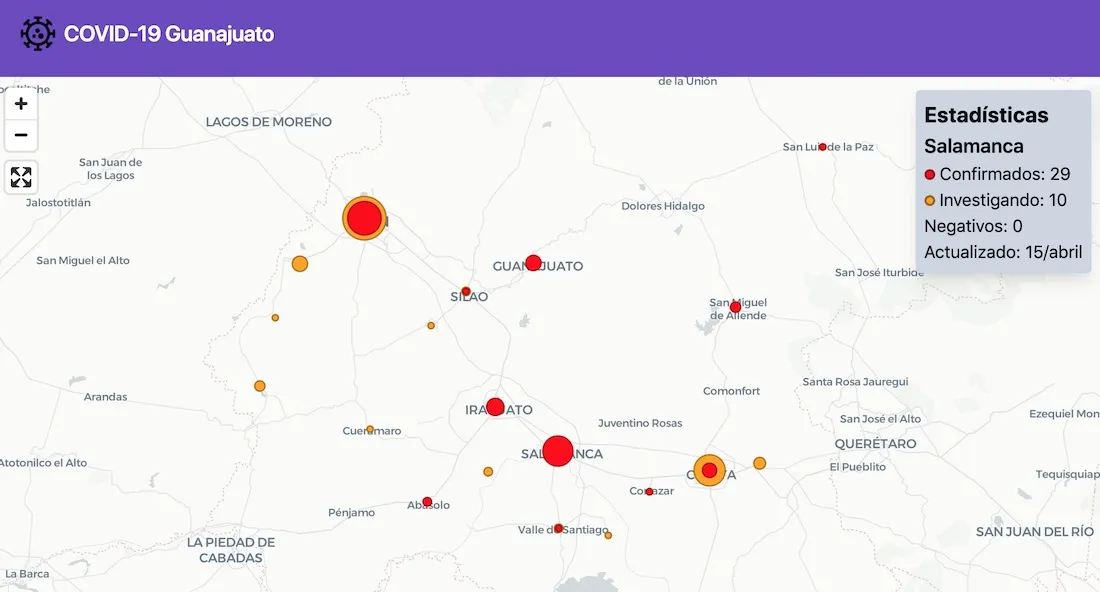
- A software engineer in Mexico: To make the data for COVID-19 of Guanajuato state (Mexico) available to people in a more dynamic manner than that currently offered by the government: COVID-19 Guanajuato
- Rekaofela Wireless in South Africa: To help South Africans visualize the spread of COVID-19 in the country.
- Evidation Health in the US: To visualize the state of wellbeing and health among Americans.
- Henry Ford Health System in the US: To increase the exposure of spatial analysis for the higher-up officials.
- Territorial Empathy in the US: To visualize free food access to New Yorkers.
- Stears in Nigeria: To include a mapping feature that allows users to geospatially visualize the geo-located data on the application and combine this with the data they've been tracking on the development of the COVID-19 cases.
- Hester Street in the US: To map all of the available COVID-19 resources for New York City
- Houston In Action in the US: To help with coordinating organizations that are doing Census and COVID-19 outreach to dis-empowered communities.
- Siyaj Organization for Protection of Children and Women in Yemen.
- Corona Why in Spain.
- geo-spatial.org in Romania: To deliver correct complete and up to date information on the COVID-19 spread in Romania.
- Guamblog in Guam: To provide a visualization map of the island
- Nunhead Knocks in the UK: To deliver fast effective emergency support to the surrounding communities in London during the COVID-19 pandemic.
- Doctor 4 Africa in the UK: To create a a Coronavirus Tracker Map for Africa.
- Translators without Borders in the US: To help visualize language and literacy trends in humanitarian crises affected by COVID-19 around the world
- ChrysalisPartners in the US: To support a symptom tracker tool that they are going to provide to municipalities in the United States for free.
- A PHD Student at Brown University in the US: To map how heterogeneity in coronavirus response interacts with local welfare regimes to help design optimally targeted welfare responses.
- Mapfry in Brazil: To contribute to the economic struggle shining a light over the more exposed regions and those that could be more or less a business-safe area.
- Landlord Watch in the US: To map discrimination reports filed by their community of homeless tenants.
- Partnership for the Public Good in the US: To help maximize the impact of their research create more awareness about inequitable systems and especially with the current health crisis highlight ways that policies need to change for longterm good.
- Ilara Health in Kenya: To create a heat map that allows Kenyans to view how many possible cases there are in their area.
- Koresol in India: To develop apps which will help the community combat COVID-19.
- A Software Engineer in Japan: To create a global time-series visualization of map data of COVID-19 affected regions.
- Startupistan in Afghanistan: To map and visualize the global response in real-time with a donation heat map highlighting the city location of donors from around the world.
- A Graduate Student at Brown University in the US: To create interactive maps on social distancing metrics in the US.
- Instituto do Cérebro do Rio Grande do Sul in Brazil: To accelerate the delivery of data visualization for Task Force COVID-19 and the online community.
- Universidad de los Andes in Colombia: To democratize the knowledge about COVID-19.
- HomeOn in Australia: To improve the online NSW Covid-19 Cases Breakdown Map (using NSW goverment data) to better visualize the live COVID-19 situation on each New South Wales postcode.
- Cyberian Inc. in Pakistan: To provide the current stats of coronavirus at a local level.
- Zoe in the UK: To map the current COVID-19 symptoms in the UK based on the COVID Symptom Tracker app
- Pengiun in Bangladesh: To build a coronavirus tracker for Bangladesh.
- New York Restoration Project in the US: To better understand the impact of COVID-19 and the response required.
- The Mayfield Healing Project in the US: To aid in the purchase of supplies to go directly to the program participants.
- Temple University in the US: To estimate the economic impact of Coronavirus on global tourism hotel and restaurant industry.
- UFPA in Brazil: To chart human mobility dynamics during the COVID-19 pandemic.
- IDIEQ in India: To add more relevance to their map.
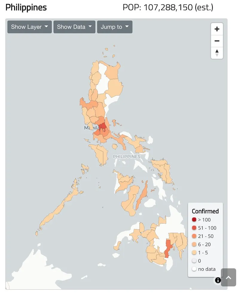
- World Health Organization in the Phillippines: To map confirmed cases stages of transmission and health clusters on the provincial/state/prefecture (admin01) level for the entire WHO Western Pacific Region.
- MyData.org in Finland: To build a bottom up volunteered data-set driven by and for individuals to help them in various aspects of managing through COVID-19.
- MyData.org in Finland: To build a bottom up volunteered data-set driven by and for individuals to help them in various aspects of managing through COVID-19.
- Estornudame in Mexico: To aid communication of findings to politicians and non-technical audiences to make better decisions that safeguard individual and collective health.
- The Seroprevalence Project in the US: To analyze and display the world's COVID antibody test results in order to help inform policy makers on which areas can be opened up first.
- LuckyGo LLC in the US: To create a public and open-source tracker for re-openings of businesses.
- Basil Labs in the US: To give their researchers access to CARTO to visualize their work.
- Social Drive in Spain: To create heat maps based on incidents reported by drivers in relation to the state of alarm.
- XY in the US: To map communities at risk in the US.
How can you get access?
Simply visit our grants page and apply for access - and we’ll commit to getting your grant approved and your team started within 2 working days. You will also receive support from our team along the way to ensure we’re sharing relevant and accurate location-based insights with the public and organizations as we fight together against COVID-19.
Discover why Spatial Matters in Disease Containment & Prevention Replay our recent webinar!