Analyzing the Impact of Coronavirus on Meetups
Meetup is the most popular platform to organize community events. With more than 40 million members and 320 000 Meetup groups the site facilitates 12 000 meetups per day around the world.
We have already taken a look at how COVID-19 is having an impact on larger events and conferences but for this post we wanted to analyze the data relating to smaller scale community events often organised via Meetup.
Visualizing Meetup Data
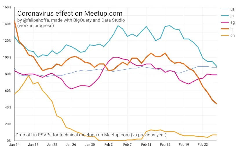
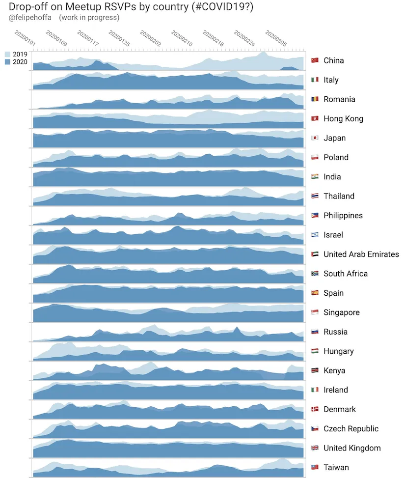
Felipe Hoffa from Google worked on a project retrieving all of the RSVP data from Meetup and visualized it using BigQuery and Data Studio in the graphics below. The impact on attendance in China where the outbreak began is clear from the very start with Japan and Italy following a similar pattern a few weeks later. This sort of analysis can also give us an indication of the level of response in each country.


Correlating with Location Data
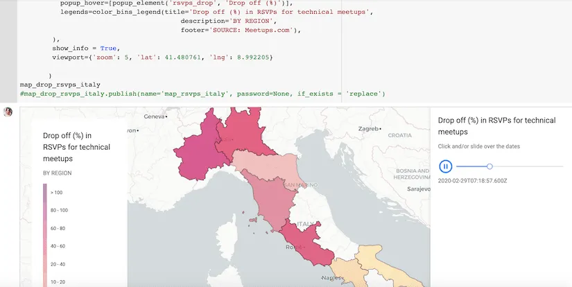
The next step was to analyze this data from a location perspective. One thing is predicting the impact and another is viewing and quantifying it. We looked at the locations of the Meetups to ascertain if there was a spatial correlation between the drop offs seen earlier and the location of confirmed cases of Coronavirus. We focused on Italy for this analysis and on the following map you can clearly see that there is a correlation.

What we can see here is the difference in attendance at Meetups per day compared to last year. The places where there are more Coronavirus cases reported have a greater drop in participation of meetups.
How was this achieved?
CARTO and Google Cloud Platform are working to create the best spatial analysis platform with collaborations around connectivity and our Data Observatory as we shared recently. The data was obtained from meetup.com and pushed to BigQuery where it was then analyzed. Using a combination of our Data Observatory and CARTOframes we connected to BigQuery and represented the data. You can take a look at the analysis on this Google Collab.

Why is this useful?
Being able to measure the impact of coronavirus is critical to drive risk mitigation strategies and ensure preparedness. Finding good proxies that showcase this impact in real time is critical. Meetups are great places to network and do business and if they are not happening or they have less participants there will clearly be an economic impact. This is commonly known as alternative data and can be used to understand economic impact much earlier than is officially reported.
Finding good proxies that showcase this impact in real time is critical.
As announced this week CARTO will be making its platform available to public and private sector organizations fighting against the coronavirus outbreak via our grants program.
Location Intelligence can help your organization understand in real time the impact that Coronavirus has on your business.
Discover why Spatial Matters in Disease Containment & Prevention Register for the upcoming webinar!


