Exploring the differences in dynamic data through time
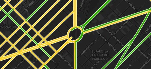
We often find ourselves exploring what interesting things can be found in data that changes through time. In recent blog posts about the Mobile World Congress (MWC) we have published a couple interesting experiments with temporal data. In the first we showed how CartoDB could be used to map traffic in Barcelona.
The map was built to automatically update every 15 minutes through the day. In the second map we show a fun visualization of credit card purchases in Barcelona during MWC compared to purchases over a similar period not during the MWC.During the development of the second example we realized how important it can be to show two maps simultaneously side-by-side. In the credit card transaction example each map show the view what happened at a different point in time.
The side-by-side technique can be really useful. For example here we have recreated the Barcelona traffic map now showing the traffic during the start of MWC and the traffic exactly one week later.
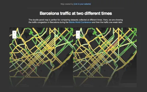
The utility of the side-by-side map example is that you can allow users to zoom and pan into areas of interest. While traffic may not appear immediately different if you are driving in Barcelona you may want to explore the map close to discover the intricacies and maybe learn how large crowds influence the flows in that city. These insights are already helping some CartoDB users to build data dashboards to support their missions of creating smart cities.


