Predicting Collisions in NYC with New Data Streams and Spatial Analysis


Since GPS devices first appeared in cars in 1995 routing technology has been guiding us from Point A to Point B. In addition to its utility at the individual level this now-ubiquitous technology can provide insights on wider human mobility when collected and aggregated. But how can we use these new derivative data streams in conjunction with spatial data science methodologies to help understand the health of our road networks make them safer and more efficient?
For traffic engineers and analysts working in a city like New York (with its over 6000 miles of road) looking to use these data streams to tackle big challenges like reducing the number of car crashes it is often helpful to start with some basic questions:
- Where do car crashes happen in NYC?
- When do they happen?
- What are the common characteristics of crashes?
Thanks to NYC Open Data we have access to NYPD records of every recorded motor vehicle collision. Updated monthly this dataset includes information like vehicle type time and location data whether pedestrians motorists or cyclists were involved the number of injuries and fatalities and contributing factors such as "driver distracted" or "unsafe lane changing".
In this map we've joined all collisions from 2017 to the nearest street segment and styled those segments by the rate of collision (collisions per road segment divided by road segment length). Red lines indicate a high rate of collision and green represents a low rate. More details on how to "snap" the collision points to line segments using CARTO and PostGIS can be found here.
Exploratory Analysis - Where When and Why
Let's take a look at the collision data to see if we can tease out any patterns or trends to start answering our questions.
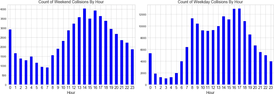
In the above charts we can see that collisions are less frequent during the weekend and during the early hours of the morning which makes sense because there are simply fewer cars on the street during these times. We need to normalize these counts by traffic volume to create a more meaningful collision rate.
But how do we get traffic volume numbers? Traditional methodologies such as inductive loop counters and manual counting can be prohibitively expensive while opening a study up to issues of sample size and human error.
With newer sources of data like GPS or mobile event data we have the opportunity to have continuous accurate information about the volume of cars on the road. For example TomTom gathers GPS data from all vehicles using its routing applications and aggregates the results into traffic counts for each road segment. Waze also collects user-generated data to detect traffic jams. They then make their real-time traffic data feed available to city partners as part of the Connected Citizens Program (CCP). At CARTO we have worked with Madrid and San Diego to spatially analyze this data using our Traffico solution.
While it is important to investigate these new data streams to uncover bias or ensure adequate coverage for metropolitan areas like New York the relative numbers are helpful for providing adequate volume counts. With tens of millions of devices worldwide coverage provided by GPS and mobile event data sources will only continue to grow.
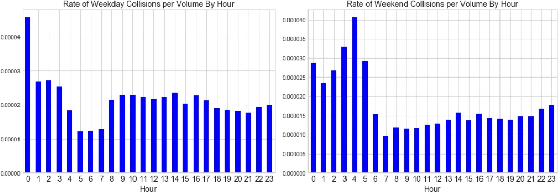
Once we normalize collisions by traffic volume using TomTom data we see some interesting patterns start to emerge. The spike in the collision rate during the early morning hours of the weekend and the low rate of collision from 5-8am on weekdays stand out. Additionally there is a midnight spike which may be due to the NYPD vehicle collisions record system using midnight as a default setting for a blank field.
We can hypothesize that the spikes could stem from drunk or tired driving which one might expect from 3-5am on weekends. Similarly low rates may be attributed to fewer collisions occurring while vehicle interaction is low prior to the peak commute on weekdays.
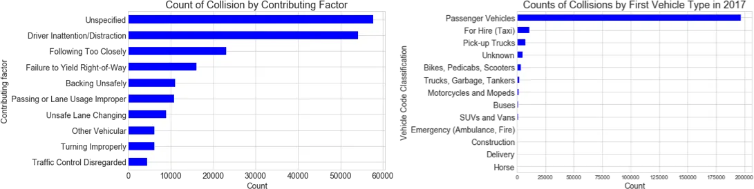
To answer our third opening question "what are the common characteristics of crashes " we can look at the primary contributing factors and vehicle types from the NYPD open dataset. Per the above charts we can see that a large quantity of crashes involve passenger vehicles due primarily to drive inattention or distraction.
Performing a minimal exploratory analysis of the data to understand the when where and why of NYC traffic collisions can help us draw hypotheses but with a goal of actually reducing crash incidents it's not enough to simply visualize collisions on a map.
As a next step we need to use spatial data science methods to detect clusters of high or unusual activity. This can help us find actionable answers to deeper questions:
- Where are the collision hotspots?
- Are there things about certain road segments that make them more crash prone?
- What is the relationship between traffic jams and collisions?
Spatial Autocorrelation to Find Collision Hotspots
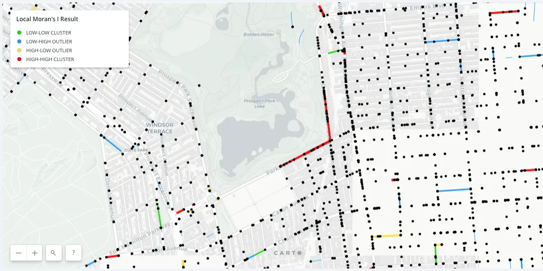
One key method for answering these deeper questions about NYC collisions is to determine spatial autocorrelation using a Moran's I analysis. This analysis measures the correlation between neighboring geographies.
After standardizing and transforming the data we apply a local Moran's I analysis for spatial autocorrelation to the collision rates of the New York City street network. We can determine correlated collision hotspots as mapped above. In the map red lines represent high-high clusters (hotspots) green lines are low-low clusters (coldspots) blue lines represent low surrounded by high collision streets and yellow lines represent high surrounded by low collision streets. As you can see most of our road segments have zero or close to zero collision rates and our map is mostly green.
If we filter out insignificant streets and keep only the ones that have p-value less than a threshold of 0.05 we're left with the most significant and interesting segments and a few insights start to jump out from the map.
First it looks like there's a higher cluster of red hotspots in Manhattan. However this could be because the road network is simple denser in Manhattan and the density is drawing our eyes towards Manhattan. To verify we could check the density of significant streets per borough.
Another feature of the above map that seems to jump out is some of the clusters of red road segments in Brooklyn. Again this could be biased because the length of the line segments is arbitrary so our eyes are unfairly being drawn to these longer lines. But regardless let's take a closer look at one of these red spots anyway.
At first glance there doesn't seem to be much information as to why these road segments have been identified as hotspots. However upon further investigation we realize that the locations of the collisions in the NYPD dataset are geocoded to exactly the same point if they occurred at an intersection. This means there actually many collision dots stacked on top of one another here at the corner of Parkside and Ocean.
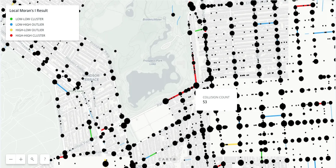
Exposing this information in our visualization will help us to better understand these hotspots. By grouping and aggregating on the geometry we can represent collision quantity at each intersection via point size. By clicking into the point we can see that 53 collisions occurred at this intersection in 2017. The fact that there's a hotspot here is a public safety concern due to the quantity of pedestrians coming to and from the park.
Using spatial autocorrelation on this data to determine hotspots provides instant value to local authorities. A quick look at the above map shows that this particular intersection and other hotspots should be prioritized for investigation to determine how the elevated crash risk can be mitigated.
Want to learn more about fixing traffic management and commuting insights? Don't miss our recent webinar! Check it out!
Finding Common Features of Crash-prone Streets With Decision Trees
The stated leading cause of collisions in NYC is driver inattentiveness but can we start to find relationships between road infrastructure and collisions? Identifying common features could help municipal agencies such as the Department of Transportation take more concrete action to reduce collisions.
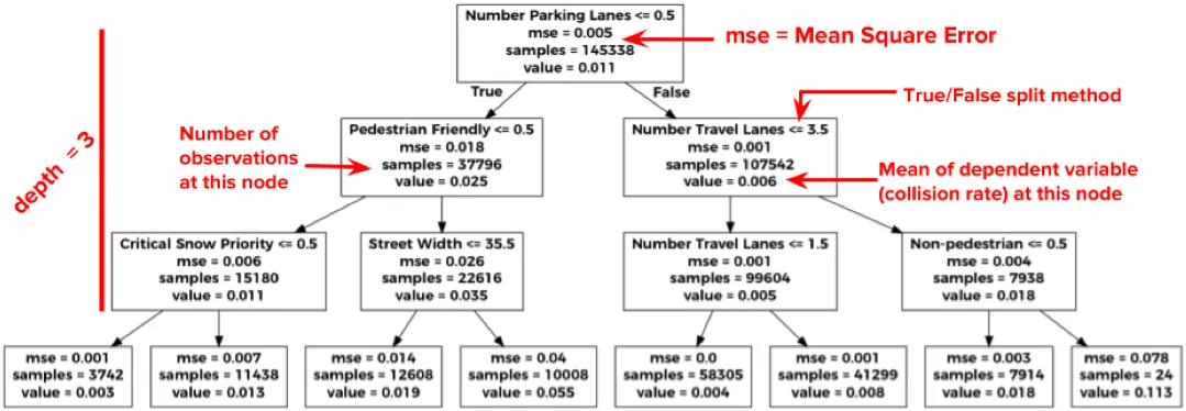
To discover which common features are most determinant of crash likelihood we can use a decision tree. Used for classification or regression decision trees work by repeatedly splitting or partitioning observed data along features that minimize a criterion like variance.
We joined the NYPD collision data to street data from the Department of City Planning and built a single decision tree. This street data captures features on the built environment like speed limits number of travel lanes and parking lanes snow removal priority street type and whether there's a bike lane.
In the below example of a single decision tree we can see how a tree might be constructed in order to minimize the mean square error or variance. For example streets with at least one parking lane have an average collision rate of 0.006 whereas streets without parking have higher collision rate of 0.025.
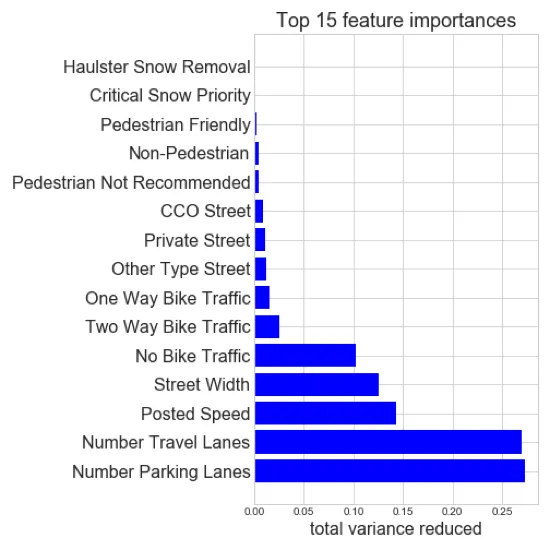
We can determine the importance of each feature by the total variance it reduces in the model. After running a random forest regressor which is multiple trees constructed on subsets of the data to prevent overfitting we find that the number of parking lanes and the number of travel lanes are the top two features in determining collision rate
Let's take a closer looking at what's going on with parking and travel lanes. If we normalize the count of collisions by the total length of road for each of these categories we create the resulting charts:
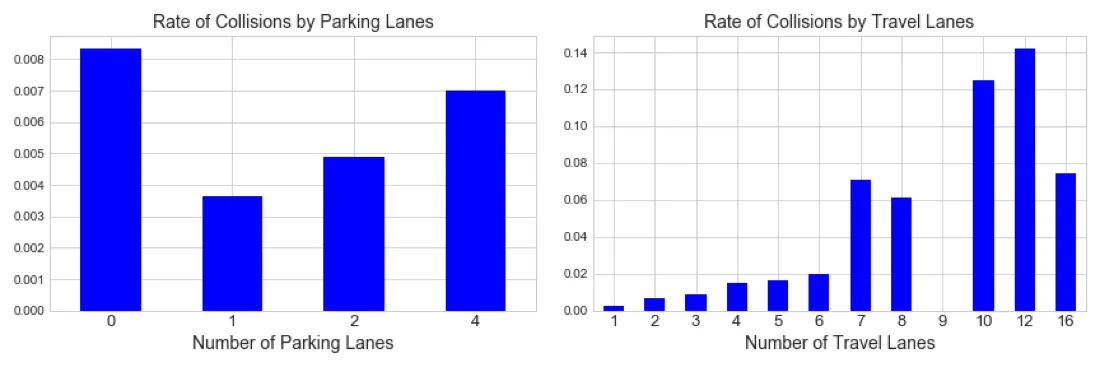
We find that as the number of travel lanes increase; the rate of collision increases. Of course there are very few roads in NY that have more than 6 lanes and these are mostly areas immediately before and after tolls. This makes sense since drivers are likely to be distracted before and after toll booths while trying to cross several lanes at once to be in the right lane before a toll or go in the right direction afterwards.
NYC has already begun to replace toll booths with more advanced technology like automated tolling systems such as those on the RFK Bridge that entirely remove the toll plaza. Transportation agencies not just in New York can take similar measures in order reduce collisions.
Looking at the rate of collisions by number of parking lanes we can hypothesize on these results. Streets with no parking lanes are more likely highways and major thoroughfares with higher speed limits and a larger volume of vehicles which may account for the higher collision rate. For city planners it is most interesting that streets with a single parking lane have fewest crashes as that information could be used to potentially mitigate risk in hotspots and influence future road network decision.
The Connection between Traffic Jams and Collisions
In the process of investigating the NYPD collision data we wondered how collision frequency and severity are impacted by traffic patterns and traffic jams. To answer this questions we employed Waze traffic data.
In order to begin drawing connections between traffic jams and collisions we need to be able to detect when and where traffic jams occur. There are three real-time feeds that Waze provides to its partners:
- The alerts feed: Containing location points and information on user-reported traffic incidents.
- The jams feed: Containing locations along the road network where there are traffic slowdowns based on user alerts and user speed.
- The jam irregularities feed: Contains unusual traffic jams based on historic speed data.
Now keep in mind this is a real-time traffic data feed and the ultimate purpose is to provide real-time information to Waze users. In order to perform analysis on this data we need to collect and clean the data over a period of time. In the following analysis we use a two week sample of the Waze traffic jam feed in NYC nearly 10 million records. But After "flattening" the data by unioning the unique jams geometries together and capturing their start and end times we are able to establish a far more reasonable count of 1.5 million unique jams in a our two week period.
We can now find which collisions occurred during traffic jams by joining the collision dataset with the jams based on time and space. In this two week sample we find there were about 8 000 collisions and about 2 000 of those happened during a traffic jam.
Let's go back to our question regarding collision severity and how that is impacted by traffic. Although the NYPD collision dataset does not capture the velocity at which crashes happened we can take the number of people injured or killed as a proxy for severity.
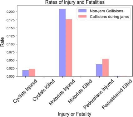
If we compare the rates of injuries and fatalities for collisions during and outside of jams we find that motorists are more frequently injured during collisions that happen outside of jams. Meanwhile pedestrians are injured at a higher rate during traffic jams. This is an unexpected result since we expect most collisions that occur during jams to be low velocity "fender benders".
For the New York City urban planner focusing on overall road safety finding the intersections of high pedestrian traffic and traffic jams can help to prioritize the locations where fixes and additional safety measures may be needed to prevent pedestrian injury and fatality.
New Data Streams and Methodologies to Ensure a Safer City
City streets are a shared space buzzing with people cars and cyclists. New data sources working in combination with traditional ones can help city planners and Departments of Transportation to understand the full picture of what happens on their roads.
With new data opportunities from mobile device applications like Waze and TomTom and data science methods like spatial autocorrelation and regression experts can better explore the health of city streets gain new insights into how they can be made safer and identify problem areas earlier.
Take the fast lane to better traffic management
Our experts are available to help you capture the geospatial power of crowdsourced traffic data for your city.