The Political Moneyball


This week The Wall Street Journal rolled out its >Political Moneyball graphic a visualization of the connections between political action committees super PACS campaigns and individuals. Based on the latest official Federal Election Commission data for the 2012 election the project visualizes more than one million connections between donors and committees. The data is updated every month.
The graphic has been designed and built by WSJ's Andrew Garcia Phillips Sarah Slobin and Jovi Juan. CartoDB handles all data analysis and dynamically displays the links between donors and committees.
A piece published on Washington Wire explains how similar donor groups cluster together what the color and the size of the circles mean and how to share a view. The project includes a full tutorial on how to use and navigate the graphic and encourages the role of readers in exploring the donations and linking the dots.
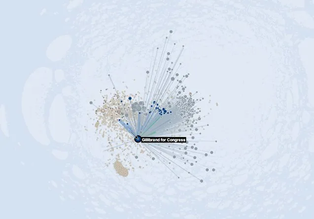
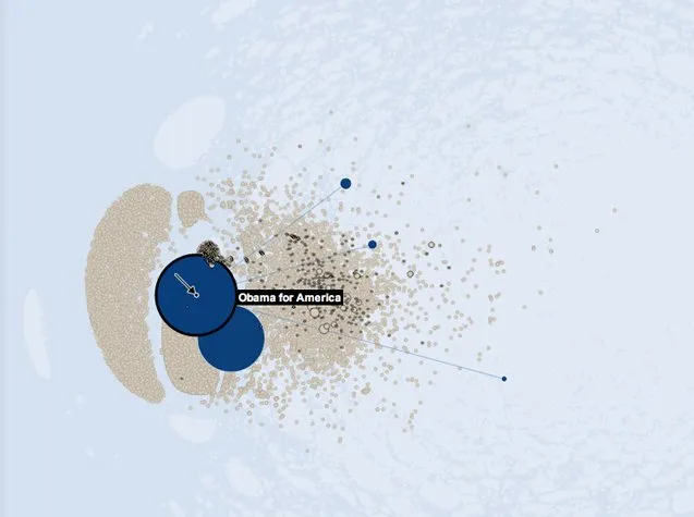
Here are a couple of views of the Political Moneyball:
Donors to Gillibrand for Congress
Money received by Obama for America
This is one of the most amazing uses of CartoDB we’ve seen thus far and it's great to see how CartoDB has helped to manage and explore such a big database in real time. And a big congratulations to the WSJ’s graphic team for this amazing visualization.