Map of the Month: Global Partnership for Effective Development Co-operation Dashboard


Established in 2011 at the High-Level Forum on Aid Effectiveness in Busan South Korea The Global Partnership for Effective Development Co-operation is a project lead by the United Nations Development Programme (UNDP) and The Organisation for Economic Co-operation and Development (OECD) in concert with 161 countries 56 international organisations and additional partners across the public and private sectors.
Bringing Monitoring Evaluation and Greater Transparency to International Development
With a goal of bolstering the efforts of countries foundations and other organizations participating in international development and supporting the achievement of the UN's Sustainable Development Goals (SDGs) the Partnership is guided by four principles:
- Ownership of development priorities by developing countries
- A focus on results
- Inclusive development partnerships
- Transparency and accountability to each other
Based on these principles open monitoring and consistent evaluation are of paramount importance to the Partnership and require a platform to track progress on a country-by-country level empowering Sustainable Development Goal reviews and informing strategic decisions based on accurate data and the wider global context.

Officially launched in March 2018 at the Global Partnership for Sustainable Development Data's inaugural Data for Development Festival the Global Partnership's Dashboard is specifically designed to be the monitoring tool that powers the Partnership and meets its commitment to partner ownership a results-based focus openness transparency and inclusivity.
##_IMAGE_SIZE_LIMT_## https://carto.com/media-content/blog/img/posts/2018/2018-04-30-undp-global-partnership-dashboard/gpedc_mainmap.gif##_IMAGE_SIZE_LIMT_##
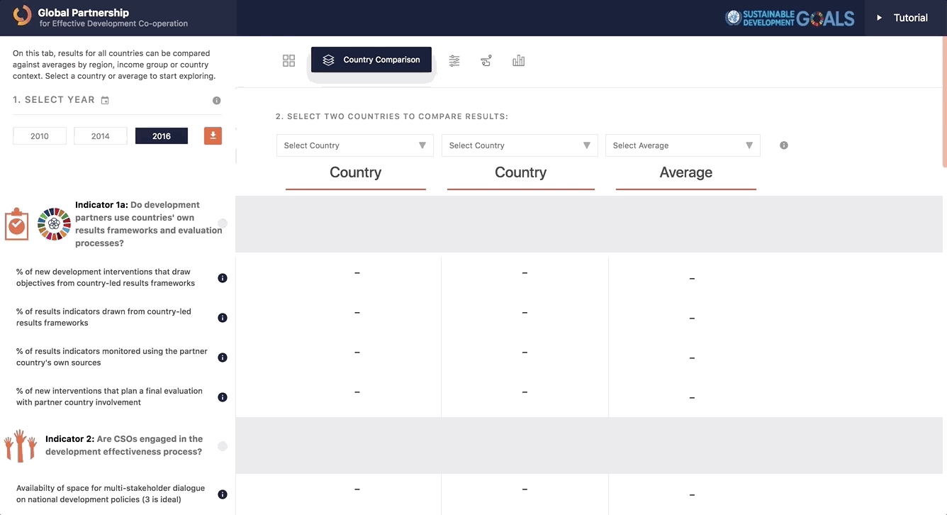
The Map and How It Works
Built by Vizonomy The Dashboard is powered by CARTO's Engine API which drives the interactive maps tables and graphics that allow partners to track performance based on various sustainable development indicators. When logging into the app in-app documentation is designed to guide users through its capabilities.
##_IMAGE_SIZE_LIMT_## https://carto.com/media-content/blog/img/posts/2018/2018-04-30-undp-global-partnership-dashboard/gpedc_tutorial.gif##_IMAGE_SIZE_LIMT_##
The dashboard is flexible allowing users to select any indicator year partner country or other attribute and have the interface update immediately. For example a user can view available indicators for Cameroon and Ethiopia (as below) while comparing those results with the average score in the region. As a result the dashboard presents an an easy-to-understand approach to comparative analysis empowering partners to evaluate performance understand historical trends and lay the foundation for additional monitoring mechanisms.
The dashboard is built using data sets from both public and private sources and the Global Partnership team uses CARTO to easily manage edit and update this data to make sure that it is accurate and relevant for partners.
Want to see this & similar maps in action?
Request a live personalized demo
The Future of Global Development Monitoring
The Global Partnership for Effective Development Co-operation is confident that their dashboard will be a powerful tool for Partners and development practitioners to:
- Monitor progress and results of recipient programs countries or cities.
- Identify high priority programs and geographies.
- Identify where and why funding is not producing the intended results.
- Compare performance among recipient programs countries and cities.
- Identify trends in the performance on indicators and sdgs over time and over different countries.
Through its use the greater development community can improve funding processes ensuring that money ends up in the right programs at the right time to maximize impact. By continuing to add data to and improve the dashboard the Global Partnership will improve the lives of people around the world for generations to come.
Want to do sonething similar?