Analyzing Mobility Hotspots with MovingPandas & CARTO


Mobility data is a cornerstone of geospatial analysis for so many industries. Being able to gain insights from movement and behavior data is key to decision making - from adapting mobile data coverage to meet event-based demand to assessing the insurance risk profile of drivers living in different areas.
However, traditionally, mobility data has posed a challenge for geospatial analysts. Data is often fragmented and proprietary, and by its very nature is enormous in size - making it difficult to analyze with traditional GIS systems.
By adopting a cloud-native approach - with data hosted and processed in a cloud data warehouse - organizations are increasingly able to leverage mobility data to make more informed decisions at scale.
In this blog post, we’ll dive into a tutorial on one particular element of mobility data; trajectories. This data not only tells us where numbers of people have been, but where they are coming from and going to - obviously incredibly useful for predictive analytics!
Working with trajectory data
In this tutorial, we’ll be showcasing how you can work with MovingPandas—a Python library for handling movement data—and CARTO’s cloud-native geospatial analytics platform to turn raw mobility data into a space-time hotspot analysis.
Step 1: Accessing the mobility data and platform setup
- Install the MovingPandas library with instructions here, and load the necessary libraries; it’s recommended that you use conda-forge to do this and not Pypi.
  import movingpandas as mpd
  import geopandas as pd
  import h3
  import opendatasets as od
- Then, we need to acquire the mobility dataset. We’ll be using the Porto Taxi dataset from Kaggle which you can download here or by using the script below. The dataset includes useful variables concerning trip details like trip ID, taxi ID, timestamp, missing data flag, and polyline data.
  input_file_path = 'taxi-trajectory/train.csv'
  def get_porto_taxi_from_kaggle():
      if not exists(input_file_path):
          od.download("https://www.kaggle.com/datasets/crailtap/taxi-trajectory")
  df = pd.read_csv(input_file_path, nrows=10, usecols=['TRIP_ID', 'TAXI_ID', 'TIMESTAMP', 'MISSING_DATA', 'POLYLINE'])
You’ll also need access to a CARTO account. If you don’t have one already, you can sign up to a free 14-day trial here.
Step 2: Data Preprocessing
To prepare the data for the hotspot analysis, we’ll convert the polyline string into a list of coordinate pairs and remove records with missing data. Additionally, we’ll calculate timestamps for each trajectory fix based on the Unix timestamp of the trip start and a 15-second sampling interval.
Run the below code to do this.
df.POLYLINE = df.POLYLINE.apply(eval)  # Convert polyline string to list
df = df.query("MISSING_DATA == False")  # Remove missing data records
df["geo_len"] = df["POLYLINE"].apply(lambda x: len(x))
df.drop(df[df["geo_len"]==0].index, axis=0, inplace=True)
You can see a snapshot of the output of this below.
| TRIP_ID | TAXI_ID | TIMESTAMP | MISSING DATA | POLYLINE | geo_len |
|---|---|---|---|---|---|
| 1372636858620000589 | 20000589 | 1372636858 | False | [[-8.618643, 41.141412], [-8.618499, 41.141376...] | 23 |
| 1372637303620000596 | 20000596 | 1372637303 | False | [[-8.639847, 41.159826], [-8.640351, 41.159871...] | 19 |
| 1372636951620000320 | 20000320 | 1372636951 | False | [[-8.612964, 41.140359], [-8.613378, 41.14035]...] | 65 |
| 1372636854620000520 | 20000520 | 1372636854 | False | [[-8.574678, 41.151951], [-8.574705, 41.151942...] | 43 |
| 1372637091620000337 | 20000337 | 1372637091 | False | [[-8.645994, 41.18049], [-8.645949, 41.180517]...] | 29 |
The next step is to calculate timestamps for each trajectory fix based on the unix timestamp of the trip start with a sampling interval of every 15 seconds, which we can do with the following code:
def unixtime_to_datetime(unix_time):
    return datetime.fromtimestamp(unix_time)
def compute_datetime(row):
   unix_time = row[‘TIMESTAMP’]
   offset = row[‘running_number’] * timedelta(seconds=15)
   return unixtime_to_datetime(unix_time) + offset
new_df = df.explode(‘POLYLINE’)
new_df[‘geometry’] = new_df[‘POLYLINE’].apply(Point)
new_df[‘running_number’] = new_df.groupby(‘TRIP_ID’).cumcount()
new_df[‘datetime’] = new_df.apply(compute_datetime, axis=1)
new_df.drop(columns=[‘POLYLINE’, ‘TIMESTAMP’, ‘running_number’], inplace=True)
new_df.head()
Again, you can see a snapshot of the output of this below.
| TRIP_ID | TAXI_ID | MISSING DATA | geo_len | geometry | datetime |
|---|---|---|---|---|---|
| 1372636858620000589 | 20000589 | False | 23 | POINT (-8.618643 41.141412) | 2013-07-01 02:00:58 |
| 1372636858620000589 | 20000589 | False | 23 | POINT (-8.618499 41.141376) | 2013-07-01 02:01:13 |
| 1372636858620000589 | 20000589 | False | 23 | POINT (-8.620326 41.14251) | 2013-07-01 02:01:28 |
| 1372636858620000589 | 20000589 | False | 23 | POINT (-8.622153 41.143815) | 2013-07-01 02:01:43 |
| 1372636858620000589 | 20000589 | False | 23 | POINT (-8.623953 41.144373) | 2013-07-01 02:01:58 |
Shall we see what that looks like on a map?
Now we have a series of time stamped coordinates for each trip, we can transform them into trajectories.
Step 3: MovingPandas Trajectory Analysis
With the data preprocessed, it's time to turn the taxi data into trajectories with MovingPandas. This step is crucial for gaining insights into the taxi movement patterns.
We can use the code below to do this.
gdf = gpd.GeoDataFrame(new_df, crs=4326)
trajs = mpd.TrajectoryCollection(gdf, traj_id_col='TRIP_ID', obj_id_col='TAXI_ID', t='datetime')
The results of this can be seen below:
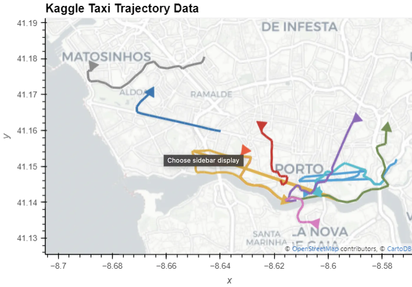
Notice anything strange? We can see some of the trajectories seem to be taking strange routes, particularly those coloured orange and blue in Central Porto. These are caused by location errors in the data and need to be cleaned.
Step 4: Data Cleaning
We can identify outliers in the data by examining travel speeds between consecutive trajectory fixes. Unrealistically high speed values (over 100 m/s) are caused by large jumps in the GPS trajectories. To clean these trajectories, we use MovingPandas’ OutlierCleaner.
cleaned = trajs.copy()
cleaned = mpd.OutlierCleaner(cleaned).clean(v_max=100, units=(“km”, “h”))
cleaned.add_speed(overwrite=True, units=(‘km’, ‘h’))
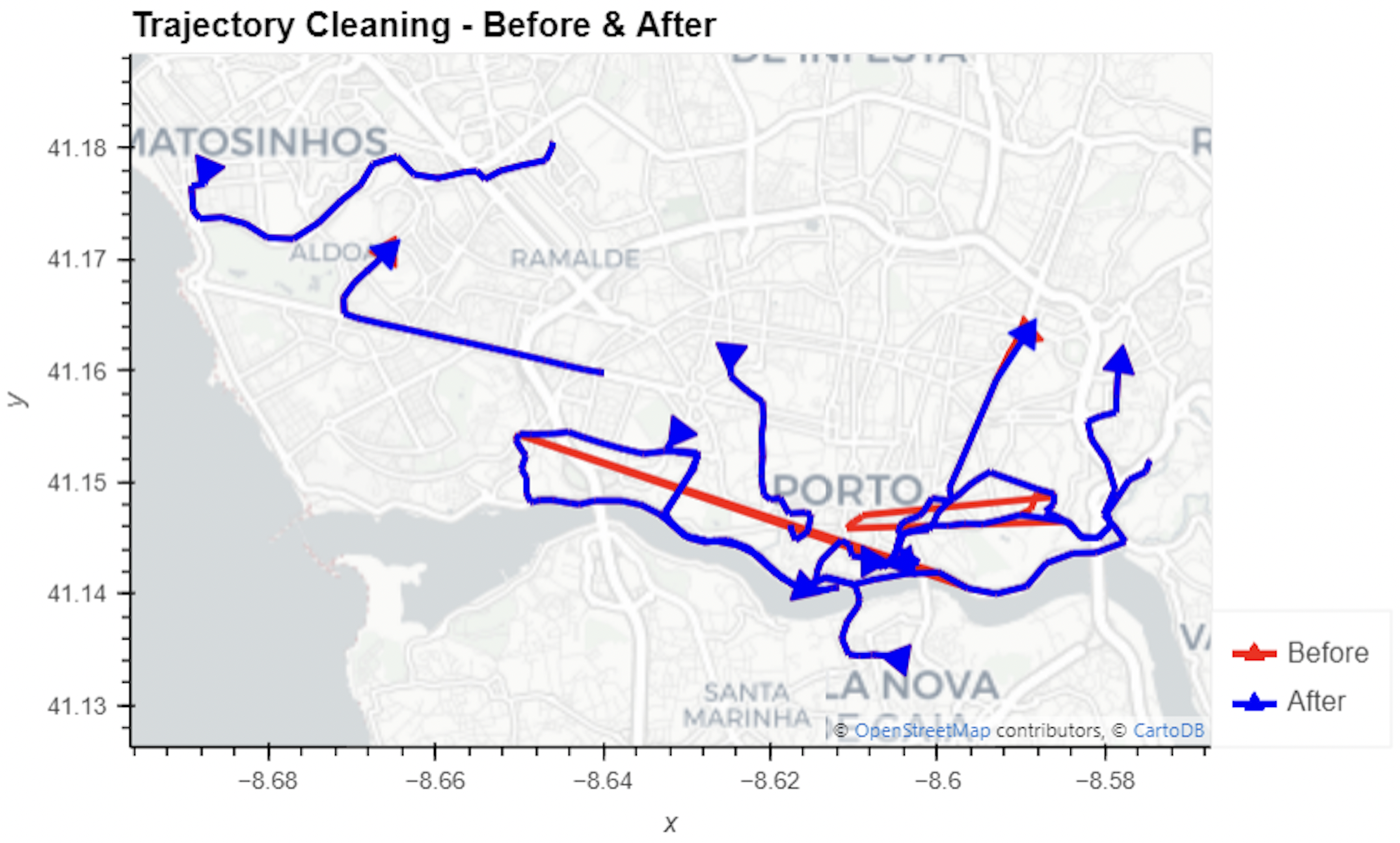
We can visualize the before-and-after trajectories to see the impact of cleaning.
(
   traj.hvplot(title=‘Trajectory Cleaning - Before & After’, label=‘Before’, color=‘red’, **hvplot_defaults ) *
   cleaned.hvplot(label=‘After’, color=‘blue’, tiles=None)
)
Let’s take a look at the difference below. The red lines are the original trajectories, whilst the blue are the results of our outlier cleaning - much more sensible!
Now we have data that we’re confident in, we can start to generate some insights.
Calculating space-time hotspots from mobility data
A really useful technique for understanding the patterns in mobility data is to calculate Space-time hotspots, where you’ll understand statistically significant clusters in your data in both space and time. But, before we do that, we need to convert our data to a Spatial Index called H3.
Spatial Indexes are global discrete grid (DGG) systems with multiple resolutions available. They’re incredibly useful as a support geography, as their grid cells are geolocated by a short reference ID, rather than a long geometry description. This makes them lightweight to store and super quick to process - ideal for working with typically heavy data like mobility data. If you’d like to learn more about Spatial Indexes, head here to download a FREE copy of our ebook - Spatial Indexes 101!
H3 is one type of Spatial Index, popular for its hexagonal shape making it ideal for measuring and representing spatial trends; learn more about the power of hexagons for spatial analysis here.
Step 5: Converting the data to a H3 Index
Transforming your data to a H3 index couldn’t be easier - you can find a range of tools from the Analytics Toolbox and in Workflows, from simple geometry converters to enrichment functions which allows you to aggregate numerical variables.
As we’re working with trajectory data - however - we need to do something a little different; we’ll be clipping the trajectory data to H3 polygons.
The first step in this process is to first create the geometries which represent the H3 polygons in our study area using the code below.
h3cells = gdf[‘h3’].unique().tolist()
polygonise = lambda hex_id: Polygon(
   h3.h3_to_geo_boundary(hex_id, geo_json=True)
)
all_polys = gpd.GeoSeries(
   list(map(polygonise, h3cells)), index=h3cells,
   name=‘geometry’, crs=“EPSG:4326” )
all_polys = all_polys.reset_index()
Next, we can use the code below to clip the trajectories to the newly created H3 polygons.
def get_sub_traj(x):
   results = []
   tmp = trajs.clip(x[1])
   if len(tmp.trajectories)>0:
       for jtraj in tmp.trajectories:
           results.append([x[0],jtraj])
   return results
my_values = list(all_polys.values)
res = p_umap(get_sub_traj, my_values)
def flatten(l):
   return [[item[0], item[1]] for sublist in l for item in sublist]
tt = pd.DataFrame(flatten(res), columns=[‘index’, ’traj’])
tt.head()
Finally, in order to calculate Space-Time Hotspots we need to split the trajectories into hourly segments using MovingPandas’ TemporalSplitter. The first code block below achieves this, whilst the second extracts the “end” hour for each trajectory.
tt = tt.rename(columns={‘index’:‘h3’}).reset_index()
tt[‘st_split’] = tt[’traj’].apply(lambda x: mpd.TemporalSplitter(x).split(mode=“hour”).trajectories)
st_traj = tt.explode(‘st_split’)
st_traj.dropna(inplace=True)
We also extract the hour when each trajectory segment ends.
def get_end_day_hour(traj):
   try:
       t = traj.get_end_time()
   except:
       print(traj)
   return datetime(t.year, t.month, t.day, t.hour, 0, 0)
st_traj[’t’] = st_traj[‘st_split’].progress_apply(lambda x: get_end_day_hour(x))
st_traj[‘duration’] = st_traj[‘st_split’].progress_apply(lambda x: x.get_duration())
With both the start and end times calculated, we can extract the travel duration for each H3 cell using the code below - the final piece of the puzzle we need to run Space-Time hotspots!
agg_st_traj = st_traj.groupby([‘h3’,’t’], as_index=False)[‘duration’].sum()
agg_st_traj[‘duration’] = agg_st_traj[‘duration’].apply(lambda x: x.total_seconds())
agg_st_traj[‘geometry’] = agg_st_traj[‘h3’].apply(lambda x: Polygon(h3.h3_to_geo_boundary(x, geo_json=True)))
agg_st_traj.head()
Finally, load the data into your cloud data warehouse - and let’s analyze!
Step 6: Space-Time Hotspot Analysis
Now we’re ready to perform Space-time hotspot analysis to enable us to identify and measure the strength of spatial-temporal patterns in our mobility data. We’ll be doing this with CARTO Workflows - a low-code, drag-and-drop interface for building analytical pipelines. The component we’ll be using to run this analysis is Getis-Ord* Space-Time; you can learn more about this statistic as well as other spatial hotspot techniques here. You can see this in action in the workflow below, which you can download as a template here.

This statistic can also be run using the below SQL code; for more details please refer to our documentation here.
SELECT * FROM carto-un.carto.GETIS_ORD_SPACETIME_H3((
   SELECT ARRAY_AGG(STRUCT(index, timestamp, value)) AS input_data
   FROM mytable
), 3, ‘DAY’, 1, ‘gaussian’, ‘gaussian’);
In this tutorial, we will use a neighborhood size of 1 and a kernel function of uniform for both spatial and temporal analysis. Shall we check out the results?
Explore the map in full screen here. We’ve used a SQL Parameter here to allow the end user to filter the hotspots to the date and time period they’re interested in.
With the results of this analysis, taxi companies can make more intelligent decisions for optimizing resources around spatio-temporal demand.
Conclusion
Combining MovingPandas and CARTO opens up exciting possibilities for analyzing complex and large-scale trajectory data. This approach can help you gain valuable insights and drive decision-making for any organization dependent on knowing not just patterns in space, but also time.. By following this tutorial, you can adapt these techniques to a wide range of mobility datasets and use them to make informed decisions.
Want to learn more about building more scalable spatial data science pipelines? Get in touch for a free demo with one of our experts!
This tutorial was developed as part of the EMERALDS project, funded by the Horizon Europe R&I program under GA No. 101093051.