Building a Spatial Model to Classify Global Urbanity Levels


Decision-makers in the private and public sector are trying to understand our rapidly changing use of urban areas. The way we shop and travel; what we expect from our living space and how often we go to an office has (in many cases) changed forever - and measuring if the drastic changes caused by COVID-19 are permanent will be key for businesses and governments to evolve their plans in line with consumer and citizen demand.
As an example in the US there has been much hype around people leaving cities yet (according to the US Census Bureau) 84% of movers stayed within the same metro area; 7.5% stayed within the same state; 6% stayed in the top 50 metro areas and only 0.28% left the metro/micro area altogether. So how can we monitor these trends and measure the new and changing levels of urbanity that we are seeing emerge across the globe?
In this project we have designed a spatial model which is able to classify urbanity levels globally and with high granularity. As the target geographic support for our model we selected the quadkey grid in level 15 which has cells of approximately 1x1km at the equator.
Understanding how to classify territories based on an urbanity typology synthesizing information regarding how population density and urban infrastructure (roads lights) vary across a country has a multitude of applications in the Location Intelligence space. For example this can support logistics and quick commerce companies to optimize their supply chain operations or help telecoms companies to better plan the roll out of their networks and adapt the density of cells depending on the urbanity level. It can also be relevant for retail and CPG companies to analyze their performance and calculate their addressable market depending on the type of areas in which their stores are located.
There are several datasets that provide an urbanity classification focusing only on specific countries such as the work carried out by Geolytix (Geolytix GeoData Urbanity User Guide 2020) and A.Alexiou et. al (source) in the United Kingdom and by Unica360 in Spain (source). However it appears to have been less common to attempt building such a classification at a global level following a common approach. The global datasets that can resemble only to a certain extent to what we aimed in this project are the land use classification from OpenStreetMap and several satellite-based land cover data products such as MODIS Land Cover Climate Modeling Grid (CMG) and CORINE Land Cover in Europe.
In this article we will go through the input data and methodology we designed to build the spatial model showcasing some of the results and key metrics.
Input data
For the model we needed datasets that are available globally and with a high granularity. This included:
- Population mosaics (WorldPop): Global population figures projected in a grid with cells sized 1x1km. This data is publicly available as well via CARTO’s Data Observatory.
- Nighttime lights (Colorado School of Mines): processed time series of annual global VIIRS nighttime lights produced from monthly cloud-free average radiance grids. The image resolution is 15 arc seconds approximately 500x500m at the equator.
- Road Network (OpenStreetMap): OSM offers access to the main road network infrastructure in each country and a classification for different road segments. For this study we only considered primary secondary motorway and trunk road (which we found to be more consistent and available across different countries).
The rationale behind the selection of these datasets is that the nighttime lights and population data are capable of differentiating the urbanized areas from the rural/remote areas. Several studies have examined the relationship between these features and the outcome is that they are very correlated with each other. As the population increases the intensity of the light data increases as well. The reason behind using nighttime light data in addition to population is to better cover areas within a city where the population is suddenly low (e.g. a big park within a city).
We then use the data about the road network infrastructure in order to differentiate areas that are accessible from those that are isolated.
Urbanity classes
For this project we decided to consider 6 different classes or urbanity levels as described below. The classification is done at the country level allowing us to run the classification model for each country individually. This is an important consideration motivated mostly by the fact that from country to country the structure of urban areas and how this affects the distribution of population density varies considerably; for example if we look at urban areas such as New York City in the US or Mumbai in India compared to Amsterdam in The Netherlands they are structurally different especially if we look at population density while they are all urban areas within their corresponding countries.
- Class 1 - Remote: areas that have no or very low population and are not easily accessible through the main road network.
- Class 2 - Rural: areas that have very low population but their access via main road infrastructure is feasible. This class differs mostly from ‘Class 1 - Remote’ due to its easier accessibility but the classification has nothing to do with the use of the land for farming purposes.
- Class 3 - Low density urban: areas that are relatively sparsely populated small-medium towns.
- Class 4 - Medium density urban: densely populated areas and night time light data most medium and big cities or areas in the outskirts of big cities.
- Class 5 - High density urban: densely populated areas and nighttime light data. Large cities centre of import cities;
- Class 6 - Very high density urban: Metropolitan areas centres of main cities in each country where areas are very densely populated.
Methodology
As we want our resulting dataset to be aggregated at the Quadkey grid as it is a standard geographic support system; we first need to transform the input datasets into that grid specification. For that we use some of the Quadkey functions available in CARTO’s Spatial Extension for Google BigQuery. We transform Worldpop population data into population density per quadkey cell. For the nighttime light data we enrich the quadkey grid based on the intersected areas between the different pixels and the target grid cells. For the road network data we compute the total length of each type of road segment within each target cell.
We detected that the nighttime light data needed to be pre-processed in order to be ready for our use case as we found a series of outliers with high light intensity values in areas such as power plants and river deltas where there is not a correlation with population density. The approach used to detect such outliers is the following:
- Clustering (with 8 clusters) following a Gaussian Mixture Model (GMM) [4] using standardised nighttime light data and population density;
- Find clusters which deviate from the basic rule of high light and high population density which we tag as "outliers";
- Build a model (i.e. polynomial regression with 3 degrees) with population density and the spatial lag of population density from the "non-outliers";
- Interpolate for the outlier areas using the previous model.
An example of the results from the correction process we run over the nighttime light data is illustrated below:
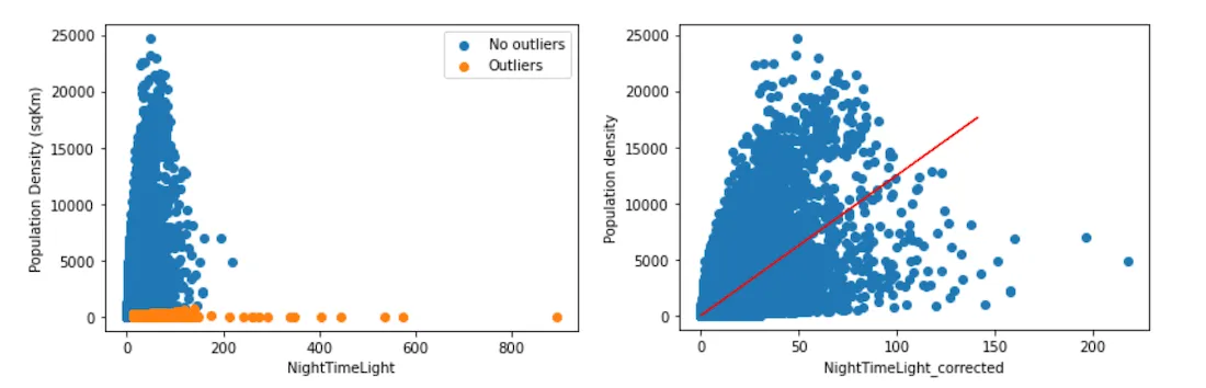
Example of outlier correction left : NightTimeLight vs Population density original right : NightTimeLight vs Population density after correction
Then once we have all the input data pre-processed and aggregated at the target geographical support system we combine the nighttime light data and population density data in order to create an index to cover both features. We then use this index to represent "urbanity". This is done using the Principal Component Analysis (PCA) with only one component; thus creating an "index" for each area. In that way for an area if the population density or the light intensity present high values then the index will have a high value as well. This is based on two papers ("Relationships between Nighttime Imagery and Population Density for Hong Kong" & "Night-time light data: A good proxy measure for economic activity?") where the authors state that the nighttime light data and the population density are correlated.
Since we work with a high resolution grid but we also want to ensure some continuity in the classification and avoid drastic changes in the urbanity level in neighboring areas (e.g. due to large variations of population density in adjacent cells) we need a way to include spatial dependence. For example we do not want to classify a park in the center of a city as rural or low density just because its population and light intensity are low compared to the neighboring cells.
For this reason after generating the index the Getis-Ord statistic for all cells is calculated using as neighboring cells the two layers area as is illustrated below. The objective now is to generate a Z-score value taking into account the surrounding area of each grid cell.
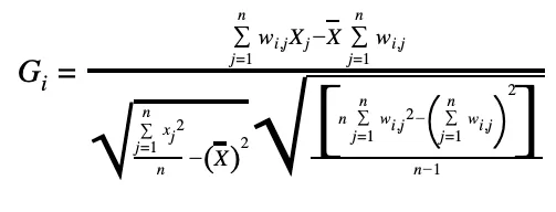
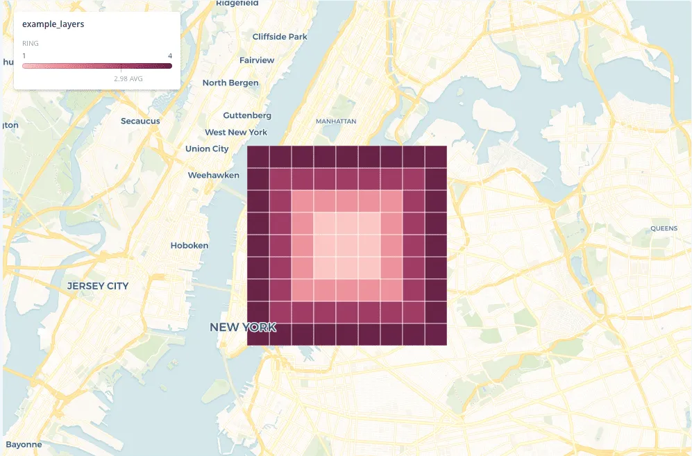
Illustration of up to 4 levels of neighbouring layers in the grid
The resulting Z-score is used as an input to a clustering algorithm (i.e. KMeans) where 6 different clusters are used the same number as the number of urbanity level classes we want to obtain as a result of the project. The cluster with the lowest average of population density is remote the second lowest is classified as rural and so on.
As a next step we further cluster the resulting remote and rural areas using the Z-score (i.e. GetisOrd statistic as described above) of the length of all roads in each cell. This time we calculate the Z-score with 4 layers of neighboring cells (see image above). We then label the cluster with the lowest road length as remote and the rest as rural areas.
At the end of the process we do a final refinement of labels in order to correct some spurious cells which have a different label compared to all their first layer neighbors. For each cell the labels of the neighboring cells are checked and if all of them are the same urbanity class but different for the targeted cell then the label of the target cell is changed to that of its surrounding cells.
Results
In the maps below we showcase the result of our urbanity model for a few illustrative countries. It is important to note that in order to build these visualizations given the volume of data we have used CARTO’s BigQuery Tiler.
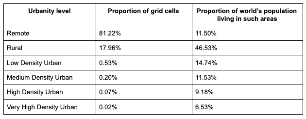
We run this model for 251 countries following the country codes as defined in the ISO 3166-1 Alpha-3. The tables below summarize some of the results looking at the % of grid cells that have been classified in the different urbanity levels. As it can be seen 42% of the global population resides in at least low density urban areas. The majority of the population lives in rural areas. This is mainly because of the population distribution in large countries such as China Russia etc.
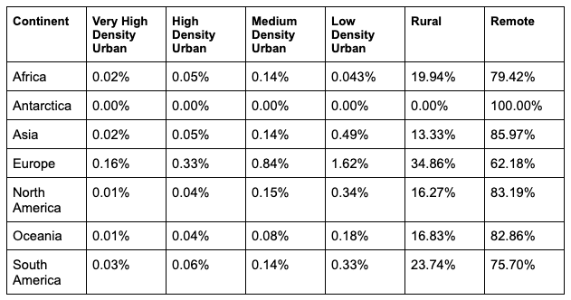
When looking at the different urbanity levels across continents we see that Asia and North America show the largest percentage of remote areas mainly due to Russia and Canada where the northern areas are uninhabitable. Europe appears to have the greater percentage of cells in the higher density urbanity levels.
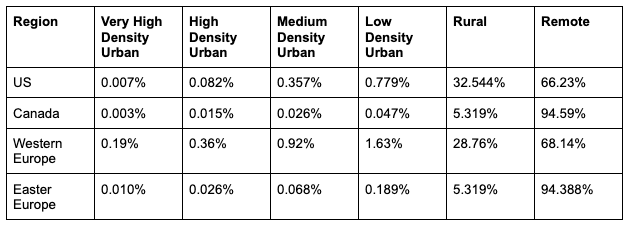
Looking closer at certain regions Western Europe appears to be the one with a higher proportion of areas with high density urbanity; with Canada and Eastern Europe having the higher proportion of areas classified as remote.
In the visualization below you can explore the results of our model for all countries in Europe showcasing again the capabilities of our BigQuery Tiler in terms of building visualizations with high volumes of data.
Available soon in CARTO Spatial Features
In late 2020 CARTO introduced our very first derived data product called "CARTO Spatial Features". This dataset is meant to enable data scientists to create spatial models offering a set of spatial features in standardized formats with global coverage. In the next few weeks we will be releasing a new version of the Spatial Features data in which we will include urbanity level as one of the new available features.
Want to get started?
 | This project has received funding from the European Union's Horizon 2020 research and innovation programme under grant agreement No 960401. |