

Canary Islands Volcano: Mapping La Palma Lava Flow & Damage


On Sunday the Cumbre Vieja volcano on La Palma in the Spanish Canary Islands started erupting causing the destruction of 300 homes and forcing the evacuation of more than 6 000 residents. Thankfully no casualties have been reported so far but there are fears the lava could trigger a powerful chemical reaction and the release of toxic gases when it reaches the sea less than 2km away.
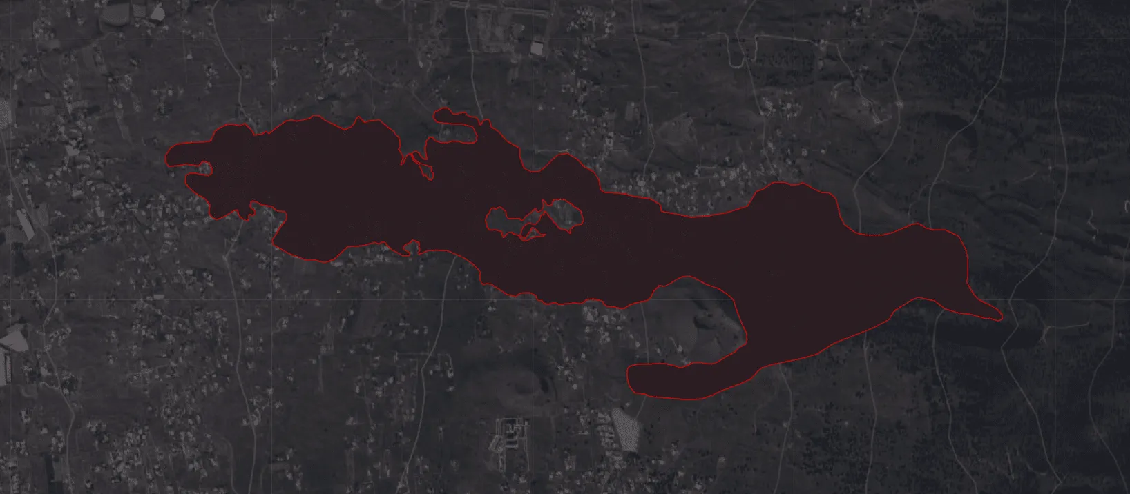
The lava flow has advanced more than 14 hectares in the past 36 hours and continues to destroy everything in its path. Our team has been mapping the flow both actual and modeled in order to estimate its inexorable advance to the sea and the potential damage to property based on a number of data sources as described below.
Mapping Actual Lava Flow & Damage
The Copernicus Emergency Management Service (CEMS) from Europe provides great data almost daily on the situation on the ground. Using that data we can overlay the current extent of the lava.
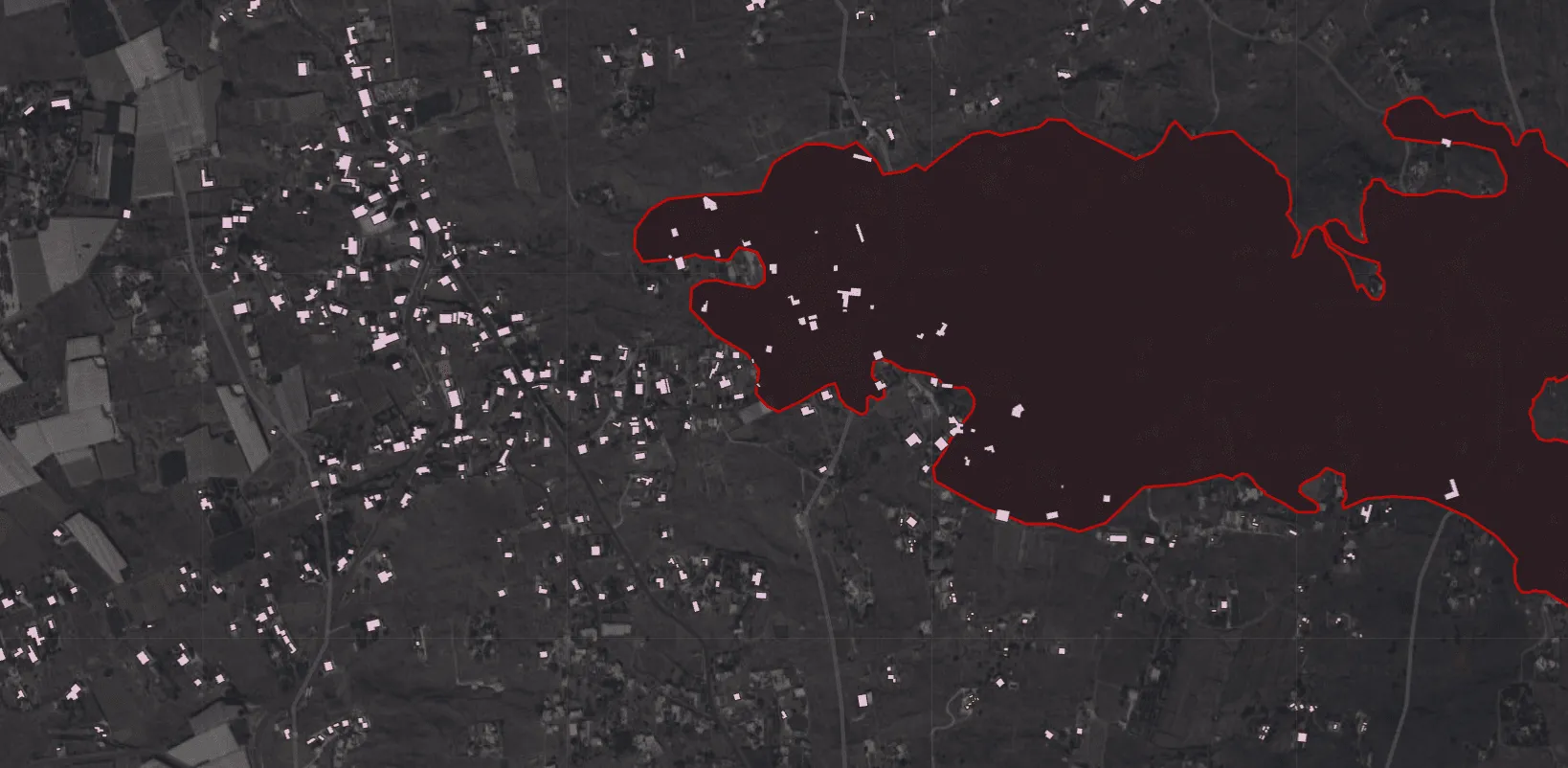
By using data from the just released Open Buildings dataset from Google we can see where buildings are:
If you want to explore this full dataset in fact we have created a simple app for that using our BigQuery Tiler.
And by intersecting them together we can see which buildings have been destroyed:
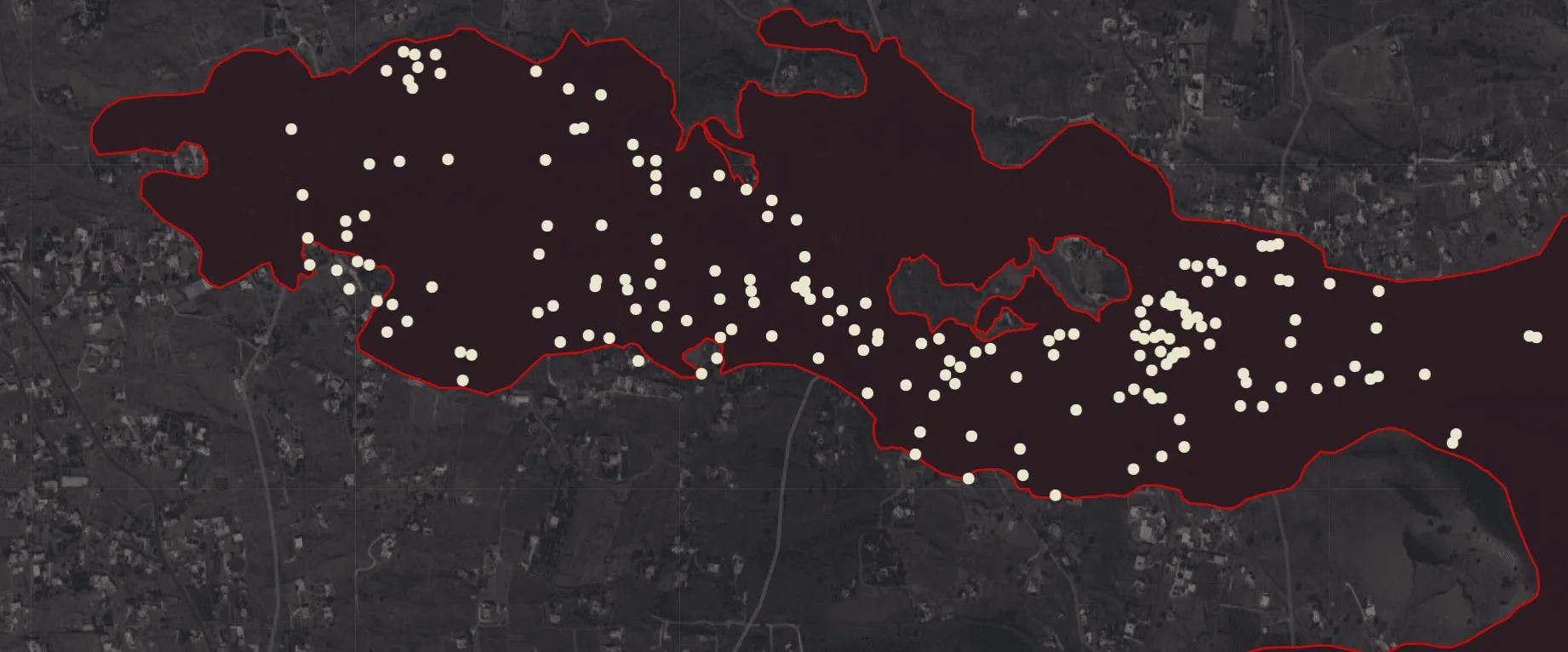
And finally by using a lava flow model, developed by the Universidad de La Laguna and published by the Cabildo de La Palma we can make different scenarios on what other buildings are at risk:
Putting these data layers together, we can visualize in a brief video:
Modeling Future Lava Flow & Property Damage
Spatial data and analysis can be used in this way within catastrophe modeling to estimate the economic impact of extreme events and set the early response.
In this other map we look at the same data but aggregate it by the number of buildings. The higher the column, the more buildings that are in the path of the lava flow. Additionally the colors represent the distance from the lava flow model.
Here at CARTO we would like to express our solidarity with the people of La Palma, and we will be offering our help and support during the difficult period that lies ahead.
Want to get started? Sign up for a free account


