Happy Birthday CARTOframes, CARTO's Python Interface


One year ago today we announced the launch of CARTOframes a Python package for interacting with CARTO built specifically for data scientists. To celebrate I sat down for a Fireside Chat with CARTOframes creator and member of our data science team Andy Eschbacher and Senior Customer Support Manager Jeff Ferzoco.

Feel free to jump to the different topics covered in our ranging conversation:
- Why build a Python interface for CARTO?
- How did CARTO's customers help with development? How have they benefited?
- What are the latest features in CARTOframes?
- What future development do you want to see for CARTOframes?
- Quick hits! What are the things you love about CARTOframes?
Why build a Python interface for CARTO?
Andy: Well we really built CARTOframes out of an internal need on our own team. Often we would be pulling data out of our CARTO accounts and from other data sources and we would build models for example and have all of these outputs from our models. We'd write our outputs into a CSV using Python Pandas and drag and drop it back into CARTO. As we iterated we would constantly have to context switch between CARTO and the Jupyter Notebooks that we were working in and have too many temporary tables. It was a pretty tedious workflow.
We wanted a way to use CARTO more quickly and within our data science workflows. Eventually we had a client request something similar to what we were looking for. So it came together nicely that we could set aside the time and build CARTOframes!
Jeff: When Andy and the data science team were looking for ways to make it easier to work in Python I had a lot of customers who were interested. So as Andy was building and testing CARTOframes he and I worked together a lot. Our customers helped us understand more clearly how people wanted to use Python and CARTO together. This guided a lot of the iterations of the tool. Andy and I were sitting next to each other at the time and we would talk all day and it enabled a great back and forth between customers and product.
Andy: Our goal was to write CARTOframes in a way that would feel really natural for a data scientist. For the data side of things that meant working in Pandas (a Python data analysis library) the de facto standard for working with tabular data in Python.
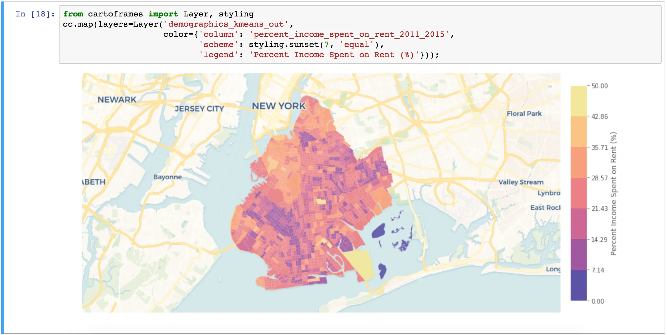
For visualization one of the most common formats is Matplotlib which is a beast of a plotting library but lets you pull in static images from CARTO's Static Maps API. This way you can create a map of your data layers with a basemap using just one line of code with CARTOframes.
On top of that if you're working with Jupyter Notebooks it has a very rich display environment allowing HTML outputs so you can have an interactive CARTO map displayed in the notebook programmatically all communicated in your workflow.
How did CARTO's customers help with development? How have they benefited?
Jeff: One of my customers for example had a problem where they had terabytes of data coming in daily. They had this massive supercomputer in the corner and they had to peel data off of it for processing. So they would peel that data off and use CARTOframes for analysis.
Once they started with CARTOframes we ended up using them as a measure of success. We were looking at usage stats which were high from the moment we introduced the tool. Then we would go in and ask them questions which boosted usage even higher. So we had this great system where we were almost bespoke developing the audience for CARTOframes. And with the feedback Andy was making little tweaks and responding to specific customer needs.
Andy: We learned quickly that a key priority was making it easier for customers to get data into and out of CARTO with zero frustration especially for data scientists who have CSVs with millions of rows. We built in some functionality under the hood so CARTOframes allows the passage of that data to be a lot more seamless.
Jeff: That's really critical because the one thing a data scientist doesn't want is to struggle with data size.
Andy: Right! So one result of focusing there is that CARTOframes been used for the ETL process (data extraction) for various tools. We built a big data connector between someone's Hive data lake and CARTO and it uses CARTOframes running on a server to be the proxy in between for transferring. Another user in Australia who uses CARTOframes to process transit data for a city bus system put it into a dataframe and sent it to CARTO making more or less a real time data stream living in CARTO for busses in that city.
Jeff: That's what CARTOframes does best basically creating a workflow Python is so flexible that you can do almost anything with it and CARTOframes just makes it a lot easier to bring in data from multiple sources transform it through analysis and get results into a map in somewhat real time.
What are the latest features in CARTOframes?
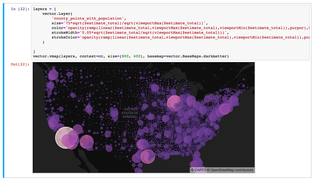
Andy: Well I've recently released CARTOframes 0.8.0 which involves a couple of cool things. First and perhaps most importantly CARTO VL is built into CARTOframes. You can use the whole styling language there's click and hover interactivity you can add layers from a table or a query. You can even pass in a Geopandas dataframe and it will visualize that data locally within your notebook along with the layers hosted in your CARTO account.
Jeff: So you brought vector into CARTOframes!
Andy: Right! The update also adds a 'style by line' option to Layer and QueryLayer fixes a couple of bugs and adds a custom basemap layer to vector maps.
Catch up on all things CARTOframes by watching our recent webinar!Download Today!
What future development do you want to see for CARTOframes?
Andy: I want to ensure full feature parity with CARTO VL which is a challenge because production on that moves pretty quickly. I want to bring in a way to visualize data from the Data Observatory or any of our premium data offerings with Tileset API so people can visualize more outside data layers. I think a lot of data scientists would be really interested in bringing in features from MRLI data to add to their machine learning models so we need to add more methods for accessing that data.
Jeff: So you could bring Mastercard data in have Mapbox vector tiles underneath them and then access the data within those inside CARTOframes?
Andy: Yep. That's kind of the visual part but also we want to start viewing CARTO as a processing engine. So just imagine that in CARTOframes you could programmatically build an analysis chain compute against it and get the results and then visualize. For me that's something I'm most excited to build in CF.
Jeff: What you're talking about is really exciting chaining analysis inside of a Python script. I mean you can do it in other ways now but it isn't easy. Analysis is all people want to do now. People want to transform their data into meaningful insights. So a full analysis toolkit could be a gamechanger in the Python mapping universe. And I can see it helping a lot of teams do things a lot faster specifically in an industry like Real Estate where I often see Python used. There's just so much data and so many things to analyze.
Quick hits! What are the things you love about CARTOframes?
Andy:
- First being able to create data-driven maps in one line of code is very cool.
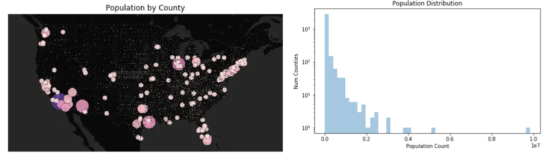
- Since the output for maps is a Matplotlib image if it's static you can compose them alongside charts to see the visual map output paired with something like the distribution of the data and obviously you can do much more complex things than just show a histogram.
- I think that CARTOframes has one of the easiest interfaces for exploring and accessing the Data Observatory
- This is a bit in the weeds and not very sexy for our on-premise customers CARTOframes works natively. That was one client request that we started getting almost from the beginning.
Jeff:
- For folks who have done a little bit of Python CARTOframes is super easy to pick up which is great for me as a Customer Success Manager I can offer something with instant value.
- It works particularly well with Jupyter Notebook. The visual element of Jupyter is a perfect match for the visualization component of working with CARTO.
- On top of that access to CARTO Color Ramps is amazing and improves those visualizations in Jupyter.
- CARTOframes works really nicely with a tool like Colab where teams can have shared Jupyter Notebooks. This feels like the next step with data science in general where everyone can pile into one notebook and make changes and then it becomes the center point for a team.
Want to see CARTOframes in action?
Schedule some time with our experts!