This map shows attendance of over 1,000 US protests in 2017
Update: To view maps & analysis of the summer 2020 protests in the US click here.
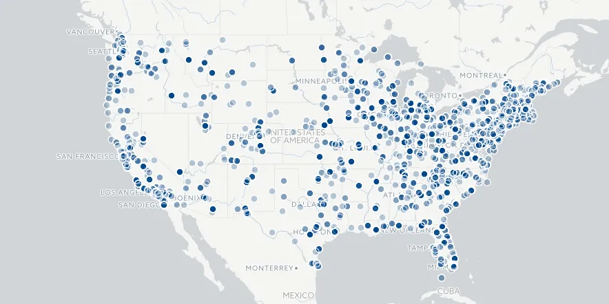
Our Map of the Month for November is Count Love (click to explore).
Working with location data spatial analysis machine learning and digital cartography Tommy Leung and Nathan Perkins built a repository of aggregated protest data beginning with the Women's March on January 21 2017.
Count Love is an open source tool that collects visualizes and shares open data on protests nationwide.
The goal Tommy and Nathan write on their website is to keep "an actual record of ongoing demonstrations and making this data more accessible helps citizens journalists and politicians make more compelling cases for a diverse empathetic and kind country."
In this post you'll learn how Count Love got started how the platform and their app work and what surprising insights have been discovered so far. Tommy and Nathan also shared with us their experience visualizing protest data with CARTO.
Let's get started.
How Count Love started collecting data
Count Love began on January 21 2017 when Tommy and Nathan (and an estimated 5 million other people) participated in the Women's March showing solidarity with women worldwide protesting the new administration.
Following the march Tommy wondered what if any actions would result from the day's events.
Tommy and Nathan quickly discovered that analyzing the effectiveness of past protests demonstrations and rallies wasn't possible as enough reliable data had not been collected. To answer their original question Tommy and Nathan needed to start collecting protest data themselves.
There are lots of challenges when it comes to data collection data quality and data storage. When it comes to protest data these challenges are all the more difficult since protests are sporadic and tend to be local rather than national. Count Love needed a method for collecting data on protests around the country that were often not making national headlines.
Tommy and Nathan wrote a web crawler and text extractor that scans 2 500 local newspapers and tv stations and targets select keywords like "protest " "demonstration " and "rally."
(A more detailed account of their methodology can be found here).
"On any given day " Tommy and Nathan admit "data entry is the most important and error prone part of Count Love " but to ease this process an internal workflow was designed and implemented.
Estimating crowd counts with location data
Data collection and data accuracy pose challenges especially when aggregating data on short-lived events like political protests but ensuring accuracy is often the most difficult aspect of working with data.
Count Love addresses this challenge using conservative crowd size estimates. When scanning local newspapers Count Love interprets "a dozen" protesters at an event as 10 "dozens" as 20 hundreds as "100" and so on.
After the March for Science on April 22 2017 Nathan started developing a new tool that could use protesters mobile devices to collect anonymized protest data.
Nathan built an iOS mobile app aptly named Count Love App which allows individuals to register their attendance at a specific event. The GPS coordinates of the mobile device are mapped and then later verified using nearby event information.
This data helps Count Love identify protests and protest attendance numbers that may not have been covered in local media outlets.
Geographic and temporal trends discovered in protest data
Studying the temporal and geographic trends of protest data provided psychographic insights into the activities attitudes and values of protesters. To test whether a protest type exhibits a geographic pattern Count Love mapped the most common protest category for each state:
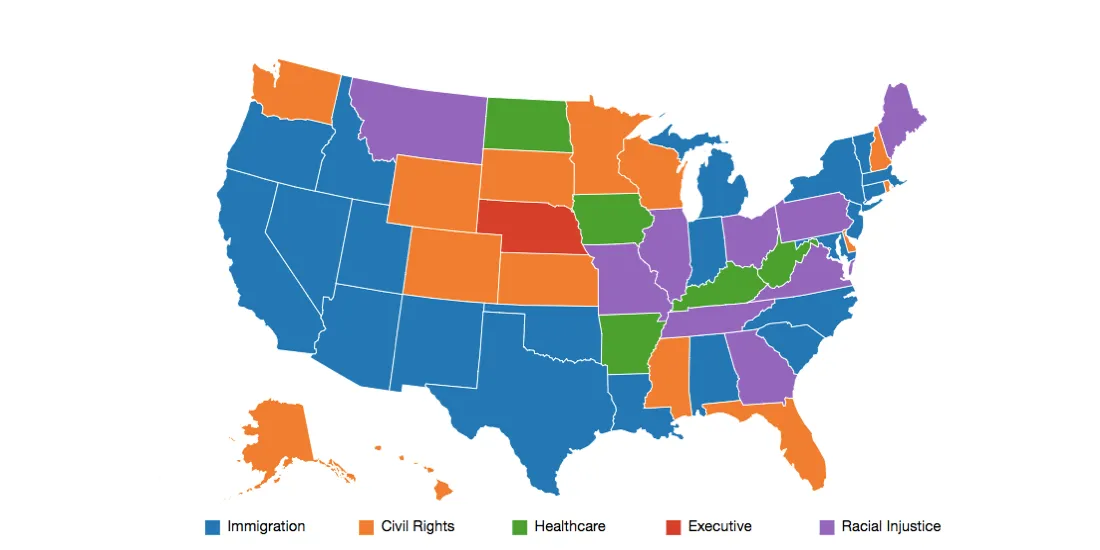
This map provides a "barometer" on political issues frustrating Americans. Count Love found:
- Higher interest in immigration in states along the Mexican border
- States with highly publicized incidents of racism (Charlottesville North Carolina) showed higher interest in racial justice
- States facing risks to changes made to Affordable Care Act held more healthcare protests
The time-series animation below displays protests across the country since the Women's March.
The area of each circle is proportionally scaled to the event's crowd count. The animation slows down around the time of nationally publicized events including both nationally organized events (Women's Day March for Science etc.) and more locally coordinated responses (Travel Ban Charlottesville etc.).
It is interesting to note that protest activity is consistent in rural areas showing a presence of protests at the local levels of government.
The benefits of working with our data agnostic platform
Tommy and Nathan worked with Builder to create an interactive map imported their aggregated protest data and layered it on a basemap at the state and congressional district level.
Here's what they had to say:
From Tommy:
Nathan and I use CARTO tiles everywhere—in addition to mapping protests for Count Love we've also analyzed bike sharing and public transit in Boston by overlaying trip data on top of CARTO's tiles. The tiles are beautiful clean and retina-ready; I've found that they make our data visualizations easy to comprehend and explore. We like the tiles so much that we actually have a mapping template that we use for new projects and that we've open-sourced that hardcodes CARTO as the tile server. I'm not sure what we would do without these tiles!
From Nathan:
Working with a local organization that wanted to understand protest activity within the state of Massachusetts I tried out CARTO Builder for the first time. By simply uploading a CSV file of protests Builder was able to automatically identify columns and place the Massachusetts protests on a map. With a few minutes of configuring I had tailored the color scheme and marker size to show protest type and size respectively. It was empowering to be able to so quickly iterate on the appearance and immediately see how the final map would look.
Although I am glad we learned about writing the map code used on our website my experience with Builder highlighted that there are powerful tools already available to help bring spatial data to life.


