

Map of the Month: Reach of CJ Marple’s Tweet


As a part of our Map of the Month series we dive into a recent Twitter project and see how they use maps to engage with the Twitter community. On January 8th CJ Marple a 3rd grade teacher at Osage City Elementary School in Kansas began a lesson exploring the speed and distance that information can travel using social media. Marple an active twitter user worked with his students to compose a tweet with the intention of mapping the social media engagement as the message spread. It isn't hard to imagine CJ and his students’ surprise as the tweet began to pick up steam go viral and circle the globe.
I am a 3rd grade teacher in Kansas. I am trying to teach my class about the power of Twitter and how fast information can spread. If you could RT this tweet/comment where you are reading from I would really appreciate it. I am planning to share results with them on 1/12. Thanks!
— C.J. Marple (@Marple82) January 8 2018
With over a million and a half total engagements retweets from several celebrities (including Modern Family’s Eric Stonestreet Former White House Press Secretary Dana Perino and U.S. Senator Jerry Moran) and responses from across the world CJ’s tweet proved shockingly effective. He had initially set up a map in his classroom to flag retweets using post it notes but as the tweet continued to go viral and the data points continued to pour in that solution likely proved untenable. To help CJ out Twitter stepped in:
Hi from Twitter HQ! We made an animated map so you can show your students how it spread around the world:https://t.co/zB83Q9KJeX pic.twitter.com/hrjoIu6B0u
— Twitter Data (@TwitterData) January 12 2018
Twitter used CARTO to visualize the location of retweets mapping out the spread of the data and in doing so were able to create an extremely valuable teaching tool for CJ. Not only did their map represent the locations of each retweet but took twitter’s temporal data into account.
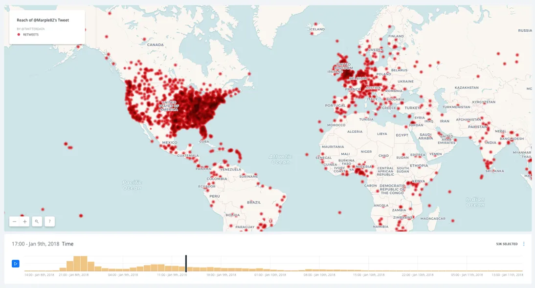
By creating an animated time-scale map twitter was able to fully visualize CJ’s lesson. The time-scale map provides a more complete view to CJ’s students not only showing them where their information had spread but also when and how presenting the pattern of retweets using a histogram.
When discussing what led them to put together this map Elaine Filadelfo Data Editor at Twitter noted:
"This story was the perfect fit for using Carto. We could clearly visualize the original Tweet being posted in Kansas and then watch as it spread regionally nationally and globally over the following days."
At its core visualizing our location data empowers us to further understand the world around us and the systems that we interact with every day. CJ noted that "looking at the data the thing that was really crazy for them to see (and their big takeaway) was where it was getting retweeted." With retweets from Chile to China Location Intelligence helped a class of 3rd graders from Kansas see just how connected to the wider world they truly are.


