Design Principles for Making Maps on the Web

Cartography is as much art as it is science. A map can use the best data and most sophisticated analyses but is ineffective if the reader can't understand the story behind it. However unless you're Leonardo da Vinci being both an artist and a scientist doesn't come naturally so we've found two maps that demonstrate how colors labels boundaries and symbols can help you create a powerful map.
Though this image looks like it could be a picture of a rectangular-shaped petrii dish growing a family of bacteria it’s actually a map of Washington Park in Denver Colorado.
Each orange dot represents either a tree or a location of interest the blue lines depict trails or roads and the amorphous blobs (technically called polygons) are supposed to be ponds.
However without proper labels coherent boundaries or an intuitive color scheme it’s difficult to see what’s going on let alone be able to use the map for a game of Ultimate Frisbee or a Sunday picnic.
Ah much better. This map looks much more like a park because it follows three key design principles:
- Colors should align with expectations. Here the grass is light green the ponds are light blue and instead of being an unnerving shade of orange the trees are now dark green.
- Labels should be hierarchical. Notice for example that the streets adjacent to Washington Park are named. The second map retains those labels but fades them into the background emphasizing the interior of the park itself.
- Positioning should match the map’s intent. Because the map is designed for visitors to navigate the park the walking paths and locations of interest are clarified and labeled. Likewise instead of cluttering the map with words the cartographer uses symbols (and a key) to depict the various activities available which gives the map the same simple and expansive feeling as the park itself.
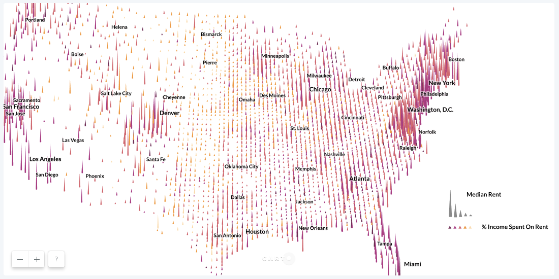
This map looks like a snapshot from halfway through The Oregon Trail when a few of the covered wagons have finally made it West but most are still chugging through the East Coast and the Great Plains. In fact it's a map of every county in the United States and it makes a very important point — but what could it be?
This map clearly has a point to make and it does so by employing three more key visual design principles:
- Add additional variables to tell a story. By showing both the median cost of rent (height) and the percent of income spent on rent (color) the map called a bivariate map implicitly tells a complex story about how affordability differs by region.
- Incorporate shapes to de-clutter the map. Though the first map has just as many points as the second the former feels cluttered because each county is represented in an identical way. By expanding the range of visual options the cartographer actually makes the map more legible.
- Use features that emphasize unexpected data. It’s well understood that major cities are expensive to live in but what’s surprising about this dataset is the outliers. For example a county in northern Salt Lake City has a high median rent but it's relatively cheap for people in that area. Conversely residents in many counties around Milwaukee give a lot of their paycheck to their landlords even though the property isn't that costly in absolute terms.
This post was based off the work and research of Mamata Akella the Senior Cartographer at CARTO. You can watch her full talk All about the carto in CARTO at the Location Intelligence Summit to learn even more principles to apply to your map making process.


.png)

